

Risk Management Heat Map 5x5 Showing Low Medium High Powerpoint Ideas




Try Before you Buy Download Free Sample Product
 Impress Your
 Audience
 100%
100% Editable
 Save Hours
 of Time


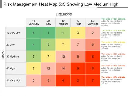
Control the future uncertainty of your business with our risk management heat map PPT design. Use this heat map diagram PPT image to identify all your business potential risks which may affect your business growth. Thus, you can also define the best possible business solutions to manage as well as to control all your risks with this risk management PPT template. This 5X5 heat map Presentation diagram allows you to describe the levels of risks into 5 categories such as very low possibility of risks, to the low, medium, high and very high. It further allows the management to take immediate actions against the very high risks of your organization. Whereas you can also develop some adequate risk mitigation strategies on the basis of such predicated risk mapping PPT diagram design. Therefore, use our enterprise risks management PowerPoint diagram to define the stages of your risk management process. It starts from risk identification till the final stage of monitoring performance of your business after implementing the best risk mitigation strategy. Thus, click on the download link now. Our Risk Management Heat Map 5x5 Showing Low Medium High Powerpoint Ideas are amenable to any alterations. They allow you to pay heed to changes.
People who downloaded this PowerPoint presentation also viewed the following :
Risk Management Heat Map 5x5 Showing Low Medium High Powerpoint Ideas with all 5 slides:
Be on the ball with our Risk Management Heat Map 5x5 Showing Low Medium High Powerpoint Ideas. Bring your A-game to the fore.
FAQs for Risk Management Heat Map 5x5 Showing Low Medium
So a risk heat map is just a visual grid where you plot risks by how likely they are vs how bad they'd be if they happened. Picture a color-coded chart - red zones are "drop everything and fix this" while green areas can wait. You map each risk based on probability and impact. The redder it gets, the higher priority. Super handy because you can instantly spot what needs immediate attention. Though honestly, half the battle is being realistic about your ratings - I've seen teams way too optimistic about their risks and then wonder why their map doesn't help when things actually go sideways.
Most places use 1-5 or 1-3 scoring scales for this stuff. Your team rates each risk on likelihood (using past data, expert opinions, current situation) and impact (money, operations, reputation damage - the usual suspects). Having standardized rubrics defining "low/medium/high" saves so much time in meetings, trust me. You'll want everyone agreeing on these definitions upfront and write them down somewhere. I'd check what other companies in your industry do first. Why start from scratch when someone else already figured it out?
Honestly, heat maps are game-changers for spotting patterns you'd never catch scrolling through spreadsheets. Your brain just processes those colors instantly - red areas jump out screaming "fix this!" while green zones mean you're good. Everyone understands them too, which is huge when you're presenting to bosses who hate data dumps. I've seen people completely zone out during traditional risk reports, but throw up a colorful heat map? Suddenly they're asking smart questions. Makes prioritizing so much clearer since the urgent stuff literally glows at you. Worth trying on your next review - the difference is pretty striking.
So a Risk Management Heat Map is basically this visual grid that plots risks by how likely they are vs how much damage they'd do. The red zones? Those are your "oh shit" risks - high probability AND high impact. Deal with those first, obviously. Yellow and green can wait, though don't totally forget about them. Way better than staring at some endless Excel list trying to figure out what matters. Honestly, once you see it laid out visually, it's pretty obvious where to throw your time and money. Just start with the darkest red spots and work down from there.
Start with probability and impact axes - that's your basic grid. Color coding is huge but don't make it confusing (I've seen some truly terrible ones). You'll want risk categories like operational, financial, compliance stuff. Use 1-5 scoring scales, they're pretty standard. Add ownership assignments and show both current risk levels plus what they'd be after mitigation. Dates matter too - when was this last actually reviewed? Brief descriptions help, plus space for key actions you're taking. Honestly though, test it with your stakeholders first. Nothing worse than building something nobody understands.
Quarterly is the bare minimum, but honestly that feels pretty slow these days. Monthly makes way more sense if your industry moves fast or things change a lot. Oh, and don't wait around for your next scheduled update when something big happens - regulatory stuff, market drama, internal disasters - just update it right away. The whole thing's useless if it's not current. I'd set up calendar reminders for the regular ones and maybe create some quick process for when you need to make changes on the fly. Otherwise you'll just forget about it.
You really can't skip getting stakeholder input on this - they'll catch risks you'd never think of and give you way better accuracy on impact/likelihood since they're in the trenches daily. Different departments will have totally different perspectives too. I learned this the hard way on a project last year... anyway, if people aren't involved in creating it, they won't use it later. That's just human nature. Make sure you talk to folks across the org, not just management. Their input helps you figure out what actually matters to the business instead of guessing.
Honestly, tech is a game-changer for heat map accuracy. You can automate data collection instead of doing everything manually - pull from your ERP, compliance systems, incident reports, all that stuff. AI spots patterns you'd probably miss and keeps risk scoring consistent across departments. The best part? Your heat map stays current with automated updates instead of being old news right after you finish it. I'd start by figuring out which data sources you can connect first. Way less headache than the old spreadsheet nightmare we used to deal with.
Honestly, the biggest screw-up I see is companies overdoing their scoring systems. Like, why use a 1-25 scale when 1-5 gets the job done? Don't let just one person fill it out either - you need different people weighing in or you'll miss obvious stuff. Most teams treat it like homework they only do once, but it should be updated regularly. Oh and this drives me crazy - actually define what "high risk" vs "medium risk" means for YOUR situation. I've watched entire meetings derail because everyone's using different definitions. Keep it simple, get the right people involved, revisit it every few months.
Regulators eat this stuff up - heat maps show you're actually on top of your risk management game. Auditors can see at a glance how you've spotted and ranked different risks across your business. Color coding makes the danger zones pop right out, which honestly saves everyone time during reviews. Most frameworks already want documented risk assessments anyway, so you're covering that requirement too. Just update them every quarter and keep your data sources handy. Trust me, auditors get excited when they can trace everything back to the source data. Makes their job way easier.
Dude, heat maps are game-changers for risk talks. Everyone instantly gets what's urgent - red stuff needs attention NOW, green means you're fine. No more endless debates about severity or digging through boring spreadsheets. Honestly, I get weirdly excited watching risks shift from red to yellow to green over time (yeah, I'm a nerd like that). Your team will actually know what to focus on during meetings instead of arguing in circles. Stick one on the office wall where people see it daily - works way better than you'd think.
So finance, healthcare, and manufacturing see huge benefits from risk heat maps. Any industry juggling tons of variables and compliance stuff, really. Instead of getting lost in endless spreadsheets, you can actually see what's going on at a glance. Construction and oil companies are obsessed with them since their risks can literally kill people or blow budgets. I mean, safety's no joke in those fields. The visual thing makes patterns super obvious - you'll spot what needs fixing first way faster. Just start with your biggest 10 risks and watch everything click into place.
So your risk tolerance basically sets up how you build the whole heat map. Low tolerance? You'll want way more color gradations and trigger those red alerts sooner. Companies that can handle more risk usually go with broader color bands - less hand-wringing, you know? Here's the thing though: your heat map has to actually match what your leadership cares about. No point making something pretty if it doesn't reflect what genuinely worries them. I'd honestly figure out those tolerance levels first, then worry about colors later. Makes the whole process way smoother.
For your heat map tracking, focus on risk distribution across severity levels and how many risks move between categories over time. Time to resolution for different risk types is gold - seriously, execs eat that stuff up. I'd also watch risk velocity (how fast you're catching and assessing new ones) plus the split between preventive vs reactive responses. Oh, and track what percentage of your high-priority risks actually have mitigation plans running. Don't go crazy though - pick maybe 3-4 that actually move the needle for your business and stick with those consistently.
Look at those red zones first - they're screaming for attention. I know it's way more satisfying to knock out the easy stuff, but don't fall into that trap. Those high-risk areas could seriously mess things up if you ignore them. Get someone specific assigned to each problem area and give them real deadlines, not just "sometime soon." Medium and low-risk stuff can wait their turn. Oh, and this isn't a one-and-done thing - you'll need to keep updating it as things change. Trust me, new problems pop up constantly.
-
Design layout is very impressive.
-
It saves your time and decrease your efforts in half.
-
Top Quality presentations that are easily editable.
-
Very unique, user-friendly presentation interface.