

Risk management heat map showing likelihood vs severity 6x6 ppt diagrams




Try Before you Buy Download Free Sample Product
 Impress Your
 Audience
 100%
100% Editable
 Save Hours
 of Time


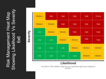
Display risks in a concise manner using the risk heat map 6x6 PPT slideshow. This readily available risk management heat map template helps an individual to highlight business risk assessment in a well-organized manner. Devise strategies to deal with the risk factors. You can use this heat map risk matrix design PowerPoint slide for illustrating enterprise risk management as well as emerging risks. The heat map risk assessment PPT slide describes the classification of risk by severity as well as the likelihood of risks. Different colors represent different types of risks such as high risk, medium risk, and low risk. The heat map showing likelihood vs severity template for PowerPoint is an ideal template for business managers, quality professionals and many more.
People who downloaded this PowerPoint presentation also viewed the following :
Content of this Powerpoint Presentation
Description:
The image displays a PowerPoint slide titled "Risk Management Heat Map 6x6 Showing Likelihood Vs Severity". It's a color-coded matrix that categorizes risk levels based on two dimensions: likelihood and severity. The horizontal axis represents 'Likelihood', ranging from low to critical, and the vertical axis represents 'Severity', with the same range. The matrix uses a gradient of colors—green for low, yellow for medium, orange for high, and red for critical—to visually represent the level of risk. This type of heat map is a common tool in risk assessment to prioritize risks based on their potential impact and the probability of occurrence. The slide also indicates that it is "100% editable" to adapt to specific needs and engage the audience.
Use Cases:
1. Finance:
Use: Assessing investment risks
Presenter: Financial analysts
Audience: Investors and portfolio managers
2. Healthcare:
Use: Prioritizing patient safety issues
Presenter: Hospital risk managers
Audience: Clinical staff and hospital administrators
3. Construction:
Use: Evaluating safety hazards on-site
Presenter: Safety officers
Audience: Construction workers and project managers
4. Information Technology:
Use: Managing cybersecurity threats
Presenter: IT security consultants
Audience: Network administrators and C-suite executives
5. Insurance:
Use: Determining policy premiums based on risk
Presenter: Actuaries
Audience: Underwriters and insurance agents
6. Manufacturing:
Use: Identifying potential production line failures
Presenter: Quality control specialists
Audience: Plant managers and operational teams
7. Event Management:
Use: Planning for potential event disruptions
Presenter: Event planners
Audience: Vendors and emergency services personnel
Risk management heat map showing likelihood vs severity 6x6 ppt diagrams with all 5 slides:
Bring her concerns to the forefront with our Risk Management Heat Map Showing Likelihood Vs Severity 6x6 Ppt Diagrams. Fight for the female cause.

FAQs for Risk management heat map showing likelihood vs severity
So a risk management heat map is this visual grid thing where you plot risks by how likely they are vs how bad they'd be if they happened. Red zones = deal with immediately, green = monitor but chill. Honestly, it's one of those tools that actually works because executives can look at it and instantly get what's urgent. You just identify your biggest 10-15 risks first, then map them out based on probability and impact. Takes forever to explain risks in meetings otherwise. Once you see everything plotted, your priorities become super obvious and you know where to throw your budget.
Heat maps are honestly perfect for this kind of thing. Your stakeholders won't have to dig through boring spreadsheets anymore - they'll just see red zones that scream "fix this immediately" and green areas where everything's chill. Executives love them because they can spot problem areas in like 5 seconds instead of reading endless reports. Your team saves tons of time too since the colors do most of the explaining for you. One thing though - stick with the same color scheme across all your risk stuff so people don't get confused switching between documents.
Start with likelihood and impact as your two main axes - that's basic risk mapping 101. Plot everything based on probability vs potential damage. The traffic light colors work best (green/yellow/red) since nobody has to think about what they mean. Write out actual risk descriptions instead of generic stuff like "operational risk" - be specific. Oh, and definitely track mitigation status so you can see what's covered and what isn't. Update it every quarter minimum or it just becomes wall art that nobody looks at.
Honestly, just ditch the generic templates and build around what actually hits your industry. Healthcare? Patient safety and compliance stuff should dominate your heat map. Manufacturing gets wrecked by downtime and supply issues, so weight those heavier. The color coding needs to match your sector's reality too - banking's "high risk" looks nothing like construction's version. I'd start by listing your top 10 industry-specific risks first, then customize the probability scales and impact levels around those. Way better than trying to force some cookie-cutter framework that doesn't fit.
Look, heat maps basically cram everything into those color-coded squares, which means you'll miss the messy details that actually matter. What you think is "high risk" might not match what your coworker thinks - it's super subjective. They only capture one moment too, so if risks are connected or changing fast, you're screwed. I've watched entire meetings get derailed because people obsessed over whether something should be yellow or orange instead of talking about the actual problem. Use them to start the conversation, but don't stop there.
Yeah, colors totally mess with people's heads on risk maps. Red makes everyone panic and rush straight to those boxes, even if a yellow item might actually need attention too. It's wild how the same risk score gets completely different reactions just based on color choice. Different industries see colors differently though - what looks scary to a banker might seem normal to someone in manufacturing. I'd honestly skip the basic red-yellow-green thing and use gradients instead. Way more helpful. Just make sure your legend is super obvious because people will definitely misread it otherwise.
For your heat map, go with probability on one axis and impact on the other. Basic 1-5 scale works great - don't overthink it. Probability is just how likely something is to happen during your timeline. Impact covers the damage if it does hit - money, operations getting screwed up, bad PR, whatever. I've seen people try adding detectability as a third thing but honestly? That just makes it messy. Stick with the two main ones and you'll spot which risks need fixing right away vs the ones you can just keep an eye on.
Quarterly updates are the bare minimum, but honestly that's probably not enough if things are actually moving in your company. Big changes like new regulations or restructuring? Update that thing monthly, or even right after major events happen. The whole point is staying current - nobody wants to look at risk data from six months ago when everything's different now. I'd start with quarterly as your default schedule, then just... I don't know, trust your gut about when something big enough happens that you need to refresh it early. Way better than sticking rigidly to some timeline.
Start with color contrast - green for low risk, red for high. Pretty standard stuff. Don't go crazy with categories either, like 3-5 max because nobody wants to decode 10 different shades. Your axis labels need to be super clear, and please make the text big enough that people can actually read it in meetings. I've sat through way too many presentations squinting at microscopic fonts. Think about where this thing's gonna be used - big screen or printed handout? That changes your sizing. Oh, and definitely throw in a legend explaining your scoring system. Stakeholders get confused without it, then you're stuck explaining the same thing over and over.
Honestly, heat maps are a game changer for this stuff. You get instant visual feedback on what's gonna bite you first - red means drop everything and deal with it, yellow is your next batch of problems, green can chill for now. Way easier than drowning in spreadsheets trying to rank everything. I've seen managers literally just point at the red spots during meetings and boom, everyone's on the same page about priorities. Sure beats arguing over which risk "feels" more important. Just don't completely forget about those green ones sitting there.
Honestly, Excel is probably your best bet to start - everyone already knows it and you can make decent heat maps with conditional formatting. Once you outgrow that (and you probably will), check out GRC platforms like ServiceNow or MetricStream. They're pricier but handle way more than just visuals. Airtable's pretty solid too if you're on a tighter budget. My buddy's team uses Google Sheets and it works fine for them. Start basic though - figure out what you actually need before dropping cash on fancy software. Most people overthink this stuff initially.
Dude, risk assessment is so subjective it's crazy. Your manufacturing company freaks out over supply chain issues while some tech startup shrugs it off. Different industries use totally different scales too - 3x3 grids, 5x5 matrices, whatever. Even the colors don't match up between companies, which is kind of annoying when you're switching jobs. The key thing is getting your whole team on the same page about what "high risk" actually means. Once you nail down those definitions, just stick with them. Otherwise you'll have people scoring the same problem completely differently and that's useless.
So basically a heat map is like your risk dashboard - shows you the big threats at a glance. Way better than those spreadsheets everyone ignores, honestly. You can prioritize what needs fixing first and actually communicate with leadership without boring them to death. It helps with planning, resource decisions, all that stuff. Plus you track changes over time so nothing major slips by. I'd update it quarterly or whatever makes sense for your company - though some places do it monthly if they're really paranoid about risks.
Yeah, they work great together - honestly that's when heat maps get really useful. Pull data straight from your risk registers and incident systems to keep everything updated. Most teams I know connect them to dashboards and KRI monitoring too. Just make sure your risk categories match up across tools or you'll have a mess on your hands. Short version: map what systems you've got first, then find the data points that overlap. Oh, and compliance tracking integration is pretty slick if you're dealing with that stuff. The whole setup talks to itself once you get it right.
JPMorgan Chase does this really well - they use heat maps to spot operational risks across all their branches. Makes resource allocation so much simpler. Boeing jumped on this after their supply chain nightmare (smart move honestly). Now they can instantly see which suppliers might mess up production schedules. Pfizer does something similar for tracking compliance risks when they're developing drugs in different markets. The cool part? These aren't just fancy visuals sitting in presentations - companies actually make real decisions based on them. I'd start small though, maybe map your biggest 10 risks first and see where they land.
-
Top Quality presentations that are easily editable.
-
Awesomely designed templates, Easy to understand.