

Risk management heatmap 3 x 3 showing low medium high powerpoint shapes




Try Before you Buy Download Free Sample Product
 Impress Your
 Audience
 100%
100% Editable
 Save Hours
 of Time


Define the risk appetite of your business with our risk management heatmap PowerPoint design. Use this risk heatmap PPT template to represent the qualitative as well as quantitative evaluation of your business risk. It helps in visually describing the probability of the particular risk occurrence and its impact on your business. The graphical representation through this colored level of risks PPT image design will help in introducing the risk mitigation strategies for the company. You can also define the various benefits of managing the risk map for the business with this enterprise risk management PPT slide diagram. It helps your management to take strategic business decisions and offers more precision to your risk assessment process. It will also bring efficiency to your business operations while managing its financial stability. Therefore, just simply click on the download link given below to start working over this risk assessment matrix PPT slide design. Rejuvenate your team with our Risk Management Heatmap 3 X 3 Showing Low Medium High Powerpoint Shapes. Get them behind you with full sincerity.
People who downloaded this PowerPoint presentation also viewed the following :
Content of this Powerpoint Presentation
Description:
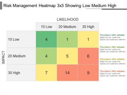
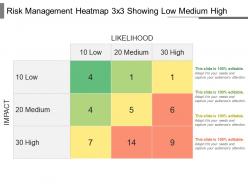
The image shows a Risk Management Heatmap with a 3x3 matrix layout indicating different levels of risk based on two dimensions – Likelihood and Impact. Both the Likelihood and Impact are ranked on a scale from Low (10) to High (30). The heatmap uses a color-coding scheme to visualize the levels of risk: green for low risk, yellow for medium risk, and red for high risk. Within each colored square are numbers which likely represent either the quantity of risks identified at that level or some form of risk score.
Use Cases:
This heatmap is useful for visualizing and prioritizing risks, and it can be applied across various industries for risk assessment purposes:
1. Financial Services:
Use: Identifying and categorizing investment risks
Presenter: Risk Analyst
Audience: Investment Managers
2. Healthcare:
Use: Assessing patient safety and healthcare delivery risks
Presenter: Hospital Administrator
Audience: Medical Staff
3. Information Technology:
Use: Evaluating cybersecurity threat levels
Presenter: IT Security Manager
Audience: IT Department
4. Manufacturing:
Use: Analyzing risk in supply chain management
Presenter: Operations Supervisor
Audience: Product Development Team
5. Energy Sector:
Use: Mapping risks associated with energy production and distribution
Presenter: Risk Assessment Officer
Audience: Utility Company Executives
6. Construction:
Use: Project risk management and safety hazard assessment
Presenter: Safety Officer
Audience: Construction Project Team
7. Consulting:
Use: Providing clients with strategic risk evaluation services
Presenter: Strategy Consultant
Audience: Corporate Executives
Risk management heatmap 3 x 3 showing low medium high powerpoint shapes with all 5 slides:
Find an essential aid in our Risk Management Heatmap 3 X 3 Showing Low Medium High Powerpoint Shapes. They deliver critical assistance.
FAQs for Risk management heatmap 3 x 3 showing low medium
So it's basically a visual grid - you plot risks by how likely they are vs how bad they'd be if they happened. Red/yellow/green colors make it super obvious which ones need your attention first. Honestly, execs love these things because they don't have to dig through boring spreadsheets. Just list out your main risks, score them on both scales, then throw them on the grid. The red squares? Those are your "drop everything and deal with this" problems. Way better than trying to explain risk priorities in a meeting - people get it instantly. Makes the whole team way more focused on what actually matters.
I'd stick with 1-5 scales for both likelihood and impact - makes everything way easier to compare later. Historical data helps with the likelihood part, but honestly you'll need people from different departments weighing in since they know their stuff inside out. Impact gets tricky because you're looking at financial hits, operational chaos, reputation damage, the whole mess. Being consistent with your scoring criteria is huge though, otherwise you can't really stack risks against each other. Oh and definitely write down why you scored things the way you did - future you will thank you when it's time to update everything.
Okay so for your risk heatmap you need likelihood on one axis, impact on the other. Color code it green-yellow-red style so risks pop out visually. Add clear descriptions or IDs in each cell, plus who owns each risk - trust me, accountability matters. Define your scales super specifically too, none of that vague "medium risk" nonsense that leaves everyone guessing. Include a legend because people will 100% forget what red means halfway through the meeting. The whole point is making it dead simple to scan and figure out which fires to put out first. Oh and make sure impact/likelihood criteria are crystal clear upfront.
First thing - figure out what risks actually hit your industry. Tech companies obsess over cyber stuff, healthcare deals with compliance nightmares. Heatmaps are pretty flexible though, so tweak the probability and impact scales to match what "high risk" means for you specifically. Manufacturing might care way more about operational hiccups than bad PR. You can mess with the colors and add whatever metrics make sense. Honestly, I'd peek at what competitors track or check out frameworks like NIST for ideas. Just don't use some boring generic template - make it fit the real problems your company faces.
So for risk heatmaps, honestly Excel's probably your best bet to start. Conditional formatting works pretty well, though it can get messy with complex stuff. If you need something fancier, check out GRC platforms like ServiceNow or MetricStream - they're built for this exact thing. Tableau and Power BI make everything look way better if presentations matter to your team. I've actually seen some really solid heatmaps done in plain old Excel that did the job perfectly fine. My buddy's company still uses theirs from like 2019. Start with whatever you've already got and upgrade later if you need more bells and whistles.
Quarterly minimum, but monthly's way better if you can pull it off. Things change so damn fast now - new regs drop, markets flip, hackers get creative. Your heatmap turns into expensive wallpaper if you're working off old info. After big incidents or strategy shifts? Definitely update then too. I've seen teams burn out doing it weekly (total overkill), so find what works without making everyone hate the process. Start quarterly and bump it up if your industry's particularly crazy. The whole point is keeping it actually useful, not just checking a compliance box.
Honestly, just go with the classic red-yellow-green setup. Everyone knows what it means instantly. If you need more detail, throw in orange between red and yellow - gives you four levels instead of three. I've watched people get all fancy with those blue-to-red gradient things, and it's a nightmare. Stakeholders just want to spot the problem areas fast, you know? Red = bad, green = good. Simple. Oh, and definitely check that colorblind people can read it too - learned that one the hard way. Your heatmap should basically scream the important stuff without making people think.
Honestly, heatmaps are genius because they speak everyone's language - red means trouble, green means you're good. Your CFO doesn't need to understand technical scoring systems, and IT doesn't need compliance training to get it. Finance, ops, and tech teams can all look at the same visual and spot the problem areas instantly. Way better than those soul-crushing reports nobody actually reads. I swear, executives make decisions faster when they can just glance at colors instead of diving into spreadsheets. Next time you're in a cross-department meeting, throw one up and watch how quickly people actually agree on priorities for once.
Set up monthly check-ins with whoever owns each risk data source - trust me, this stuff gets stale fast without regular nudging. Pull from live systems instead of spreadsheets when you can. Calendar reminders are your friend here, plus alerts when data goes too long without updates. Version control will save your sanity later when someone asks what changed. Document who's responsible for what upfront - sounds boring but you'll thank yourself when chaos hits. Oh, and honestly? People will just forget unless you make it stupidly easy for them to remember.
Honestly, the biggest screwup is using vague scales like "high/medium/low" without defining what those actually mean. Everyone ends up interpreting risks differently, which is pretty pointless. Don't jam too many risks on one heatmap either - it becomes this unreadable mess. People also treat it like homework they can finish once and forget about. You've got to update these things regularly. And here's what really bugs me: teams make everything look "medium" to dodge tough conversations. Just be real about which risks are actually serious so you can focus on what matters.
Honestly, heatmaps work because they make risks impossible to ignore. Everyone can actually see what's going on instead of just hearing about it in boring emails. Stick it up in meeting rooms or pull it up during discussions - suddenly risks aren't just the compliance team's headache anymore. Think of it like a weather forecast for your company. People start connecting dots between their work and potential problems when everything's visual. The trick is keeping it fresh and actually using it for decisions. Oh, and don't be one of those teams who creates it once then never looks at it again!
You definitely need stakeholder input for your heatmap - it's what makes it actually useful instead of just theoretical. Different teams see totally different risks. Finance spots threats that operations might miss, and vice versa. Plus stakeholders won't trust something they didn't help create, which I've seen backfire before. Their expertise helps you catch blind spots you'd never think of. Short answer: get them involved early when you're identifying risks AND when you're figuring out how to score everything. Otherwise you'll end up with this perfect-looking chart that nobody uses.
Heatmaps work perfectly for ISO 31000's risk assessment phase - just plot your risks using their likelihood and consequence criteria. The visual color coding makes it super obvious which risks need attention first. Honestly, stakeholders get it way faster than staring at boring spreadsheets. Map your existing ISO risk register onto the heatmap and boom - instant clarity on priorities. Your heatmap categories need to match ISO's evaluation criteria though. Update them during regular reviews. I've seen teams suddenly "get" their risk landscape once they see it visually laid out like this.
Put your biggest risks right at the top - nobody wants to dig for the scary stuff. Red/yellow/green is your friend here, and yeah, you'll need that legend even though it seems obvious. Skip the fancy corporate speak when naming your risk categories. Executives just want to spot what's broken fast. Have backup slides ready for the high-risk items because that's where everyone gets chatty. Oh, and here's the thing that actually matters - don't just show them pretty colors. Tell them what you think they should DO about it. That's where you add real value.
Honestly, pull your last two years of incident data and see where you totally whiffed on predictions versus what actually happened. Historical patterns are like a cheat sheet for calibrating your probability scores better. Track which mitigation stuff actually worked too - you'd be surprised how many "foolproof" strategies fall flat. Most people skip this step entirely, which is crazy because it's probably the best way to spot risks that escalate fast. Map everything against your current heatmap categories. Oh, and don't forget to look at how risks evolved over time - that's where the real insights are hiding.
-
Great designs, Easily Editable.
-
Helpful product design for delivering presentation.