

Risk Management Heat Map 4x4 Showing Probability And Severity Ppt Ideas




Try Before you Buy Download Free Sample Product
 Impress Your
 Audience
 100%
100% Editable
 Save Hours
 of Time


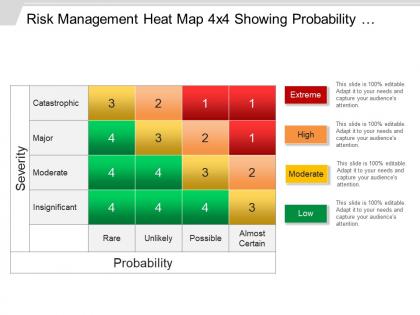
Display presentation templates to communicate with entrepreneurs and create new business concepts through our, risk management heat map 4x4 showing probability and severity PPT ideas. Forecast and evaluate financial risks coincidentally with the identification of procedures to avoid or minimize their impact through our engaging vision. We have shown four parameters over a severity and probability graph. Four stages are shown here to identify four types of risk involved, which, are, catastrophic, major, moderate, insignificant. Bright color schemes are shown here to display these types of risk, starting from, low, to moderate, to high to extreme. Monitor the lags and improper functioning in your business to minimize, direct, and control the probability or impact of unfortunate. Download our, risk management heat map 4x4 showing probability and severity PPT ideas to enhance the quality of your presentations. When you want to communicate your vision for a business PowerPoint is a good tool. However it becomes even better when you make use of pre-prepared Risk Management Heat Map 4x4 Showing Probability And Severity Ppt Ideas.
People who downloaded this PowerPoint presentation also viewed the following :
Risk Management Heat Map 4x4 Showing Probability And Severity Ppt Ideas with all 5 slides:
Display all the information folks desire with our Risk Management Heat Map 4x4 Showing Probability And Severity Ppt Ideas. Demonstrate capability to deliver.
FAQs for Risk Management Heat Map 4x4 Showing Probability And
So basically it's a visual grid where you plot risks by likelihood vs impact - like a traffic light system with red/yellow/green colors. Plot each risk on those two axes: how probable it is versus how much damage it'd do to your business. Red zones are your "oh shit" risks that need immediate attention. Most companies pull these out during board meetings and quarterly planning to figure out what fire to put out first. Honestly, they're pretty clutch for getting executives aligned on priorities. Just start with your top 10-15 risks and map them out - you'll spot patterns right away that weren't obvious before.
So you'll want to create clear scales first - I usually go with 1-5 or just low/medium/high. Likelihood is basically how probable something is to actually happen. Look at your past data, ask people who know their stuff, or check current conditions. Impact measures what happens if things go sideways - money lost, operations screwed up, reputation hits, whatever hurts your business most. Here's the thing though: you gotta stay consistent when rating everything or your heat map will be garbage. Get everyone together to nail down what "high impact" actually means in real numbers, then don't deviate from those definitions.
Dude, heat maps are seriously a game changer for risk stuff. You get this instant visual of where your biggest problems are - way better than staring at boring spreadsheets all day. The color coding thing is clutch because red stuff = deal with now, green = you're good. Your boss will love them too since they can see the big picture without diving into all the messy details. I've seen teams waste so much time trying to figure out priorities when a simple heat map would've made it obvious. Just pick your worst 10-15 risks and map them out. You'll be surprised how much clearer everything becomes.
First thing - take whatever risk categories you're already using and just map them onto the heat map. No point reinventing the wheel there. The trick is making it actually useful, not another document that collects dust (been there!). Color code it so people instantly know what to do when they see red zones. Plug it straight into your monthly reviews instead of treating it like some side project. Honestly, start with just one department to test it out. Once they see it working, expanding to other areas becomes way easier. Keep the whole thing simple at first.
Honestly, the biggest screw-up is when people jump straight into plotting risks without defining what "high impact" even means first. Everyone ends up with different interpretations. Don't just recycle last year's map either - I've totally done this before and it's useless. You need the right people in the room or you'll miss obvious stuff. Oh, and watch your categories - too broad and everything looks the same, too narrow and it's overwhelming. Get your team on the same page about what each level actually looks like in real terms first.
So basically you update your heat map every quarter or when big stuff changes - new threats pop up, controls get better, whatever. Most tools let you compare time periods which is actually pretty cool when you see risks going down. Set up regular reviews with whoever owns each risk. I always use color coding to show which risks moved a lot between updates. Oh and document why things changed - you'll spot patterns later. Sometimes I get lazy about the documentation part but it's worth it in the long run.
Don't just grab a generic heat map template - that's honestly a waste of time. Think about what risks actually keep people in your industry up at night. Healthcare? Patient safety and compliance stuff. Manufacturing? Equipment breaking down, supply chain going haywire. Your probability scoring needs to match reality too. Like, data breaches are super likely in tech but maybe not so much if you're running a farm. Start by writing down your top 10 risks that could actually happen, then build everything around those. The impact categories should reflect what would genuinely hurt your business, not some textbook examples.
Honestly, most people just use Excel for risk heat maps and it works fine. Conditional formatting makes it super easy to visualize everything. There's fancier stuff like ServiceNow or MetricStream if your company has money to burn - they've got better automation and all that. Tableau's pretty cool too if you want something that looks more professional. Oh, and Power BI. Start simple though. Get your risk categories figured out in Excel first, then worry about upgrading later. I've seen too many teams jump straight to expensive software without nailing the basics.
Look at your heat map and attack the top-right corner first - high probability AND high impact. Those are your "oh shit" moments waiting to happen. After that, work through the red zones before touching yellow ones. Think of it like ER triage but for your business problems. Honestly, I've seen too many people get distracted by small stuff while missing the real threats. Assign someone to own each major risk and set actual deadlines for fixing them. The visual makes it pretty obvious what deserves your attention. You'll sleep better knowing you're not ignoring potential disasters.
Communication is huge here - honestly, your heat map is useless if people don't get it or act on it. Make sure everyone knows what the colors mean, otherwise you'll get those awkward blank stares in meetings. The visual needs to tell a story that sparks real discussion about which risks need immediate attention. Don't let it go stale either - I've seen too many become pretty wallpaper that nobody looks at. Keep updating it as things change. Most important part? It should drive actual conversations and decisions, not just sit in some folder.
Honestly, heat maps are a game changer for team meetings. Everyone sees the same visual, so there's no confusion about what counts as "high risk" - it's just right there in red. Your team can jump straight to discussing the problem areas instead of wasting time on minor stuff. I've noticed people who normally struggle with abstract concepts really get it when everything's color-coded. Short sentences work better than long explanations, you know? Just throw it up on the screen next time and you'll probably cut your meeting time in half while actually getting better decisions.
Hey! So for better heat map accuracy, start with nailing down your criteria - like what exactly makes something "high impact" vs "medium." That's where most people mess up honestly. Get different people involved too because one person's assessment is usually pretty biased. I learned this the hard way on a project last year. Also make sure you're updating the thing regularly and keeping track of where your data comes from. The criteria thing though? That's your biggest win right there.
Oh yeah, this is totally a thing! People from different cultures see risk maps completely differently. Someone from a high-context culture might think "medium risk" is actually way worse but won't say it directly. Meanwhile your German colleague is probably gonna tell you exactly why that yellow zone is unacceptable lol. Even colors mess things up - red doesn't mean "danger" everywhere. Honestly, I learned this the hard way on a project last year. Best approach? Set up clear definitions from day one and actually talk through what each risk level means to everyone. Don't just assume you're all on the same page.
Honestly, risk heat maps are a lifesaver for compliance stuff. Auditors eat this visual approach up - way better than dumping spreadsheets on them. You can pinpoint your worst risk areas instantly and show exactly what controls you've got in place. When regulations change (and they always do), just update the map to prove you're handling new requirements. I'd refresh yours every quarter so it's ready when auditors show up. Oh, and tracking how risks shift over time? That's where these really shine for showing due diligence.
Quarterly reviews are a must, though monthly might be better for your riskier stuff. Get automated reminders set up so you don't forget - trust me on this one. Someone needs to own each risk area or it'll just sit there gathering dust. Here's the thing though: annual reviews are completely pointless now. Everything moves too fast. You'll want to connect your heat map to incident reports so new issues automatically trigger updates. Honestly, just schedule these like any other meeting and stick to it. Makes it feel less like extra work when it's built into your regular routine.
-
Out of the box and creative design.
-
Easily Editable.