


Coffee Cafe Brochure Trifold




Try Before you Buy Download Free Sample Product
 Impress Your
 Audience
 100%
100% Editable
 Save Hours
 of Time


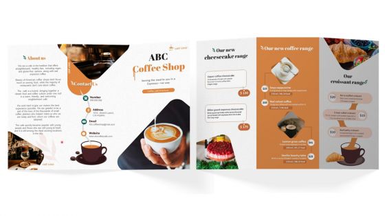
Advertise your cafeteria or coffee chain by using our outwardly engaging cafeteria or coffee chain catalogue design template. Use the cafeteria or coffee chain catalogue presentation to give a brief introduction about cafeterias along with their unique selling propositions, such as their new coffee range, cheesecake range, and croissant range, that enhance your experience of having coffee. You can use this PowerPoint catalogue to highlight menu specialties in the coffee and dining ranges. Use this professionally designed PPT booklet to showcase your cafes infrastructure and cutting-edge technology. Use this cafeteria brochure to highlight information about the cafe, how to contact it, and the key services it offers.
People who downloaded this PowerPoint presentation also viewed the following :
Coffee Cafe Brochure Trifold with all 1 slides:
Use our Coffee Cafe Brochure Trifold to effectively help you save your valuable time. They are readymade to fit into any presentation structure.
FAQs for Coffee
Ok so definitely get your menu with prices, hours, and contact stuff on there. Good coffee photos are like 80% of the battle honestly - make sure your signature drinks look amazing. Tell people your story or what makes you different, customer reviews help too. Oh and don't forget the boring but necessary stuff like WiFi password and parking info. Your outside panels need to pop with your logo and something catchy. I'd put your bestsellers front and center. Keep it clean but cozy looking. Actually fold a test version first to see how it flows!
Colors totally make or break your café brochure - they set the whole mood before people even step inside. Think warm browns and creams for that cozy neighborhood vibe, or go with sleek black and gold if you're aiming for premium artisanal. I swear, half the cafés I see pick colors that don't match their actual space at all. Like, if you've got that rustic farmhouse thing going, why would you use neon blue? Makes no sense. Stick to 2-3 colors tops and use them throughout everything for consistency.
So for trifold menus, put your best stuff right in that center panel - it's what people see when they flip it open. Your signature drinks, popular items, all that good stuff should go there with descriptions that actually sound appealing. Left and right panels are perfect for grouping things by category - espresso drinks, cold brew, pastries, whatever you've got. Oh and seriously, leave some breathing room between sections. Nobody wants to read a cluttered mess that looks like those old Yellow Pages ads. Keep your pricing lined up nice, throw in some coffee bean graphics or whatever fits your vibe. I'd sketch it out on paper first honestly - way easier than jumping straight into design software and getting frustrated.
Definitely scatter those testimonials around your trifold instead of dumping them all in one spot. Front panel needs a killer quote to grab attention. Then sprinkle shorter ones next to your menu items - way more effective than a boring testimonial wall. Use actual names and maybe what they ordered to make it real. "Sarah K. - best espresso I've had" hits different than some generic "amazing service!" nonsense. Photos with the quotes are awesome if you have them, but honestly even just text in quotes works. Oh, and keep them super specific - people trust "perfect foam art" over vague compliments any day.
Honestly, ditch the stock photos completely - they look so fake. Take pics of your actual coffee and food instead. Get some shots of your latte art, those flaky pastries up close, real customers hanging out. I'm totally obsessed with those overhead flat lay shots right now, they kill it on Instagram. Your baristas making drinks, the cozy reading corner, whatever makes your place special - that's what you want to show. Even your phone works fine as long as the lighting doesn't suck. Just make everything look tasty and real, you know?
Start with your visual identity - colors, fonts, and images that actually feel like your place. Cozy café? Go with warm earth tones and maybe some handwritten fonts. More modern minimalist? Clean lines work way better. Your writing style should match this vibe too. Are you the punny neighborhood spot or that fancy third-wave coffee place? Honestly, I'd check out brochures from cafés you love and notice how different they feel from each other. Skip the stock photos - use real shots of actual customers in your space. The brochure should basically give people a taste of what it's like to walk in.
Okay so typography is everything for your coffee shop trifold! I'd go with something handwritten-ish for headers - gives off those cozy vibes people love. Body text though? Keep it super clean and readable because nobody wants to squint at your menu prices lol. Mix up your font weights to create hierarchy. Bold works great for menu sections, regular for actual items, then maybe light for descriptions. Honestly, I spend way too much time obsessing over coffee shop fonts but it's worth it. Good typography should make people want that perfect latte before they even step inside, you know?
Bright colors and bold fonts are your best friends here - make those offers pop with vibrant boxes that contrast against everything else. Put them right on the front panel where people can't miss them. Honestly, nothing bugs me more than seeing "Save 20%" buried in tiny text somewhere! Be super specific too - "Buy 2 get 1 FREE" beats vague "amazing deals" every time. Throw in some urgency with expiration dates or "limited time" language. Oh, and consider adding a perforated coupon section they can tear off and actually bring back to your café.
Put your phone, address, hours, and website right on the back - that stuff's essential. Instagram icon is a must since coffee looks so good in photos. Don't bother with the full social handles if they're those weird long ones, just stick with icons. Hours need to be super clear because there's literally nothing worse than driving somewhere and finding it closed. Oh, and a QR code linking to your Google Maps or menu is pretty smart for people who are into that.
Definitely tell your café's origin story! Like how you found that perfect roast or decided to open up shop. Customer stories work great too - maybe that regular who discovered their new obsession, or something about your baristas' skills. Honestly, people love feeling connected to the place they're buying from. Don't just list menu items and prices on each panel. Instead, create this flow where customers feel like they're joining your coffee community, not just grabbing caffeine. Oh, and those little moments? They're gold - use them to make each section tell part of your bigger story.
Definitely go with at least 100gsm paper - trust me, anything lighter feels super cheap. Glossy or satin finish will make your coffee photos look amazing, plus the colors really pop. Matte's okay if you want that artsy feel, but honestly it doesn't handle dark images as well. Oh, and skip textured paper since it makes small text a pain to read. You could do spot UV on your logo if you want to get fancy without spending too much. Browns and creams can print weird sometimes, so maybe test a sample first?
Honestly, go heavy on photos - like 70% visuals, 30% text. Coffee's totally about how it looks and feels, so show off those latte art shots and cozy corner vibes. People flip through brochures fast anyway. Keep your text super scannable with bullet points for menu stuff and short descriptions. I'd probably skip the long paragraphs completely - nobody reads those. Each panel of your trifold can hit one main thing. Oh, and make your contact info really obvious! Start with your best photo on the front since that's what hooks people first.
Honestly, people won't grab brochures unless there's something in it for them. Throw in exclusive deals - maybe 20% off or a free pastry coupon you can't get anywhere else. I'd put them by the register where customers are just standing around anyway. The cover needs killer coffee photos and something like "Discover Our Secret Roasting Process" - you know, make it sound special. Your staff should definitely mention them at checkout too. "Hey, grab one of these for some sweet deals!" Train everyone to actually hand them out with purchases instead of just letting them sit there.
Dedicate a whole panel to "Seasonal Favorites" or whatever - creates that FOMO effect people love. Autumn leaves for pumpkin stuff, snowflakes for winter drinks, you get it. Seasonal items honestly sell themselves when they look good. QR codes are clutch here too since you won't need to reprint every time your menu changes. Just link to your current specials page. Don't forget your social handles so people can follow along with new drops. Oh and make everything visual - nobody reads walls of text anymore. Keep it timely, keep it eye-catching, give folks an easy way to stay updated.
Keep it simple - max 2-3 fonts and make your headers way bigger than body text. Don't crowd everything together, white space actually helps people read it better. I'd do intro on the first panel, menu stuff in the middle, then hours/contact on the last one. People unfold these things left to right anyway, so work with that flow. Bullet points are perfect for menu items and prices. Oh and definitely put your hours somewhere obvious - can't tell you how many places bury that info. Have someone else look at it before you print, they'll catch stuff you missed.
-
Making a presentation has never been this easy for me. Thank you SlideTeam for offering a splendid template library.
-
Easily Editable.