


Paleta de colores rojo y azul





Try Before you Buy Download Free Sample Product
 Impress Your
 Audience
 100%
100% Editable
 Save Hours
 of Time


Inyecta una gran dosis de alegría y diversión con nuestra Paleta de Colores Para Presentación Rojo y Azul. Crea una abundancia de buen humor.
People who downloaded this PowerPoint presentation also viewed the following :
Contenido de esta presentación de Powerpoint
Descripción:
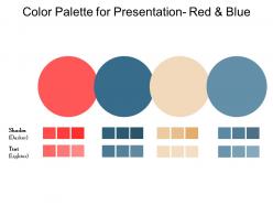
La imagen presenta una paleta de colores cuidadosamente seleccionada diseñada para crear presentaciones visualmente atractivas con un enfoque temático en tonos rojos y azules. En la parte superior de la imagen, hay un título que dice "Paleta de colores para presentación - Rojo y Azul", indicando claramente el propósito de la paleta, que es proporcionar colores recomendados para usar en el diseño de presentaciones. Debajo del título, se muestran tres círculos grandes, cada uno relleno con un color clave diferente: rojo, beige neutro y azul. Estos colores primarios se eligen por su impacto psicológico y compatibilidad visual, creando una paleta armoniosa y atractiva.
Debajo de los círculos, la paleta de colores se divide en dos secciones etiquetadas como "Sombras (más oscuras)" y "Tinte (más claras)". Cada sección incluye tres muestras de color más pequeñas. Tanto para el rojo como para el azul, algunas variaciones van desde tonos más oscuros hasta tintes más claros. Esta gama de sombras y tintes permite a los presentadores usar estos colores de manera efectiva para diferentes elementos en sus presentaciones, como fondos, texto y gráficos, asegurando una paleta de colores coherente y visualmente atractiva mientras se mantiene la legibilidad y el atractivo visual general.
Casos de uso:
Esta versátil paleta de colores puede encontrar aplicaciones en una amplia gama de industrias y para diversos propósitos, convirtiéndola en un recurso valioso para el diseño de presentaciones:
1. Diseño gráfico:
Uso: Creación de diseños de presentación visualmente atractivos.
Presentador: Diseñador gráfico o director de arte.
Audiencia: Clientes o equipo de diseño.
2. Marketing:
Uso: Desarrollo de materiales de presentación para campañas de marketing y propuestas.
Presentador: Estratega de marketing o representante de ventas.
Audiencia: Clientes potenciales o el equipo de marketing.
3. Capacitación corporativa:
Uso: Elaboración de materiales de capacitación efectivos y diapositivas.
Presentador: Capacitador corporativo o profesional de recursos humanos.
Audiencia: Empleados en capacitación.
4. Agencias de marca:
Uso: Diseño de presentaciones de marca que se alineen con los colores de la empresa.
Presentador: Estratega de marca o director creativo.
Audiencia: Clientes de marca o partes interesadas internas.
5. Instituciones educativas:
Uso: Preparación de presentaciones educativas para conferencias o seminarios.
Presentador: Educador o investigador académico.
Audiencia: Estudiantes o personal académico.
6. Organizadores de conferencias:
Uso: Elaboración de presentaciones principales para oradores en eventos.
Presentador: Planificador de eventos o coordinador de conferencias.
Audiencia: Asistentes a la conferencia.
7. Startups tecnológicas:
Uso: Presentación de productos o servicios innovadores a inversores o socios.
Presentador: Fundador de startup o gerente de producto.
Audiencia: Inversores, socios potenciales o miembros del equipo.
Paleta de colores rojo y azul
Agárralos firmemente con nuestra Paleta de Colores Para Presentación Rojo y Azul. Te permiten aprovechar esa gran oportunidad.
FAQs for Color palette for presentation
So there are three big things: contrast, harmony, and hierarchy. Your text needs enough contrast so people can actually read it - dark on light backgrounds is your friend here. For colors, stick with stuff that goes together like analogous colors or just different shades of the same color. Random colors everywhere? Yeah, that's gonna look like a mess. Use color to guide people's eyes to what matters most. Oh, and honestly don't go over 2-3 main colors or it gets chaotic. Also test your slides on whatever screen you're presenting on because colors can look totally different than your laptop.
Colors mess with people's heads in ways they don't even realize. Red and orange get your heart pumping - they scream urgency and energy. Blues and greens? Totally opposite vibe - calm, trustworthy, safe. Ever wonder why every luxury brand goes for black or deep purple? It's not an accident. People judge your stuff before they even read a word. I mean, imagine a hot pink bank logo - you'd run the other direction, right? My advice? Test different color combos with real people and see how they actually react, not just what looks good on your screen.
So first figure out who you're actually talking to - corporate suits or Gen Z on TikTok, you know? Finance companies always go with blues and greens because trust, while food brands love those warm reds that make you hungry (totally works on me btw). Don't forget colors mean completely different things in other countries. Check out what 3-4 competitors are doing first. The psychology stuff matters too since different colors make people feel different ways. Oh, and make sure it's accessible so everyone can see it! I'd definitely test a couple options with real people before you pick one.
Dude, colors can totally tank your presentation if you're not careful. In China, red's lucky, but here it screams danger. White? We think "pure and clean" while some Asian cultures associate it with death - awkward. Blue's usually your safest bet (honestly, half the Fortune 500 probably got that memo), though the exact shade still matters. Got a diverse audience? Do some quick research on who you're presenting to. Or just play it safe with neutral combos that won't offend anyone. Pro tip: if you're unsure, run your color choices by someone from that culture first. Way better than bombing because of a bad palette choice.
Honestly, stick to just 2-3 colors max or it'll look like a mess. Yellow text on white backgrounds? Nightmare fuel - nobody can read that stuff. Test your colors on different screens too since they can look totally different on various projectors (learned that the hard way once). Neon colors are super tempting but they're actually exhausting to look at during long presentations. Oh, and definitely run your palette through one of those contrast checkers online first. Trust me, your audience will thank you for not making them squint the whole time.
Pull 2-3 colors straight from your logo first—that's your base. Then use the 60-30-10 thing: main color gets 60% usage, secondary takes 30%, accent color for that last 10%. Honestly, don't skip the neutral grays because you'll be lost without them for text and backgrounds. Here's the annoying part though—test everything in print AND digital since colors can look totally different. Oh, and make a quick style guide with all the hex codes. Trust me, your team will thank you later when everyone's actually using the same blues instead of 47 random variations.
Adobe Color is solid for generating palettes from images. But honestly? Coolors.co is where it's at - super fast and totally free. I waste way too much time on there just clicking the spacebar to generate new combos lol. WebAIM has this contrast checker that's clutch for making sure your colors actually work for people with visual stuff. Canva's got one built in too if you're already there anyway. My move is usually Coolors first to mess around, then check contrast before I commit to anything. Works pretty well for presentations.
Honestly, stick to 3-5 colors tops. I learned this the hard way after making slides that looked like a kid's birthday party threw up everywhere lol. Pick one main color for your headers and important stuff first. Then grab a secondary color for everything else. You'll need neutrals too - black, white, gray for text and backgrounds. Sometimes I add a fourth color but only for highlights or when I really need something to pop. The trick is building everything around that first color you choose. Makes the whole thing look way more professional.
You definitely need good contrast or people won't be able to read your slides at all. Dark text on light backgrounds (or the opposite) works best. Anyone with vision issues or color blindness will struggle with poor contrast, but honestly even people with perfect eyesight end up squinting at terrible color combos. Aim for at least 4.5:1 contrast ratio for regular text, 3:1 for bigger text. Here's what I always do - step back from your screen or check the slides in a bright room. If you can't read them easily, nobody else will either.
Gradients are actually pretty cool for guiding where people look on your slides - like subtle background ones or little accent bits that pull the eye around. Stick with maybe 2-3 shades of your main colors so you're not overwhelming anyone. I always do lighter stuff for backgrounds, darker for text or important points. Rainbow gradients though? Hard pass - we've all suffered through those presentations lol. Coolors or Adobe Color will help you figure out good combinations. Oh, and start with just one gradient thing per slide. You can always add more later if it feels right.
So warm colors like reds and oranges? They basically scream "act now!" - super energizing but can stress people out. Blues and greens are the opposite, totally chill and trustworthy. I swear everyone just slaps blue on everything these days without thinking! But warm colors actually get better engagement and faster sales. Cool ones make people browse longer though, which isn't always bad. You should definitely test your current colors against warmer/cooler options. I did this last year and was shocked how different the results were. People's brains are weird with color.
So digital colors are way more vibrant because screens actually emit light, while print just absorbs it - makes everything look duller. CMYK can't even reproduce some RGB colors, which is honestly annoying but whatever. I always make separate color palettes for each format now. Test printing is clutch - learned that the hard way after wasting tons of paper on crappy prints. The color gamut thing is real too, so don't get attached to those super bright digital colors if you're planning to print later.
Honestly, high contrast is everything - people in the back row will thank you. Don't go crazy with colors though, like 3-5 max or it looks like a kindergarten art project. Oh, and definitely use colorblind-friendly palettes! There are tons of free tools for that. Red-green combos are the worst since that's super common colorblindness. Your brand colors matter too if it's an external presentation. Here's what I always do: convert everything to grayscale first. If it still makes sense without color, you're golden.
Bright colors against neutral backgrounds will make your important stuff jump out immediately. I learned this the hard way after making way too many designs that looked like rainbow explosions lol. Save your boldest colors for headings and buttons - people's eyes go straight to the most saturated things first. Here's what actually works: stick to 2-3 colors total, otherwise it gets messy fast. The 60-30-10 split is solid - mostly neutral tones, some secondary color, then just a tiny bit of your brightest shade for the really crucial bits. Quick test: squint at your design and see what pops first.
Everyone's going super minimal right now - like 2-3 colors max with tons of white space. Monochromatic schemes are huge (different shades of the same color). Dark mode is everywhere, which honestly makes sense because who wants to stare at blinding white slides all day? Navy-and-orange or green-and-cream combos never fail. High contrast is essential now for accessibility reasons. Those rainbow gradients from a few years back? Totally dead. Just pick one bold accent color and stick it with neutrals - works every time.
-
Appreciate the research and its presentable format.
-
Unique research projects to present in meeting.