


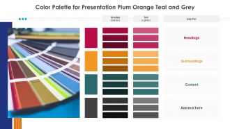
Color palette for presentation plum orange teal and grey


Try Before you Buy Download Free Sample Product
 Impress Your
 Audience
Editable
of Time


Heads begin to bob with our Color Palette For Presentation Plum Orange Teal And Grey. They help in building consensus.
People who downloaded this PowerPoint presentation also viewed the following :
Color palette for presentation plum orange teal and grey with all 2 slides:
Our Color Palette For Presentation Plum Orange Teal And Grey can change the game. They will put you on the path to fame.
FAQs for Color palette for presentation plum orange
Colors actually mess with people's heads in good ways. Red gets people hyped and creates urgency. Blue makes everyone chill and trust you more. Green feels balanced and natural, orange brings the energy. Yellow's tricky though - it grabs attention but holy crap it'll hurt people's eyes if you go overboard. Navy and darker shades scream "professional," while lighter colors make you seem way more approachable. Honestly, just pick 2-3 colors that match the vibe you're going for. Your audience will feel it without even realizing why.
Honestly, contrast is such a game-changer for readability. Dark text on light backgrounds (or the other way around) stops people from squinting at your slides. I swear, nothing bugs me more than when someone uses light gray text on white - like why make everyone's life harder? You want enough difference between your text and background colors so eyes don't have to work overtime. Here's what I do: squint at your slide from across the room. Can you still read it? Then you're golden. Trust me, your audience will thank you later.
Honestly, monochromatic is so much easier than trying to match different colors! Start with your base color, then just make lighter versions by adding white and darker ones with black. Throw in some muted tones by mixing gray too. You'll want like 5-7 variations minimum - gives you way more flexibility. Just make sure there's enough contrast between your lightest and darkest so people can actually read your text. Oh, and definitely test everything together first! I always screenshot mine and walk away for a bit. You'd be surprised how different it looks when you come back.
Okay so you know how blue and orange just *pop* together? That's complementary colors doing their thing. Basically you're using opposites on the color wheel - blue/orange, red/green, whatever. The contrast literally makes people look longer because there's this natural tension that grabs attention. Pick one color to dominate your design, then use its opposite as an accent for buttons or stuff you want noticed. It's kinda wild how something so simple works, but people actually engage more when you do this. Their eyes just stick around longer. Don't go crazy with it though - less is more here.
Honestly, color theory just helps you pick colors that don't make people want to look away. You want harmony - think complementary colors or ones next to each other on the color wheel. I made the mistake once of putting bright orange text on red (what was I thinking??) and learned real quick what NOT to do. Warm colors get people excited, cool ones are more chill. Also super important for accessibility - you need good contrast so everyone can actually read your stuff. Grab a color wheel tool online and stick to 2-3 colors max. Trust me on this one.
Adobe Color is honestly your best friend here - pulls colors from images and creates matching palettes automatically. Coolors.io is addictive too, just hit spacebar until something looks right (fair warning: you'll lose track of time). The 60-30-10 rule works pretty well: main color covers 60% of your slides, secondary takes 30%, accent gets the last 10%. Canva throws in some decent suggestions if you're already using it. Just pick one tool, generate a few options, then actually test them on real slides before committing.
Oh man, colors are tricky with international audiences! Red screams danger here but it's lucky in China. White = purity to us, mourning in parts of Asia (awkward story there lol). Green can mean "newbie" in the US but growth elsewhere. Honestly, I always just play it safe with blues and grays when I'm presenting to mixed crowds - way less stressful. You should definitely look up your audience's background first though. Even simple color choices can totally throw people off if you're not careful.
Ugh, the worst thing you can do is go crazy with colors - like seriously, 3-4 max or it looks like a kid's birthday party exploded. Yellow text on white? Your audience will hate you. Also skip red/green combos since colorblind people can't tell them apart (learned that one the hard way). Neon colors are just cruel unless you want everyone walking out with migraines. Here's what I do - convert everything to grayscale first to check if it's still readable. Sounds nerdy but it actually works!
Don't just rely on color alone – throw in patterns, textures, or labels too. High contrast between text and background is huge. I swear by tools like Stark or WebAIM's contrast checker for testing this stuff. Red-green combos are the worst since that's super common colorblindness. Honestly, those free browser extensions that simulate colorblindness are game-changers – you can see exactly how your design looks to different users before you're stuck with it. Test early, saves headaches later.
Honestly, you can't go wrong with navy blue - it just looks professional without trying too hard. Deep greens are solid too, they give off that stable, growth-minded vibe. Gray's perfect for filling in the gaps without being boring. Stay away from bright reds or orange though, way too aggressive for business stuff. I mean, unless you're pitching energy drinks or something lol. You can throw in tiny hints of warmer colors if you want, but keep most of it cool and understated. Navy + light gray + maybe some subtle teal? That's my usual go-to combo.
Just pick colors that already exist in your palette and blend between those. Like if you've got a blue and purple in your scheme, gradient between those instead of random colors. Honestly, I see so many designs where the gradient is completely unrelated to everything else and it looks amateur. Short gradients work great for buttons. Backgrounds too. The key is making sure each color in the gradient lives somewhere else in your design - that way it all feels connected instead of like you just slapped a rainbow on there.
Dude, you've gotta use your brand colors in presentations! Makes everything look way more professional and put-together. People start connecting those colors with your company without even realizing it. Trust me on this one - it's such an easy win. The trick is saving your hex codes as a default PowerPoint theme so you're not scrolling through a million blues trying to find "the one." Takes like 5 minutes to set up but saves you tons of time later. Also shows you actually care about the details, which honestly goes further than you'd think with clients and bosses.
Okay so basically - high contrast is your friend. Dark text on light backgrounds makes stuff 40% easier to read, which is huge. I made this awful presentation once with yellow text on white (what was I thinking lol). Your brain wastes energy trying to decode hard-to-read colors instead of actually remembering the info. Orange and red get people engaged, blues and greens help them focus better. Honestly, just stick to 2-3 colors max and test it on your phone first. Oh, and complementary colors won't make people's eyes hurt.
So the big thing right now is these really muted, classy color combos - like sage green with terracotta, or dusty blue and coral. Monochromatic looks are everywhere too. Different shades of the same color just make everything look so put-together. Oh, and dark mode presentations are killing it with tech crowds (obviously lol). Honestly, I'd stick to 2-3 colors tops for your whole deck. Any more than that and it starts looking messy. Trust me on this one - simple beats busy every time.
So keep your main brand colors but just switch up which ones you emphasize in different sections. Like if you've got blue and gray, go heavier on blue for data stuff and maybe throw in some orange for calls-to-action. It's kinda like changing the lighting in a room - same vibe, different energy. You can also mess with saturation levels. Muted tones work great for background stuff, then crank up the vibrancy where you want people to look. I'd honestly create like 2-3 mini color combos from your main palette before diving in. Just don't go too crazy or it'll look all over the place.
-
Really like the color and design of the presentation.
-
Good research work and creative work done on every template.