


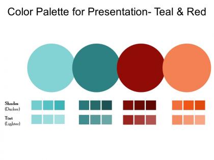
Paleta de colores teal y rojo




Try Before you Buy Download Free Sample Product
 Impress Your
 Audience
 100%
100% Editable
 Save Hours
 of Time


Evoluciona globalmente con nuestra Paleta de Colores Para Presentación Azul Verdoso y Rojo. Son aceptados en todo el mundo.
People who downloaded this PowerPoint presentation also viewed the following :
Paleta de colores para la presentación: azul verdoso y rojo.
Nuestra paleta de colores para la presentación. El cambio de miradas desaprobatorias al teal y rojo será la forma en que avancen.
FAQs for Color palette for presentation
Honestly, teal and red work so well together! Red grabs attention and gets people pumped up, while teal keeps things chill and trustworthy. Your audience won't feel overwhelmed but they'll stay engaged - which is kinda the sweet spot you want. The contrast really pops without being harsh on the eyes (I've sat through way too many presentations with terrible color choices lol). It's perfect when you need to look professional but still approachable. Just use red for your key points and let teal handle the main content areas.
Honestly, teal and red is such a smart choice. Those colors are complementary, so they create this really nice visual tension that just grabs people's attention. What I love about it is you get sophistication but also energy - like your brand feels trustworthy AND exciting at the same time. Way better than that tired blue-orange thing every startup does these days. Teal gives off innovation vibes while red brings the urgency and passion. Just make sure one's your main color and use the other sparingly as an accent, otherwise it'll look like a Christmas decoration gone wrong. Definitely test it everywhere first though.
Oh nice combo! Teal and red are solid for tech stuff - I've noticed SaaS dashboards look super clean with those colors. Medical apps too since teal feels trustworthy and red grabs attention when needed. Also works great for anything water-related or sports content. The contrast pops without being annoying like some color pairs that just assault your eyeballs, you know? One thing though - stick with deeper teals and warmer reds. The bright versions can look kinda cheap honestly. Sports teams use this combo a lot for a reason!
Teal and red is amazing for high-contrast stuff - holiday campaigns, vintage vibes, anything targeting creatives. Since they're complementary, they naturally grab attention. Perfect for CTAs or event posters where you need things to pop. I've actually seen it work really well in restaurant branding, which surprised me at first. Watch your saturation though. Both colors at full intensity? Overwhelming as hell. Use one as your main color and the other as accent - that's where the magic happens. Great combo when done right.
Honestly, teal and red can look amazing together if you don't go overboard with the red. Make teal your main color - like 60% of your design - since it's way more calming. Then use neutrals for about 30% and save red for just 10% as your accent. Red should only hit the really important stuff - key data points, buttons you want people to click, that kind of thing. Oh and try softer reds like burgundy or coral instead of that bright fire-truck red. Red text on a light teal background actually works pretty well for contrast without being too intense.
Oh god, don't use them both at full brightness - your eyes will literally burn. I made this mistake on a client project and it was brutal. Pick one as your main color and use the other sparingly as an accent. The 50/50 split thing never works because they're opposite on the color wheel and just fight each other. Throw in some neutrals too - white, cream, maybe gray - so there's somewhere for your eyes to actually rest. And definitely test it on different screens first because colors can look totally different depending on the display.
Okay so teal and red are literally magic together - they're opposites on the color wheel so your brain can't help but notice them. Like, think about movie posters or stop signs. I've watched clients get 30-40% better engagement just by ditching boring color combos for this one. The trick is picking a main color and using the other for accents. Red buttons on teal backgrounds work great. Or flip it around. Honestly, the visual tension is so strong people can't scroll past without looking. It's kinda crazy how well it works.
Medical companies are obsessed with this combo - teal feels super trustworthy and calming, while red brings that urgent "we save lives" vibe. Tech startups and fitness brands nail it too. Gaming companies jump on it because honestly? It just looks sick on screens. Nonprofits doing health or crisis work use it a ton. The whole thing works because of the contrast - it's dynamic without being chaotic. Just don't go too harsh with your specific shades or it'll look jarring instead of professional. Actually, I've seen some brands totally mess this up by picking the wrong teal.
Yeah totally! Teal and red work great for both. Just tweak your shades depending on where you're using them. Screens love bright, saturated colors so go bolder for digital stuff. Print's more annoying though - tone it down a bit or you'll get that classic "why does this look so different printed?" moment. Honestly, I always make two separate color palettes now, one for each format. Test in CMYK and RGB early on too. Way easier than panicking when your boss suddenly needs it printed for a meeting you didn't know about.
Adobe Color is honestly amazing for this - just plug in your teal and red and it'll spit out perfect variations. Coolors.co works great too, you can lock those two colors and generate palettes around them. Figma has some decent color plugins but I always circle back to Adobe Color anyway, it's just easier to use. The tricky part is getting the saturation right so they don't clash. Oh and definitely test your palette on a few mockups first - colors look way different in context than they do on their own. Export from Adobe Color and you're good to go.
Ok so this totally depends on where your audience is! Western markets usually dig the teal/red combo - very tech startup vibes. But red means something completely different in East Asia (luck, prosperity, the whole deal) and teal doesn't hit the same premium notes there. Middle Eastern cultures have their own traditional associations too. Geography literally changes everything with color psychology - it's crazy how much location matters! My advice? Do some quick research on your specific market first, especially if this is for branding. Don't want any awkward cultural misses, you know?
Go with dark teal or deep red for text - way more readable than light colors. Charts look best when you pick one as your main color and use the other just for highlights. Don't let them compete too much or it gets messy. I'd keep images pretty neutral, maybe black and white? They won't fight with your colors that way. Throw in some soft gray or cream if you need to break things up. Honestly, the whole thing works better when one color dominates and you're strategic about the other. Just mock up a slide or two first - you'll know pretty quickly if it's working.
Oh gradients will totally save you here! They smooth out that harsh teal-red clash so it doesn't scream "Christmas wrapping paper." I'd start with a diagonal or radial gradient - way more modern looking. Patterns work great too. Stripes or geometric shapes help spread both colors around instead of having them fight each other. Honestly, I went through this same thing with a poster design last month and a simple gradient made all the difference. Even dots can work if you're feeling bold. The key is avoiding that jarring contrast that makes your eyes hurt.
Stick with clean fonts like Montserrat or Open Sans - your teal and red combo is already bold enough without competing typography. I've definitely seen designs where people went crazy with fancy fonts and it just looked messy. Maybe try Playfair Display for headers if you want some flair, but keep body text simple. One font family with different weights usually works better than mixing styles. Oh, and test how readable your text is on both colors before you commit. Nothing worse than beautiful colors you can't actually read on!
Oh man, teal and red can be tricky! I'd pick one as your main color and use the other sparingly - like teal backgrounds with just red accents. Definitely check your contrast though, especially for text readability. I made that mistake on a client project once and it was... not great lol. Try softer shades maybe? Deep teal with muted red works better than both at full intensity. Short version: test it on real people if you can, because your eyes might love it while everyone else squints.
-
Use of different colors is good. It's simple and attractive.
-
Enough space for editing and adding your own content.