

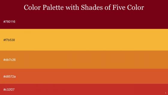
Color Palette With Five Shade Venetian Red Saffron Ochre Flame Pea Tall Poppy




Try Before you Buy Download Free Sample Product
 Impress Your
 Audience
 100%
100% Editable
 Save Hours
 of Time


Heres a visually-pleasing color palette with Five Color Shades With Hex Code 780116, f7b538, db7c26, d8572a, c32f27. These colors are intuitively picked to ignite the spark of brilliance in your designs and creativity.
People who downloaded this PowerPoint presentation also viewed the following :
Color Palette With Five Shade Venetian Red Saffron Ochre Flame Pea Tall Poppy with all 14 slides:
Use our Color Palette With Five Shade Venetian Red Saffron Ochre Flame Pea Tall Poppy to effectively help you save your valuable time. They are readymade to fit into any presentation structure.







FAQs for Color Palette With Five Shade Venetian Red Saffron Ochre Flame
Focus on contrast first - nobody wants to squint at yellow text on white backgrounds (been there, suffered through that). Stick with 3-4 colors tops. Analogous colors work great since they're neighbors on the color wheel and don't fight each other. Save complementary colors for when you really need something to pop. Test everything in your actual room lighting because conference room projectors are honestly terrible. Always keep a grayscale backup ready - you'll thank me later when the tech inevitably fails.
Oh, complementary colors are your best friend here! You know, the opposites on the color wheel - blue/orange, red/green, that stuff. Pick one as your main color for backgrounds and text. Then sprinkle its opposite color just on the important bits - buttons, key stats, whatever you want people to notice. Honestly, this trick works way better than I expected when I first tried it. Don't plaster complementary colors everywhere though or you'll give everyone a headache. Pro tip: try a muted shade of one with a bright version of its complement. Way classier but still grabs attention.
Oh man, color psychology is everything! Your audience literally feels different based on what colors you pick. Red gets people hyped or creates urgency. Blue makes you seem trustworthy - that's why every bank uses it. Green feels calming or suggests growth. Darker shades come across more professional, but bright colors energize people (just don't go crazy with them). I once made slides with this awful neon yellow background... never again lol. Match your colors to what you're trying to achieve. Financial stuff? Go blue for credibility. Creative pitch? Warmer tones get people excited.
Colors totally mess with people's heads during presentations. Reds and oranges pump up the energy, blues make everyone feel chill and trusting. I once used bright yellow text - what a train wreck that was! For finance stuff, you can't go wrong with blues and grays. Creative pitch? Go wild with bolder choices. Dark colors look fancy but don't overdo it or your slides feel like a funeral. Oh, and make sure there's actual contrast so people aren't squinting. Match your vibe to the room basically.
Okay so first figure out what your brand actually *is* - corporate and trustworthy? Go with blues. Bold and energetic? Reds work great. Natural vibes call for greens, you know? Don't just pick colors you personally like (biggest mistake people make). Your audience matters too since different cultures see colors differently. Pick one main color that screams "this is us," then add 2-3 supporting ones. Oh and test everything - website, packaging, all of it. Make sure your contrast meets accessibility standards or you'll hate yourself later when you have to redo everything.
Keep gradients subtle - max 2-3 colors from the same family or analogous ones on the color wheel. Don't go overboard or you'll end up with that cringey early 2000s PowerPoint look (we've all been there). Use them for backgrounds, buttons, or dividers - NOT on your main text where people actually need to read stuff. The whole point is making things look polished without hurting readability. Oh, and definitely test it on the actual screen you'll be presenting on beforehand. Trust me on that one.
Honestly, Coolors.io is amazing - just hit spacebar and it keeps spitting out new combos until you find one that doesn't suck. Adobe Color's solid too, especially if you upload your logo and let it pull colors automatically. Canva has one built in that's pretty decent. Oh, and Colormind is specifically made for screens so the colors actually look good in presentations (learned that the hard way). I'd start with whatever brand colors you already have, then use these to find stuff that goes with them. Coolors is probably the easiest to mess around with though.
Ugh yeah, color meanings are wild across cultures. In China red = good luck, but here it screams danger. White's pure to us but means death in parts of Asia. I bombed a green campaign once in the Middle East - turns out it has major religious ties there, whoops. Blue's usually your safest bet though it still varies. Honestly? Just test stuff locally before you launch. Even quick focus groups beat assuming what works. Don't be like me learning this lesson the expensive way lol.
Oh dude, monochromatic is honestly the way to go! You just pick one color and use different shades of it - way harder to screw up than trying to match random colors. Everything automatically looks put together and professional. Your audience won't get distracted by weird color combos either. Just make sure you vary the tones enough so people can actually read your text (learned that one the hard way lol). Pick your brand color or whatever fits your topic and go lighter/darker with it. Super clean look with basically zero effort.
So for contrast, shoot for 4.5:1 with normal text and 3:1 for large stuff. Don't just use color to show meaning though - crazy fact but like 8% of guys can't see certain colors properly! I always run my palettes through WebAIM's contrast checker or Color Oracle first. Those tools show you what your site looks like with different vision issues. Your colors need to work on phones, laptops, bright offices, whatever. Build around solid contrast pairs first, then layer in your fun accent colors. Trust me, it's way easier than trying to fix accessibility later.
Pick 3-5 colors max and actually stick to them - I know it sounds boring but trust me on this. Use your presentation software's theme colors thing to lock them in so you don't accidentally grab weird shades later. Learned that lesson the hard way with like 8 different blues in one deck, looked terrible. Save the hex codes somewhere too if you're jumping between programs. Honestly the hardest part is not adding "just one more" color when you see something pretty. Stay strong and only use what's in your palette!
Okay so here's what works for me - start with boring colors (grays, whites, beiges) for like 70% of everything. Those are your safe zones. Then pick maybe 1 or 2 bold colors tops and use them sparingly - just for the stuff you really want people to notice. Headers, key numbers, that kind of thing. More than 2 gets messy fast, trust me. There's this 60-30-10 thing that's actually pretty solid: 60% neutral background, 30% secondary neutral, 10% your pop color. Honestly the neutral stuff makes your bold colors look way more dramatic. Test a couple slides first though - sometimes what looks good in theory feels weird in practice.
First thing - don't toss your whole palette yet. You might be surprised how many colors actually work with the new theme. Check if they match the vibe you're going for. Honestly, the hardest part is making sure existing users don't get whiplash from a jarring change. Accessibility stuff matters too, especially contrast ratios for text. Before you commit to anything, test your main UI elements with the new colors. Oh, and definitely do a side-by-side comparison of old vs new - it'll save you from some pretty obvious mistakes you might miss otherwise.
Honestly, high contrast is your best friend here - dark text on light backgrounds or flip it around. Put your most important stuff with the strongest contrast, then tone it down for secondary details. I made this mistake once where I used light gray text and literally nobody could read my slides, so embarrassing. Don't put similar colors next to each other either. Red and green are especially bad since some people can't tell them apart. Pick one accent color for your main points, keep everything else neutral. Oh and definitely test your slides on different screens first!
Ugh, the worst thing you can do is go crazy with colors - seriously, stick to 3-4 max. I've seen so many presentations where you literally can't read the text because there's zero contrast. Super annoying. Don't use red and green together either since colorblind people can't tell them apart. And neon colors? Hard pass unless you hate your audience lol. Your slides need to work whether the room's bright or dark - you never know what kind of sketchy projector you'll get stuck with. Test everything on different screens first and maybe prep some high-contrast backup slides just in case.
-
Amazing variety of PowerPoint slides. Really helpful in designing professional presentations.
-
I can say with full confidence that all your business, academic, or professional work requirements will be sufficed with SlideTeam. Their gallery is as rich as 2Million+!!