

Color Palette With Five Shade Froly Mauvelous Rose Bud Apricot Peach Frangipani




Try Before you Buy Download Free Sample Product
 Impress Your
 Audience
 100%
100% Editable
 Save Hours
 of Time


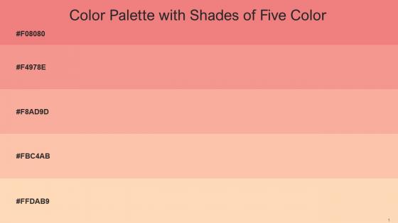
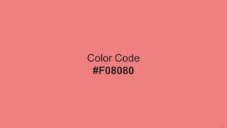
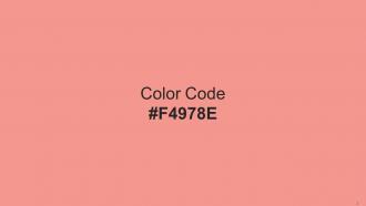
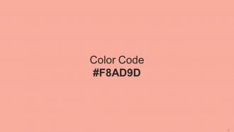
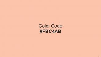
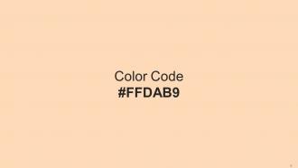
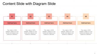
Heres a visually-pleasing color palette with Five Color Shades With Hex Code f08080, f4978e, f8ad9d, fbc4ab, ffdab9. These colors are intuitively picked to ignite the spark of brilliance in your designs and creativity.
People who downloaded this PowerPoint presentation also viewed the following :
Color Palette With Five Shade Froly Mauvelous Rose Bud Apricot Peach Frangipani with all 17 slides:
Use our Color Palette With Five Shade Froly Mauvelous Rose Bud Apricot Peach Frangipani to effectively help you save your valuable time. They are readymade to fit into any presentation structure.









FAQs for Color Palette With Five Shade Froly Mauvelous Rose Bud
Colors in presentations significantly influence audience emotions and behavior, with red conveying urgency and passion, blue building trust and professionalism, green suggesting growth and stability, and yellow enhancing creativity and energy. These psychological associations enable presenters to strategically guide audience responses, enhance message retention, and create more engaging experiences, with many organizations finding that thoughtful color choices ultimately deliver stronger audience connection and improved communication outcomes.
A cohesive color palette enhances audience engagement by creating visual consistency, improving brand recognition, and establishing emotional connections that guide viewer attention effectively. Through strategic color coordination, presentations deliver clearer messaging, reduced cognitive load, and stronger professional credibility, with many organizations finding that consistent palettes increase audience retention and comprehension significantly.
Best practices for selecting a business presentation color palette include ensuring brand consistency, maintaining high contrast for readability, limiting colors to 3-5 maximum, considering audience demographics, and testing across different devices. These approaches enhance visual hierarchy, support message clarity, and create professional credibility, with many organizations finding that strategic color choices significantly improve audience engagement and information retention.
Contrasting colors can effectively highlight key points by using high-contrast combinations like dark text on light backgrounds, strategic accent colors for critical data, and complementary color schemes that guide audience attention. Through techniques like color-coding different sections, emphasizing call-to-action elements, and creating visual hierarchies, presenters streamline information processing while enhancing audience engagement and message retention.
Cultural associations with colors significantly impact international presentations through varied meanings, emotional responses, religious significance, and business perceptions across different regions. These cultural nuances influence audience engagement, message interpretation, and overall presentation effectiveness, with many global organizations finding that culturally-aware color choices enhance cross-cultural communication, build stronger audience connections, and ultimately deliver more successful international business outcomes.
Choosing a brand-aligned color palette involves analyzing your brand values, target audience demographics, industry conventions, and desired emotional responses. Start by identifying 2-3 primary colors that reflect your brand personality, then select complementary secondary colors, ensuring accessibility compliance and versatility across digital and print applications, ultimately creating consistent visual recognition that enhances customer trust and competitive differentiation.
**INPUT**: What tools or software can assist in creating a professional color palette? **OUTPUT**: Professional color palette tools include Adobe Color, Coolors, Canva Color Palette Generator, Paletton, and ColorHunt, which streamline design workflows through intuitive interfaces and collaboration features. These platforms enhance brand consistency by enabling teams to extract colors from images, generate harmonious schemes, and export palettes across multiple formats, ultimately delivering cohesive visual identities and improved design efficiency.
Color accessibility considerations significantly affect palette selection by requiring sufficient contrast ratios, avoiding color-only information conveyance, and ensuring visibility for colorblind audiences through strategic hue combinations. These accessibility standards enhance presentation effectiveness by improving readability for all viewers, expanding audience reach, and demonstrating professional inclusivity, with many organizations finding that accessible palettes ultimately deliver clearer communication and broader engagement.
Common mistakes include using too many colors, selecting low-contrast combinations that reduce readability, ignoring brand guidelines, choosing colors that clash with content themes, and failing to consider accessibility needs. These missteps often result in distracting presentations that undermine message clarity, with many organizations finding that strategic color limitation and consistent brand alignment significantly enhance audience engagement and professional credibility.
A minimalist color palette enhances information clarity by reducing visual distractions, creating stronger focal points, and establishing clear hierarchical relationships between data elements. This approach streamlines comprehension in corporate dashboards, financial reports, and medical presentations, with many organizations finding that strategic color restraint ultimately delivers faster decision-making and improved audience retention across complex datasets.
Trending presentation color palettes in 2023 include earthy terracotta and sage combinations, bold navy and coral pairings, minimalist monochromatic schemes, vibrant jewel tones, and sophisticated dusty pastels. These palettes enhance audience engagement by creating visual harmony, improving readability, and establishing professional credibility, with many organizations finding that strategic color choices significantly boost presentation impact and brand consistency.
Color palette significantly influences text readability through contrast ratios, background-foreground relationships, and accessibility considerations for diverse audiences. Strategic color combinations enhance comprehension by reducing eye strain, improving focus, and ensuring legibility across different viewing conditions, with many presentation designers finding that high-contrast palettes deliver clearer communication and better audience engagement.
Successful presentations using innovative color palettes include Airbnb's "Belong Anywhere" campaign with warm coral and soft pinks, Spotify's annual data presentations featuring vibrant gradients, and Netflix's investor decks using bold reds with strategic accent colors. These approaches enhance brand storytelling, improve audience engagement, and create memorable visual experiences, with many organizations finding that distinctive color choices significantly strengthen message retention and presentation impact.
Gradients and textures enhance color palettes by adding visual depth, creating smooth transitions between hues, and establishing hierarchy through subtle variations. These design elements enable presenters to maintain color consistency while introducing sophisticated layering, with many corporate presentations finding that strategic gradient applications and textured backgrounds significantly improve audience engagement and information retention, ultimately delivering more professional, memorable communication experiences.
Balance vibrant colors with neutrals by using the 60-30-10 rule, where neutrals dominate backgrounds and text areas, vibrant colors accent key elements, and a third color provides subtle contrast. Many successful corporate presentations leverage this approach by featuring neutral slides with strategic pops of brand colors for charts, callouts, and headers, ultimately delivering visual hierarchy while maintaining professional credibility and audience engagement.
-
It saves your time and decrease your efforts in half.
-
What a stunning collection of customizable templates! Really a time-saver..