Data Architecture Diagram Powerpoint Ppt Template Bundles

Rating:
80%
Data Architecture Diagram Powerpoint Ppt Template Bundles
Slide 1 of 17
Favourites Favourites

Try Before you Buy Download Free Sample Product

Audience Impress Your
Audience
Editable 100%
Editable
Time Save Hours
of Time
The Biggest Sale is ending soon in
0
0
:
0
0
:
0
0
Rating:
80%
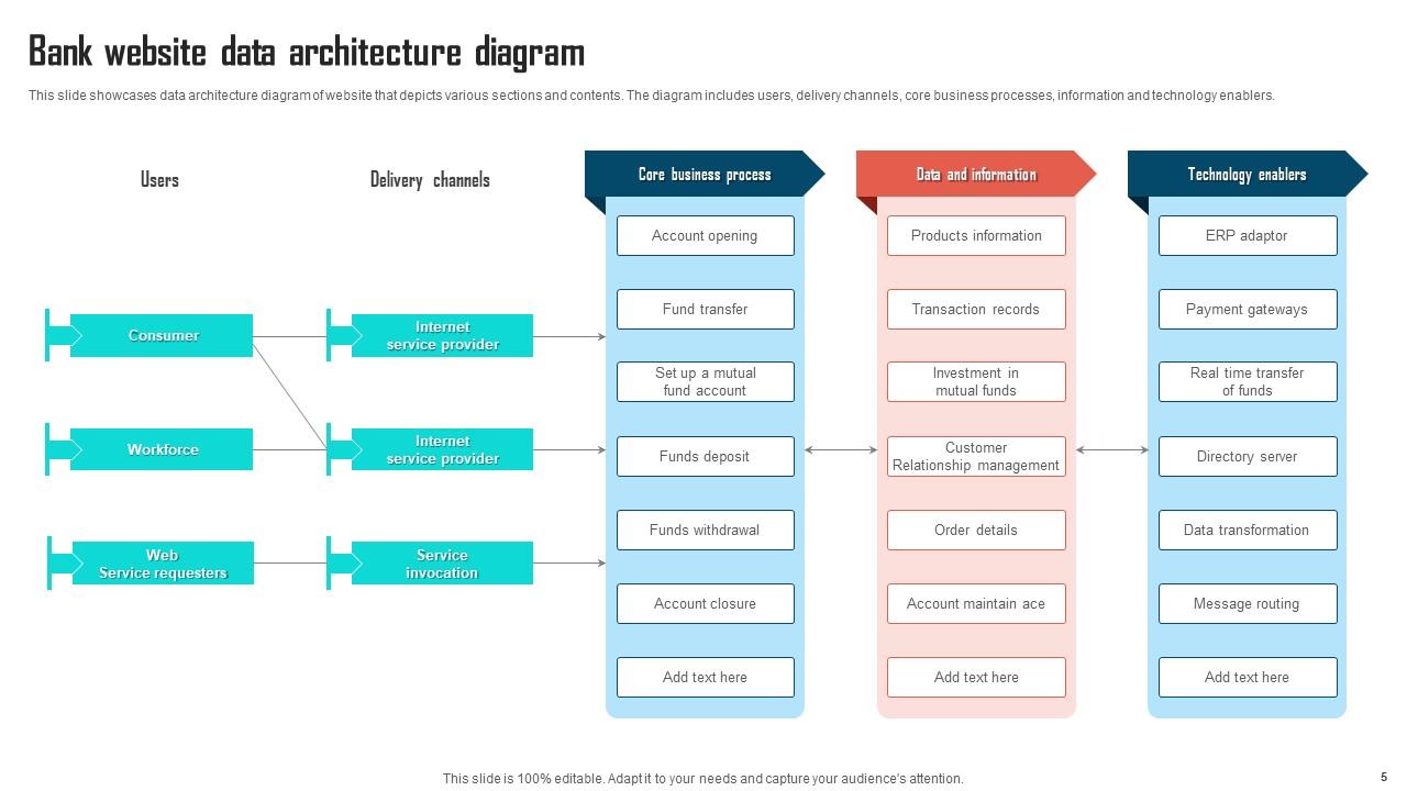
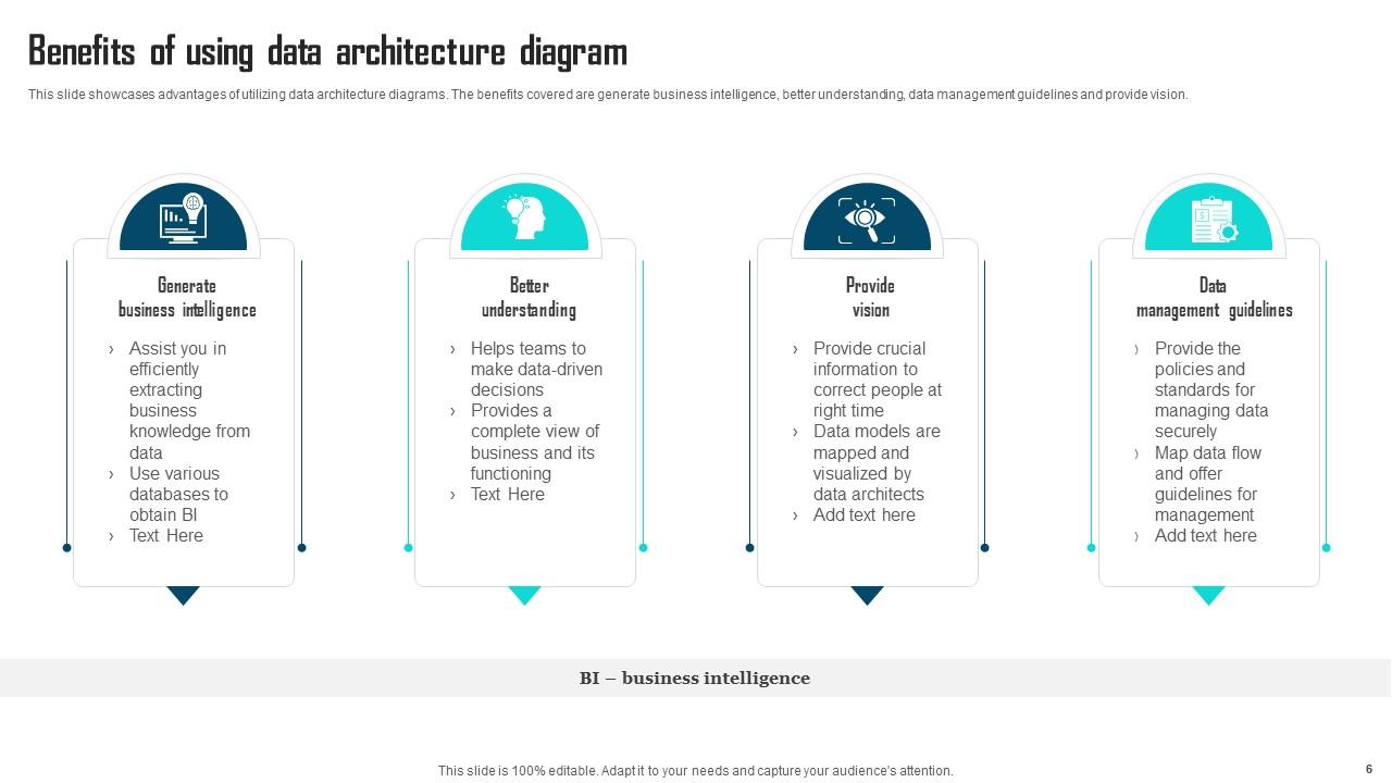
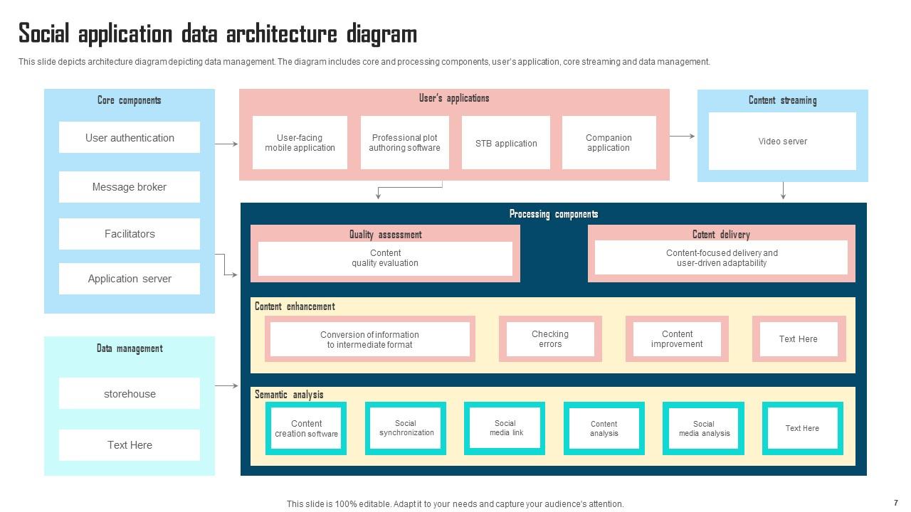
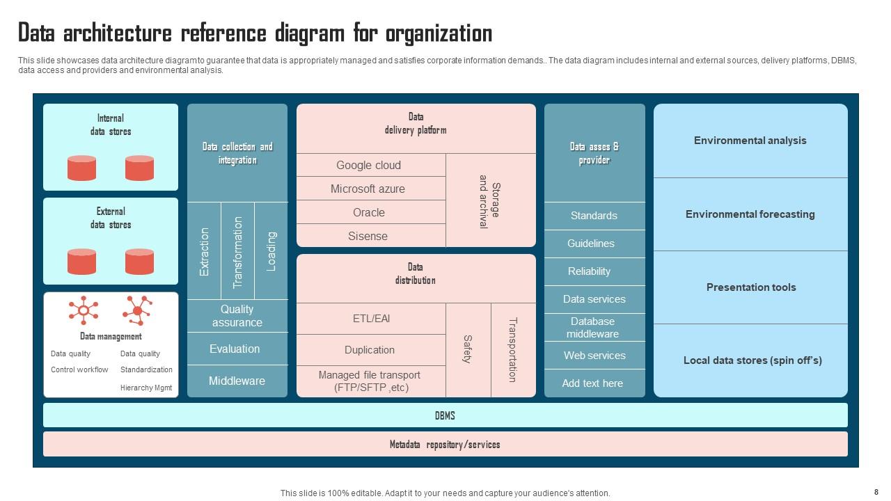
Introduce your topic and host expert discussion sessions with this Data Architecture Diagram Powerpoint Ppt Template Bundles. This template is designed using high-quality visuals, images, graphics, etc, that can be used to showcase your expertise. Different topics can be tackled using the twelve slides included in this template. You can present each topic on a different slide to help your audience interpret the information more effectively. Apart from this, this PPT slideshow is available in two screen sizes, standard and widescreen making its delivery more impactful. This will not only help in presenting a birds-eye view of the topic but also keep your audience engaged. Since this PPT slideshow utilizes well-researched content, it induces strategic thinking and helps you convey your message in the best possible manner. The biggest feature of this design is that it comes with a host of editable features like color, font, background, etc. So, grab it now to deliver a unique presentation every time.

FAQs for Data Architecture Diagram Powerpoint

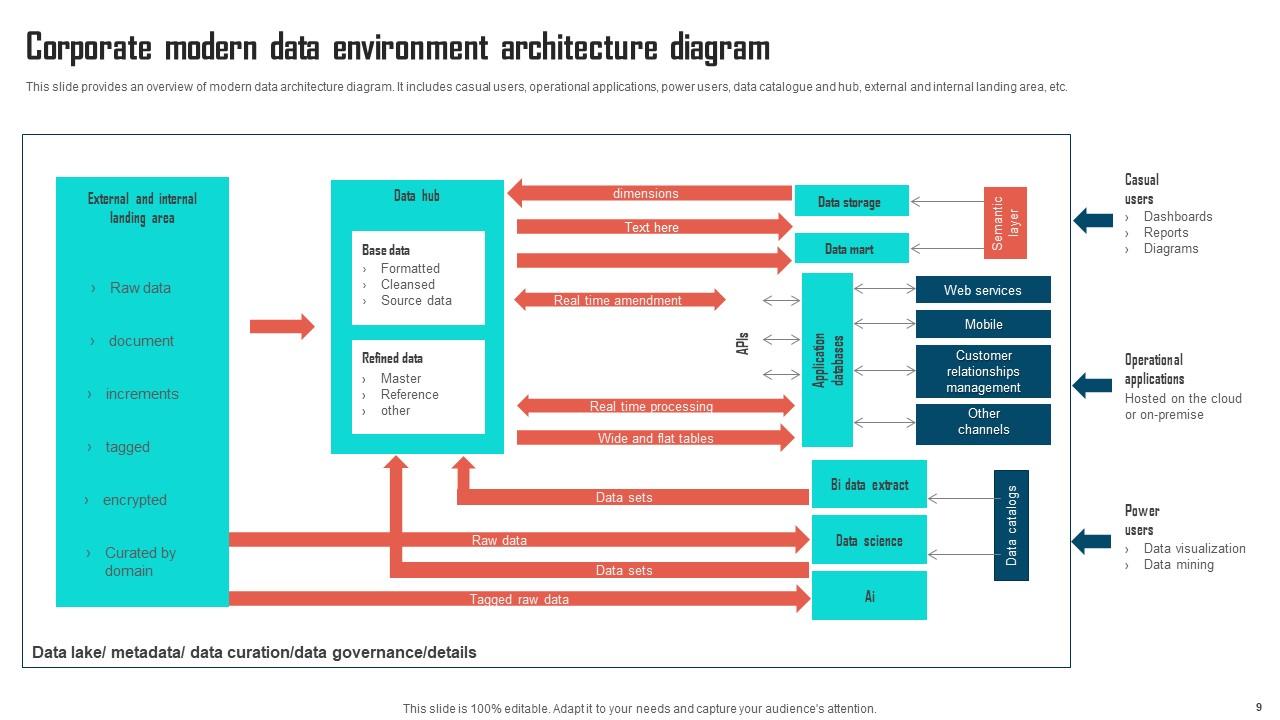
Start with mapping out where your data comes from - databases, APIs, files, whatever. Then show your storage stuff like data lakes and warehouses. Processing engines are next (ETL tools, streaming platforms). BI tools and apps go at the end for consumption. Honestly, those data flow arrows connecting everything? Way more crucial than people think. Security and governance components need to be in there too - access controls, data catalogs, all that. The whole point is showing how data actually moves through your system from start to finish. Oh, and definitely tackle your current setup first before getting fancy with future architecture.

So data architecture diagrams are all about tracking where your data lives and how it moves around - databases, data lakes, ETL stuff, you know the drill. Regular system diagrams show the bigger picture like apps and infrastructure, but they don't get into the nitty-gritty data details. Honestly, I find data diagrams way more helpful when you're trying to figure out why something broke or planning a migration. They answer "where's my data going" instead of "how do my apps talk to each other." My advice? Map out what you've got first, then follow where everything flows downstream. Makes the whole mess way clearer.

Okay so data models are like your blueprint - they show what your data actually looks like and how everything connects. You need that foundation before drawing your architecture diagram, otherwise you're just making random boxes and lines that don't really mean anything. The model maps out your entities, attributes, and relationships first. Then you can figure out what databases and data flows you actually need. I always start with the conceptual model because honestly, trying to do architecture without it is just asking for a mess later. Build everything else around that structure.

Think of it like having a shared map everyone can look at. Your CEO and database guy won't be talking past each other anymore - they're literally pointing at the same boxes and arrows. Way better than trying to explain messy data flows with just words (trust me on this one). Business people finally see how their requests translate into actual systems. Tech teams get why they're building what they're building. Honestly, it just becomes the go-to reference in every planning meeting. Oh, and keep that thing updated or it'll be useless in like two months.

Here's my take: Start with your main business processes, not whatever random database exists. Keep it high-level - cramming every single data source into one diagram just creates chaos. Use language your business people actually get, not tech speak. Make the data lineage super clear so anyone can follow where stuff comes from and where it ends up. Consistent colors and symbols matter more than you'd think. Honestly, I've seen too many beautiful diagrams that are completely useless because they tried to show everything at once. Focus on the key flows between your major systems and you'll be golden.

So the integration patterns you pick totally drive how your architecture diagram looks. Event-driven stuff? Your diagram's gonna be full of message queues and streams everywhere. API patterns mean you're highlighting all those service boundaries and REST endpoints. Batch processing will have you showing off data lakes and ETL pipelines. Honestly, I always figure out the integration approach first - makes the whole diagramming thing way less of a headache. The pattern basically becomes your roadmap for where everything goes. Just identify your main integration patterns first, then let those guide where you stick all the components. Way cleaner process that way.

Honestly, just go with Draw.io first since it's free and works great for data architecture stuff. Lucidchart is another good option - both have decent templates so you won't be starting from scratch. If you're already deep in Microsoft land, Visio does the job but feels kinda dated compared to those web tools. There's also fancy enterprise stuff like Erwin, though that's probably way more than you need unless you're building something massive. I'd mess around with Draw.io for now. You can always switch later if you need better team collaboration features or whatever.

So data architecture diagrams are honestly a lifesaver for compliance stuff. They show exactly where your sensitive data sits, how it moves around, and who's got access to what. Perfect for proving you're following GDPR, HIPAA, whatever regulations you're dealing with. Stakeholders love them because they can actually see what's happening instead of sifting through endless policy documents (seriously, who reads those?). Just make sure you keep them updated - maybe quarterly? And definitely include data classifications and access controls, or auditors will have a field day. Way better than trying to explain everything verbally.

Honestly, data volume and processing speed should be your top priorities here. Your current setup will probably buckle under 10x growth - I've seen it happen way too often. Storage costs add up fast too. Think about how your team might expand and what compliance stuff you'll deal with as more sources get plugged in. Oh, and monitoring becomes a nightmare at scale if you don't plan for it. Here's what I'd do: figure out where things are already slow or breaking, then design around those weak spots. Leave room for the weird stuff you can't predict yet.

Honestly, cloud services flip the whole approach on its head. You're not mapping physical servers anymore - now you're showing services like managed databases, APIs, and data lakes instead. Way more modular. The tricky part is tracking how data flows between different cloud providers and figuring out your security zones. Oh, and compliance stuff gets messy fast if you're not careful. Start by separating which services actually process your data vs. just shuttle it around. Makes the whole diagram cleaner. Everything becomes way more scalable once you think in services rather than hardware.

Honestly, quarterly reviews work best for most teams. Hook your diagrams into CI/CD so they update automatically when systems change - not six months later when someone finally goes "oh crap, these are totally wrong." I've watched so many teams where diagrams turn into complete fiction lol. Stick them in version control, ideally the same repo as your infrastructure code. Don't leave updates to "whoever gets around to it" - assign actual owners. The whole point is making it feel automatic instead of another task everyone avoids.

Honestly, data architecture diagrams are lifesavers - they show you exactly how your data moves around and what connects to what. Super helpful when you're planning migrations or adding new tools because you can spot problems before they blow up. I learned this the hard way after a "simple" database change broke three different dashboards nobody knew existed. Short sentences work too. The visual makes it obvious where you've got redundant processes or weird dependencies. Just keep it updated (I know, I know, documentation is boring) and pull it out during planning meetings. You'll avoid those panic moments when someone realizes you forgot about some random integration.

Think of data lineage as your data's GPS history - tracks where it came from and where it's headed. When stuff breaks (and it will), you can trace backwards to find the culprit instead of playing detective across 20 different systems. Your architecture diagram becomes way more useful since you can follow those arrows and actually understand the flow. Compliance teams love this too because you can show auditors the exact path sensitive data takes. I'd start with your most critical flows first - don't try to map everything at once or you'll go crazy.

So for data flow diagrams, thick arrows for your main flows, thin ones for the smaller stuff. Think subway map vibes - you want the big lines super obvious. I always go left-to-right or top-to-bottom since that's how we naturally read anyway. Color-coding helps tons if you've got different data types or systems. Don't forget to actually label what's moving through each arrow (like "raw user data" or whatever). Honestly, the best test is just grabbing someone and walking them through it. If they look confused, you probably need to simplify things.

APIs are basically how all your systems talk to each other and actually share data. Super important for pulling from external sources, feeding your data warehouse, connecting analytics tools - you know, all that stuff. They're like bridges between everything in your architecture diagram. Most setups today are spread across different cloud services anyway, so you really need them. Honestly, I'd map out which APIs you'll need pretty early in the design process. Trust me on this one - teams will start bugging you later about how they're supposed to access the data, and you don't want to be scrambling to figure that out.

Ratings and Reviews

80% of 100
Review Form
Write a review
Most Relevant Reviews
  1. 80%

    by Brown Murphy

    SlideTeam is my one-stop solution for all the presentation needs. Their templates have beautiful designs that are worth every penny!
  2. 80%

    by Colby Coleman

    Out of the box and creative design.

2 Item(s)

per page: