


Data Analysis Process Powerpoint Ppt Template Bundles




Try Before you Buy Download Free Sample Product
 Impress Your
 Audience
 100%
100% Editable
 Save Hours
 of Time


Our Data Analysis Process Powerpoint Ppt Template Bundles are topically designed to provide an attractive backdrop to any subject. Use them to look like a presentation pro.
People who downloaded this PowerPoint presentation also viewed the following :
Data Analysis Process Powerpoint Ppt Template Bundles with all 17 slides:
Use our Data Analysis Process Powerpoint Ppt Template Bundles to effectively help you save your valuable time. They are readymade to fit into any presentation structure.

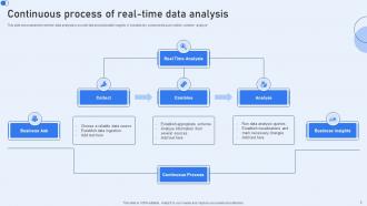
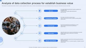
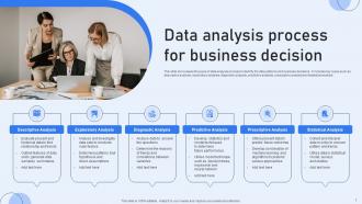
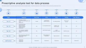






FAQs for Data Analysis Process Powerpoint
So you've got five main steps: collecting data, cleaning it, exploring patterns, doing your actual analysis, then reporting everything out. Fair warning - cleaning always takes forever, like way longer than you'd expect. Once that's done, you'll dig into the data to spot trends and weird outliers. Then comes the fun part where you actually run your statistical methods or whatever models you're using. Honestly, don't skip corners on the cleaning phase because messy data = messy results. Always double-check your findings before you present anything too.
First thing - figure out what questions you're actually trying to answer. That'll drive everything else. Then hunt for data sources that connect to your key metrics. I always make a quick spreadsheet rating potential sources on relevance, reliability, and cleanup effort (trust me, data's always messier than you think). Consider what's already sitting in your system versus what you'd need to buy or get access to. Honestly, internal stuff is usually your best starting point. Begin with your most solid, relevant sources. You can always branch out later once you've got those nailed down.
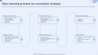
Okay so first things first - handle missing values, duplicates, and get your formats consistent. Missing data is tricky though, you gotta decide if you're filling gaps, interpolating, or just dropping rows based on what you're actually trying to analyze. Boxplots are clutch for spotting outliers. Also check your data types and watch for weird inconsistencies that don't make sense. Oh, and naming conventions matter more than you'd think. Honestly? Do a data profiling summary right at the start. Trust me, it's boring but you'll thank yourself later when you're not debugging random issues at 2am.
Honestly, just pick the chart that makes sense - bars for comparing stuff, lines for trends, scatter plots when you're looking at relationships. Don't overthink it! I always sketch mine out first because jumping straight into Excel usually ends badly. One insight per chart, seriously. Cram too much in and people's eyes glaze over. Colors should highlight what actually matters, not just look pretty. Label everything clearly too. The five-second rule is real - if someone can't get your main point that fast, you've lost them. Keep it simple and tell one clear story.
Think of statistical analysis as your data's lie detector - it separates real patterns from random junk. You'll use it to test theories and spot trends that actually matter. Honestly, without it you're just making educated guesses with prettier charts. Start simple with descriptive stats to get a feel for what you're working with. Then dive into inferential analysis to test your hunches and draw solid conclusions. It's the difference between having insights you can trust versus just... well, having numbers that look impressive but don't mean much.
First thing I do is figure out *why* the data's missing - random or systematic? That changes everything. Small amounts (under 5%) you can just drop those rows, no big deal. Larger gaps need imputation though - mean/median for numbers, mode for categories. KNN imputation works great for complex datasets but honestly it can be overkill sometimes. I always get nervous about deleting data because you might lose interesting patterns. Whatever you pick, just write it down somewhere so you don't forget what you did later!
Honestly, the worst mistake is diving into analysis before you've actually looked at your data - I learned that one the hard way. Don't cherry-pick results just because they match what you expected. Clean your data first or you'll get garbage results. Outliers aren't automatically bad either, figure out why they're there. Oh and correlation doesn't equal causation, obviously, but people mess that up constantly. Document everything as you go because you'll definitely forget your logic later when your boss asks questions.
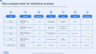
Honestly depends what you're working with. Excel's perfect for quick stuff - I probably use it more than I should admit. Python with pandas is clutch when things get messy or you need machine learning. R's the statistical powerhouse, plus their visualizations look incredible. Huge datasets? SQL's your friend, or Tableau if you want pretty dashboards. Here's the thing though - just stick with whatever your team already uses first. Don't go learning some fancy new tool if Excel handles your data fine. You can always upgrade later when projects actually demand it.
So for EDA, definitely start with your basic descriptive stats - mean, median, standard deviation, all that good stuff. Then get into visualizations because honestly that's where the magic happens. Histograms and box plots are clutch for distributions, scatter plots show relationships really well. I'm obsessed with correlation matrices lately - they make patterns so obvious. Oh and pair plots! Those are perfect when you've got multiple variables to compare. Always check for missing data and outliers too, they'll mess with your analysis if you're not careful. The key is starting simple then building up complexity as you go.
So basically, data analysis stops you from making decisions based on hunches. You'll actually see what's working instead of just hoping your strategy makes sense. Think of it as having superpowers for business problems - you can catch trends early, figure out which projects are worth your time, and avoid expensive screwups. The trick is knowing what questions to ask first (this part trips people up constantly). Also making sure you're tracking stuff that actually connects to your real goals, not just vanity metrics that look impressive but don't matter.
Privacy and consent should be your first priority - make sure you actually have permission for that data. Watch out for bias too because your analysis could screw over certain groups without you realizing it. I've seen people get so wrapped up in the cool technical parts that they totally forget real humans will be affected by this stuff. Your findings might get twisted or misused later, so think about that now. Oh, and don't just do one ethics check at the very end - build them in throughout the whole process. Trust me on this one.
Cross-check everything with multiple sources first - that's saved me countless times. Run your analysis different ways and get someone else to look at it too. Fresh eyes catch weird stuff you'll miss. Statistical tests are clutch here, especially confidence intervals when you're working with samples. God, the number of dumb mistakes I've found this way is embarrassing! Build this checking into your workflow from day one though, not after you're done. Document what you did so you can actually explain why you trust your results. Here's my test: can you defend it to that one colleague who questions everything?
Start with regular check-ins and shared docs - seriously makes such a difference. Get everyone using the same collaborative tools so you can actually see what's happening in real time. Define who's doing what upfront because otherwise people just end up duplicating work or worse, breaking each other's code. Set up templates for reports and do code reviews. Oh, and create space for people to ask questions without feeling dumb about it. The workflow stuff is honestly more important than the actual analysis sometimes. Just get alignment on tools first before anyone touches data.
So ML works great for finding patterns during your initial data dive, plus predictive stuff once you've got a handle on things. Also good for automating boring tasks like spotting outliers. But here's the thing - sometimes you don't need it at all. Like, a basic correlation might do the job just fine. Look for places where you're manually hunting for patterns or making predictions from old data. That's where ML shines. Oh, and definitely start small with one use case first. Get that workflow down, then branch out. Trust me on this one.
Pick metrics that connect to your actual business goals first - accuracy rates, performance scores, ROI when you're making decisions. But here's the thing, don't get stuck just measuring the technical stuff (I've totally done this before). Track if people are actually using your recommendations too. Are stakeholders happy? Did your insights change anything that matters? Short answer: balance the nerdy metrics with real impact. Oh and set these before you dive in, not after - saves you from chasing random numbers that don't mean much.
-
Stunning collection! With a wide variety of options available, I was able to find a perfect slide for my presentation. Thank you, SlideTeam!
-
Based on my personal experience, I would recommend other people to subscribe to SlideTeam. No one can be disappointed here!