

Election Campaign Brochure Bifold




Try Before you Buy Download Free Sample Product
 Impress Your
Audience
 100%
Editable
 Save Hours
of Time


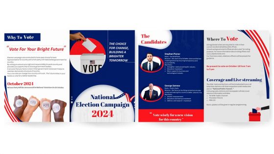
Election campaigning is a complex job. To build confidence and trust among voters use our professionally designed Election Campaign Bifold Brochure Template. Use this pamphlet presentation template to provide information about list of initiatives and changes politicians intend on bringing. With the assistance of the Election campaign brochure PowerPoint theme, you can talk about candidate profile, manifesto, mission and participating parties. Employ this professionally designed PPT brochure to represent important dates, importance and reasons to vote. Further, this brochure covers important details such as voting address, streaming channels, timings and date to aware voters.
People who downloaded this PowerPoint presentation also viewed the following :
Election Campaign Brochure Bifold with all 1 slides:
Use our Election Campaign Brochure Bifold to effectively help you save your valuable time. They are readymade to fit into any presentation structure.

FAQs for Election
Honestly, focus on three main things: a catchy headline people will remember, actual policy stuff voters care about, and visuals that don't suck. People scan these things in like 2 seconds, so make it easy to read. Don't forget the basics - contact info, when/where to vote, any decent endorsements you've got. Skip the political BS language that puts everyone to sleep. Here's the thing though - talk about what's in it for THEM, not just why your candidate is amazing. Oh, and definitely test it on some real people first before you blow money printing a thousand copies that nobody reads.
Honestly, good design makes a huge difference for campaign brochures. Bold headlines grab attention first. Then use consistent colors that match your brand - and leave plenty of white space so it doesn't look like a mess. People barely glance at these things, so photos and infographics work way better than paragraphs of text. One main message per panel works best. Oh, and definitely use contrasting colors for your contact info and key points - that stuff needs to pop. I learned this the hard way helping my cousin's city council run last year.
Oh man, color psychology is everything in political stuff! Blue's your safe bet - screams trustworthy and stable, which is why literally everyone uses it. Red gets people fired up and creates urgency. Green works if you're going for that growth/eco vibe. Stay away from orange though - comes across way too aggressive IMO. Yellow can look unstable depending on the shade (learned that one the hard way). And obviously don't touch whatever colors your opponent's using. Just pick whatever emotions you want people feeling when they see your candidate's name. It's wild how much this stuff matters before anyone even reads the actual content.
Honestly, just figure out what each group actually gives a damn about first. Seniors? Healthcare and social security all day. Young families are stressed about school funding and childcare costs - that stuff hits their wallet hard. Working people want jobs and better roads so they're not sitting in traffic forever. Don't flip your whole platform or anything. Just switch up which parts you emphasize and what examples you throw in there. Makes your existing message feel like it's actually about their life, not some generic politician speak. Oh, and definitely test this with focus groups before you blow money on printing. Trust me on that one.
Honestly, less is more with text - people are already buried in campaign stuff. Get specific about policies instead of saying generic things like "I'll fight for you." Make your contact info super obvious because voters are surprisingly forgetful about basic details. Proofread everything! Typos scream amateur hour and people definitely notice. Oh, and include voting info clearly. The biggest thing though? Tell people exactly what to do next - visit your site, vote on Tuesday, whatever. Don't assume they'll figure it out.
Dude, infographics are perfect for this stuff. Most people won't touch a policy paper with a ten-foot pole, but they'll totally look at charts and icons. Break down your budget numbers visually, use timelines for policy rollouts, show how different groups get affected. People absorb visual info crazy fast compared to text walls. One tip though – stick to one big point per graphic or it gets messy. Oh, and don't forget to cite your sources properly because someone will definitely call you out if you don't. Use your campaign colors consistently too. Makes everything look more professional and people start recognizing your stuff immediately.
Honestly, you'll want both. Digital's perfect for younger voters and social sharing - plus if you spot a typo (which always happens), you can fix it instantly without reprinting 5,000 copies. Print still matters though, especially for older folks who actually read their mail. There's something about holding a real brochure that feels more legitimate somehow. I'd design one version that translates well between formats, just tweak the sizing later. Test digitally first since it's faster, then do print runs once you know what's working.
Pick 2-3 moments that really shaped who your candidate is, then connect those directly to their policies. Skip the generic "working family" stuff - get specific. Like "his mom had to choose between groceries and her diabetes medication." That actually means something, you know? Throw in real photos from their life and quotes that sound like them, not some speechwriter. I'd go chronological so people can follow the story. Short bursts work best - 2-3 sentences per story, then boom, here's what they'll actually do about it. You want voters thinking "finally, someone who gets it."
Start with a solid brand guide - colors with hex codes, fonts, logo rules, all that stuff. Share it with literally everyone on your team (yes, even that intern posting on Instagram). Templates are your best friend for flyers, yard signs, digital ads. Why remake everything from scratch? Pick someone to be your brand enforcer who checks stuff before it goes live. Honestly, this makes such a huge difference - voters notice when you look put-together versus your opponent who's using Comic Sans on half their materials.
QR codes are actually pretty solid now - people finally use them after COVID. Link yours to your website, donation page, or maybe a quick video from the candidate. Super cheap to make too. I'd skip the fancy AR stuff unless you've got money burning a hole in your pocket. Always include a short URL backup since some folks still rock flip phones. Test everything before you print obviously (learned that one the hard way). Put them somewhere people can't miss with clear text like "Scan for my full platform."
Dude, first thing - slap "paid for by" on everything or you're screwed. Don't twist your opponent's record either, that's where people get sued. Campaign finance stuff is huge too - stick to donation limits and check if your state has weird rules about disclaimer font sizes (some places are ridiculously picky about that). Honestly? The rules are all over the place depending where you are. I'd call your election office before printing anything. Better to look dumb asking questions than deal with fines later.
Don't just slap all your testimonials in one spot - scatter them around the brochure. Real names and photos are huge, people need to see actual faces. Mix it up: regular voters, business owners, community folks, even former opponents if you can swing it. Short, specific quotes beat generic "awesome candidate" nonsense every time. Here's the thing though - the best testimonials tackle whatever concerns people might have about you directly. And honestly? Your strongest one goes right on the front panel where everyone'll see it first.
Dude, you NEED a clear call-to-action or your brochure is basically expensive confetti. People will read it, think you seem cool, then forget about it completely. Tell them exactly what to do - vote November 5th, volunteer, donate, whatever. Make it specific: "Text VOTE to find your polling location" or "Vote for [Name] on Tuesday." I've seen so many campaigns just dump policy stuff without any direction. It's honestly painful. Put your CTA on the front AND back. Short sentences work better than long rambling ones. Give people that next step or you're literally throwing money away.
Use icons instead of full handles - way cleaner and everyone knows what they mean. I'd stick them in corners or footers, not mixed in with your main stuff. QR codes are actually pretty popular again if you're into that. Group your links in a little "Connect with us" box instead of scattering them everywhere. Your main message should stay the focus though. Oh, and don't list every single platform you're on - just pick your top 2 or 3. Nobody needs to see all seven of your social accounts, you know?
Dude, you absolutely need to test that thing with real voters first. I've watched campaigns bomb because they thought people cared about stuff that was totally off their radar. Get some focus groups going or just chat with folks from your target demo - see if your message actually hits. Sometimes the font's too small, sometimes your policy explanations sound like gibberish. You'll catch confusing visuals too. Honestly, rough drafts work fine for testing - you don't need it polished. Just gives you time to fix what's broken before printing thousands of these things.
-
I came across many PowerPoint presentations with excellent creatives and I believe they would be beneficial to my work.
-
I want to thank SlideTeam for the work that they do, especially their customer service.