


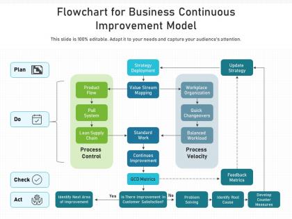
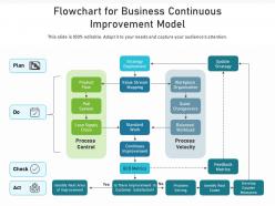
Flowchart for business continuous improvement model




Try Before you Buy Download Free Sample Product
 Impress Your
 Audience
 100%
100% Editable
 Save Hours
 of Time


Our Flowchart For Business Continuous Improvement Model are topically designed to provide an attractive backdrop to any subject. Use them to look like a presentation pro.
People who downloaded this PowerPoint presentation also viewed the following :
Flowchart for business continuous improvement model with all 2 slides:
Use our Flowchart For Business Continuous Improvement Model to effectively help you save your valuable time. They are readymade to fit into any presentation structure.
FAQs for Flowchart for business
Start with clear beginning and end points, then map out your specific steps. Add those diamond shapes for yes/no decisions and swimlanes if different people are involved. Honestly, half the charts I see look like someone threw spaghetti at a wall - make sure your arrows actually make sense! Include timing estimates and spot potential bottlenecks. Here's what really helps: mark pain points right on the chart where things usually go wrong. Map your current messy process first, then tackle the dream version later. Don't try doing both at once or you'll want to throw your laptop out the window.
Honestly, flowcharts are amazing for this stuff. You can actually see where everything gets stuck once you map it all out visually. Look for spots where decisions drag on forever, or where approvals keep piling up. Also check anywhere work bounces between too many different people - that's usually a mess waiting to happen. I always scan for steps that take way longer than they should, or places where multiple things converge at once. Oh, and if you see "waiting for..." anywhere in your process, that's your red flag right there. Once you spot these problem areas on paper, fixing them becomes so much easier.
Honestly, just go with draw.io (they call it diagrams.net now for some reason). It's free and does everything you need. Lucidchart's pretty sweet too if you don't mind paying - has nice templates and team stuff. Visio works but feels outdated compared to these newer options. Oh, and Miro or Figma are cool if you're doing more interactive workshop-y things with your team. I'd start with draw.io though. Don't get stuck comparing every feature - you'll learn way more just picking one and messing around with it.
Honestly, flowcharts are game-changers for team confusion. You know how everyone pictures processes differently in their head? A flowchart fixes that instantly. Everyone's looking at the same visual roadmap showing steps, decisions, who does what. Those awkward "wait, who's supposed to handle this?" moments just vanish. Bottlenecks jump out at you. So do weird redundancies nobody noticed before. I'd throw one up in your next process meeting - you'll be shocked how fast people actually get on the same page instead of talking in circles.
Get your team together first - especially the people actually doing the work, not just the managers who think they know what happens. Map everything from start to finish. Mark all the decision points and handoffs. This part's honestly such a pain and takes forever, but you gotta do it. Use those standard flowchart symbols so it makes sense later. Then test it out by walking through real examples with different people - you'll catch so many gaps you missed. Once that's done, the improvement spots become way more obvious. Trust me on this one.
Flowcharts work great with basically any project method - they're seriously underrated. During Agile sprint planning, map out your user stories to spot bottlenecks before they bite you. Waterfall projects? Perfect for documenting inputs and outputs at each phase. I've found they're clutch during retrospectives too when you're trying to figure out where things went sideways. Honestly, pick whatever workflow has been driving your team crazy lately and just start there. Sometimes seeing it laid out visually makes the solution obvious. They're basically the project management equivalent of duct tape - fixes everything.
So flowcharts are actually perfect for this - map out your customer's whole journey from when they first hear about you through buying and getting support after. Plot all the decision points and where things get messy between departments. Honestly, most businesses have no clue how confusing their process looks from the outside. When you share these with your team, it's like a lightbulb moment - everyone finally gets how their piece affects the customer. I'd start with just one customer type this week and see what you find. You'll probably be surprised at the gaps.
Don't go crazy with details right off the bat - that's where most people mess up. Map out how things actually happen first, not your ideal version (there's always some weird stuff nobody talks about). Too many cooks in the kitchen early on and you'll get a hot mess. Keep your symbols simple - not everything needs to be a fancy diamond shape. Oh, and definitely check with the people actually doing the work before you finalize anything. They'll catch things you missed. Start basic, then build from there once you know it's right.
Ok so basically each shape means something specific - ovals are start/end, rectangles are processes, diamonds are decisions, circles connect stuff. You really gotta stick to these because otherwise people won't understand your flowchart at all. I've honestly seen some terrible ones where people just used whatever shapes they felt like. Makes zero sense. Those four symbols I mentioned? They'll cover pretty much everything you need. When you follow the standard rules, anyone can look at your process and actually follow it. Plus it makes you look like you know what you're doing when presenting to management or whatever.
Yeah, totally! Flowcharts work for both manufacturing and service stuff. Manufacturing ones show the physical steps - assembly lines, quality checks, moving materials around. Service flowcharts are different though, they track customer interactions and how information gets passed between people. Honestly, I think they're even more useful for services because those processes are usually a mess and hard to visualize otherwise. The main difference? Manufacturing focuses on actual products while services map out experiences and data flow. Just grab one annoying process you deal with and sketch out what currently happens - you'll spot the bottlenecks right away.
Honestly, flowcharts are like GPS for work processes - way clearer than trying to explain everything verbally. New people can actually see the whole workflow from start to finish, plus who's responsible for what step. I'd rather look at a simple diagram than sit through another boring training presentation, wouldn't you? The best part is they can reference it later when they're actually doing the task. Oh, and definitely start with your most common processes first. Those are what new hires need to learn fast anyway.
Hey! So I'd add measurement points right into your flowcharts - track cycle time, error rates, bottlenecks at each step. Basically turns your flowchart into a data collection map. Pick key performance indicators for each major stage, then collect that data regularly. The visual aspect makes it ridiculously easy to spot where things slow down or break. Honestly, this approach has saved me so much headache because problems just jump out at you. I'd start with your 3 most critical processes first - don't try to measure everything at once or you'll go crazy.
Oh nice question! First thing - figure out who you're showing it to. Your boss probably wants the big picture stuff, but the actual team doing the work needs all those nitty-gritty details. I'm kinda obsessive about keeping the colors and shapes consistent because it just looks so much better. Don't just email it though - walk through it together so people can ask questions. Give them a digital version they can zoom into later, plus maybe a simple one-pager for meetings. The whole point is getting people to actually use it, not just say "looks great" and forget about it.
Dude, flowcharts are huge for Lean and Six Sigma stuff. Map out your current processes first - you'll catch so much waste and bottlenecks you didn't even notice before. Root cause analysis becomes way easier when everything's visual. Six Sigma's DMAIC method uses them tons in the Define and Measure phases. The trick is getting everyone on your team to build them together instead of doing it solo. Once you have that visual roadmap, tracking improvements is actually pretty straightforward. I swear, once you start using them for work processes, you'll want to flowchart everything.
Honestly, mixing flowcharts with other mapping stuff is a game changer. You'll see things you totally missed before. Like, throw in swimlane diagrams and suddenly it's obvious who's actually responsible for each step. Value stream maps? They'll show you where all the waste is hiding. Each technique catches different problems - I've seen people find bottlenecks they'd been blind to for months just by switching up their approach. Your team responds better too when you can show them info in ways that click for them. I usually start basic with a flowchart, then add whatever makes sense for what I'm trying to fix.
-
Designs have enough space to add content.
-
Topic best represented with attractive design.
-
Awesome presentation, really professional and easy to edit.
-
Appreciate the research and its presentable format.