


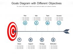
Goals diagram with different objectives infographic template





Try Before you Buy Download Free Sample Product
 Impress Your
 Audience
 100%
100% Editable
 Save Hours
 of Time


Our Goals Diagram With Different Objectives Infographic Template are topically designed to provide an attractive backdrop to any subject. Use them to look like a presentation pro.
People who downloaded this PowerPoint presentation also viewed the following :
Goals diagram with different objectives infographic template with all 2 slides:
Use our Goals Diagram With Different Objectives Infographic Template to effectively help you save your valuable time. They are readymade to fit into any presentation structure.
FAQs for Goals diagram with different
Start with your main goal at the top. Then add 2-4 supporting objectives underneath it - kinda like a family tree but for work stuff. Each objective needs specific actions you can actually measure. Don't forget timelines and who's responsible for what. I swear, most people overcomplicate this and then wonder why nobody looks at it! Keep it visual and simple enough that you can check it quickly in meetings. Oh, and make sure you can track real progress on everything - otherwise you're just making expensive wall decorations that collect dust.
So basically you take your huge project and break it down visually into bite-sized chunks. Shows you which tasks depend on each other - honestly saves so much headache down the road. Your team stays on the same page because they can actually see how their stuff connects to everything else. When your boss asks for updates (and they always do), you've got something concrete to point to instead of just rambling. I started doing this last year and wow, way less confusion. Even if you just sketch it out on a napkin or whatever, it's worth it.
You should diagram goals when they're messy and interconnected - like when you have a big strategic objective that splits into smaller pieces, or when timing and dependencies actually matter. I'm probably obsessed with these things at this point, but they really do help! Quarterly planning is perfect for this. So are projects where multiple people are involved, or those long-term personal goals that need stepping stones along the way. Next time you have a complicated goal, try sketching it out instead of just making another list. You'll catch stuff you totally missed before - gaps, weird connections, the whole thing.
Honestly, it depends on who you're showing it to. Executives eat up those clean pyramid charts - makes them feel like everything's under control. But if you're doing team stuff, mind maps are way better since everyone can jump in and add ideas. Tree diagrams work great when you've got messy goals with lots of dependencies (I learned this the hard way). For personal planning though? Just stick with simple lists - no need to get fancy. The trick is don't make a complicated chart for simple goals, but also don't try cramming complex stuff into something basic.
Honestly, goals diagrams are a game changer because they show everyone how their stuff connects to the big picture. Like, suddenly those boring Tuesday meetings actually make sense when you see how your task feeds into everything else. New people get up to speed way faster too. When your team argues about what's most important - and they will - you can just point at the visual instead of going in circles for an hour. Put it somewhere everyone sees it daily. Oh and update it during regular check-ins or it'll just become useless wall decoration.
High-contrast colors are your friend here. I always go with blues and greens for main goals - they just feel right, you know? Use darker shades for the smaller stuff underneath. Red's tempting but only use it for truly urgent things, otherwise your whole diagram screams "crisis mode." Rainbow colors are the worst honestly - makes everything confusing. Stick to 3-4 colors tops and play with different shades to show how things connect. Blue-to-gray gradient is a solid starting point. You can get fancy with accent colors later once you've got the basic structure down.
I usually just add little SMART indicators right in each goal box - like "T: March 2024" or "M: 50% increase." Works way better than those separate checklist things (honestly, who has time for that?). Color-coding is pretty helpful too - I'll make goals red if they're missing key stuff, green when they hit all the SMART criteria. Makes the weak spots super obvious. Oh, and don't try to cram everything in at once. Start with just timeframes, then add the measurable bits. Your diagram shouldn't look like a cluttered mess, you know?
Honestly, Lucidchart and Miro are your best bets - super easy to use and they've got actual goal mapping templates. Visio's decent if you're stuck in Microsoft land, but it can be kinda clunky. Canva's surprisingly good for this stuff too, way less corporate-looking than you'd expect. Oh, and draw.io is free and actually pretty solid (they rebranded to diagrams.net or something). I'd probably just try Lucidchart's free version first though - their templates are clean and don't make you look like you're trying too hard.
Put your biggest, most critical stuff right in the center - that's what grabs attention first. I always use different colors because honestly it makes everything so much clearer when you're scanning through later. Hard deadlines go near the top, then work outward with things that support your main goal. Don't forget about dependencies though - some stuff literally can't start until other things finish. The whole point is anyone glancing at it should immediately see what's urgent versus what can sit on the back burner for now.
Honestly, the two biggest screwups are being way too vague and cramming everything into one hot mess of a diagram. Like, "improve customer satisfaction" tells you absolutely nothing useful. Be specific about what you're measuring. Oh, and don't create some crazy spaghetti monster - I've seen diagrams that make zero sense because they're all over the place. Stick to 3-4 levels max. Make sure goals actually connect to each other logically. Slap some deadlines and owners on there too. Nobody wants an orphaned goal floating around forever. Start basic, then build from there.
Honestly, I just make different versions for different people. Stakeholders want the big picture stuff - strategic goals, business outcomes, that kind of thing. Don't bog them down with every little detail or they'll zone out. Your team needs the opposite though - specific deliverables, when things are due, what depends on what. I actually keep two separate diagrams because otherwise meetings turn into a mess. Oh, and definitely highlight different success metrics depending on who's looking at it. Like, executives care about revenue but your dev team probably cares more about technical milestones. Match the complexity to what they actually need to decide on.
Honestly, feedback is what stops your goals diagram from becoming useless clutter on your wall. Share it with your team or stakeholders - you'll be shocked how quickly they spot the unrealistic stuff or things you completely missed. I've watched so many diagrams die a slow death because nobody bothered updating them. Monthly reviews are clutch here. Adjust the connections between goals, dump the irrelevant ones, add new priorities as they come up. Seriously though, actually stick to those check-ins or you're just wasting your time making pretty charts.
Honestly, goals diagrams are game-changers for keeping teams on the same page. They show you exactly how everyone's daily work connects to the bigger company strategy - like a roadmap but for objectives. No more departments accidentally working against each other (which happens way more than it should). When people can actually see how their individual tasks ladder up to the main goals, coordination gets so much better. Way less wasted effort too. I'd start by just mapping out what you've got now - you'll probably spot some weird gaps or places where things don't quite line up right.
Oh totally! Goals diagrams work for way more than just business stuff. I use them for personal projects all the time - mapped out my whole career change with one last year. They're perfect for fitness goals, academic research, even family planning decisions. Some people think they're overkill for personal stuff, but honestly the visual breakdown makes such a difference. You can see how all the little steps connect to your big picture. Next time you're stuck on a multi-step goal, just sketch one out. The hierarchy thing really helps clarify what actually matters versus what just feels urgent.
Visual metaphors are honestly a game-changer for goal diagrams. Think mountain peaks for big milestones, or building blocks for foundation work. Way better than boring boxes and arrows! Your team gets it instantly because they're seeing familiar stuff instead of trying to decode abstract shapes. I started using pathways to show progress routes and it clicked for everyone immediately. The trick is matching your metaphor to what you're actually trying to show - random pretty icons just confuse people. We've all "climbed mountains" before, right? That instant recognition makes complex goal relationships so much clearer.
-
Top Quality presentations that are easily editable.
-
Design layout is very impressive.
-
Commendable slides with attractive designs. Extremely pleased with the fact that they are easy to modify. Great work!
-
Topic best represented with attractive design.
-
Awesome use of colors and designs in product templates.
-
Visually stunning presentation, love the content.
-
Helpful product design for delivering presentation.
-
Awesome use of colors and designs in product templates.