


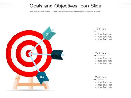
Goals and objectives icon slide infographic template




Try Before you Buy Download Free Sample Product
 Impress Your
 Audience
 100%
100% Editable
 Save Hours
 of Time


Our Goals And Objectives Icon Slide Infographic Template are topically designed to provide an attractive backdrop to any subject. Use them to look like a presentation pro.
People who downloaded this PowerPoint presentation also viewed the following :
Goals and objectives icon slide infographic template with all 2 slides:
Use our Goals And Objectives Icon Slide Infographic Template to effectively help you save your valuable time. They are readymade to fit into any presentation structure.
FAQs for Goals and objectives icon
Key features include clear visual hierarchy, customizable icon sets, progress tracking elements, timeline components, and flexible layout options. These design elements enhance presentation clarity by organizing strategic information systematically, accommodating various goal types across departments, and enabling teams to communicate objectives effectively, ultimately delivering stronger stakeholder engagement and clearer strategic alignment.
Icons enhance goal and objective communication by providing instant visual recognition, reducing cognitive load, and creating memorable associations that transcend language barriers. These visual elements streamline complex information processing, enable faster audience comprehension, and deliver consistent messaging across diverse stakeholder groups, with many organizations finding that icon-supported presentations achieve significantly higher engagement and retention rates.
**INPUT**: What design principles should be considered when creating a goals and objectives infographic? **OUTPUT**: Key design principles include visual hierarchy, consistent color coding, clear typography, balanced white space, and logical flow progression. These elements work together by guiding viewer attention, simplifying complex information, and enhancing comprehension, with many organizations finding that strategic visual design ultimately delivers stronger stakeholder engagement and clearer communication outcomes.
Color psychology enhances goals and objectives by using strategic hues to trigger emotional responses, improve comprehension, and reinforce key messages through visual hierarchy. Blue conveys trust and stability for long-term objectives, green represents growth and achievement, while red creates urgency for critical targets, with many organizations finding that consistent color coding across goal categories ultimately improves audience retention and engagement.
Effective goal representation icons include arrows and targets for short-term objectives, mountains and telescopes for long-term visions, clocks for time-sensitive goals, growth charts for performance targets, and lightbulbs for innovation aspirations. These visual elements enhance audience comprehension by creating immediate conceptual connections, with many organizations finding that strategically chosen icons streamline communication and reinforce goal clarity across diverse teams.
Infographic templates streamline presentation creation by providing pre-designed layouts, consistent visual hierarchies, and ready-to-use color schemes that eliminate design guesswork and formatting decisions. Busy professionals across consulting, marketing, and corporate training find these templates reduce preparation time by 60-70%, while ensuring polished, professional outcomes that enhance audience engagement and message clarity.
Consistency in style ensures visual cohesion across goals and objectives infographics by maintaining uniform fonts, colors, icons, and spacing throughout all elements. This strategic approach enhances readability, reinforces brand identity, and enables audiences to focus on content rather than design inconsistencies, ultimately delivering clearer communication and more professional presentations that strengthen organizational credibility.
Storytelling elements can be integrated through narrative arcs that connect current state challenges to future objectives, compelling visuals that illustrate the journey, and relatable scenarios that demonstrate goal achievement. These approaches enhance audience engagement by transforming abstract objectives into concrete stories, with many organizations finding that narrative-driven presentations increase stakeholder buy-in and strategic alignment.
Common icon mistakes include using inconsistent styles, overcrowding slides with too many icons, choosing decorative over functional icons, mixing different design aesthetics, and selecting icons that don't clearly represent their intended concepts. These errors confuse audiences and weaken message clarity, with many presenters finding that maintaining visual consistency, using icons purposefully to support content, and ensuring cultural appropriateness ultimately delivers more professional, impactful presentations.
Audience feedback improves goals and objectives slide design by identifying unclear messaging, highlighting visual hierarchy issues, and revealing which elements resonate most effectively with viewers. Through iterative refinement based on stakeholder input, organizations can enhance clarity, streamline complex information, and ensure strategic alignment, ultimately delivering presentations that drive engagement and facilitate better decision-making across teams.
**INPUT**: What software tools are best for customizing infographic templates focused on goals and objectives? **OUTPUT**: Leading customization tools include Canva, Adobe Illustrator, PowerPoint, Figma, and Visme, each offering distinct capabilities for goals-focused infographics. These platforms streamline visual communication by enabling drag-and-drop editing, custom color schemes, and scalable graphics, with many organizations finding that PowerPoint delivers seamless integration while design-focused tools like Figma enhance creative flexibility.
Metrics and data can be visually represented alongside goals through charts, graphs, progress bars, percentage indicators, and timeline visualizations that show current performance against targets. These infographic elements enable organizations to communicate progress transparently, with many businesses finding that visual data representation enhances stakeholder understanding, accelerates decision-making, and ultimately delivers improved accountability and strategic alignment.
Whitespace enhances visual hierarchy, improves readability, reduces cognitive load, and guides viewer attention to critical goal elements in infographic design. Through strategic spacing, organizations create cleaner presentations that highlight key objectives, milestones, and metrics more effectively, with many finding that well-balanced whitespace ultimately increases comprehension and engagement across stakeholder communications.
Cultural differences significantly influence icon interpretation through varying color symbolism, religious associations, reading patterns, and gestural meanings across regions. For global presentations, organizations increasingly adopt culturally neutral designs, conduct regional testing with diverse audiences, and provide contextual explanations, ultimately ensuring clearer communication and enhanced audience engagement across international markets.
Effective infographic balance combines concise, action-oriented text with complementary visual elements like icons, charts, and progress indicators that reinforce key messages without overwhelming the content. Prioritize scannable headlines, bullet points for complex objectives, and consistent visual hierarchy, with many organizations finding that 70-30 visual-to-text ratios enhance audience engagement and information retention significantly.
-
Designs have enough space to add content.
-
Informative design.
-
Unique and attractive product design.
-
Best way of representation of the topic.
-
Excellent design and quick turnaround.