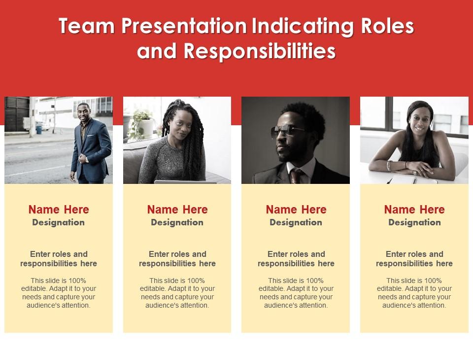
Team presentation indicating roles and responsibilities infographic template
Try Before you Buy Download Free Sample Product
Audience
Editable
of Time
Professionals belonging to any sector can use this set titled Team Presentation Indicating Roles And Responsibilities Infographic Template. From managers, executives to lower level employees, every individual can use this tool to present insightful details and implications in a well structured format. Various charts and graphs are added to this infographic design that makes it a resourceful set. Not only will this add to the informative qualities of this template, but it also makes it an instant attention grabber. Apart from this, it offers at a glance view of the topics, thus simplifying complex concepts. This helps in retaining the information presented for a long time. The biggest quality of this template is its visual elements, all added to elevate the aesthetic appeal of the presentation. Therefore download this template and present a customized version of it without any trouble.
People who downloaded this PowerPoint presentation also viewed the following :
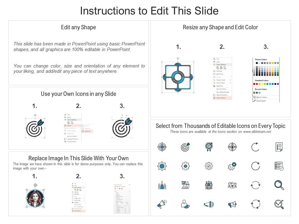
Team presentation indicating roles and responsibilities infographic template with all 2 slides:
Use our Team Presentation Indicating Roles And Responsibilities Infographic Template to effectively help you save your valuable time. They are readymade to fit into any presentation structure.
FAQs for Team presentation indicating roles and
Okay so for your team infographic - definitely use clear headings and stick to consistent colors for each person/section. White space is your friend here, nobody wants to look at something jam-packed with info. Icons beat text blocks every time, honestly. Flow should go top to bottom or left to right logically. Put your key stats in bold callout boxes so they pop. Oh and don't forget contact details at the bottom! The whole point is making team stuff easy to scan quickly. Test it on someone random first - if they're confused, you'll know what needs fixing.
Keep it simple - 2-3 colors tops that actually match your brand or theme. More colors just make everything look messy. Pick one clean font for headers and another for body text. I'm obsessed with Montserrat + Lato combo lately, but whatever's readable works. Make your important stuff bigger and use contrast so it stands out. People in the back need to see this too, so don't go tiny with the text. Oh and use your accent color sparingly - like just for key numbers or main points you really want to hit home.
Match your chart type to what you're showing - bar charts for comparing stuff, line graphs for trends over time. Don't go crazy with colors, but stay consistent with your brand. I've sat through way too many presentations where they crammed like 10 data points on one slide and nobody could read anything. Stick to 2-3 key numbers per section. Make your text big enough that people in the back can actually see it (trust me on this one). Oh, and test your template with real data first - sometimes things look great in theory but fall apart when you plug in actual numbers.
Honestly, I'd go with a circular diagram - shows everyone's equal but handling different stuff, which cuts down on weird office politics. Throw in photos, titles, and bullet points for each person's main duties. Or you could try an org chart if your team's more traditional. Color-coding works great too, especially where people's responsibilities overlap (helps spot who to bug about what). Keep text super short and use icons so you can glance at it and immediately know who does what. Oh, and definitely base it on how work actually flows through your team rather than some generic template.
So for team wins, trophies and medal icons are obvious choices but they work. Bold numbers with achievement badges next to them really grab attention. I'd throw in some growth arrows and star ratings too. Before/after comparisons are honestly my favorite - they just hit different when you're showing progress. Target icons with checkmarks are perfect for goals you've crushed. Oh, and those team silhouette graphics with plus signs show collaboration really well. Just keep your colors consistent and use contrast so the big wins actually stand out on the slide.
Think of it like telling a story - grab them with a hook first, then walk through problem to solution. Most important stuff goes at the top since people scroll fast (honestly, attention spans are terrible these days). I'd sketch out your main points before touching any design software. Break up text-heavy parts with icons or graphics, and don't be afraid of white space. People's eyes naturally follow a Z-pattern when they scan, so work with that flow instead of against it. Create little "breathing room" spots throughout so it doesn't feel overwhelming to read.
Honestly, just start with Canva - their templates are solid and you can throw your branding on there without much hassle. PowerPoint's gotten way better for this stuff too if you don't want to learn something new. Adobe Illustrator gives you the most control but ugh, the learning curve is brutal unless you're already into design. Oh and Figma's awesome for team stuff since everyone can edit at once. No more of that "can you send me the latest version" nonsense. I'd probably mess around with Canva first, see how it goes, then maybe try Figma if you need your whole team collaborating.
Make your infographic template modular - like swapping out different accessories with the same base outfit. Way easier than starting from scratch each time. Keep your main message the same but switch up the data viz, examples, and how complex your language is. Execs want ROI numbers and big picture stuff. Tech teams? They're all about the methodology details. General audience needs simple visuals and analogies they actually get. I'd probably create 2-3 versions of each section so you can just mix and match quickly. Honestly saves so much time in the long run.
Think of your infographic like telling a story over coffee - start with the problem, walk through what happened, then boom, here's how it worked out. Guide people's eyes the way they naturally read, left to right or top to bottom. Definitely throw in some team photos or quotes because honestly, people just connect better with faces. Timeline stuff works great, plus before/after shots if you've got them. Oh, and build up some tension with your data before you reveal the big win. Each section should flow into the next so people hit that satisfying "oh, now I get it" moment.
Get feedback super early - like, before you even touch the visual stuff. I always start with structure and messaging first because honestly, people will tear apart your beautiful design if the content's confusing. Set up a shared doc where everyone can comment on specific parts. Trust me on this one. Short sentences work better for clarity checks. Focus feedback on whether it flows well, stays on-brand, and actually makes sense to your audience. After you fix the big issues, do one final round and then STOP. Otherwise you'll be stuck in revision hell forever and nothing will ever ship.
Don't cram a novel onto your infographic - nobody wants to read that much text anyway. Also those neon color combos that burn your retinas? Hard pass. Stick with fonts that don't give people headaches and avoid throwing every chart type known to humanity on there. Oh, and make sure it flows logically - top to bottom usually works best. I learned this the hard way after making some truly hideous ones in college. Quick test: would you actually bother reading this thing if your friend sent it to you? If not, go back and fix it.
Honestly, team infographic templates are a lifesaver. Everyone works within the same visual framework instead of reinventing the wheel each time. Your messaging stays consistent, and all the pieces actually fit together - no more random design choices that clash. They force you to organize info clearly, which makes complex ideas way easier to communicate. The time savings alone are worth it since people can focus on content rather than getting stuck on design decisions (which, let's be real, can eat up hours). I'd definitely try one for your next project update. The collaboration just flows so much better when everyone's on the same page visually.
Honestly, whitespace is a game-changer for team infographics. Your audience needs visual breaks or they'll just zone out looking at a wall of info. I usually aim for like 20-30% whitespace - sounds like a lot but trust me on this. Space around headings and between team sections makes everything way more digestible. It's kinda like pausing when you talk. Without those breaks, people can't tell what's important anymore. Oh and start with MORE space than feels right, then dial it back if you have to. Better too much breathing room than cramming everything together.
Focus on visual hierarchy to make those metrics actually stand out. Progress bars and percentage circles work way better than just dumping numbers everywhere. Color gradients are honestly my favorite for showing goal progress - they just look clean. Group similar metrics together and stick with consistent icons throughout. Don't go crazy with too many though - 3-5 key ones max or people's eyes will glaze over. Small trend arrows next to each metric are clutch for showing direction without making things messy. Before/after charts can be super effective too if you've got that kind of data to work with.
Animated infographics work great for live presentations - just reveal data points slowly to build suspense. I love using animated timelines to walk through project phases. Some teams get creative and make "choose your own adventure" style presentations where they click different paths based on what the audience asks. Pretty smart tbh. Background animations can keep things visually interesting while you're talking, but don't go overboard or they'll distract from your points. Timing is everything - sync your animations with what you're saying. Oh, and start simple with fade-ins before getting fancy. You'll figure out what works best for your style.
-
Wonderful templates design to use in business meetings.