

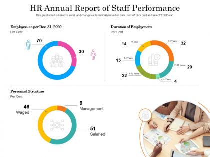
Hr Annual Report Of Staff Performance




Try Before you Buy Download Free Sample Product
 Impress Your
 Audience
 100%
100% Editable
 Save Hours
 of Time


Our HR Annual Report Of Staff Performance are topically designed to provide an attractive backdrop to any subject. Use them to look like a presentation pro.
People who downloaded this PowerPoint presentation also viewed the following :
Hr Annual Report Of Staff Performance with all 2 slides:
Use our HR Annual Report Of Staff Performance to effectively help you save your valuable time. They are readymade to fit into any presentation structure.
FAQs for Hr Annual Report
Hey! Focus on the metrics that actually tell your story - turnover rates, time-to-fill positions, engagement scores, diversity stats. Training hours and internal promotions show you're investing in people. Leadership will definitely want cost-per-hire numbers (they always do). Track absenteeism and performance review completion too. Employee NPS is solid if you're already measuring it. Honestly, pick like 8-10 metrics that connect to real business goals instead of tracking everything under the sun. Each one should tie back to something strategic you're trying to accomplish.
Focus on what your executives actually care about - revenue per employee, retention in critical roles, talent pipeline stuff. Don't just list HR activities. Connect everything to business impact instead. Cut time-to-hire by 30%? Show how that helped hit sales targets or speed up product launches. I always think the best reports map talent data directly to company priorities. Like if you're expanding into new markets, highlight your diversity hiring or leadership development there. The whole point is making your metrics feel like business metrics, not just HR tracking headcount. That's how they'll see you as strategic.
Your engagement data is gold for the annual report - it shows what's actually moving the needle vs what's flopping. Track it throughout the year, not just those once-a-year surveys everyone dreads. Look for patterns in retention and productivity across different teams. Honestly, it beats those meaningless "we had cake in the break room" updates by miles. The real magic happens when you connect engagement scores to business stuff like turnover rates. Short bursts of data work better than massive dumps. You'll spot trends that actually matter for your company culture and can prove ROI on HR initiatives.
Hey! So for DEI stuff in reports, definitely include the actual numbers - hiring percentages, promotion rates, pay gaps, all that. Numbers tell the real story. Show your employee resource groups doing cool things, training participation rates, retention stats broken down by demographics. But here's the thing - don't just dump a list of programs. Include before/after comparisons and what employees actually said about them. Oh, and be honest about where you sucked before vs now. Then set specific goals for next year so execs can't wiggle out of accountability.
Honestly, before/after charts work best for this stuff - show your retention rates over 2-3 years so the trend jumps out immediately. Side-by-side bars comparing turnover by department are solid too. Heatmaps are clutch for showing which roles take forever to fill (way better than boring spreadsheet rows). Break down your recruitment funnel visually - applications to interviews to actual hires. Oh, and definitely segment everything by tenure and department since exec turnover is totally different from entry-level chaos. Keep your colors consistent throughout or it'll look messy.
Honestly, the biggest game-changer is just connecting your HRIS and payroll systems so data pulls automatically - no more copying numbers around like it's 1995. Real-time metrics from performance platforms give you way better insights too. The analytics tools are clutch for spotting patterns you'd miss otherwise, like weird turnover spikes in specific departments. Visualization makes everything so much cleaner than those brutal spreadsheets everyone ignores. I'd start by figuring out your must-have metrics first, then see what systems you can actually link up to do the work for you.
Start with the hard numbers - participation rates, completion stats, skills development. ROI is huge, so connect training to actual performance gains or cost savings whenever possible. I always include employee quotes because honestly, pure data gets boring fast. Success stories make everything click better. Highlight any cool programs or partnerships that make you stand out from other companies. The key thing? Tie it all back to business goals so leadership sees this as smart investment, not just another expense. Oh, and don't forget to mix the quantifiable stuff with the human stories - that combo works every time.
Grab your HR report and stack it up against industry benchmarks - SHRM and Glassdoor are solid for this. I did it last quarter and holy crap, we were way overpaying some roles! First figure out what metrics actually matter for your industry though. Tech cares about totally different stuff than manufacturing does. Pull your turnover rates, satisfaction scores, compensation data, whatever's relevant. Then find good industry comparisons and see where the gaps are. Shows you what you're killing versus what needs work. Plus leadership loves real data when you're asking for budget changes - learned that the hard way.
Start with the basics - EEO compliance stuff, wage violations, discrimination complaints, safety incidents. Diversity metrics and pay equity analysis are huge right now too. Don't forget policy updates and training completion rates. Oh, and any legal settlements or ongoing cases that could bite you later. Honestly, leadership will throw you under the bus if they're caught off guard by something you didn't report. The whole thing sounds overwhelming, but it's really just documenting everything so you're covered. Pro tip: collect this quarterly instead of panicking at year-end like everyone else does.
Instead of cramming all the feedback into one boring section, sprinkle it throughout your whole report. Quote actual employees when you're talking retention numbers - makes everything hit different. Engagement scores look way better next to your culture stuff too. Oh and definitely weave in what people said about benefits when you cover those programs. I've seen reports where they cross-reference survey responses with turnover data and it tells such a complete story. Don't just highlight the wins though. Include the messy stuff employees called out - shows you're actually listening and using their input to shape decisions.
For your annual report, definitely dig into generational shifts - Gen Z's coming in while Boomers head out, which changes everything from benefits to how people communicate. Gender, ethnicity, and disability representation matter too, but look at all levels not just entry roles. Remote work data is everywhere these days, so include where your people actually live and who's staying versus leaving based on work setup. Oh, and break down promotion/turnover by demographics - leadership eats that stuff up anyway. Short story: if there's a weird pattern hiding in the numbers, you'll want to catch it before someone else does.
Okay so instead of just throwing numbers at people, turn your data into actual stories. Like don't just say "employee satisfaction went up 15%" - explain WHY. Was it the new flexible work thing? Those listening sessions everyone loved? Stories stick way better than random stats floating around. Structure it like a journey: where you started, what went wrong, how you fixed it, what happened next. Oh and definitely start each section with a real employee quote or something - hooks people before they hit the boring data part. Trust me, nobody wants to read another dry corporate report. Make employees the heroes of your company's story and you'll actually get people to care about what you're saying.
Oh man, the data situation is brutal - you've got payroll stuff in one system, performance reviews somewhere else, and nothing talks to each other. Manual tracking makes it worse because there's always missing pieces you don't find until December when you're panicking. Honestly? Start getting your data house in order now instead of waiting. Set up monthly check-ins to catch problems early. And maybe push for better integrated systems if you can swing it - I know budgets are tight but the headache savings are real. Also assign someone to own each metric so nothing falls through cracks.
Track your participation rates and actual costs - those numbers really matter. Grab some anonymous employee stories too because honestly, the data means nothing without real voices behind it. Break everything down by program type: mental health stuff, fitness, work-life balance. Don't sugarcoat what flopped either. If you're not already collecting this info, start now because next year you'll thank yourself. Oh, and definitely include measurable wins like fewer sick days or reduced healthcare costs. That's the stuff leadership actually cares about.
Honestly, ditch the PDF thing entirely. Interactive dashboards are so much better - or try video summaries if you're feeling ambitious. Employee journey maps work great too, especially with actual photos from team wins. I've seen people use Tableau for the data viz stuff, but even Canva works if you're not super technical. Break it into different sections by department, maybe? Or create one of those microsites where people can click around. The whole point is making executives actually want to read it instead of skimming past endless spreadsheets. Put your people first, not just the boring metrics.
-
Good research work and creative work done on every template.
-
Excellent design and quick turnaround.
-
Understandable and informative presentation.
-
Best way of representation of the topic.
-
Innovative and attractive designs.