


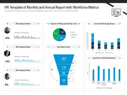
Hr Template Of Monthly And Annual Report With Workforce Metrics




Try Before you Buy Download Free Sample Product
 Impress Your
 Audience
 100%
100% Editable
 Save Hours
 of Time


Our HR Template Of Monthly And Annual Report With Workforce Metrics are topically designed to provide an attractive backdrop to any subject. Use them to look like a presentation pro.
People who downloaded this PowerPoint presentation also viewed the following :
Hr Template Of Monthly And Annual Report With Workforce Metrics with all 2 slides:
Use our HR Template Of Monthly And Annual Report With Workforce Metrics to effectively help you save your valuable time. They are readymade to fit into any presentation structure.
FAQs for Hr Template Of Monthly And Annual Report
So basically you need four main buckets: workforce stuff (headcount, turnover, how long it takes to fill roles), performance numbers (goal completion, review scores), engagement data (survey results, which managers people actually stick with), and comp analysis (pay equity, budget vs what you actually spent). Leadership always wants to see trends over time - they eat that stuff up. Oh, and diversity metrics are huge now for strategic planning. The trick is mixing day-to-day operational data with bigger picture insights. Honestly, just start with whatever your leadership team actually looks at when they're making decisions, then build out from there.
Honestly, HR data is like having a crystal ball for turnover. Track which departments are bleeding people and when they typically bail (spoiler: usually within that first year). Look at exit interviews next to performance reviews - that's where the real tea is. Maybe it's crappy managers, pay gaps, or zero growth opportunities. Once you see the patterns, you can actually fix stuff before more people peace out. Way better than scrambling after someone already quit. Start with compensation analysis and manager feedback scores - those usually tell you everything.
Honestly, visual HR reports are a game-changer. Instead of drowning people in spreadsheets, you're showing them clear stories about what's actually happening. Turnover spikes? Engagement drops? You'll catch these way faster with charts than scrolling through endless rows of data. Executives eat this stuff up too - they'd much rather click through a dashboard than squint at some massive Excel file. Oh, and it makes budget meetings so much easier when you can actually show why you need more resources. Just start with whatever charting tool you already have. Even basic graphs make a huge difference.
Honestly, monthly is your best bet for most HR stuff. You'll catch trends without going crazy with data overload. During crazy busy times though? Switch to weekly for the big things like turnover rates. Quarterly works fine for the strategic reports - comp analysis, that kind of thing. I've watched teams completely burn themselves out trying to pump out weekly reports for everything (spoiler: it never ends well). Really depends on how fast things change and when you actually need to make decisions. Start monthly, then tweak it based on what people actually read.
Honestly, you've gotta nail down your data entry standards first - like how dates get formatted, names spelled, all that stuff. Consistency saves your butt later. I'd randomly audit records against source docs too (learned this when our turnover stats were completely wrong last quarter, ugh). Your HRIS can probably automate some of this which cuts down on typos. The trick is catching screwups early instead of scrambling when your boss wants those quarterly reports. Trust me on this one.
So HR analytics is basically taking all your employee data and turning it into insights that actually matter for business decisions. You know how Netflix uses data for literally everything? Same idea but for your workforce. Instead of guessing about hiring or who might quit, you can predict turnover and spot where you're missing skills. The magic happens when you connect HR numbers directly to stuff like productivity or revenue - honestly, executives get way more interested once they see real data behind people decisions. Pick one problem your leadership team is wrestling with, then figure out what employee data might help solve it. You'll be amazed how fast they start paying attention.
Honestly, automation is a game changer for HR reporting. Start with whatever manual reports eat up most of your time - that's where you'll feel the biggest relief. Modern HR platforms pull everything together (payroll, performance reviews, the works) so you're not juggling five different systems. Real-time dashboards basically run themselves once you set them up. The AI stuff is actually pretty cool too - it catches turnover patterns and compliance issues that are easy to miss when you're buried in Excel hell. Visual tools make presenting to executives way less awkward. You'll wonder why you waited so long to automate this stuff.
Ugh, the biggest nightmare is your data being everywhere - HRIS, payroll, performance systems, you name it. Half your time goes to just getting clean data that actually matches up. Then everyone defines metrics differently (seriously, ask three people what "turnover" means and get three answers). Incomplete records will drive you crazy, especially when leadership wants everything yesterday. Oh and don't forget privacy stuff since it's all employee data. Stakeholders always want the same info sliced fifty different ways too. Honestly? Save yourself the headache and build some standard templates. Automate the recurring reports or you'll lose your mind doing the same thing every month.
Honestly, tracking stuff like engagement scores and turnover rates is like getting a heads up before your workplace culture goes completely off the rails. Exit interviews are gold too - people finally tell you what they really think when they're walking out the door. I'd focus on maybe 3 or 4 key metrics and check them monthly. You'll start seeing patterns, like maybe one department's constantly unhappy or certain managers need help. Way better than just winging it and hoping things improve. The data actually shows you where to focus instead of throwing solutions at random problems.
So there's a few good options for this. SHRM has a solid metrics framework that most people use. ISO 30414 is the international standard - bit more formal but comprehensive. Corporate Leadership Council has one too, though it gets messy fast honestly. I'd map what each department tracks now first. Then pick common stuff everyone can actually use - turnover rates, time-to-fill positions, engagement scores. The key is focusing on metrics that tie to real business goals instead of just numbers that look impressive. Don't overthink it at the start.
Think about what each group actually needs to make decisions. Executives care about the big picture stuff - turnover rates, diversity numbers, hiring costs. Things that affect strategy and budgets. Managers need the nitty-gritty they can actually use: team performance, who finished training, interview schedules for their department. I learned this the hard way when I once presented super detailed metrics to our VP and watched her eyes glaze over completely. Meanwhile, giving managers just high-level summaries doesn't help them do their job day-to-day. Match the detail level to what they'll actually do with it.
Privacy first, always. Don't collect more than you actually need - like, do you really need their birthday for that productivity report? Anonymize everything you can. Be super transparent about what you're tracking and why. People hate feeling spied on at work (rightfully so). Just because your system CAN pull certain data doesn't mean you should use it. Write up some solid data policies and actually follow them - I've seen too many companies create rules then ignore them when convenient. Trust me, once employees lose faith in how you handle their info, you're screwed.
Look, without benchmarking you're basically guessing whether your HR numbers are decent or garbage. Is 15% turnover good? Could be great for retail, terrible for tech - totally depends. I always tell people to grab 2-3 solid industry reports for their sector first. Then track your retention, hiring speed, engagement stuff against similar companies every quarter. That's how you'll actually spot what's broken and what's working. Oh and it makes getting budget approved way easier when you've got real data showing "hey, our competitors are crushing us on this." Makes the case pretty clear.
Honestly, employee feedback is like your cheat sheet for making HR reports people actually want to read. Survey your current users about what metrics they care about and how they like getting info. I swear, half the dashboards I see are gorgeous but totally useless because nobody asked what questions people need answered. Ask recipients what format works best, how often they want updates, and which KPIs actually drive their decisions. Oh, and start simple - just ask what's the one thing they'd change about your current reports. That alone will tell you tons.
Ok so here's what works - turn your data into actual stories about people. Don't just say "turnover is 15%." Say something like "our best salespeople are bailing after 18 months because they hit a promotion wall." Before/after examples are gold. Show individual wins that reflect bigger patterns. Honestly, executives eat this stuff up way more than boring spreadsheets. Lead with the human drama first, then back it up with numbers. I mean, it feels a little dramatic at first but trust me - they'll actually remember what you're saying instead of glazing over.
-
Appreciate the research and its presentable format.
-
Editable templates with innovative design and color combination.
-
Innovative and Colorful designs.
-
Thanks for all your great templates they have saved me lots of time and accelerate my presentations. Great product, keep them up!
-
Perfect template with attractive color combination.