

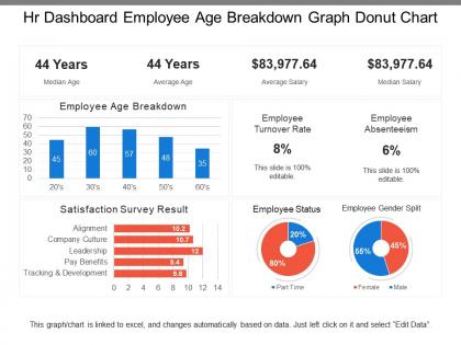
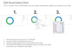
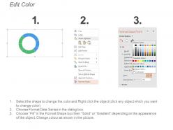
Hr dashboard employee age breakdown graph donut chart




Try Before you Buy Download Free Sample Product
 Impress Your
 Audience
 100%
100% Editable
 Save Hours
 of Time


Establish a basis for creating consensus with our Hr Dashboard Employee Age Breakdown Graph Donut Chart. Bring folks on common ground.
People who downloaded this PowerPoint presentation also viewed the following :
Hr dashboard employee age breakdown graph donut chart with all 6 slides:
Draw accurate conclusions with our Hr Dashboard Employee Age Breakdown Graph Donut Chart. Correctly identify important information.
FAQs for Hr dashboard employee age breakdown
Honestly, pick metrics that'll actually get looked at - not just fancy charts nobody cares about. I'd go with headcount trends, turnover by department, and how long it takes to fill roles. Those tell you what's really happening operationally. Add in employee satisfaction scores and performance rating spreads too, since miserable people quit faster. Compensation analysis is huge right now, plus diversity numbers (leadership loves those). Keep it to maybe 6-8 total though. Any more and people just ignore the whole dashboard - learned that one the hard way at my last job.
Dude, visual dashboards are a game changer for HR data. Nobody wants to scroll through endless spreadsheet rows – that's just painful. Clean charts show trends instantly, so your managers can spot issues without staring at numbers forever. Color-coded stuff and filters let people dig into specific departments or dates without their eyes glazing over. Honestly, I've seen people completely ignore reports until they were turned into visuals. Make it visual-first and suddenly everyone's actually using the data to make real decisions. It's weird how much presentation matters, but it really does.
Okay so basically an HR dashboard lets you see what's actually happening with hiring and keeping people instead of just guessing. You can figure out which job boards or whatever are bringing in your best candidates, track how long it takes to fill positions, and catch warning signs before good people quit. It shows compensation gaps too - honestly that one's huge for avoiding those awkward "why does Jake make more than me" conversations. You'll also spot high performers who might be getting ready to bounce and departments bleeding talent. Just run through it weekly and tweak your approach based on what you're seeing.
Look at what your engagement surveys are telling you first - that's gonna shape your whole dashboard. Say people keep mentioning career growth and work-life balance in feedback. Focus on metrics like promotion rates, training hours, PTO usage instead of random stuff like who's in the office (seriously, who cares anymore?). Map out your biggest engagement drivers. Then find measurable KPIs that actually connect to those issues. Your dashboard should reflect what employees genuinely want, not just generic HR metrics. Otherwise you're just tracking numbers that don't mean anything to anyone.
First thing - figure out what your company actually cares about, then pick HR metrics that tie into those goals. Growth mode? Track time-to-fill and retention rates. Trying to cut costs? Focus on cost-per-hire and turnover expenses. Most dashboard tools are pretty decent at letting you build custom widgets and set alerts when things go sideways. Honestly, the biggest mistake is cramming too many metrics in there. Stick to like 5-7 KPIs that actually matter - otherwise you'll just get overwhelmed by data that doesn't help anyone make decisions. Start basic, add more fancy stuff later once you've got the hang of it.
Honestly, it comes down to your budget and how tech-savvy you are. Tableau and Power BI are pretty powerful for complex stuff, though Power BI can be a pain sometimes. Google Data Studio's free which is clutch if money's tight. For something simpler, Klipfolio works well, or check if your HRIS like BambooHR already has dashboards built in - might save you some headache. Excel's okay but gets crazy messy with live data. I'd figure out which HR metrics you actually need first, then see what plays nice with whatever systems you're already using.
Honestly, HR dashboards are game-changers for compliance stuff. They'll track overtime limits, monitor when certifications expire, and flag weird hiring patterns that could bite you later. Everything gets timestamped and documented automatically – no more digging through spreadsheets like a maniac during audits. Set up alerts so you're not panicking when someone's safety cert expires next week. The best part? All your compliance data lives in one spot instead of scattered across random files. Trust me, get those automated reports running now. Future you will be so grateful when inspection season hits!
Don't try to cram everything onto one screen - I've seen dashboards that look like NASA mission control and nobody uses them. Stick to maybe 5-7 key metrics max. Think about who's actually looking at this thing too. Your CEO wants the big picture stuff, but your team leads need the nitty-gritty operational data. Skip the vanity metrics that just make you feel good but don't help anyone make decisions. Oh, and definitely test it with real people first - what makes sense to you might be confusing as hell to everyone else. Context matters too, so make sure people can tell if the numbers they're seeing are actually good or bad.
Weekly updates are your sweet spot, but real-time is even better if you can swing it. Monthly? Way too slow - I learned that the hard way when we missed a huge turnover spike last year. Employee satisfaction and headcount stuff changes fast, and stale data will bite you. Honestly, some of the best HR teams I know started with weekly dashboards, automated whatever they could, then gradually moved to real-time once they got their act together. Don't overthink it though. Pick what works for your bandwidth and go from there.
Start with your main HR systems - HRIS for employee data, payroll for compensation stuff, and your ATS for recruiting metrics. Performance tools and engagement surveys are huge since they show you what's actually happening with people. Learning management systems track development, plus time tracking if you use it. Exit interview data is honestly pure gold. Don't try connecting everything right away though - pick 3-4 key sources first. Way easier to manage. You can always add more systems later once you figure out which insights your team actually cares about.
So predictive analytics in HR dashboards - basically you're using historical data to forecast stuff like turnover, flight risks, hiring needs, performance trends. Tableau and Power BI have this built in already, which honestly surprised me how simple it was. Don't go crazy with fancy models that look impressive but don't actually help anyone make decisions. I'd start with something straightforward like turnover predictions first. Once leadership sees the value (and they actually use it), then you can add more complex forecasting. The key is picking metrics that'll drive real decisions, not just dashboard eye candy.
Start with basic data literacy - reading charts, spotting trends, that kind of stuff. Your HR dashboard is probably pretty user-friendly (most are these days, thankfully), but definitely get a demo from your vendor first. Figure out which KPIs actually matter for your job. Learn the filtering options too - you'll use those constantly. Oh, and practice explaining data stories to leadership because that's honestly half the battle. Nobody cares about your beautiful charts if you can't tell them what it means. Ask your IT team about troubleshooting basics while you're at it.
So basically, HR dashboards put all the important stuff right out in the open - turnover rates, diversity numbers, performance metrics, pay breakdowns. When everyone can see the data instead of it being buried somewhere, people actually have to own their results. Like, your manager can't pretend their team isn't hemorrhaging people when the numbers are staring leadership in the face every week. Employees trust the company more too because they're not wondering what's really going on behind closed doors. I'd start by figuring out what metrics your stakeholders would actually care about tracking.
So you can set up widgets in your dashboard for all the main stuff - hiring, promotions, retention, pay gaps. Honestly, seeing it all visualized hits different than just reading reports. I'd focus on retention rates by demographic first - that's where you catch the real problems. Department breakdowns and leadership diversity are obvious ones to track too. Oh, and don't sleep on inclusion survey scores if you do those. The smart move is setting alerts when numbers drop below your targets. That way you're not just staring at pretty charts but actually catching issues before they get worse.
So basically, when employees fill out surveys and pulse checks, all that feedback automatically flows into your HR dashboard metrics - engagement scores, satisfaction ratings, turnover risk stuff. You can spot trends super fast, which is honestly pretty neat. The system also does sentiment analysis to predict which departments might lose people soon. Oh, and it'll flag teams with dropping feedback scores so you can jump in before things get worse. Just don't be like most managers who set it up then never actually look at it - that defeats the whole purpose, you know?
-
Graphics are very appealing to eyes.
-
Excellent Designs.