

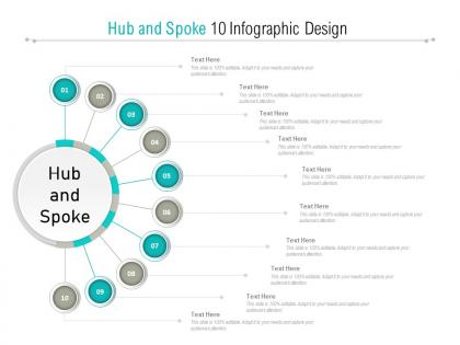
Hub and spoke 10 infographic design




Try Before you Buy Download Free Sample Product
 Impress Your
 Audience
 100%
100% Editable
 Save Hours
 of Time


Good ideas go hand in hand with our Hub And Spoke 10 Infographic Design. They create a formidable team.
People who downloaded this PowerPoint presentation also viewed the following :
Hub and spoke 10 infographic design with all 5 slides:
Grab it with both hands with our Hub And Spoke 10 Infographic Design. Make the best of every chance you get.

FAQs for Hub and spoke
Honestly, hub and spoke layouts are amazing because they make complicated stuff way easier to follow. Your audience gets this clear center point, then everything else branches out logically from there. I use it all the time now - works for processes, comparisons, whatever you're presenting. People can see the big picture immediately, then dig into details if they want. Way better than those boring bullet point slides everyone does. Oh, and it actually looks pretty clean too, which doesn't hurt. Next time you're stuck organizing content, just throw the main idea in the middle and see what happens.
Honestly, the hub and spoke thing is a game changer for making complex stuff digestible. You stick your main idea in the middle, then all the supporting details just radiate out from there. Way less overwhelming than those crazy dense infographics that make your brain hurt. People can actually choose where to look first instead of getting dragged through some predetermined path. Short sentences work great here. Plus you can spot connections between different pieces super quickly - like, oh wait, these two things actually relate to each other. I swear every designer should try this at least once. Give it a shot next time you're stuck with complicated info.
Pick your main color first - that's your hub. Then grab 2-3 colors that actually work with it for the branches. Trust me, I made this psychedelic mess once that hurt people's eyes lol. Helvetica or Open Sans are boring but they work. Don't get fancy with fonts - readability beats creativity every time. Two font families max or it looks amateur. Make sure your text pops against the background. Oh, and if you're presenting to older folks, bump up that contrast. They'll thank you later. Build everything around that central color choice.
Oh totally! Hub and spoke layouts are super versatile. Healthcare folks put treatments in the center with symptoms and solutions branching out. Tech companies do the same thing - main product in the middle, features as spokes. Finance people love showing how one strategy connects to different outcomes (though honestly everything in finance looks better as a diagram lol). The trick is making sure whatever you put in the center actually deserves to be there - like it genuinely connects to everything else. Once you start using them you'll see opportunities everywhere.
Honestly, I'd start with **Canva** - it's ridiculously easy and has a bunch of hub and spoke templates already made. Just drag, drop, done. **Adobe Illustrator** is way more powerful if you want total control, but the learning curve is brutal. I spent hours just figuring out basic tools when I first tried it. **Lucidchart** and **Visme** work great too, especially for messier data stuff. If you're broke, **Draw.io** is decent or even PowerPoint works in a pinch (though it'll look kinda basic). Really depends on how fancy you need it to look and how much time you've got.
Put your main metric smack in the middle, then branch out like a wheel. Each spoke is a different category - sales regions, customer types, whatever works for your data. I'd stick to 6-8 spokes tops because it gets messy real quick otherwise. Use different colors or little icons to make each spoke pop. The cool thing is how it shows connections without looking like those awful spreadsheet disasters everyone hates. Make sure your data flows from center outward in a way that actually makes sense. Oh, and honestly? This layout just looks way more professional than most alternatives.
Dude, spacing is everything with hub and spoke infographics. Your central hub needs tons of whitespace around it so it actually pops as the main thing. Then you gotta spread out those spokes - otherwise they'll fight each other and nobody can follow the flow from center outward. Each spoke should feel like its own little section, not cramped together. I always go overboard with space at first (like, way more than seems right) then pull back if needed. Trust me, cramped infographics look amateur and people just bounce.
Okay so digital lets you get fancy with interactive stuff - clickable spokes, hover effects, maybe some animations. Print's obviously static, so you need solid visual hierarchy instead. Think numbered spokes, color coding, different sizes to guide people through it. Plus digital gives you endless space (scrolling forever) while print makes you ruthless about what stays. Honestly, I'd pick your main format first and design for that, then tweak the other version. Way easier than trying to force one design to work everywhere - trust me on this one.
Oh man, don't cram too much text onto each spoke - that's like the
No Reviews