Issues and solutions powerpoint presentation slides

Issues and solutions powerpoint presentation slides
Slide 1 of 20

or

Favourites Favourites

Try Before you Buy Download Free Sample Product

Audience Impress Your
Audience
Editable 100%
Editable
Time Save Hours
of Time
The Biggest Sale is ending soon in
0
0
:
0
0
:
0
0
Presenting issues and solutions PowerPoint deck with slides. This deck is a set of 20 PowerPoint templates. Our PowerPoint professionals have incorporated appropriate diagrams, layouts, templates and icons related to the topic. The best part is that these templates are completely customizable. Edit the colour, text and icon as per your need. Click the download button below to get your hands on the issues and solutions PPT deck.
Content of this Powerpoint Presentation


Slide 1: This slide introduces Issues and Solutions. State Your Company Name
Slide 2: These slide showcases solutions and challenges.
Slide 3: This slide presents Template 2 which further showing CHALLENGES and SOLUTIONS.
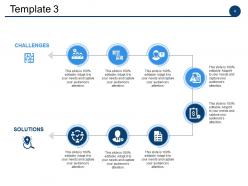
Slide 4: This slide shows Template 3 with solutions and challenges.
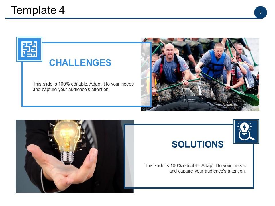
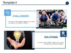
Slide 5: This slide showcases Template 4 with these two of the parameters- CHALLENGES, SOLUTIONS.
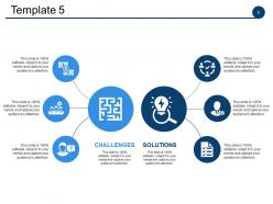
Slide 6: This slide presents Template 5 solutions and challenges.
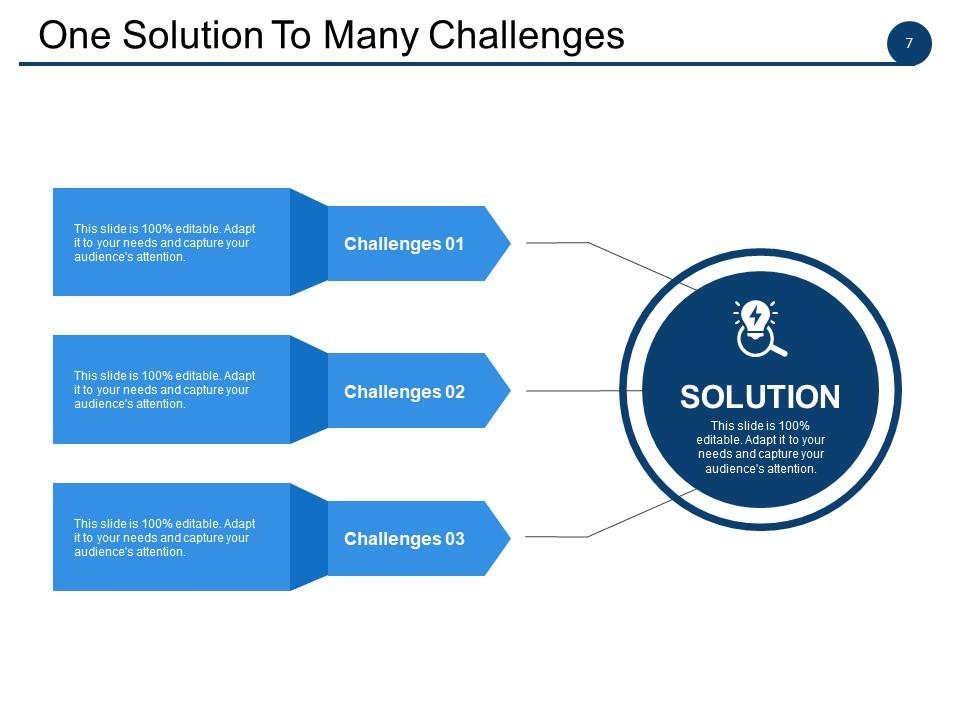
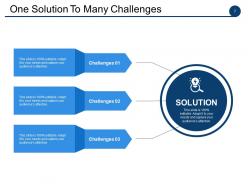
Slide 7: This slide shows One Solution To Many Challenges. so this solution may listed as you can add 3 of the challenges.
Slide 8: This slide is titled Additional slides.
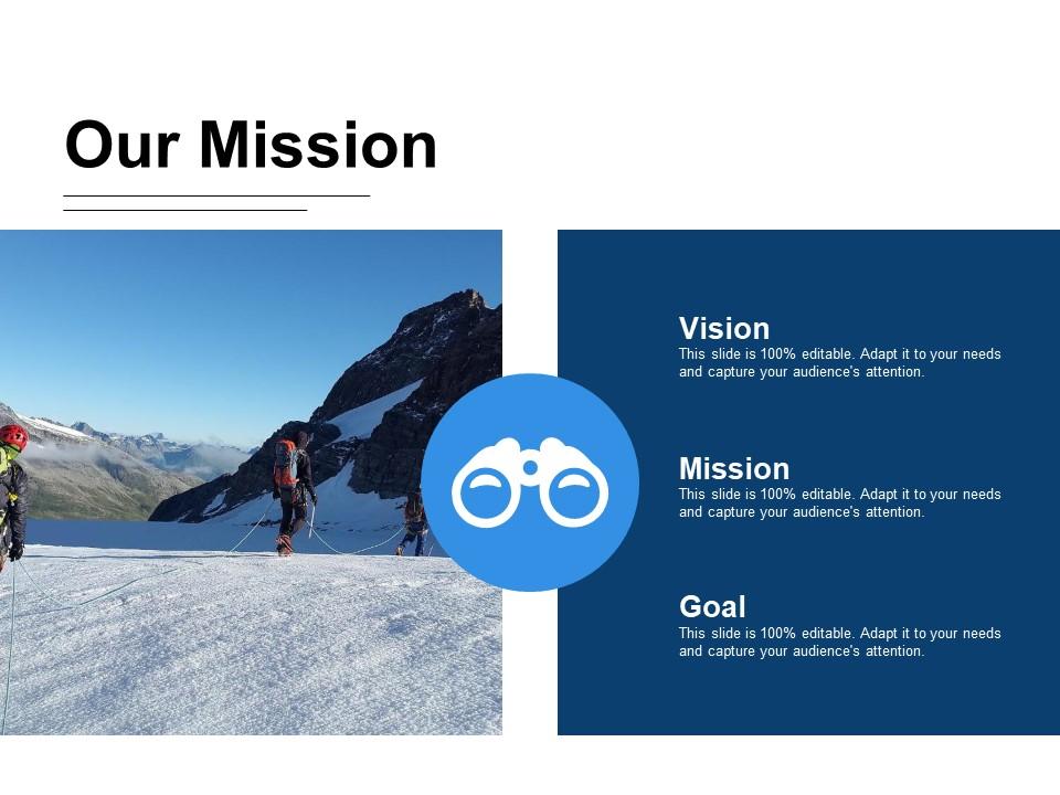
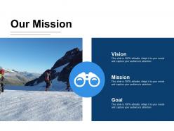
Slide 9: This is a Vision, Mission and Goals slide. State them here.
Slide 10: This is an Our Team slide with name, image &text boxes to put the required information.
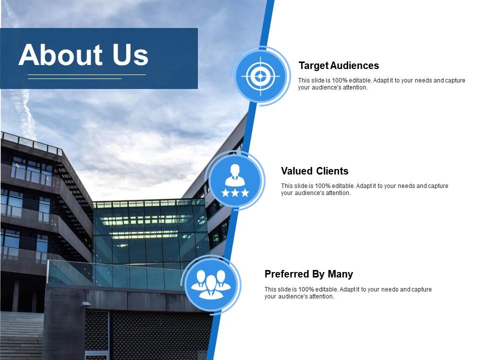
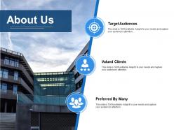
Slide 11: This is an About Us slide showing Our Company, Value Client, and Premium services as examples.
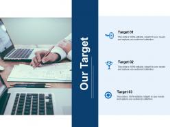
Slide 12: This is a Target slide. State targets here.
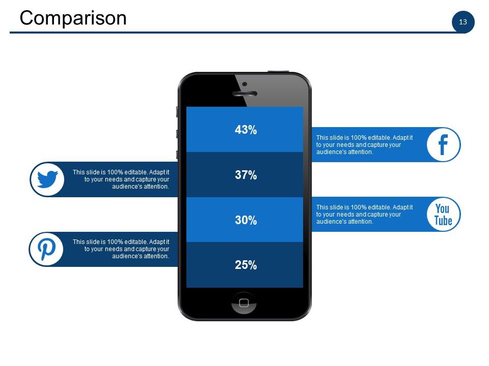
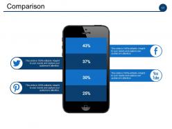
Slide 13: This slide shows Comparison of Positive Factors v/s Negative Factors with thumbsup and thumb down imagery.
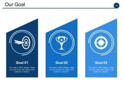
Slide 14: This slide shows Our Goals for your company.
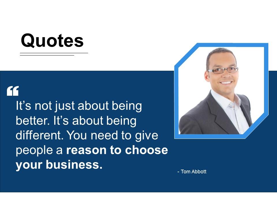
Slide 15: This is a Quotes slide to highlight, or state anything specific.
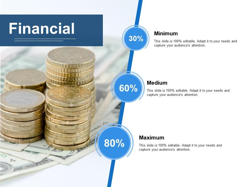
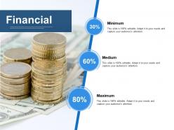
Slide 16: This slide shows Vital financial circles with percentage and text boxes.
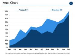
Slide 17: This slide shows Critical areas to be assessed and worked on.
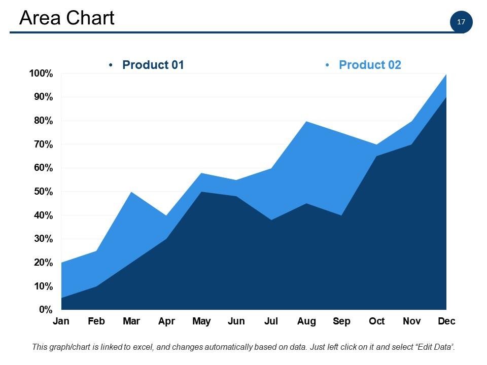
Slide 18: This slide shows a Stacked Line graph in terms of percentage and years for comparison of Product 01, Product 02, Product 03 etc.
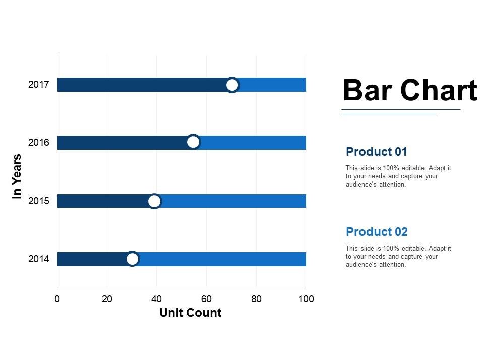
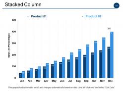
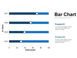
Slide 19: This slide presents Bar Chart. You can add the data and use.
Slide 20: This is a Thank You slide with Address:# street number, city, state, Contact Numbers and Email Address.

FAQs for Issues and solutions

Ugh, tech problems are the worst - slides freeze, mics die, clickers stop working right when you need them. Murphy's law in action! Then there's the whole anxiety thing where you start talking a mile a minute and lose your place. Plus keeping people interested is tough - you know that sinking feeling when half the room is scrolling their phones? My advice: practice till you could do it in your sleep and always have backups ready. Like, actually test your presentation beforehand because technology literally hates us when we're stressed.

Templates are honestly a lifesaver - they give you structure so you're not panicking about what slide comes next. Your brain can actually focus on what you're saying instead of fumbling around. And yeah, looking polished right off the bat definitely boosts your confidence. The visual flow keeps people engaged too, which saves you from those painful dead-silence moments (we've all been there). Oh, and do a quick practice run with whatever template you pick. Trust me on this one - you'll want to know how everything flows before you're standing up there.

Dude, you've gotta get them involved! Ask questions during your talk - don't just drone on. Polls are great if you can swing it. Move around too, nobody wants to watch someone glued to a podium. Oh and stories are everything - people will remember your random anecdote way better than boring statistics. I'm telling you, throw in a quick case study or personal example. Make eye contact with different folks around the room. If it's small enough, use their names! Let them ask questions throughout instead of saving it all for the end. You want participants, not zombies staring at you.

Dude, color psychology is actually legit for presentations. Blues and greens make you seem trustworthy and calm your audience down. Reds grab attention but create this sense of urgency. I honestly thought it was BS until I watched people zone out during a presentation with terrible colors. Match your palette to what you're saying - warm tones work great for emotional stuff, cool ones for data dumps. Oh, and don't use too many bright colors because they're super distracting on screens. Stick to 2-3 colors tops and definitely test them on whatever display you'll actually be using.

Dude, visuals are game-changers - they boost retention by like 65% because our brains just eat up images way faster than text. I used to bore people to death with wall-of-text slides until I figured this out the hard way. Now I pair everything with charts or diagrams so people have multiple ways to actually absorb what I'm saying. Those visual bits become little memory hooks later. Oh, and try that 6x6 thing - max 6 bullets with 6 words each, then pack the rest with visuals that back up your points. Trust me, your audience will thank you.

Honestly, just think about who you're presenting to first. Flashy animations for budget meetings? Terrible idea - trust me on that one. Your content matters too though. Don't pick templates with huge image spaces if you've got paragraphs of text to squeeze in. Fonts need to be readable from the back of the room. Colors can't look awful with your company's branding either. Here's what I'd do: grab a few different templates and test them out with your real slides. You'll know pretty quickly which one actually works instead of just looking pretty in the preview.

One big idea per slide, that's it. Cut everything else - seriously, be brutal about it. Bullet points work way better than giant paragraphs, and keep lines to 6-7 words max so people don't have to squint. I made this mistake so many times before figuring it out! Connect your ideas with smooth transitions. For every point, ask yourself "so what?" - like why would anyone care? Oh, and here's what really helped me: practice explaining your main message in just one sentence before you even touch the slides. Makes everything clearer.

Okay so definitely save your presentation on like 3 different devices and grab some adapters - you never know what weird ports they'll have. When tech inevitably crashes (because it always does at the worst moment), just laugh it off and keep talking through your points. Audiences get it, honestly they're probably relieved it's not them up there. Show up early to test everything and figure out who the IT person is. Oh and definitely know your content well enough that you could wing it without slides. I've seen people completely freeze when their PowerPoint dies, but if you can just roll with it, you'll look like a total pro.

Honestly, knowing your audience changes everything. Younger people want flashy visuals and tech, but older crowds? They just want clear, simple slides. I bombed once using gaming examples with a bunch of accountants - never again! The industry matters too because you'll sound like an idiot using the wrong jargon. Education level tells you how technical to get, and cultural stuff affects whether your jokes will land or crash. Quick tip: spend like 5 minutes before any presentation figuring out who's actually gonna be there. Trust me, it'll save you from some seriously awkward moments.

Honestly, make sure every video or image actually helps your point - don't just throw stuff in because it looks cool. Test everything first! Tech will 100% break when you need it most (trust me on this one). High-res files are great but don't make them so huge they freeze your laptop. Audio levels should match throughout - nobody wants to get blasted by one loud clip. Oh, and always download videos locally instead of streaming them. Bring your own dongles too because conference rooms never have the right ones. Your content matters more than flashy graphics anyway.

Mix it up constantly - throw in charts for visual people, tell stories for auditory learners, and do polls or demos for hands-on folks. I'm obsessed with those "turn to your neighbor" moments because honestly, everyone needs a breather anyway. Switch your approach every 5-10 minutes so nobody zones out. Don't forget handouts afterward - some people just process better when they can review stuff later. Oh, and never rely on just one method. That's how you lose half your audience right off the bat.

Honestly, timing practice is everything - use your phone to track each section, not just the whole thing. I made this mistake once and totally rushed my ending, it was awful! Break your content into chunks with time goals for each part. Always plan to finish 2-3 minutes early because you'll need that buffer. If you're running late, figure out beforehand which parts you can cut. The key is rehearsing with a timer over and over until you just feel the rhythm naturally. Trust me on this one.

Dude, storytelling changes everything. Your audience will literally put their phones down instead of scrolling through Instagram while you talk. Our brains just eat up stories way more than boring data - like, who's ever repeated someone's bullet points at a party? Nobody. But a good story? That stuff sticks and actually makes people care about what you're saying. Try opening with some random anecdote that connects to your point. I swear people's faces completely change when you hook them with a story first. Makes even the driest topics feel human.

So for accessible slides, you want high contrast - dark text on light backgrounds works best. Use simple fonts like Arial or Calibri, but bump them up to at least 24pt. White space is your friend here, cluttered slides are the worst. Skip animations entirely tbh, they're just annoying. Also watch your color combos - don't use red/green together since colorblind people can't tell them apart. I'd honestly just grab one of PowerPoint's accessible templates to start with. They're actually pretty decent and save you the headache of figuring it out yourself.

Honestly, just make a simple system to track feedback by themes - like content, delivery, visuals, whatever. After each presentation, take 15 mins to see what keeps coming up. Those repeated comments? That's where you start. I totally ignored people telling me to slow down until I realized EVERYONE was saying it (oops). Don't try fixing everything at once though - pick 1-2 things max for your next presentation. Oh, and keep a running doc of what you've improved so you can actually see you're getting better. The trick is figuring out which feedback actually matters for your specific goals.

Ratings and Reviews

0% of 100
Review Form
Write a review
Most Relevant Reviews

No Reviews