


The solution presentation images





Try Before you Buy Download Free Sample Product
 Impress Your
 Audience
 100%
100% Editable
 Save Hours
 of Time


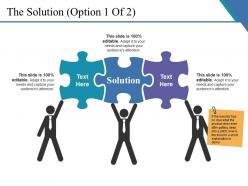
Bring a significant change through our, the solution presentation images PowerPoint design. We have created the PPT design for the solution building purpose. Curate our customer needs and develop successful plans through our design. We have shown the visual of three employees holding the three puzzle section here with the text solution incentre. Teamwork and harmony is the core of and business workforce. Get better at your core roles by including your data in this design and let the performance take place in your business meetings. Edit the design and include your key points here according to your vision. Color schemes and images utilized in the creation of this intrinsic PowerPoint layout are of high quality to impress the audience. Obtain your business meets a success, attract your audience with our the solution presentation images PowerPoint design and look for the growth curve. Bring the insolent to book with our The Solution Presentation Images. Bring about an improvement in conduct.
People who downloaded this PowerPoint presentation also viewed the following :
The solution presentation images with all 5 slides:
Become a champion for their cause with our The Solution Presentation Images. Become a hero in their eyes.
FAQs for The
Dude, visuals are seriously a lifesaver for presentations. They boost engagement by like 400% compared to just text - which honestly makes total sense because who wants to stare at boring bullet points? Your brain processes images way faster than words anyway. Charts, photos, infographics - they actually help people absorb what you're saying instead of mentally checking out. I learned this the hard way after giving way too many dry presentations early on. Just don't go overboard with flashy stuff that doesn't relate to your point. Keep them clean and relevant, and you'll notice people actually stay awake.
Dude, colors totally mess with people's heads during presentations. Red grabs attention but screams urgency. Blue makes everyone chill and trust you more. Green says "money" or "success" - you get it. I bombed this financial pitch once using bright orange everywhere. What was I thinking? Anyway, your audience is already judging your content based on colors before you say anything. Pick 2-3 that actually match your vibe and message. Don't go crazy with the rainbow thing.
Honestly, just stick to your main design - same colors and fonts so it doesn't look like you threw random graphics together at 2am. One key point per infographic, that's it. Don't cram everything in there like you're making a grocery list. High res is non-negotiable since nobody wants to squint at pixelated mess from the back row. I always test mine on different screens first because Murphy's Law will strike during your actual presentation. Oh, and have backup text ready - trust me on this one. Place them where they actually support what you're saying, not just because there's empty space to fill.
Honestly, visuals are a game-changer for making data less painful to look at. Nobody wants to stare at endless spreadsheets - your brain just glazes over. Charts and graphs let people spot patterns super quickly instead of hunting through rows of numbers. I learned this the hard way in my first presentation (total disaster). The trick is keeping it simple. If your visual needs explaining, you've overcomplicated it. People process images way faster than text anyway, so you're working with their brain instead of against it. Just don't go crazy with colors and fancy effects - that actually makes things worse.
Honestly, simple charts that tell a story work best - but they've gotta be dead simple to read in like 10 seconds. Before/after shots are gold. Emotional photos hit different than just data too. I always throw in customer testimonials with actual faces because people trust real people, you know? Progress timelines are clutch for showing momentum. One thing per slide though - don't cram everything together like I used to do. The whole point is making complicated stuff instantly clear while actually making people *feel* something. Oh, and if you wouldn't be convinced seeing your own slide for 10 seconds, it's probably too busy.
Honestly, stick to the 80/20 thing - mostly visuals with just a bit of text. Nobody wants to read a wall of bullet points (learned that the hard way). Let your images and charts tell the story while text just gives context or highlights the big takeaways. The whole point is someone should get your main message just by glancing at it. If they have to read every single word to understand what you're saying, you've probably gone overboard with text. Oh, and make sure your visuals actually support what you're saying - not just random stock photos that look pretty.
Don't cram a novel onto each slide - seriously, less is more. Tiny fonts are the worst because half your audience won't see anything past row three. Those cheesy stock photos? Skip them entirely, they make everything look so corporate and fake. Simple animations only - I've sat through way too many presentations with spinning text that just gave me a headache. Your slides should back up what you're saying, not just repeat it verbatim. Here's what I do: glance at each slide and see if the main point hits you immediately. If not, cut more stuff out.
Your brain processes visuals crazy fast - like 60,000 times faster than text. Adding the right images can boost how well people remember stuff by 65%. Stock photos are honestly pretty worthless though, sometimes they're just distracting noise. What actually works? Simple diagrams that match your content, real photos, even messy hand-drawn sketches. Think of visuals as memory hooks - they give people's brains multiple ways to store and recall your info later. I mean, anything's better than staring at endless paragraphs of text, right?
Honestly? Animation is super tempting but most people totally overdo it. Like, I get it - those spinning transitions look cool, but they actually make you seem less professional. Simple stuff works way better - just fade in your bullet points or use clean slide transitions. The bouncing text thing? Yeah, that's distracting as hell. Good animation can help people follow along with complex ideas, which is great. But when there's too much happening, your audience stops focusing on what you're actually saying. Your content's what matters, not the flashy effects. Keep it clean and purposeful.
Canva's probably your best bet to start - seriously so easy and the templates actually look good. I've wasted hours tweaking things in Photoshop before (don't be like me lol), but Adobe's great if you want total control over everything. Figma works well too for graphics. Even PowerPoint has some decent design stuff built in now, which is kinda surprising. But yeah, just go with Canva first - you'll have something that looks professional in like 10 minutes instead of spending your whole weekend on it.
Ok so three main things to think about: contrast, readability, and not overwhelming people. Make sure there's good contrast between text and background - at least 4.5:1 ratio. Don't just use color alone to show important stuff, throw in some icons or patterns too. Your text needs to be way bigger than what looks "nice" on your laptop - trust me on this one. Alt text for images is clutch. Oh and definitely run everything through one of those colorblind simulators online first - takes like two minutes and saves you from accidentally making something totally unreadable. Keep slides clean, test on different screens if you can.
Honestly, just go bold with your colors - high contrast is everything right now. White space is your friend too, people are so tired of cramped slides. Oh, and please upgrade your data viz game! Those boring bar charts aren't cutting it anymore. I've been obsessed with hand-drawn illustrations lately instead of cheesy stock photos. Dark mode is huge if you can pull it off. Interactive stuff works great for digital presentations. My advice? Start simple - clean up what you have first, then add trendy elements one by one. Don't overwhelm yourself trying to do it all at once.
Okay so visuals completely change how people actually absorb information - like, way more than you'd think. A simple before/after photo hits so much harder than a whole paragraph of stats, you know? Your audience stops just reading and starts actually *experiencing* what you're saying. Visuals let you control where people look first and turn boring abstract stuff into something concrete. Honestly, people remember emotional journeys way better than random facts. Figure out the main feeling or insight you want them to leave with, then build everything around that core emotion. It's kind of like creating a path for their brain to follow.
Static visuals are just fixed images - charts, photos, infographics that don't move. Dynamic ones have animations, videos, or interactive stuff that changes. Use static when you want people to really focus and digest info at their own speed. They're perfect for data that needs clarity. Dynamic visuals? They grab attention and show processes well, but honestly they can backfire if you go overboard. Nobody wants to sit through slides with crazy spinning graphics everywhere. Pick dynamic when you need to show change or keep energy high. Otherwise, stick with static. Just don't add animation unless it actually helps your point - flashy for the sake of flashy is annoying.
Dude, definitely dig into your audience's culture first. Colors are tricky - red screams luck in China but spells danger here in the West. White? Could mean pure or death depending where you're at. Don't forget reading patterns too (some go right-to-left). I totally bombed once using thumbs-up for a Middle Eastern client - whoops! Religious stuff with images can get weird fast. Honestly, your best move is finding local team members who'll catch your mistakes. Test small batches first. When you're unsure, just keep it simple and clean.
-
Very well designed and informative templates.
-
Topic best represented with attractive design.