

Machine learning icons example of ppt




Try Before you Buy Download Free Sample Product
 Impress Your
 Audience
 100%
100% Editable
 Save Hours
 of Time


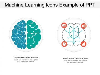
Make better decisions with patterns of data with our machine learning icons example of PPT. This presentation slide has been designed by our professional team members to display information on the development of computer programs which can learn from data sets by themselves without being programmed. With the help of this artificial intelligence machine learning you can showcase how computers learn automatically without human intervention or assistance and adjust actions accordingly to tackle solvable problems of a practical nature. This template of learn AI is useful to review computer learning’s has can be used to show that this technology has given us self-driving cars, practical speech recognition, effective web search, and improved understanding of the human genome. This data mining layout can be helpful to focus on prediction on known properties learned from the training data and how it also helps to focus on the discovery of unknown properties in the data. Demonstrate authority with our Machine Learning Icons Example Of Ppt. The audience will get behind you.
People who downloaded this PowerPoint presentation also viewed the following :
Machine learning icons example of ppt with all 5 slides:
Deliver beyond all dreams with our Machine Learning Icons Example Of Ppt. Be declared the firm favorite.
FAQs for Machine learning icons
Go with stuff people instantly recognize - brain networks, gears, circuit boards. That kind of thing just works. Keep it simple because these need to be readable when they're super tiny in apps. Don't get too artsy with weird abstract ideas, honestly nobody has time to figure those out. Stick with classic symbols like connected dots, robot faces, or those flow chart arrows. Oh and test them at 16px - if you can't tell what it is at that size, start over. Make sure your line thickness stays consistent throughout. Also worth checking they look decent in both light and dark modes since that's everywhere now.
Honestly, focus on what ML actually *does* for people instead of trying to show the technical stuff. A brain icon for neural networks? Perfect. Magnifying glass for pattern recognition? Works great. I've watched so many designers try to turn algorithms into pretty pictures and it just... doesn't land, you know? Simple shapes people already recognize are your friend here. Test them with real users - if they need an explanation, you're probably overthinking it. Build meaning through how you use the icons consistently across everything.
Blue and green are your safest bets - they scream "smart and trustworthy" without being intimidating. For neural networks, blue's perfect since it feels deep and complex. Green's awesome for decision trees because of that whole organic, growing vibe. Orange could work for optimization stuff, but honestly everyone's using it now and it's getting old. Skip red entirely - makes people think something broke. Oh, and cooler colors just look more professional overall. You want icons that feel technical but won't scare people away, you know?
Yeah, icons are super tricky across cultures! That gear symbol? Makes perfect sense to us for settings, but tons of people don't connect gears with digital stuff. Red's another weird one - we see "stop" but in China it's lucky. Brain icons for AI are hit or miss too since intelligence means different things everywhere. Honestly, I'd just test your icons with people from different backgrounds. Maybe throw in text labels as backup? Universal symbols are safer but honestly pretty boring sometimes. Short version: what seems obvious to you might be completely confusing to someone else.
Dude, you really need to keep ML icons super simple. When they're shrunk down to like 16x16 pixels on toolbars, anything complex just turns into mush. ML stuff is abstract enough already, right? I always stick to maybe 2-3 elements tops - clean shapes, basic colors. Neural networks and data processing icons work way better when they're not cluttered up. Honestly, I've seen so many designers go overboard and then wonder why their icons look terrible in actual apps. Test them small first! That's probably the most important thing.
Icons are honestly a game-changer for mapping out ML workflows! Start with database cylinders for raw data, then use arrows connecting to gear symbols for preprocessing. Brain or node icons work great for the actual models, and finish with chart symbols for outputs. Stick with the same icon family though - your team will thank you later. I'd map out whatever project you're working on right now this way. You'll probably catch weird bottlenecks or redundant steps that weren't obvious before. Way better than trying to explain everything in paragraphs!
Honestly, the worst thing you can do is make your icons super vague - like those generic gear or circuit symbols that scream "tech" but could mean literally anything. People should instantly know it's ML stuff. Also, cramming tons of detail seems smart until your fancy neural network looks like mush at 16px (been there). Skip the robot head thing everyone's doing. Instead, stick with actual ML concepts - neural nodes, data flow, that kind of thing. Keep your style consistent across the set, and definitely test them small before you finish. Trust me on that last part.
Honestly, icons are game-changers for ML presentations. They work like visual shortcuts - throw a brain icon next to "neural networks" and people get it instantly instead of drowning in technical terms. A target symbol for supervised learning? Perfect. Most people's eyes glaze over during tech talks anyway (been there). Visual cues keep them hooked and create those lightbulb moments when complicated stuff finally makes sense. Here's what works: pick one icon per major concept and stick with it throughout your whole deck. You're basically building a visual dictionary they'll actually remember later.
Figma's probably your best bet here - super easy to use and great for collaboration. You could also try Illustrator or Inkscape if you want something free. Vector tools are key since they stay sharp when you resize them. Honestly, Canva works too if design isn't really your thing, they've got decent tech templates. I'd skip Photoshop though, it's more for photos and you'll get pixelated icons. Oh and keep things simple - geometric shapes work best. Most good ML icons are pretty minimal anyway, no need to go crazy with details.
Dude, animated icons are a game changer for ML stuff. Static diagrams are honestly pretty useless when you're trying to show how neural networks actually work. With animation, people can watch data move through layers and see algorithms doing their thing in real time. Makes the whole "black box" problem way less intimidating. Your audience won't zone out either - movement naturally grabs attention better than boring static charts. I've seen presentations where this totally saved someone's demo. Definitely try it next time you're explaining something complex. Works especially well for those tricky concept transitions.
Yeah, ML icons are getting way more abstract these days. Thank god we're moving past all those cheesy brain graphics - I swear every startup had one for a while. Now it's all about geometric shapes, minimal node connections, data flow lines. Way cleaner look. Colors aren't as harsh either - softer gradients instead of that aggressive tech blue everywhere. Honestly, the best ones just hint at intelligence without being obvious about it. If you're designing something, go for symbols that feel like processing or analysis rather than trying to literally show what the algorithm does. Works better.
So tech folks can handle way more complex stuff - like icons referencing algorithms or data flows. But honestly? Even developers love when things are just clear and simple. Non-tech audiences need the obvious stuff - lightbulbs for insights, magnifying glasses for search, basic shapes. Here's the thing though - test your icons with real people from each group first. What makes total sense to you might be gibberish to them. I always start simple then add complexity only if the audience can actually handle it. Way better to be understood than to look smart, you know?
Honestly, just look at the original perceptron papers - those circle-and-arrow neural network diagrams basically became the template everyone still uses. Decision trees are huge too since the branching thing is so visual and makes sense right away. Oh, and the classic "black box" representation never goes out of style for some reason. Most modern ML icons are just variations on stuff from the 60s-80s papers, which is kind of wild when you think about it. Definitely check out Hinton's early neural net visualizations though - surprisingly clean designs that still influence icon work today.
Focus on contrast first - you'll want at least 3:1 color ratios and make sure everything works in grayscale too. Simple designs are your friend here. Honestly, I've seen way too many ML icons that look like someone threw shapes at a wall and called it "neural networks" or whatever. Keep them scalable and consistent in size. Don't forget alt text for screen readers - that's huge for accessibility. Also test how they look to colorblind users. Oh, and definitely run your current icons through WCAG guidelines if you haven't already. It's kind of a pain but worth it.
Honestly, yeah - visuals make a huge difference with ML stuff. Your brain latches onto those icons way better than just reading walls of text. Like when you see neural networks as those connected circle diagrams? Way easier to remember than definitions. Same with decision trees actually looking like trees. I always doodle little sketches when I'm learning new algorithms - sounds dumb but it works. The trick is staying consistent with whatever symbols you pick so your brain builds those connections. It's basically like how road signs beat written directions every time. Try it next time you're stuck on some concept!
-
Easily Editable.
-
The Designed Graphic are very professional and classic.