


Medical Clinic Brochure Trifold




Try Before you Buy Download Free Sample Product
 Impress Your
 Audience
 100%
100% Editable
 Save Hours
 of Time


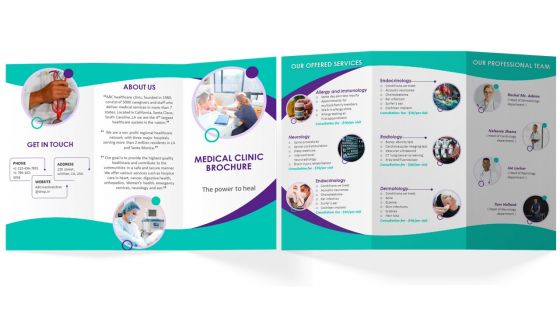
Advertise your Medical clinic business by using our outwardly engaging medical clinic Trifold Brochure Template. Use medical clinic pamphlet presentation template to give a brief information about company details, contact information, socials etc. With the assistance of the medical clinic brochure PowerPoint theme, you can talk about the offered services such as allergy and immunology, neurology, cardiology, endocrinology etc. Employ this professionally designed PPT brochure to showcase the various types of services provided and professional team qualification to engage and inflict interest of your customers.
People who downloaded this PowerPoint presentation also viewed the following :
Medical Clinic Brochure Trifold with all 1 slides:
Use our Medical Clinic Brochure Trifold to effectively help you save your valuable time. They are readymade to fit into any presentation structure.
FAQs for Medical
So definitely get your basic info up there first - services, doctor credentials, hours, contact stuff. Insurance details need to be super obvious because honestly that's what everyone checks before anything else. Location with directions is crucial too (people still get lost even with smartphones, it's weird). Your specialties should stand out from other clinics in the area. Patient reviews help a ton if you've got good ones. Oh and make online booking really easy to find - nobody wants to call anymore. Keep fonts big enough that older patients can actually read everything without squinting.
Honestly, visuals are a game-changer for medical practices. Most people just glaze over when they see medical jargon, but show them a photo of your actual equipment or a simple diagram? Suddenly they get it. Before/after shots work really well too - builds trust way faster than paragraphs of text ever could. Icons are clutch for service overviews since people scan websites super quickly anyway. I mean, think about how you browse stuff online. When patients can actually see what they're signing up for, they're way more likely to book and won't be as nervous walking in.
Oh man, typography can make or break your medical brochure! Patients will literally toss it if it looks sketchy or hard to read. Go with clean fonts like Arial or Helvetica for the main text - super readable, especially for older folks with vision problems. Make your headings bold and give them breathing room. I swear, some clinics think cramming tiny text everywhere looks professional, but it just screams "we don't care about accessibility." Stick with 11-12pt font minimum and don't be afraid of white space. Trust me on this one.
Honestly, most clinics totally blow this - you've got to actually show your real patient base in photos. Different ages, races, abilities, the whole deal. Throw in some key info in other languages or at least mention you do translations. Your writing matters too - ditch the medical jargon and keep it simple. Some people aren't great readers, so add icons and visual stuff. Oh, and bigger fonts with good contrast colors help everyone see better. I'd start by just asking your patients what would make them feel more welcome. They'll tell you exactly what's missing.
Put contact info and hours right at the top - that's what people need first. Group your services by department so it makes sense. Definitely use bullet points and lots of white space because honestly, who wants to read a wall of text when they're worried about their health? Skip the medical jargon too. Patients just want plain English. Oh, and include a good map since half your patients will be running late anyway. Before you publish it, show it to a few actual patients first. They'll spot the confusing stuff you totally missed.
Don't dump all your testimonials in one boring block - scatter them around instead. Grab short, punchy quotes that match each section, like "Dr. Smith's quick diagnosis saved me weeks of worry" right next to your diagnostic services. Patient stories work well as little sidebar boxes, but honestly? Keep them super brief since people barely read these things anyway. Just make sure the good stuff jumps out visually. Oh, and definitely get written permission first - maybe stick to first names only for privacy. The whole point is making testimonials feel genuine, not like you're desperately trying to sell people.
Go with blues and whites - they just work for medical stuff. Navy blue with white looks super professional and trustworthy. Muted greens like sage are good too since they're calming. Don't go crazy with bright colors though, you're not designing a concert flyer lol. Gray makes a nice accent color if you need something softer. Keep it to 2-3 colors max or it'll look messy. I always tell people to ask themselves: would I trust this place with my own healthcare? That's honestly the best test for whether your colors are working.
Honestly, the biggest thing is making it super obvious what they should do next. Put your phone number everywhere - people are scatterbrained and will lose it otherwise. Clear buttons like "Book today" or whatever work way better than being subtle about it. What really gets people though? Address their actual problems upfront. Like if you take their insurance, say it. If scheduling's a pain everywhere else, mention how yours isn't. Throw in some real patient reviews too - that stuff actually matters. Oh and whatever makes you different from other clinics, lead with that. People need a reason to pick you over the place down the street.
Dude, watch out for health claims - FDA doesn't play around. Never say "guaranteed results" or that you cure anything specific. HIPAA stuff gets messy too with patient photos or testimonials. My buddy got burned for overpromising once, wasn't pretty. Stock photos can even be risky sometimes. Keep everything factual and throw in those boring disclaimers nobody reads. Honestly though? Just run it past your lawyer first. I know it's annoying but beats getting slapped with violations later. Trust me on this one.
Honestly, QR codes are pretty clutch for brochures. Link them to appointment booking - that's where I'd start since people hate calling offices. You could also do virtual tours or patient testimonials, stuff that won't fit on paper anyway. Even older patients scan these now (my neighbor who still uses a flip phone somehow figured it out). Pre-visit forms are smart too - saves everyone time at check-in. Just don't go crazy adding QR codes everywhere. Pick one thing that'll actually help patients, not just because it looks techy.
Go with 8.5x11 tri-fold - honestly it's just the standard that works. Fits in purse pockets, looks professional in those little display holders. Don't cheap out on paper though, people get weird about flimsy medical stuff (can you blame them?). Cardstock with glossy or matte finish is your friend. Bi-fold's fine too if you're not cramming tons of info in there. Just make sure your staff will actually want to hand these out - I've seen some clinics go overboard and end up with brochures that sit untouched. Test how it folds before you print a thousand of them!
Honestly I'd say every 6 months if you're growing or adding stuff. At minimum once a year though. But here's the thing - if you get new staff, move locations, or change services? Update that thing immediately. Nothing makes you look more unprofessional than wrong phone numbers or listing services you don't even do anymore lol. Insurance changes are another big one to watch for. I always tell people to just set a quarterly reminder to skim through it. Catches most issues before patients start calling confused. Trust me, it's worth staying on top of.
Make your offers jump out with bright colors or boxes - that front panel needs your best deal since it's the first thing they see. Throw in expiration dates for urgency. Here's the thing though - lead with benefits, not just procedure names. "Pain-free whitening in 30 minutes" beats "laser whitening available" every time. Patient testimonials work great if you've got them. Keep the language super simple and focus on what they actually get out of it, not your fancy equipment. Oh, and don't forget a clear phone number to call!
Start with your basics - logo, colors, fonts, how you talk to people. Then just use them everywhere, honestly. Your brochure and website should feel like they're from the same company, you know? Make yourself a simple brand guide (doesn't have to be fancy, one page is fine) showing which colors go together, font combos, messaging examples. Super helpful when you're designing stuff later or if someone else is helping you out. Oh, and definitely look at what you've got now first - you'll probably spot some random inconsistencies to clean up. Makes a huge difference once everything matches.
Ugh, don't cram a novel onto that thing - nobody's reading walls of medical mumbo jumbo. Those cheesy stock photos with fake-smiling doctors? Skip 'em. Use fonts big enough that your 70-year-old patients can actually see without squinting. I've seen places forget their own phone number on there (seriously!). Just explain your services like you're talking to your neighbor, not writing a textbook. Clean layout, maybe 3 key things max. Oh, and double-check your address is on there - sounds obvious but you'd be surprised how often that gets missed.
-
SlideTeam is the best in the business. Their templates are engaging and customizable. You can rely on them.
-
Great work on designing the presentation. I just loved it!