

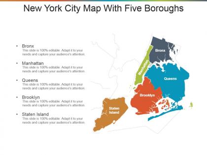
New york city map with five boroughs presentation design




Try Before you Buy Download Free Sample Product
 Impress Your
 Audience
 100%
100% Editable
 Save Hours
 of Time


Our New York City Map With Five Boroughs Presentation Design enable you to hammer away. Get down to it with full gusto.
People who downloaded this PowerPoint presentation also viewed the following :
New york city map with five boroughs presentation design with all 5 slides:
Help folks handle every difficulty with our New York City Map With Five Boroughs Presentation Design. They allow you to give constructive advice.


FAQs for New york city map with five
Key elements include clear borough boundaries, major landmarks, transportation networks, neighborhood distinctions, and appropriate scale ratios. These design components enhance readability by providing visual hierarchy, incorporating recognizable reference points like Central Park and Brooklyn Bridge, and using distinct color coding for each borough, ultimately delivering intuitive navigation tools that help viewers quickly identify locations and understand NYC's geographic relationships.
Color schemes enhance borough demographics understanding by creating visual hierarchies, establishing intuitive associations, and enabling quick pattern recognition across different data categories. Through strategic color gradients and contrasts, viewers can immediately identify population density variations, income distribution patterns, and ethnic compositions across Manhattan, Brooklyn, Queens, Bronx, and Staten Island, ultimately delivering clearer insights for urban planning and demographic analysis.
**INPUT**: What types of data visualizations effectively represent the unique characteristics of each borough? **OUTPUT**: Effective visualizations include choropleth maps, demographic heat maps, comparative bar charts, population density overlays, and economic indicator dashboards. These approaches streamline borough comparison by highlighting population distributions, income variations, and cultural demographics, with urban planners and real estate professionals finding that layered visualizations ultimately deliver comprehensive insights for strategic decision-making.
Historical context significantly influences borough representation through demographic patterns, infrastructure development, landmark emphasis, and cultural district highlighting that reflect each area's unique evolution and identity. Maps often showcase Manhattan's dense financial and cultural corridors, Brooklyn's diverse neighborhood boundaries, Queens' immigrant community clusters, the Bronx's park systems and urban renewal areas, and Staten Island's suburban development patterns, ultimately delivering geographical storytelling that helps viewers understand each borough's distinct character and strategic importance within the metropolitan landscape.
Landmarks serve as essential navigation anchors and visual reference points in borough-focused maps, helping users orient themselves while highlighting each area's unique character and cultural identity. By incorporating iconic structures like the Brooklyn Bridge, Statue of Liberty, and Central Park, designers create intuitive wayfinding tools that enhance user engagement and spatial understanding, ultimately delivering more effective navigation experiences across New York's diverse neighborhoods.
Typography distinguishes boroughs through strategic font variations, size hierarchies, color contrasts, and weight differentiation that create clear visual separation. By employing distinct typefaces for Manhattan versus Brooklyn, varying text sizes for prominence, and using complementary colors like navy for Queens and burgundy for the Bronx, designers ensure immediate borough recognition while maintaining overall map cohesiveness and readability.
Creating user-friendly NYC borough maps requires clear visual hierarchy, accurate geographical boundaries, intuitive color coding for each borough, readable typography, and strategic placement of major landmarks and transportation hubs. These design elements enhance navigation by minimizing visual clutter, incorporating familiar reference points like Central Park and Brooklyn Bridge, and using consistent symbols, with many urban planners finding that accessible maps significantly improve wayfinding experiences and reduce confusion for both residents and tourists.
Interactive elements significantly enhance NYC borough map engagement by enabling clickable neighborhoods, hover-over demographics, transit layer toggles, real-time data feeds, and customizable filtering options. These features transform static presentations into dynamic exploration tools, allowing users to drill down into specific areas like Manhattan's financial district or Brooklyn's cultural zones, ultimately delivering personalized insights and deeper neighborhood understanding.
Simplifying complex geographical information for borough maps presents challenges including maintaining accurate proportions, preserving essential landmarks, balancing detail with readability, ensuring clear boundary delineations, and representing transportation networks effectively. These design considerations require strategic choices between geographic precision and visual clarity, with many cartographers finding that successful borough maps prioritize functional navigation over comprehensive detail, ultimately delivering accessible wayfinding tools.
Cultural aspects significantly influence spatial representation by determining which neighborhoods, landmarks, cultural districts, and community centers receive visual emphasis, size allocation, and detailed labeling on borough maps. Design choices reflect each area's identity, with Manhattan's financial districts, Brooklyn's diverse ethnic enclaves, Queens' multicultural corridors, the Bronx's historical sites, and Staten Island's suburban character receiving proportional attention, ultimately delivering maps that serve both navigation and cultural recognition for residents and visitors.
Best practices for integrating transportation routes in borough maps include using distinct color coding for different transit types, maintaining consistent line weights, employing clear symbols for stations and stops, and ensuring adequate spacing between overlapping routes. These design strategies enhance readability by minimizing visual clutter, improving navigation accuracy, and creating intuitive wayfinding experiences, with many urban planners finding that strategic layering ultimately delivers more accessible and user-friendly metropolitan transportation guides.
Borough maps serve as powerful educational tools for teaching geography, demographics, cultural diversity, urban planning concepts, and historical development patterns across New York's five distinct areas. Schools utilize these visual resources to enhance social studies curricula, facilitate neighborhood research projects, and help students understand population distribution, transportation networks, and economic zones, ultimately delivering hands-on learning experiences that connect local geography to broader urban studies concepts.
Online mapping tools enhance NYC borough representation through interactive layers, real-time data integration, customizable zoom levels, and dynamic filtering capabilities that traditional static maps cannot provide. While traditional methods offer reliable reference points and broad geographical context, digital platforms like GIS applications enable users to overlay demographic data, transportation networks, and neighborhood boundaries simultaneously, with many urban planners finding that interactive tools streamline analysis and presentation workflows.
Target audiences for NYC borough maps include urban planners, real estate professionals, tourists and visitors, educators and students, and local government officials. These diverse groups benefit from clear geographical visualization for strategic planning, property analysis, navigation assistance, and educational purposes, with many organizations finding that well-designed borough maps enhance decision-making and operational efficiency.
Storytelling techniques enhance borough maps by incorporating historical timelines, demographic narratives, cultural landmarks, and economic evolution patterns that transform static geography into compelling visual stories. Through layered data visualization, interactive elements, and thematic color schemes, organizations can create maps that guide viewers through each borough's unique identity, community development, and cultural significance, ultimately delivering more engaging educational experiences and deeper neighborhood understanding.
-
Colors used are bright and distinctive.
-
Colors used are bright and distinctive.