

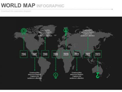
World map with linear year based timeline powerpoint slides




Try Before you Buy Download Free Sample Product
 Impress Your
 Audience
 100%
100% Editable
 Save Hours
 of Time


Hand out your findings with our World Map With Linear Year Based Timeline Powerpoint Slides. Express your conclusions with great clarity.
People who downloaded this PowerPoint presentation also viewed the following :
World map with linear year based timeline powerpoint slides with all 6 slides:
Our World Map With Linear Year Based Timeline Powerpoint Slides are very compelling. They leave your audience with no other choice than to applaud.

FAQs for World map with linear year based
Key features include accurate geographical representations, customizable timeline elements, data visualization capabilities, interactive zoom functions, and flexible color coding systems. These templates streamline global project presentations by enabling clear chronological storytelling, supporting multiple data layers, and delivering professional visual impact, with many organizations finding that well-designed map timelines enhance stakeholder engagement and strategic communication.
World map timeline slides enhance storytelling by creating visual narrative flow, connecting global events chronologically, and helping audiences understand geographical context over time. These slides enable presenters to demonstrate market expansion, historical progressions, and international developments more compellingly, with many organizations finding that geographic storytelling increases audience engagement and retention significantly.
World map timeline slides enable businesses to showcase global expansion milestones, international project phases, market entry strategies, supply chain evolution, and cross-border partnership development. These presentations effectively communicate geographic growth narratives, regional rollout schedules, and worldwide operational timelines, with many organizations finding that visual storytelling through mapped chronologies enhances stakeholder understanding and demonstrates strategic global vision.
World map timeline slides help illustrate historical events by combining geographical context with chronological progression, enabling viewers to visualize where events occurred and how they unfolded over time. These presentations enhance understanding through spatial-temporal connections, making complex historical narratives more accessible for educational institutions, museums, and corporate training programs, ultimately delivering clearer comprehension and improved retention rates.
Industries with global operations, such as multinational corporations, logistics companies, international consulting firms, and export-import businesses, benefit most from world map timeline slides. These visual tools enable organizations to showcase market expansion strategies, supply chain developments, and international project milestones effectively, while helping stakeholders understand geographic progression and timing, ultimately delivering clearer strategic communication and enhanced presentation impact.
Effective color schemes for world map timeline designs include monochromatic blues or greens, contrasting warm-cool combinations like blue-orange, sequential gradients from light to dark, neutral bases with accent colors, and professional corporate palettes. These approaches enhance data visualization by ensuring clear temporal progression, maintaining geographic readability, and supporting brand consistency, with many organizations finding that high-contrast combinations deliver optimal audience comprehension and engagement.
You can customize world map timeline slides by adjusting color schemes to match brand palettes, incorporating company logos and fonts, modifying timeline markers with branded icons, and adapting visual elements like borders and backgrounds. Through strategic color coordination, typography consistency, and branded visual elements, organizations enhance presentation cohesiveness while maintaining professional credibility, ultimately delivering more impactful stakeholder communications that reinforce brand recognition.
Common mistakes include overcrowding maps with excessive text, using inconsistent color schemes across timeline periods, selecting inappropriate map projections that distort regions, and failing to maintain clear chronological flow. These errors confuse audiences by creating visual chaos, reducing geographical accuracy, and disrupting narrative coherence, with many presenters finding that simplified designs with strategic color coding ultimately deliver better audience engagement and comprehension.
PowerPoint, Keynote, Canva, Adobe Illustrator, and Prezi offer robust features for world map timeline presentations, each providing customizable templates, interactive elements, and geographic visualization capabilities. These platforms streamline design workflows by enabling seamless integration of temporal data with geographic context, automated formatting, and collaborative editing features, with many organizations finding that combining mapping tools with presentation software ultimately delivers more engaging stakeholder communications and strategic planning outcomes.
World map timeline slides integrate seamlessly with charts, graphs, infographics, and statistical overlays by combining geographic context with temporal data visualization. Through strategic layering techniques, organizations can display demographic shifts, market expansion patterns, and performance metrics simultaneously, with financial services and retail sectors finding that these integrated approaches enhance stakeholder understanding while delivering more compelling, data-driven presentations.
The ideal world map timeline slide includes 3-5 key events or milestones, brief descriptive text for each point, and clear visual markers connecting geographic locations to specific time periods. This balanced approach prevents information overload while maintaining audience engagement, with many presenters finding that strategic selectivity enhances comprehension and retention more effectively than comprehensive detail.
**INPUT**: How can you effectively present multiple timelines on a single world map slide? **OUTPUT**: Present multiple timelines by using color-coded routes, layered animations, and differentiated visual elements like varying line weights, icons, and legends. This approach enables organizations to showcase complex historical progressions, market expansions, or operational developments across regions, with many companies finding that strategic visual differentiation ultimately delivers clearer audience comprehension and enhanced storytelling impact. [Word count: 54 words]
**INPUT**: What trends are emerging in the design of world map timeline slides? **OUTPUT**: Emerging trends in world map timeline slide design include interactive elements, animated transitions, data visualization overlays, mobile-responsive formats, and customizable regional focus capabilities. These design innovations streamline complex global presentations by enhancing audience engagement, improving information retention, and enabling real-time data integration, with many organizations finding that modern interactive formats deliver significantly better stakeholder comprehension. [Word count: 60]
World map timeline slides cater to different learning styles by combining visual geography with chronological progression, spatial relationships, and interactive elements. Visual learners benefit from color-coded regions and geographic context, while kinesthetic learners engage through interactive navigation, and auditory learners process sequential storytelling, ultimately enhancing comprehension and retention across diverse audiences.
World map timeline slides enhance geographical education by visualizing historical events, demographic changes, territorial shifts, climate patterns, and cultural developments across different time periods. These interactive presentations enable students and educators to understand spatial-temporal relationships more effectively, with many educational institutions finding that combining geographical context with chronological progression significantly improves comprehension and retention of complex global concepts.
-
Unique and attractive product design.
-
Amazing product with appealing content and design.