


World map with team and location pins powerpoint themes




Try Before you Buy Download Free Sample Product
 Impress Your
 Audience
 100%
100% Editable
 Save Hours
 of Time


Come across as intense with our World Map With Team And Location Pins Powerpoint Themes. Convince folks that you are an highly intelligent individual.
People who downloaded this PowerPoint presentation also viewed the following :
Content of this Powerpoint Presentation
Description:
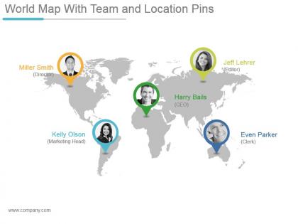
The image is a PowerPoint slide titled "World Map With Team and Location Pins," featuring a map of the world with pins marking the locations of team members along with their names and job titles. It's a visual representation of a globally distributed team, showcasing a company's workforce's international presence and reach. This kind of slide is useful for presentations that highlight the global nature of a company's operations and team diversity.
Use Cases:
This slide applies to various industries that operate on an international scale and require coordination across different geographical locations.
1. Multinational Corporations:
Use: Displaying the global distribution of key personnel.
Presenter: Company Executive
Audience: Stakeholders, International Teams
2. Technology Firms:
Use: Highlighting worldwide tech talent and leadership.
Presenter: HR Manager
Audience: Employees, Recruiters
3. Consulting Firms:
Use: Showcasing the firm's international expertise and reach.
Presenter: Managing Partner
Audience: Clients, Business Partners
4. Non-Profit Organizations:
Use: Illustrating the global impact and team locations.
Presenter: Program Director
Audience: Donors, Volunteers
5. Educational Institutions:
Use: Presenting international faculty and exchange programs.
Presenter: Academic Dean
Audience: Students, Faculty
6. Travel and Tourism:
Use: Demonstrating the scope of global operations and representatives.
Presenter: Travel Agency Head
Audience: Travel Agents, Customers
7. Logistics and Shipping:
Use: Outlining the company's logistical network and key operation centers.
Presenter: Logistics Coordinator
Audience: Suppliers, Business Customers
World map with team and location pins powerpoint themes with all 5 slides:
Our World Map With Team And Location Pins Powerpoint Themes will aid your effort. Your thoughts will flow that much smoother.
FAQs for World map with team and location
Definitely go for templates with editable regions first - you can color-code different countries however you want. Resolution matters big time (trust me on this one, pixelated maps look awful on projectors). Think about detail level too - do you need just borders or cities and stuff? Oh, and if you're showing any stats or data comparisons, get one with visualization features built in. I'd honestly just grab a few free samples first to mess around with. Check they work with whatever software you're using. Most decent ones come with multiple layouts anyway, so you'll have options.
Maps are honestly such a game-changer for presentations. They turn boring data dumps into something people can actually visualize and follow. Everyone's weirdly drawn to maps anyway - like, you put one up and suddenly people are paying attention. You can show expansion plans, market differences, supply chains, whatever. The trick is picking one that highlights the regions that matter most to your story. Don't just slap a world map on there because it looks cool. Make sure it's actually doing work for your main point, not just sitting there looking pretty.
Logistics companies are huge on these - they're always mapping shipping routes and showing off their global reach. Sales teams love them too for client locations and expansion plans. Travel companies use them obviously, but that's more niche. You'll see them in consulting, education, even government stuff for demographic data. International businesses are pretty much a given. Honestly, if you've got any global angle to your business or need to show geographic data, these templates are a lifesaver. Way better than trying to build maps from scratch - that's just painful.
Yeah totally! World map templates are super flexible - you can throw in population data, sales numbers, weather patterns, whatever you're working with. Colors, legends, data labels are all customizable. Some even do animations which is pretty cool. Just make sure you pick the right style first - choropleth works great for comparing regions, pin maps for specific spots. Oh and check the file format before you dive in, some are way easier to edit than others. I'd start basic then add more fancy stuff once you get the hang of it!
Don't use crazy color schemes that make everything blur together - your audience will hate you for it. Tiny fonts are the worst too, nobody can read that from the back. I'd skip those weird map projections that make Africa look like a pancake unless you're actually talking about projections (which honestly gets pretty nerdy). Keep your legend simple and don't plop it right over the important stuff. One map shouldn't have a million data points crammed on it. Visual chaos is real. Your goal? People should glance at it and immediately get what you're showing them.
Honestly, this stuff gets tricky fast. Your audience's location totally changes how they'll read your map. Europeans might expect to see themselves in the center, while Pacific regions use completely different projections. Colors are weird too - red screams "danger" to some people but means good luck in other cultures. Border disputes are probably the biggest minefield though (looking at you, every contested territory ever). I'd say figure out who's actually seeing this thing first, then pick a template that won't piss anyone off or make your data look biased.
For most stuff, just go with PowerPoint or Google Slides - they're solid with maps and you probably already know how to use them. Canva's pretty sweet if you want something that looks more polished without much effort. I wouldn't bother with Illustrator unless you're doing some crazy customization (which honestly sounds like a headache). Prezi works well for interactive maps, though I haven't messed with it in forever. Figma's another option if you're into that. Start with whatever you're comfortable with first - there's tons of templates out there so you won't have to learn new software just for this.
Color choice makes or breaks your map - seriously affects how people read the data. Go darker for higher values, lighter for lower ones. Never use red/green together (colorblind folks can't tell them apart). Sequential schemes work well for ranges. Got a meaningful center point like zero? Try diverging palettes instead. Don't go crazy with too many colors though - you'll just confuse everyone. Oh, and definitely check how it looks on different screens first. I've seen maps that looked great on my laptop but were completely unreadable on the projector.
Honestly, animated maps are awesome for storytelling - like showing how cities expanded over decades or highlighting regions as you talk about them. Time everything with your narrative flow. But here's the thing: don't get carried away with flashy effects because they'll just distract people. Simple fade-ins work great, or zooming into areas while you're discussing them. Your audience should listen to your points, not sit there mesmerized by some spinning globe animation (though those do look pretty cool). Start simple with basic transitions, then maybe add complexity if it actually helps your story.
Interactive maps are a total game changer - way better than just pointing at stuff on a screen. You can add clickable hotspots, hover effects that show data, or let people zoom into countries they actually care about. Trust me, it'll keep everyone awake during those brutal strategy meetings (speaking from experience here lol). Complex global data suddenly becomes way more digestible when people can click around themselves. Just throw in 2-3 interactive elements - even basic pop-ups with key stats work. Your audience will actually pay attention instead of checking their phones.
Honestly, world map templates are a game-changer for presenting market data. Color-code your regions by sales or growth - way better than making people stare at endless spreadsheets. You'll spot your strongest markets instantly, plus any gaps become super obvious. Heat maps work great too, or try bubble charts if you want to get fancy. I've seen executives actually pay attention during presentations when the data's visual like this. Makes those quick strategic calls so much easier when everything's laid out geographically. Definitely beats the old PowerPoint-heavy approach most companies still use.
Color coding with darker shades for higher concentrations is your best bet here. Just don't go crazy with the ranges - 3 to 5 max or it'll look like a mess. One demographic per map, trust me on this. Population density overlays help a ton when you're dealing with raw numbers instead of percentages. Oh, and definitely check that your colors work for colorblind folks - learned that one the hard way. Your legend should be simple and not blocking anything important on the map. Don't forget to cite your data source and when it was collected since this stuff changes constantly.
Honestly, world map templates are a game-changer for presentations. Kids actually retain info when they can see trade routes or population data mapped out instead of just hearing about it. Way better than lecturing at them about random locations they can't picture. You can throw in colors, icons, whatever data you need for your lesson. Interactive ones are pretty cool too - students click on different regions to dig deeper. I've used them for everything from tracking historical events to showing climate patterns. Trust me, it beats the old "point at a wall map" approach by miles.
Maps totally change how you see data - like, patterns just jump out at you that you'd never catch in a spreadsheet. Regional trends become super obvious, plus you can quickly spot which areas are killing it vs struggling. I've watched CEOs literally pivot their whole approach after seeing their data mapped out geographically. Heat maps work great for showing volume or intensity across different regions. Sales territories, customer locations, supply chain stuff - maps handle it all way better than boring charts. Actually makes meetings more interesting too, which is saying something.
Interactive stuff is huge right now - clickable regions, animated transitions, real-time data overlays. Clean, minimalist designs are everywhere too (honestly such a relief after those awful cluttered school maps). Dark mode's pretty much expected now. Oh, and everything needs to work on mobile since everyone's presenting on tablets. 3D and isometric styles are really taking off, especially for tech companies. I'd skip PowerPoint's built-in templates though - the marketplace options are so much better. Way more current.
-
Colors used are bright and distinctive.
-
Helpful product design for delivering presentation.