

Our locations world map ppt slides




Try Before you Buy Download Free Sample Product
 Impress Your
 Audience
 100%
100% Editable
 Save Hours
 of Time


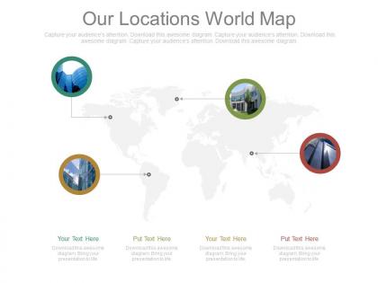
Our Locations World Map PPT Slides, helps to visually place the pins over the top on the PPT design which helps to accurately mark the position of any place on the map. The PowerPoint presentation helps reconcile, modernize the facts, track major economic changes, demarcate the boundaries, check government offices, museums, foreign embassies, bus stands, airports and other locating counters. The PPT layout helps with having a good travel map, mountains, oceans, seas and boundary of the mainland country. In order to display the geographical features like grasslands, water bodies, islands, soil type and land use plus track the cultural diversity the presentation slide is of utmost importance. Business prospects can be enhanced by keeping a track of important resources available at strategic locations using the presentation slide, and add info graphics to show areas that your business caters, people you serve and the business partners you work with. The presentation slideshow helps in saving a lot of time, enhance the skills, work on grey areas and thus perform better.Use of our Our Locations World Map Ppt Slides can be gratifying. Your decision to employ them will be fruitful.
People who downloaded this PowerPoint presentation also viewed the following :
Our locations world map ppt slides with all 4 slides:
Display a futuristic approach with our Our Locations World Map Ppt Slides. Your eyes will be focused on the future.
FAQs for Our locations world
Hey! So for world map templates, you'll want decent resolution first - pixelated borders look terrible when you're presenting. Also grab something with editable regions so you can color-code different countries. Match your presentation vibe too, whether it's clean and minimal or more corporate-y. Honestly, I'd download a few free ones first to mess around with before spending money. Oh, and if you need callouts or data stuff, check for those features ahead of time - learned that one the hard way!
Match your map colors to whatever slide theme you're using - most templates make this super easy to change. Honestly, I always get way too into picking the perfect ocean blue, but whatever. Highlight just the regions that matter for your presentation with contrasting colors or data overlays. Country labels? Ditch them if they don't add anything useful. Oh, and keep your legend simple - position it somewhere that won't fight with your main points for attention.
Honestly, high contrast is your friend here - dark blues with light grays instead of those wishy-washy pastels that disappear on screen. Don't go crazy with colors though. Three to five max, or it looks like someone threw up a box of crayons. Skip red-green combos since colorblind folks can't tell them apart. ColorBrewer's actually pretty decent for finding accessible palettes. Oh, and definitely test your colors on whatever projector you're using beforehand - I learned this the hard way when my "perfect" blues turned into muddy grays under those awful fluorescent conference room lights.
Honestly, those animated world maps are total game-changers for presentations. Your audience actually pays attention instead of scrolling their phones! You can zoom into regions, show data spreading between countries - way better than boring spreadsheets. Movement makes everything click faster too. People get those complex global trends without squinting at charts. I'd start wide with the whole world view, then animate down to whatever you're focusing on. Trust me, beats the hell out of another slide with bullet points. Geographic stuff just makes more sense when it's visual like that.
Honestly, heat maps are your best friend for this stuff - they show hot and cold spots across regions instantly. Go with data that has obvious geographic patterns like sales by territory, demographics, or market penetration. Choropleth maps work great too (those are the ones where different areas get shaded based on your data). Bubble charts on maps are solid for showing volume stuff like revenue or user counts. One thing though - don't try to cram everything onto a single map or it'll look like a mess. Pick your most important metric first, then maybe add others if there's room. Trust me on this one.
Oh man, world maps are tricky! First off, projections matter - what looks normal to Americans might seem weird to folks in Asia since they're used to different "centers." Colors can bite you too; red symbolizes totally different things across cultures. Honestly, disputed borders are where things get really messy fast. You don't want to accidentally piss off entire regions over territorial lines. Some areas end up looking tiny or chopped off depending on your projection choice. Best bet? Run it by people from your target audience first. Or just use multiple regional maps instead of trying to make one universal version work.
Maps are perfect for showing character journeys - just animate the routes between locations! Color coding works great for multiple storylines happening at once. Zoom into specific countries while you're narrating key scenes, or overlay photos and icons on locations for extra context. I've seen some really creative stuff with this technique. Revealing map sections progressively is super effective too, especially if your story unfolds geographically. Just don't dump the entire world map on screen at once (learned that the hard way). Match your reveals to the story's pacing and you'll be golden.
Dude, world map slides are clutch for geographical data. Your audience gets instant visual context - they see exactly where trends are hitting and how they spread. Color coding and heat maps work great for this stuff. Way better than drowning people in spreadsheets, honestly. The patterns become super obvious, like watching a trend move from coastal cities inland or comparing how different continents perform. I always start with the main insight first. Then layer your data on top to tell the geographic story. Makes everything click faster than just throwing numbers at people.
Honestly, just start with PowerPoint or Google Slides - they've got solid map templates you can customize pretty easily. Canva works great too if you want something that looks more polished without doing much work. Most people way overcomplicate this stuff. PowerPoint handles like 90% of what you'll actually need for presentations. If you're doing something super advanced with interactive features, maybe look into Tableau or Illustrator, but those are way more complex to learn. I'd probably just mess around with the basic templates first and see what happens. You can always add your own colors and data points from there.
Honestly, static maps are way better for big presentations or anything printed. Interactive ones look flashy but they're such a distraction - everyone just starts hunting for their neighborhood instead of paying attention to your actual point. Been there, done that. Static maps load quicker too and won't crash on you mid-presentation. Plus they work great in PDFs and emails. If you just need people to see specific data without them clicking around everywhere, definitely go static. Save the interactive stuff for when exploration is actually the goal.
Just overlay the charts right on the map regions where your data actually applies - don't waste slides on separate charts. Semi-transparent backgrounds are clutch so you can still see the geography underneath. Bar charts are perfect for comparing countries, heat maps show density patterns really well. Honestly though? Skip pie charts unless you're breaking down regional totals - they're usually just visual clutter. Use callout boxes with tiny charts that point to specific countries. Way cleaner that way. The whole point is making your data tell the geographic story, not fight against it.
Honestly, world map slides are perfect for showing off your global reach or expansion plans. Instantly shows stakeholders you're thinking big picture. Use them to highlight target markets, point out where competitors are struggling, or showcase growth opportunities by region. They're gold when you need approval for international expansion or budget allocation - though I've seen too many people just throw in boring generic maps. Color-code your priority markets instead. Make it actually tell your growth story with real data. Way more convincing than some plain template everyone's seen a million times.
So basically every industry uses world maps differently depending on what they're tracking. Sales teams love plotting revenue by region, while logistics folks map out their shipping routes and supply chains. Marketing departments show where their campaigns are hitting different markets. Healthcare orgs map disease outbreaks or treatment availability - you've probably seen a million of these during COVID briefings, honestly. Tech companies track user adoption globally, investment firms show portfolio performance worldwide. The trick is making sure your data actually tells a story your audience cares about, not just slapping numbers on a map because it looks fancy.
Honestly, the worst thing you can do is cram everything onto one map - nobody can read that mess. Also skip red/green combos since colorblind people can't distinguish them. Use colors with good contrast or you'll lose half your audience. Mercator projection is boring but safe for presentations, unlike those funky ones that make Greenland look massive. Short sentences work better than long ones. Always throw in a legend and cite your sources (professors love that stuff). Test it from across the room first - if you can't read it, neither can they.
Dude, multimedia totally changes the game for world map presentations. Videos work great - like showing Thai street food when you're talking about Southeast Asia. Audio clips are clutch too, maybe local music or language samples. Interactive hotspots let people click around and explore different regions themselves. Static maps just feel outdated now, you know? I mean, why not make it engaging? The trick is telling actual stories instead of just dumping information on people. Oh, and don't go crazy with it - stick to one or two elements per slide or you'll overwhelm everyone. Start simple and build from there.
-
The content is very helpful from business point of view.
-
Designs have enough space to add content.