


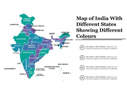
Map of india with different states showing different colours




Try Before you Buy Download Free Sample Product
 Impress Your
 Audience
 100%
100% Editable
 Save Hours
 of Time


Our Map Of India With Different States Showing Different Colours can carry a heavy burden. You will find they have great capacity.
People who downloaded this PowerPoint presentation also viewed the following :
Map of india with different states showing different colours with all 5 slides:
Free the genie with our Map Of India With Different States Showing Different Colours. Give folks enough chances to fulfill their deepest desires.
FAQs for Map of india with different states
So India's got 28 states and 8 union territories - the size differences are wild though. Rajasthan's absolutely massive while Goa's this tiny coastal strip. Each state basically has its own language too, which makes traveling interesting. The borders actually follow old cultural and linguistic lines rather than just random administrative stuff - you can literally see where ancient kingdoms used to be. Union territories work differently from regular states governance-wise, so that's worth knowing. Oh, and don't expect the language thing to be straightforward anywhere outside major cities!
So basically, political boundaries are what make India's state map look the way it does - they show where one state's government ends and another starts. Natural stuff like rivers sometimes match up with these lines, but not always. What's wild is how much those old British colonial decisions still affect the borders we see now. New states can pop up too (remember when Telangana split off?), so the map isn't set in stone. Oh and heads up - if you're using Indian data for anything, make sure you've got the current boundary version since they do shift around occasionally.
Oh man, India's state map is actually super useful for teaching! Geography basics are obvious - capitals, borders, where everything is. But it gets way more interesting when you dive into the cultural stuff across different regions. History lessons work great too, especially showing how borders shifted over time (which honestly blows my mind sometimes). Economics is another angle - agricultural zones, industries, resources by state. For activities, try map quizzes or have kids research assigned states. My favorite idea? Create a big classroom wall map where students keep adding facts and pictures. It becomes this cool ongoing project that actually grows with them.
So the massive thing was 1956 - they basically scrapped all the British borders and redrew everything by language groups. Pretty smart actually. Before that, right after independence, India had to absorb like 500+ princely states which must've been chaos. More recently you've got splits like Telangana from Andhra Pradesh in 2014, plus Uttarakhand, Jharkhand, and Chhattisgarh all carved out in 2000. Just heads up - if you're doing any long-term data stuff, these boundary changes will mess with your regional comparisons across decades.
Dude, India's map is wild when you think about it. The Himalayas literally carve out the northern borders, and coastal states just wrap around the peninsula following the water. Rajasthan basically IS the Thar Desert, while Kerala hugs that gorgeous tropical coast down south. Rivers and mountain ranges shaped everything - northeastern states are tiny and mountainous, but central ones stretch across these massive plains. Honestly, the geography explains so much about why each region feels different. If you're planning that trip we talked about, definitely look at the terrain first. Climate, culture, even the food changes based on whether you're in desert, mountains, or coast.
Oh man, so basically India's state borders follow cultural lines way more than just geography. Like Punjab is all about Sikh culture, Kerala has that distinct South Indian vibe. The whole map got completely redrawn in 1956 based on languages - which honestly makes so much sense when you think about it. Most states even use traditional colors and cultural symbols in how they represent themselves visually. It's wild how centuries of cultural stuff just became political boundaries. Way more interesting than I expected when I first looked into this!
Honestly, satellite imagery is your best bet - the high-res stuff shows exact boundaries way better than old methods. GPS coords will be dead-on accurate too. There's this LiDAR tech that's pretty incredible for 3D terrain mapping, though I know it sounds fancy. You can even get locals to verify boundaries through mobile apps, which is kinda cool. The trick is mixing different data sources so you can double-check everything. But real talk? Just updating to recent satellite data will probably fix most accuracy issues right off the bat.
Honestly, it's a total mess of red tape and different agencies that can't get their act together. Survey of India, state revenue departments, local offices - they all work at completely different paces. Border disputes drag on forever too (Karnataka and Maharashtra have been at it for decades), which makes updating anything super political. Rural areas are still using ancient surveying methods, and digitizing takes ages. I'd check the Survey of India's official site for current maps, but definitely look up recent news too since there's always some boundary drama brewing somewhere.
Honestly, you can't just look at India's map without thinking about demographics - it totally changes everything. Take Kerala vs Rajasthan. Kerala's this tiny slice but has incredible literacy rates, while Rajasthan is huge but way less developed. Population density is wild too - some states are packed, others barely have anyone. What's really interesting is how languages and religions don't match up with state lines at all, so you get these crazy migration patterns. I always overlay the demographic stuff when I'm looking at maps there - otherwise you're missing the whole story of what's actually going on.
Definitely go with color coding - makes it super easy to spot boundaries right away. Put clear labels inside each state when you can fit them. Bold lines between states help too, especially when neighboring colors are similar. Just don't go overboard with the colors though - nobody wants their map looking like a kindergarten art project! For tiny states like Goa, you might need to get creative with label placement. If your colors represent data, throw in a legend. Keep your text consistent throughout and you're golden.
Dude, interactive maps are so much better than those static ones that just sit there. People can hover over states for quick stats or click to dive deeper into the data. You can filter by population, GDP, whatever - honestly makes everything way more engaging. I spent like 20 minutes yesterday just clicking around one about migration patterns. Short sentences work. Longer ones let you explain how you can layer different datasets or zoom into specific regions. Animations showing changes over time are pretty cool too. Just don't go overboard with flashy stuff that'll slow everything down.
Dude, those state maps are everything during Indian elections. Each state gets different numbers of Lok Sabha seats based on population, so places like UP or Maharashtra are worth SO many more seats than smaller states. News channels go crazy with the maps on election night - it's honestly pretty fun to watch. You can spot which regions belong to different parties and see swing states that might flip. Oh and here's the thing - if you're watching coverage, focus on how the big states are doing first. They basically decide everything. The smaller ones matter too but the math is just different, you know?
So basically, most Indian state borders follow language lines - they reorganized everything in 1956 around this. Telugu speakers got Andhra Pradesh, Tamil speakers got Tamil Nadu, Bengali speakers got West Bengal, etc. Pretty smart move honestly. Though some bigger states like UP and Maharashtra still have multiple languages mixed in, so it's not 100% clean. I think I learned this in some geography class forever ago. Anyway, when you're looking at the map, those boundaries aren't really about mountains or rivers - they're mostly about which language people speak in that area.
Honestly, Adobe Illustrator's probably your best shot for this - super easy to mess with colors and borders on vector maps. QGIS is solid too if you don't mind free software (though it's a bit clunky at first). Figma's great if you're already living in your browser anyway. I've actually seen people pull off decent maps just using Canva templates, which feels weird to admit but whatever works, right? Mapbox is cool for interactive stuff. Oh, and grab an SVG base map first - makes everything way easier than starting from scratch. What's this for anyway?
Dude, state maps are lifesavers during disasters. They show you exactly where one state ends and another begins - super important when you're trying to figure out who's responsible for what. Population density stuff helps you prioritize the worst-hit areas first. You can map out evacuation routes and coordinate rescue teams without accidentally stepping on another state's toes (trust me, bureaucracy doesn't pause for emergencies). Communication networks follow these boundaries too. Oh, and keep a digital copy on your phone - way easier than fumbling with paper maps when everything's chaotic.
-
Design layout is very impressive.
-
Excellent design and quick turnaround.