

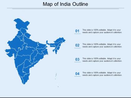
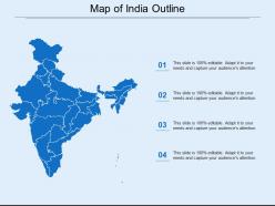
Map of india outline




Try Before you Buy Download Free Sample Product
 Impress Your
 Audience
 100%
100% Editable
 Save Hours
 of Time


Drive home the importance of abiding by your decisions with our Map Of India Outline. It helps enunciate your conclusions.
People who downloaded this PowerPoint presentation also viewed the following :
Map of india outline with all 5 slides:
Our Map Of India Outline ensure you don't jump the gun. The chain of events will flow correctly.
FAQs for Map
Look for that huge triangle hanging down into the ocean - that's the dead giveaway. The west coast is pretty much straight along the Arabian Sea, but the east side curves way more dramatically. You'll spot Sri Lanka too, that little teardrop island just sitting there at the bottom. Up north it gets all jagged and messy where the Himalayas meet China and those other countries. Honestly, once you see it a few times, India's probably one of the easiest countries to pick out on a map. Way more distinctive than most places that just look like random blobs.
Blank outline maps are perfect for this! Get kids labeling states, capitals, rivers - way more engaging than staring at finished maps. Color-coding regions works great too, or having them trace trade routes. Trust me, they remember stuff so much better when they're actually filling it in themselves. Build up layers over different lessons - climate zones one day, cities the next. Oh and use blank maps for quiz review! Once they've drawn Rajasthan like five times, they'll never forget where it is.
So basically the 1947 Partition created most of India's borders when British India split up - that's where those weird northwestern and eastern boundaries come from. The 1962 China war sorted out the northern borders, though honestly some areas are still a complete mess with disputes. Bangladesh becoming independent in 1971 finalized the eastern side. Before all this, the British had been slowly piecing together different princely states and territories. Oh, and if this is for a map project or something, just heads up that Kashmir boundaries can be pretty touchy depending on who's looking at it.
Look at India's map and you'll see why it's so culturally insane. The Himalayas up north basically isolated whole communities. Coastal areas developed totally different maritime vibes. That huge central chunk? Perfect space for languages and traditions to just... evolve separately. We're talking 28 states plus 8 union territories - each doing their own thing. Deserts, rainforests, mountains - all these geographic barriers created little pockets where cultures could grow independently. I swear every climate zone exists there. The physical shape literally explains why there's such mind-blowing diversity crammed into one country.
So outline maps of India work great for business stuff - you can color-code states by sales numbers or show where your customers are clustered. Mark cities where you're planning new stores or offices. Honestly, it beats the hell out of staring at spreadsheets when you're trying to convince executives about expansion plans. I've done this before and people actually pay attention when data looks visual like that. Just grab a high-res version and maybe use different icons for different metrics. Way more engaging than tables of numbers, trust me.
Dude, definitely check out Adobe Illustrator if you can swing it - the vector stuff is perfect for maps that won't look pixelated when you resize them. Can't afford it? Inkscape does basically the same thing for free. QGIS is another option but honestly it's way more than you probably need unless you're getting into serious geographic data stuff. Oh, and I just remembered Canva actually has some India map templates now if you want something super quick. I'd say just start with whatever you already have downloaded and see how it goes. You can always switch later if it's not working out.
Dude, digital maps are a game changer for geography class! Kids can actually click and drag stuff around instead of just staring at boring textbook pages. Interactive whiteboards work great - students can zoom in, layer different info, fill in those blank outline maps digitally. It's honestly night and day compared to traditional methods. Your students will actually remember state capitals when they're physically moving things around on screen. Plus tablets work too if you've got them. The hands-on approach just sticks better, you know? Way more engaging than the old "point at the wall map" thing we all remember from school.
Ugh, the scale thing is brutal - India's so huge that you're constantly picking between detailed coastlines or actually fitting readable text. Mountain ranges like the Himalayas and Western Ghats? Total pain to draw clearly with just outlines. I'd start simple honestly - basic shape first, then layer in features based on what you actually need. The Ganges delta alone will make you want to quit since all those tiny rivers create visual chaos. Oh and don't even get me started on whether to include every little island group. Rivers are probably your biggest headache though - they get messy fast.
So India's map shape comes from all those political borders - international ones with Pakistan, China, Bangladesh create the outer edges. State boundaries divide everything up inside. Kashmir makes it complicated though, since it's disputed territory. Different countries literally show it differently on their maps, which is kinda wild if you think about it. Your map's accuracy totally depends on who made it and what political stance they're taking. I'd check the source first so you know whose version of the boundaries you're actually looking at.
So India's got 28 states and 8 union territories total. You'll definitely spot the big ones first - Rajasthan, Maharashtra, UP, Madhya Pradesh - they take up so much space it's hard to miss them. Union territories like Delhi and Puducherry usually get marked with different colors or little dots to set them apart from regular states. The northeastern states though? Good luck with those - they're tiny and honestly kind of blend together unless you really zoom in. I'd start by learning where the massive states are, then worry about the smaller stuff later. Way less overwhelming that way!
So outline maps are actually perfect for what you're doing! Mark your target areas, show donors where the impact is happening - honestly, they eat that visual stuff up. Color-code different states by literacy rates or health stats, whatever data you're working with. They're great for tracking how projects spread geographically too. My cousin's NGO uses them for every funding pitch now. Figure out what story your numbers tell first, then let the map do the heavy lifting. Works way better than boring spreadsheets in presentations.
Outline maps of India are perfect for tracking regional development differences - way better than staring at boring spreadsheets all day. You can mark up economic data, infrastructure stuff, literacy rates, whatever you're analyzing. Different colors work great for showing which states are doing well vs. struggling. The blank format is clutch because you customize it however you want. I always notice patterns I'd completely miss in raw numbers. GDP per capita differences really jump out when you see them mapped like this. It's like getting that overhead view that suddenly makes everything click, you know?
So outline maps are actually perfect for this! You can overlay all the popular tourist circuits and create those themed routes like the Golden Triangle or Kerala tours. During client meetings, your sales team can literally plot out multi-city packages right on the map - shows proximity between spots and helps people actually visualize their trip across different states. Digital versions work great too, where you make each region clickable to link to specific tour packages. Visual stuff just works better than describing locations, honestly. Oh and don't forget you can highlight regional specialties for each area - people eat that up when planning trips.
Oh man, India's borders are way more complicated than most people think! Kashmir is the big one - you'll see totally different maps depending on where you're looking. International versions often don't match what Indians use domestically, which gets awkward fast. Don't even get me started on those tiny Andaman and Nicobar Islands floating way out there - super easy to forget they exist. The northeast has this weird finger thing poking out that throws everyone off too. Honestly, just double-check which map version you're using before sharing it with anyone.
Yo! MapChart and SimpleMaps are your best bet - both free and you can download basic outlines super easily. PowerPoint actually works great for this too (weird, I know, but it does). For something more old-school, just print out a map and trace it onto paper. d-maps.com has tons of free India templates in different formats if you need digital files. National Geographic Kids has some decent ones too. Oh, and if you're feeling fancy, GIMP works but might be overkill. Just make sure whatever you pick has good enough resolution so it doesn't look pixelated in your final thing!
-
Unique research projects to present in meeting.
-
Unique design & color.