


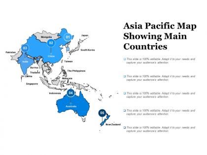
Asia pacific map showing main countries




Try Before you Buy Download Free Sample Product
 Impress Your
 Audience
 100%
100% Editable
 Save Hours
 of Time


Display your gift with our Asia Pacific Map Showing Main Countries. Expose the audience to your fascinating abilities.
People who downloaded this PowerPoint presentation also viewed the following :
Asia pacific map showing main countries with all 5 slides:
You have repeatedly displayed your professional acumen. Now put a stamp of authority with our Asia Pacific Map Showing Main Countries.



FAQs for Asia pacific map
So the Asia Pacific is basically dominated by water and mountains, which you'll definitely notice right away. The Himalayas and Andes are these massive ranges that literally split continents apart. Then you've got the Pacific Ocean taking up most of the space, plus smaller seas like the South China Sea. Honestly, the sheer number of islands is kind of overwhelming - like, there's just so many. Major rivers include the Mekong and Yangtze flowing through everything. When you're planning stuff, those coastlines and mountain barriers are gonna be your main headaches to work around.
So the map uses colored shipping lanes to show trade routes between major ports and economic hubs. Thick lines mark the heavy traffic routes - like China-Australia minerals or Japan-Southeast Asia manufacturing. Different symbols represent ports, free trade zones, partnerships, all that stuff. Honestly it can look overwhelming at first glance. But once you get the hang of it, spotting bottlenecks becomes pretty easy. Start with the legend though - seriously, don't skip that part or you'll be totally lost trying to figure out what everything means.
So you've got all the big players on there - China's red flag with the yellow stars, Japan's simple red circle on white, Australia with that Union Jack corner plus the Southern Cross. India's got their tricolor with the wheel thing in the middle. Then there's South Korea with the cool yin-yang symbol, Indonesia's basic red and white stripes, Thailand's horizontal bands. Honestly gets pretty cluttered with like 20-30 flags total depending on the map. I'd probably just focus on the major economies first if you're showing people - way less confusing that way.
Dude, planning across Asia Pacific is insane because you're literally dealing with completely different climates in one region. Singapore's sweltering heat needs totally different infrastructure than Seoul's brutal winters. Then you've got monsoons in Southeast Asia requiring massive flood systems that'd be pointless in Australia's dry areas. The Philippines needs typhoon-proof buildings while parts of China focus on drought-resistant farming. I mean, the diversity is actually crazy when you think about it. You can't just copy-paste strategies - everything has to match the local weather reality or you're screwed.
Okay so for AP, you'll want to hit the big ones - Great Wall of China shows how they defended against invasions, Angkor Wat is this massive temple complex that proves how advanced the Khmer were. Mount Fuji isn't just pretty, it's super spiritual for Japanese culture. Uluru's sacred to Aboriginal people (honestly that place gives me chills just thinking about it). Australia's so different from the rest of Asia but still counts for the region. Look at how these sites connect to trade routes on your maps - civilizations didn't just randomly pop up everywhere, you know?
Honestly, the Asia Pacific Map is pretty clutch for this stuff. It shows market sizes, demographics, and economic data all in one place instead of making you dig through a million separate reports (which is a nightmare, trust me). You can compare GDP growth, population density, industry clusters - basically spot where your product might actually take off. The visual layout makes it super easy to see geographic patterns and trade routes that could mess with your supply chain. I'd filter for countries matching your target customers first, then narrow it down from there. Way more efficient than the old spreadsheet approach.
Dude, Asia Pacific is where all the action is right now. China, Japan, South Korea, Australia - basically every major economy is crammed into one region. Most global shipping goes through there too, which is kinda crazy when you think about it. That's why the US and Europe freak out about everything that happens over there. Their supply chains would be toast otherwise. Those South China Sea disputes? Yeah, they're not going away anytime soon. Trade deals and military alliances in that area literally make or break global stability. It's wild how much power is concentrated in one part of the world.
Dude, natural disasters totally shape how cities build stuff across Asia Pacific. Tokyo's got all these earthquake codes for buildings. Coastal spots from Philippines to Australia? They mark tsunami evacuation zones and won't let you build dense housing right on the water. Bangkok's wild - everything's elevated because of flooding, plus they redesigned their whole drainage system. Geography literally controls the rules, which is kinda cool when you think about it. Oh, and if you're doing any projects there, check those disaster risk maps first. They'll show you exactly why certain areas have weird building restrictions.
Looking at the map, China and India are basically choking on air pollution right now. Southeast Asia's getting hammered by deforestation - Indonesia and Malaysia especially. Those Pacific islands? Sea levels are creeping up on them fast. Australia's dealing with water shortages, plus coastal erosion is hitting pretty much anyone near water. The typhoon patterns are getting weird too, honestly. What really gets me is how everything connects - like when forests disappear, it messes with rainfall everywhere else. I'd definitely highlight how these problems cross borders since pollution doesn't care about country lines.
Honestly, that Asia Pacific Map is a game-changer for seeing demographic stuff visually. Way better than drowning in Excel sheets! You can spot population clusters instantly, plus aging trends and where people are migrating. China's urbanization looks totally different from Indonesia's when you see it mapped out. Birth rates between Japan and the Philippines? Night and day difference that jumps right out at you. Southeast Asia's got this crazy youth bulge while Northeast Asia is getting gray fast - the contrast is wild. Perfect for making smarter regional decisions.
So I was looking at that Asia Pacific Map you mentioned - there's a ton going on. High-speed rail networks are connecting major cities, plus they're expanding ports along the main shipping routes. New highway corridors too, linking up trade centers. The airport expansions caught my eye as well. Honestly, the China-Southeast Asia rail connections are huge for supply chain stuff, and they're even talking about links to India. Pretty wild scope. Oh, and those cross-border transport projects? Game changers. But if I were you, I'd focus on the maritime port developments first since that'll hit your shipping costs and timelines directly.
Looking at an Asia Pacific map, the language diversity is crazy - Mandarin, Hindi, Tagalog, plus tons of indigenous ones I can't even pronounce. Different colonial histories and religious stuff shaped how these borders got drawn, usually around ethnic groups. City names are a dead giveaway too. What's wild is spotting all the different writing systems when you really look - like, Arabic script next to Chinese characters next to Latin alphabet. Honestly makes you realize how much cultural complexity got crammed into one region. The political boundaries basically tell the whole story of who influenced what.
Oh that map's super useful! Get your kids tracing the Silk Road and other trade routes - they love that stuff. Geography really shaped history so have them see how mountains or rivers affected where empires grew. My students always get excited when they realize why certain cities became huge ports. Short activities work best: compare old empire borders to today's countries, spot population clusters, find natural resources. The timeline overlay thing is gold though - pick a region and layer historical events right on the map. Makes everything stick way better than just reading about it.
Looking at transportation hubs and coastal areas shows the clearest tourism patterns. Thailand, Bali, Japan's main islands - they're totally packed with infrastructure. But here's what's interesting: you can also see places that aren't completely overrun yet. Vietnam's coast is blowing up, and some smaller Philippine islands have potential. Honestly, I'd skip the oversaturated spots where everyone's fighting for tourists. Those secondary destinations with decent connectivity? That's where the opportunity is. Way less competition but still accessible enough for travelers.
Looking at that Asia Pacific map, you can really see how APEC changed things. All those shipping routes and investment flows between member countries? Way more connected now than before APEC existed. The color-coded trade zones make it super obvious where barriers got reduced - honestly kind of cool how they visualized it all. Focus on the trade volume numbers and those cross-border infrastructure projects when you're analyzing it. They're your best evidence for showing APEC's actual impact. Geography really does become policy, which sounds nerdy but it's true!
-
Easily Understandable slides.
-
Out of the box and creative design.