


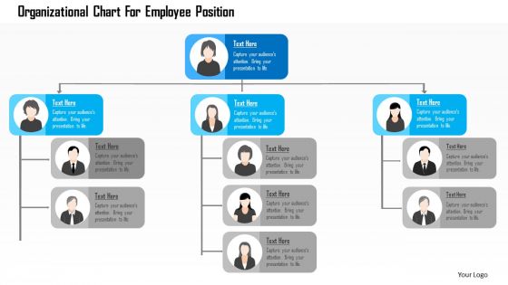
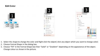
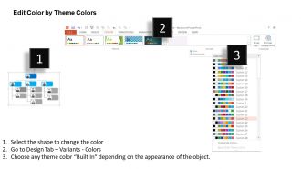
Organizational chart for employee position flat powerpoint design





Try Before you Buy Download Free Sample Product
 Impress Your
 Audience
 100%
100% Editable
 Save Hours
 of Time


PowerPoint presentation is the quickest and captivating way to present ideas and information. One can easily understand from PPT slides. Keeping this in mind, we have come up with presentation slides designs of organization chart representing organizational chart for employees. We have prepared PowerPoint infographics for organization summary, multi-level hierarchy for business, leader team organizational chart and many more. Our experts offer you ready to use PPT slides especially for the executives looking for conceptualizing in organizational chart. Just Click on the design and explore your knowledge.
People who downloaded this PowerPoint presentation also viewed the following :
Organizational chart for employee position flat powerpoint design with all 5 slides:
Colorful presentation make an impression. Thousands of high end Organizational Chart For Employee Position Flat Powerpoint Design designs are waiting to add life to your next project.
FAQs for Organizational chart for employee position
Honestly, org charts are clutch for figuring out who's actually in charge of what. No more hunting around wondering who to bug about random stuff. When someone new starts, they can look at it and instantly get how everything connects – saves so much confusion. You'll also catch weird gaps in your structure or spot where communication gets stuck. Perfect for planning promotions too since you can see the whole picture. Oh, and definitely keep it updated regularly or it becomes useless fast. Quarterly works well, though I know most people forget.
Honestly, org charts are kind of underrated. They stop all that "who's my boss again?" confusion and make it super clear who handles what decisions. New people especially love them since they don't have to awkwardly ask around to figure out the pecking order. Plus when you need something from another department, you can actually see how teams connect instead of just... wandering around hoping someone helps you lol. Update it every few months though - things change fast and outdated charts just create more mess.
Honestly, just go with a basic flat or functional chart if you're running a small business. When you've only got 10-50 people, anything fancy just makes everyone's eyes glaze over. Plus they're super easy to update when someone quits (which, let's be real, happens more than we'd like). Big companies though? They need the divisional or matrix setups because they're juggling departments across different locations. Those simple charts fall apart fast when you have complex reporting. Here's the thing - match your chart to what you actually need. Start basic. Only add complexity once people start asking "wait, who's my boss again?"
Figure out your basics first - employee count, update frequency, budget. PowerPoint or Google Drawings are totally fine for simple one-time charts. Bigger companies that update regularly? Lucidchart, Visio, or OrgChart make sense since they sync with HR systems. People overthink this stuff way too much honestly. I've watched teams debate tools for weeks when they could've just used whatever they already had. Think about who needs editing access and what export formats you'll need. Just trial 2-3 options and go with whatever doesn't make you want to throw your laptop.
Don't overcomplicate it - nobody wants to stare at some crazy subway map trying to figure out who their boss is. Keep it simple with just the main reporting lines and key roles. Oh, and definitely include contact info because people will 100% use it to find someone. Skip the weird decorative stuff that just gets in the way. The thing that kills most org charts though? They get outdated fast and then they're basically useless. Someone needs to own updating it regularly - maybe check it every few months or whenever there's a big hiring wave.
Your org chart's gonna change constantly as you grow - new management layers pop up, departments split or merge, reporting lines get shuffled around. Scaling means roles get super specialized and you need more middle managers to wrangle everything (seriously, it becomes a circus). Restructures can wipe out entire divisions or smoosh them together for cost cuts. Oh, and update that chart regularly! If people don't know who they report to, everything just implodes. Communication is huge here - I've seen companies where nobody knew the new structure for months.
Honestly, org charts are game-changers. People can finally see where they fit instead of guessing who their boss's boss is. When you map out reporting lines visually, employees get how their work actually affects other departments - way clearer than those boring job descriptions nobody reads. Plus you'll know exactly who to bug when you need approval for something. The decision-making process becomes obvious too. Oh, and definitely add photos if you can! Makes it feel less corporate and more like actual people you work with. Trust me, everyone remembers faces better than random names on boxes.
Honestly, org charts are lifesavers for new hires. Shows them exactly where they fit and who they'll be working with day-to-day. Walk through it with them that first week - trust me, they're already overwhelmed trying to remember everyone's names anyway. Give them a digital copy too because let's be real, they'll definitely forget who does what in accounting versus finance (I still mix those up sometimes). It's also great for showing potential career paths. Nobody wants to start a job feeling completely clueless about the company structure.
Honestly, org charts are super helpful for cutting through decision-making chaos. You can see exactly who approves what instead of playing guessing games with budget requests. When marketing keeps butting into product stuff, the chart shows you why - maybe they actually report to the same person. It's basically a cheat sheet for who to bug and when. Short cuts through all that "let me check with my manager's manager" nonsense. Plus you'll spot those bottleneck people who somehow oversee half the company (we all know that person). Next time you're stuck waiting for approvals, check the org chart first - might save you days of back-and-forth emails.
Ugh, outdated org charts are the worst. Your team will have no clue who reports to who, so getting approvals becomes this whole nightmare. People start doing the same work because nobody knows whose job is what anymore. New employees? They're screwed - I swear they always end up emailing someone who quit like six months ago. It slows everything down and honestly just pisses everyone off. Keep that chart updated and put it somewhere people can actually find it. Trust me on this one.
Yeah, cultural stuff totally changes how you should set up org charts. Japanese and German teams expect clear hierarchy with formal reporting - they want to see those authority levels spelled out. Scandinavian cultures though? Complete opposite. Too much hierarchy actually kills their motivation since they're all about collaboration and flat structures. Power distance is the big thing here. Some cultures need to see every single management layer represented, others just want simple charts showing team connections over rank. Honestly, I'd just ask your team leads what feels right culturally, then maybe create different versions for different regions. Way easier than guessing.
Honestly, just focus on the basics first - names, titles, and who reports to who. That's really all you need to get started. Department groupings are clutch for bigger companies so people don't get totally lost. Contact info is nice to have but not make-or-break depending on who's using it. Skip the headshots unless it's like a 10-person team where knowing faces actually helps. Clean design beats cramming everything in - people should glance at it and immediately get the chain of command. You can always add more later if it's actually useful, but simple usually wins.
So org charts help way more departments than just HR. Sales can figure out who actually makes decisions on deals. Marketing knows who to include in campaigns without guessing. IT maps permissions super fast, and finance uses them for budgets - honestly that last one surprised me when I learned it. They're great for spotting who should work together and avoiding those cringe moments where you accidentally go around someone's boss. You can see collaboration opportunities you'd totally miss otherwise. Try using yours next time you're planning something big to find the right stakeholders.
Honestly, just update it whenever someone joins, leaves, or gets promoted - basically any personnel change. I'd set up a monthly check-in with HR because there's always something you'll miss otherwise. Pick one person to own the whole thing and have them work with department heads. Oh, and this is super important - update both the actual chart AND whatever system feeds into it. I've seen too many places where they get out of sync and it becomes a mess. Don't wait until someone complains it's wrong. Send the new version to all your managers so everyone's on the same page.
Honestly, org charts are a lifesaver for project stuff. They show you exactly who makes decisions and who you need approvals from. Quick way to spot your stakeholders and figure out reporting lines too. I've found they're clutch for identifying bottlenecks - like when you discover three teams all report to one crazy busy director who's definitely going to slow things down. You can also see how departments connect, which helps when you need cross-functional work. Keep one nearby when you're mapping out communications. Oh, and they're perfect for planning escalation paths when things inevitably go sideways.
-
Unique design & color.
-
Best Representation of topics, really appreciable.