


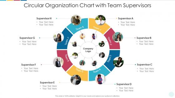
Circular organization chart with team supervisors




Try Before you Buy Download Free Sample Product
 Impress Your
 Audience
 100%
100% Editable
 Save Hours
 of Time


Our Circular Organization Chart With Team Supervisors are topically designed to provide an attractive backdrop to any subject. Use them to look like a presentation pro.
People who downloaded this PowerPoint presentation also viewed the following :
Circular organization chart with team supervisors with all 2 slides:
Use our Circular Organization Chart With Team Supervisors to effectively help you save your valuable time. They are readymade to fit into any presentation structure.
FAQs for Circular organization chart
Dude, those circular org charts are honestly pretty genius. They make everyone feel less like they're stuck in some corporate hierarchy prison. You know how traditional charts look all pyramid-y and intimidating? These put collaboration right in the middle instead. Way easier to spot how different teams actually work together - which let's be real, is how stuff gets done anyway. New people aren't as freaked out when they see the company structure. Plus they just look cooler? If you're thinking about shaking things up or really want that team-first vibe, try sketching your current setup in a circle first and see what happens.
Honestly, circular org charts are game-changers because they ditch that whole "look up to your boss" mentality. People can actually see how departments connect and work together instead of just climbing ladders. The communication flows way better when everyone realizes they're part of the same circle, you know? Plus it's more realistic - like, when's the last time a project actually followed the hierarchy anyway? Try sketching your current team in a circle instead of boxes stacked up. You'll probably notice collaboration spots you've been missing. Way less intimidating than those pyramid things too.
Start with your CEO in the middle, then build departments around them in circles based on who reports to whom. Don't make the text microscopic - I've squinted at way too many org charts where you need a magnifying glass. Pick different colors for each department but resist the urge to use every shade imaginable. White space is your friend here. Nobody wants to stare at a cramped mess of boxes and lines. The reporting structure should be obvious without looking like spaghetti thrown at a wall. Here's the real test: show it to someone who doesn't work there. If they get confused, back to the drawing board.
Honestly, circular org charts are way more flexible than the traditional ones when teams change. You can just add segments or expand those rings without everything looking totally broken. Traditional charts? They get super messy the second you add new roles. But the circular ones just flow around that center point naturally. I've watched whole teams restructure and barely touch the design - it's pretty cool actually. Just drag roles between rings or different sectors and it still looks clean. Oh, and definitely sketch your next reorg in circular format first. You'll probably find better ways to group everyone that way.
Look, circular org charts work best for companies that actually collaborate - startups, creative agencies, consulting places. If your team is constantly working across departments and you hate rigid hierarchies, it's perfect. Traditional corporate folks sometimes get weird about it though (they love their boxes and lines). Complex projects where you need different perspectives? Game changer. Also super helpful when your team structure shifts around a lot. I'd honestly just sketch out how your people currently work together first - if it looks more like a web than a ladder, you've got your answer. Makes those connections way clearer than old-school top-down charts.
Color coding your circular org chart is honestly a lifesaver. Different colors for each department - blue for finance, green for marketing, whatever makes sense. Then use lighter/darker shades for different levels within those teams. Without it, circular charts turn into a hot mess pretty quickly. Start with maybe 3-4 main colors, don't go crazy. The whole point is people can instantly spot who reports to who and find teams fast. Oh, and definitely run it by a couple coworkers first - what seems obvious to you might be confusing to them.
Honestly, I'd go with Lucidchart first - their free trial handles circular layouts automatically so you don't have to drag everything around manually. Visio's solid too if you already have it. Canva makes things look really polished but it's not as smart about the org chart stuff. PowerPoint works okay with SmartArt if you're in a hurry, though it can be kinda clunky. I always forget how annoying it is to get those circular connections right when you're doing it by hand. Lucidchart saves you that headache.
Yeah, circular charts are great for cross-functional teams! You can place people around the circle based on how much they're involved in different projects. Way better than those stuffy traditional hierarchies, honestly. Different colors work well to show which departments people are from, and you can add connecting lines between collaborators. Multiple rings are handy too if you've got complex reporting stuff going on. The main thing is labeling everything clearly - I've seen people get totally lost trying to figure out who reports to who. Oh, and they look way cooler in presentations than boring rectangular boxes.
So circular org charts are all about showing collaboration instead of that old-school pyramid thing. Everyone sits in connected circles rather than having bosses towering over everyone else. Pretty cool concept, right? It breaks down those annoying departmental silos and gets people talking across teams. The whole visual basically screams "we're all equals here" and information can flow wherever it needs to go. Just... make sure your company culture actually backs this up. Otherwise you're gonna look pretty fake putting up a collaborative chart while still running things like a dictatorship.
Don't cram everyone into one circle - it'll look like a mess and nobody will get it. Also, resist making the CEO's bubble huge compared to everyone else. These charts work best when they actually show how teams collaborate, not who's the biggest boss. Label your connections clearly! I've seen gorgeous org charts that are totally useless because you can't tell how departments relate to each other. Keep sizing consistent and test it on a colleague first. Trust me, what makes sense to you might be confusing to others. Simple beats fancy every time.
Don't just make it once and call it done - you'll need regular updates or it becomes useless pretty quick. I'd do quarterly reviews to catch changes in roles and team structure. Honestly, sometimes even that's not frequent enough with how fast things move now. Here's the thing though - assign ONE person to actually handle updates, otherwise everyone thinks someone else is doing it. Try tying updates to your performance cycles or when reorganizations happen. Makes it more automatic that way. Oh, and build it into your normal workflow instead of treating it like this huge separate thing. Way easier to stay on top of.
Oh definitely add location tags and time zones to each person's bubble - that's been a game changer for us. Include their preferred contact methods too (like whether they're more of a Slack person or email). Working hours are clutch since everyone's scattered across different zones. I'd throw in profile pics if you can, makes it feel less corporate-y. Some of the fancier tools let you link directly to people's calendars which is pretty neat. Honestly, these circular charts work way better for remote teams than those rigid hierarchy boxes. The whole point is making it clickable and info-packed since you can't just peek over cubicles anymore!
Honestly, circular org charts are game-changers for new hires. Instead of those intimidating pyramid things, newbies can actually see how everyone connects and works together. Communication flows everywhere, not just up and down the chain. Your new employee spots who they'll collaborate with right away, plus they get the cross-department relationships without feeling totally lost. I'd hand them the circular chart on day one - maybe with coffee? They'll navigate office relationships so much better and actually feel like they belong from the start.
Honestly, without feedback your circular chart will just be another useless office decoration. Ask your team quarterly if the connections you've drawn actually match how work flows - trust me, they'll have opinions! Most people are secretly waiting to tell you what's broken anyway. Short sentences work here. When someone says reporting lines are confusing or collaboration paths are missing, actually listen and update the chart. I know it sounds obvious but so many managers skip this step. The whole point is making sure what's on paper reflects reality, not creating something that looks cool in meetings.
Track your cross-departmental project completion rates and how fast decisions actually move through the org. Employee surveys are your best friend here - ask about role clarity and whether people feel heard. Communication frequency between teams is another good indicator. Customer response times usually get better too since info flows more freely. Honestly, retention rates for leadership positions matter a lot because this shift is rough on traditional managers. Oh, and definitely do quarterly check-ins to see what's working. The data will tell you if you need to tweak things.
-
Much better than the original! Thanks for the quick turnaround.