

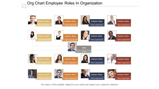
Org chart employee roles in organization





Try Before you Buy Download Free Sample Product
 Impress Your
 Audience
 100%
100% Editable
 Save Hours
 of Time


Stolid on the facts that developed with our org chart employee roles in organization. The concept of project team representation is shown in this PPT slide. Employees pictures along with their names and designation or work role can be displayed here. There are seventeen sections shown here in this employee chart presentation layout. Personalize this PPT and include your company's data by following few steps. Familiarize your team and the people responsible for the working and stability of the company, give them a feast by representing them through their work role. Initiate your development process and include this design in your org chart employee roles in organization business presentations. Deliberate on the facts that emerged with our Org Chart Employee Roles In Organization. Highlight important instances.
People who downloaded this PowerPoint presentation also viewed the following :
Org chart employee roles in organization with all 6 slides:
Our comprehensive library of Org Chart Employee Roles In Organization are ready to be added to your presentation. Appropriate for a range of presentation needs.
FAQs for Org chart employee
Okay so you'll want clear reporting lines - like who reports to who. Job titles that actually mean something to people, not weird corporate speak. Contact info is obvious but people forget it sometimes. Define what each role actually does too. Keep the visual design clean because honestly, messy org charts are the worst - they look like someone threw names at a wall. Flow should go top to bottom logically. Update it regularly though! Nothing's more awkward than showing someone who quit months ago. Make it accessible to everyone and maybe add photos if that fits your company vibe.
Honestly, org charts are super helpful for avoiding those "um, who do I even ask about this?" situations. New people can see where they fit in without bugging everyone with questions. It's way easier to figure out who makes decisions and who you should loop in on projects. The visual aspect is clutch - you can spot potential collaborators across teams you might not have thought of. Just keep it somewhere people will actually look at it (our team pins ours in Slack). Oh and don't let it get outdated or it becomes useless pretty fast.
There are four main types you'll see. Hierarchical is your classic top-down setup - works great for big traditional companies that need clear chains of command. Flat structures barely have any layers, perfect for startups and creative teams (seriously, everyone's doing this now). Matrix gets weird because people report to two bosses - like a project manager AND their department head. Functional groups everyone by what they actually do, so it's solid for places like hospitals or universities. Your company size and culture should drive the choice, plus how messy your reporting gets. Oh, and don't overthink it too much.
Dude, your org chart is gonna change constantly - it's not some static thing you create once. Growing fast? You'll be adding management layers and splitting teams that got too big. Restructuring hits different though - suddenly you're flattening everything, merging departments, maybe completely redoing who reports to who. It gets chaotic, not gonna lie. Don't let it sit there getting outdated for months. I'd say review it every quarter or so, make sure it actually shows how people work together. Sometimes the real workflow looks nothing like what's on paper, you know?
Honestly, I'd try Lucidchart first - it's web-based so collaboration is super easy and the interface just makes sense. Microsoft Visio is the heavyweight option if you're dealing with really complex stuff, but it's expensive as hell. Google Drawings or PowerPoint's SmartArt work fine for basic charts, especially if you're already using those ecosystems anyway. Oh, and Canva's actually not bad if you want something that looks professional without overthinking it. Start with Lucidchart's free trial though - worst case you're out nothing if it doesn't handle what you need.
Honestly, good visual design makes all the difference with org charts. Color-coding departments helps people find their team fast. Different box sizes show who reports to whom without having to read every single name. I always add decent white space too - nothing's worse than a cramped chart that gives you a headache just looking at it. Oh, and photos or little icons make it way more personal than just boring text boxes. Keep fonts consistent so it doesn't look like a mess. Don't go crazy with the design though - you'll end up with something that looks like a kid's art project.
Think of your org chart as a game plan for getting stuff done. It shows you who actually makes decisions and where things tend to get stuck. Before launching any big project, I always look at mine to figure out which departments I'll need and who the real stakeholders are. You can spot leadership gaps too - or places that need reorganizing. Honestly, I've watched so many initiatives crash because nobody bothered mapping out who signs off on what first. Sounds boring, but trust me on this one. Pull up that chart before your next strategic move and trace the approval chain. You'll thank yourself later.
Honestly, org charts are super helpful - they show who reports to who so there's no guessing about the chain of command. When you need approval for something, you'll know exactly who to ask. Plus it prevents that awkward thing where two people think they're handling the same project (ugh, the worst). New people can look at it and instantly get how decisions flow around your company. Just don't let yours get outdated though - I've seen teams with charts from like 2019 still hanging around, and that just confuses everyone more than helping.
Honestly, just pick someone in HR or ops to own this thing - otherwise it'll never get updated. Set up quarterly reviews, but here's the trick: build updates into your onboarding process so it happens automatically when people join or switch roles. Don't overcomplicate the visual either. Simple beats fancy every time. Oh, and make sure you're tracking how people actually work together, not just who reports to whom - that cross-team stuff matters way more than the official hierarchy shows. Quarterly calendar reminders are your friend here.
Honestly, org charts are clutch for spotting talent gaps. You'll see right away if a department has way too many managers and not enough people actually doing the work. Plus you can catch those scary single points of failure - like when only one person knows how to do something critical. I learned this the hard way at my last job when our lead developer quit with zero backup plan. Succession planning becomes super obvious too when you map it out visually. Pro tip: try adding skill levels or performance notes directly on the chart. Makes it way easier to show your boss exactly where you're screwed if someone leaves.
Honestly, it depends on your company size and how fast you need decisions made. Hierarchical works when you've got complex operations or you're scaling quickly - basically traditional corporate stuff where accountability matters. Flat structures? Perfect for startups and creative teams since everyone can collaborate directly. But here's the thing - once you hit like 50 people, flat orgs get chaotic real fast. Your industry plays into this too. Regulated sectors usually need more hierarchy whether you like it or not. Just start with what actually fits your situation right now, then adapt as you grow.
Honestly, org charts are perfect for this. New people get so lost figuring out who does what - like, is Sarah their actual boss or just someone who emails a lot? Walk through it on day one so they can see their reporting line and who they'll actually be working with. Short sentences work better than long explanations. Plus it shows how their job connects to everything else, which helps with that "why am I here" feeling. Leave them a copy they can check later because trust me, they'll forget half the names immediately. It really speeds up understanding office dynamics too.
Honestly, org charts are way more useful when you connect them to other stuff. Most HRIS tools like BambooHR sync automatically - saves you from manually updating every time someone quits or gets hired. Project management tools like Asana work great too, so you can actually see who's swamped with work. We hooked ours up to Slack which is clutch for finding the right person fast. Don't go crazy with integrations though. Pick ones that solve actual problems, not just because they look cool. Nobody needs a fancy diagram that doesn't help you get work done.
Oh man, this stuff gets tricky fast! Japanese and German companies want every single reporting line crystal clear - like, they need to see all the formal titles and hierarchy mapped out perfectly. But Scandinavian teams? Total opposite. They'd probably roll their eyes at anything too rigid or bureaucratic-looking. Power distance is what makes or breaks it - some cultures expect to see every management level while others find that whole thing kind of gross honestly. If you're dealing with global teams, you'll probably need different versions for different regions. Pain in the ass but worth it.
Oh man, you're gonna hit some serious roadblocks with people freaking out about change. Communication falls apart fast - everyone's worried about their role, who reports to who, all that drama. Technical stuff becomes a nightmare too because you're updating systems while training people on new processes. Plus the org chart never actually matches how work gets done in real life, which is super frustrating. I'd say communicate way more than you think you need to during the switch. Also be ready to adjust things when (not if) parts of it don't work out like you planned.
No Reviews