


Organization chart templates 30




Try Before you Buy Download Free Sample Product
 Impress Your
 Audience
 100%
100% Editable
 Save Hours
 of Time


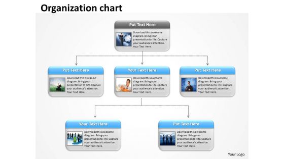
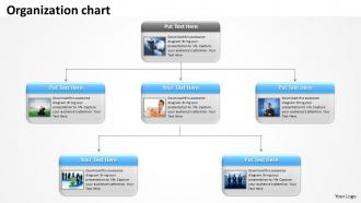
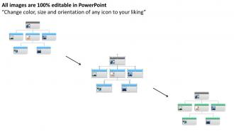
Sound organizational structure helps set priorities. For this purpose, our team of dedicated designers have crafted this organization chart templates PowerPoint slideshow. Our organization chart PPT template is designed to represent the importance and purpose of creating a good organizational structure will support a company’s mission, and it will attempt to meet the needs of various stakeholders. Organizational structure provides guidance to all employees by laying out the official reporting relationships that govern the workflow of the company. Without a formal organizational structure, employees may find it difficult to know who they officially report to in different situations, and it may become unclear exactly who has the final responsibility for what. Our organization chart Presentation graphic improves operational efficiency by providing clarity to employees at all levels of a company. Our striking presentation design can be edited as you would like to. You just require downloading, editing and then sharing it with your team. Do the analytics with our Organization chart templates 30. Arrive at correct conclusions.
People who downloaded this PowerPoint presentation also viewed the following :
Organization chart templates 30 with all 6 slides:
Construct your premises on our Organization chart templates 30. They will create a sturdy structure.
FAQs for Organization
Honestly, start with the basics - names, titles, who reports to who. Clear hierarchy is everything or people get lost in the chain of command (been there, it's messy). Format should be consistent across roles, and leave space for contact info. Department groupings help too. Photos are nice if your company's into that vibe. Oh, and make it scalable! These charts always end up way bigger than you think they will. Clean design beats fancy any day. You can jazz it up later once you've got the bones right. Don't overthink it initially.
Org charts are honestly a game-changer for clearing up confusion. When someone's like "wait, who do I even ask about this?" boom - there's your answer right there. New people especially love them since they don't have to awkwardly ask who reports to who. They show the chain of command and how departments actually connect, which saves so much back-and-forth. I'd update yours every few months and stick it somewhere obvious - maybe your company wiki or whatever platform you guys use. Trust me, it'll cut down on those "sorry, wrong person" email chains that drive everyone nuts.
Honestly, the biggest thing is making sure everything looks clean and consistent. Use the same box sizes and fonts throughout - I learned this the hard way when mine looked like a hot mess with random formatting. Clean reporting lines are crucial, and don't stuff too much info in each box. Just stick to names, titles, maybe departments. White space is your friend here. Oh, and color coding different departments actually helps way more than I expected! Definitely start with a template instead of going from scratch - saves so much time.
Look, it really depends on what type of org you're dealing with. Corporate charts are all about profit centers and clean reporting lines up to the C-suite. Nonprofits? Way messier - you've got program areas, volunteers everywhere, and board relationships that honestly make my head spin sometimes. Government ones are super hierarchical with all those statutory roles and agency structures. Here's the thing though - corporations show business units, nonprofits focus on mission stuff, and government displays who has regulatory power. Just pick whatever actually matches how your place really works, not what looks prettiest on paper.
Honestly, just use whatever you already have first. PowerPoint works fine for basic org charts and everyone knows how to use it. If your company has Visio, that's probably your best bet for anything complex. Lucidchart is really good for team collaboration - like when multiple people need to update it. Oh, and there's this free one called Draw.io (they renamed it to diagrams.net or something) that's actually pretty decent. I always forget about that one but it's solid. You can always switch to something fancier later if you need more features.
Okay so visual org charts are seriously helpful - you can see who reports to who without having to ask around like an idiot. New people especially love them because navigating office politics is already confusing enough. When you need approvals or want to start a project, you'll know exactly who has the power to say yes (or crush your dreams lol). They're also great for spotting potential teammates for collaborations. Way better than scrolling through those awful employee directories that never load properly. I'd start small though - just map out your immediate team first, then build from there.
Yeah, colors totally matter for org charts! Use them to show different departments or hierarchy levels - makes it way easier to follow. But honestly, don't go crazy with it. I've seen some that look like a kindergarten art project lol. Stick to maybe 3-4 colors tops and be consistent throughout. Like if HR is green in one spot, keep it green everywhere else. The real test? Make sure it still works when someone prints it in black and white. Trust me, people still do that.
So there's actually different templates depending on how messy your company structure is. Simple hierarchy ones work great for straightforward setups. But if you've got cross-functional teams and all that complexity, go for matrix-style templates instead. The good ones let you add layers and move stuff around however you need. Oh, and definitely get ones with color coding - way easier to follow than just boring black boxes everywhere. My advice? Don't pick a template first then cram your org chart into it. Figure out what you're actually working with, then find something that fits.
Don't just copy the template exactly - customize it for how your team actually works. Keep each box simple: names, titles, maybe contact info. That's it. You'll look super unprofessional if half the people on there don't even work there anymore, so update it regularly. I see companies do this ALL the time and it's embarrassing honestly. Skip the crazy dotted lines everywhere too. Make reporting relationships obvious. Think about your real structure first, then how people collaborate daily - sometimes those are totally different things.
Update your org chart whenever someone gets hired, leaves, or gets promoted - basically any time the structure changes. Most companies suck at this, honestly. Templates are a lifesaver since you don't have to start over every time. Just swap out the info and you're done. Try to find ones that work with your HR system or have that drag-and-drop thing going on. I do mine quarterly at least, but really you should update within a week of big changes. Oh, and set a reminder or you'll totally forget about it.
Okay so interactive org charts are seriously a game changer. People can actually click around and explore instead of staring at boring static boxes. You get hover details, clickable profiles, search functions - super helpful when you're like "wait who runs that department again?" The filtering by role/department thing is clutch too. Honestly, when people can actually interact with stuff, they'll remember it way better than just looking at a flat chart. I'd say start with the hover-over details and clickable profiles first - even just those two features will make people actually want to use the thing. Way better than those old school printed org charts we used to have hanging on walls.
Oh totally! Just add little location tags next to everyone's name - like "Remote" or "NYC office" or whatever. Did this last month actually and it made such a difference. Group people by what they do though, not where they sit, since that's how work actually happens. Time zones are clutch if you're spread out. Maybe throw in their preferred way to reach them too? Some people are Slack, others are email people, you know? The main thing is just making it obvious who reports to who. Physical location matters way less than you'd think.
Get templates that handle matrix reporting - your tech people are probably working on like 3 different projects anyway. Remote/hybrid location stuff is crucial since everyone's spread out. I'd look for ones where you can add skill tags under each role, maybe something that plays nice with Slack or GitHub. Also, make sure it can handle quick changes because tech teams are always restructuring. Oh, and find something that exports to different formats easily - you'll definitely need to share this with people who all use different tools. Trust me on the export thing, it saves headaches later.
Go with a matrix template - way better for showing both your reporting lines and project connections. Traditional box charts are honestly pretty useless here. Find ones with dotted lines or different colors so people can see they report to their manager BUT also work on cross-functional stuff. Some have these cool "project pods" that sit next to the main structure. Makes it super visual. Short version: you need templates that handle multiple relationship types, not just the basic boss-employee thing. People gotta see who they actually collaborate with beyond their immediate team.
Oh totally - good org charts are a game changer for new people. Day one is already stressful enough, right? When someone can actually see where they fit and who reports to who, it cuts down so much of that "wait, who do I even ask about this?" confusion. They'll spot key people faster and get how decisions actually flow through your company. Honestly beats having them wander around lost for weeks trying to figure out the hierarchy. Just don't let it get outdated though - stale info makes everything worse.
-
Designs have enough space to add content.
-
Best Representation of topics, really appreciable.