


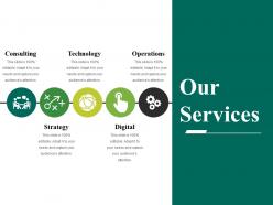
Our services powerpoint slides





Try Before you Buy Download Free Sample Product
 Impress Your
 Audience
 100%
100% Editable
 Save Hours
 of Time


Generate the desire to change for the better with our Our Services Powerpoint Slides. Encourage good intentions.
People who downloaded this PowerPoint presentation also viewed the following :
Our services powerpoint slides with all 5 slides:
Gently coax them with our Our Services Powerpoint Slides. Change will become easier to absorb.

FAQs for Our
Keep it simple and accessible - good fonts, lots of white space, colors that work for everyone including colorblind people. I've made this mistake before but avoid those "creative" templates that nobody can actually read lol. Your headings need to be obviously different sizes so people can follow along. Build in flexible spaces for charts, images, whatever you might throw in there. The whole point is making your content pop, not the template itself. Oh and definitely test it out with a couple different presentations first - you'll catch weird spacing issues that way.
Honestly, visuals are a game-changer for presentations. Your brain processes images way faster than text, so charts and infographics make complex stuff actually digestible. Nobody wants to stare at bullet point hell for 30 minutes straight - been there, done that, wanted to cry. Images give people's eyes a break and keep them from zoning out completely. Just don't throw in random stock photos that have nothing to do with your topic (we've all seen those cringe moments). Pick visuals that actually back up what you're saying. Look at your key data first, then figure out if a graph or diagram would explain it better than just words.
Okay so first thing - nail down your brand basics like colors, fonts, and where the logo goes. Build a master template with consistent spacing so everything looks clean. Honestly, most people go overboard with animations and it's just distracting. Create different slide layouts for titles, bullet points, image slides, whatever you need. The whole point is making something flexible enough for different presentations but foolproof enough that Dave from accounting can't mess up the branding. Oh, and definitely test it with real content first - you'll catch spacing issues you didn't see coming.
Yeah, so different industries totally switch up their templates based on who they're presenting to. Healthcare goes heavy on data viz and boring compliance stuff. Tech companies? Super clean and minimal - gotta make those product demos pop. Finance people need charts everywhere to make sense of complicated numbers, usually pretty conservative looking. Creative agencies are wild though - they just go nuts with bold visuals and forget half the rules. Honestly makes me a little jealous sometimes. But here's the thing - figure out your main story first and who's actually gonna be sitting there. Then you can mess with colors and layouts to match what works for your crowd.
Colors totally mess with people's heads in presentations - it's wild how much they matter. Blue makes you look trustworthy (great for business stuff), red grabs attention and screams urgency. Green = growth vibes, orange feels creative and energetic. Honestly though, never use yellow backgrounds - learned that the hard way when everyone was squinting 10 minutes in. Just match your palette to what you're pitching. Stick with blues and grays for client meetings. Creative presentations? Go nuts with warmer colors.
Dude, templates will save your sanity. I used to spend forever just getting the fonts and colors to match - such a waste of time. Now I just grab a template and boom, everything's already branded and looking professional. You can actually focus on what you're trying to say instead of messing around with design stuff. Honestly, the time savings are huge when you're doing multiple presentations. Oh and start collecting templates for your most common presentation types - future you will thank you for it.
Honestly, the worst thing you can do is treat templates like they're set in stone. Don't cram everything into those preset layouts - if your text is tiny or overflowing, just add more slides. And please don't just swap out the placeholder text without thinking about whether that layout even makes sense for what you're saying. Everything ends up looking identical otherwise! Oh, and definitely customize the colors and fonts so it actually feels like yours. Pro tip: test it on whatever screen you'll actually be using. I learned this the hard way when my "perfect" slides were completely unreadable once projected.
Corporate stuff? Go minimal - lots of white space, navy or gray colors, super clean. Educational presentations are way more fun though. Bright colors actually work, throw in some icons, maybe playful fonts (trust me, anything to keep students awake after lunch lol). Your corporate crowd wants everything polished and consistent. Students? They need visual variety to stay engaged. Oh, and definitely check if your company already has templates first - I learned that one the hard way after spending hours on formatting that didn't even get used.
Honestly, minimalism is huge right now - clean layouts with tons of white space and fonts that actually make a statement. Dark mode is everywhere too, which thank god because my eyes were dying from all those bright screens. Interactive stuff is way more common now, like clickable elements and embedded videos. Oh and the data viz has gotten so much better - animated charts that don't look like they're from 2015. Color-wise, everything's gone more muted and sophisticated instead of those awful corporate blues. You should definitely browse some recent template sites to see the difference.
So I'd definitely build chart placeholders right into your template from the start. Trust me on this one - trying to fix sizing issues after the fact is such a pain. Make containers flexible enough for different chart types - bar graphs, line charts, whatever you guys usually need. Don't forget space for titles and legends too. The whole point is dropping in fresh data without everything falling apart visually. I learned this the hard way when I spent like two hours reformatting charts that should've taken five minutes. Just standardize it upfront and you'll save yourself so much headache later.
So basically, interactive templates let people actually DO stuff during your presentation - polls, Q&A, quizzes, voting on ideas. Way better than traditional slides where everyone just stares at you looking half-dead. It turns the whole thing into an actual conversation instead of you talking at a wall. Plus you can see if people are engaged or just scrolling Instagram (probably both tbh). The metrics are pretty cool too. Honestly? Just throw in a simple poll next time and see what happens. Makes everything less awkward.
Honestly, just ask people straight up what annoyed them while making their presentations - that's where you'll get the real gold. Set up quick surveys after meetings and track which slides everyone keeps tweaking (those templates clearly aren't working). I'd also do a simple rating thing for different parts of your templates. Usage analytics help too - see which ones people actually download vs. the ones collecting digital dust. The quarterly review sessions with your team are clutch for this stuff. Oh, and don't overthink it - sometimes the feedback is just "this color scheme makes my eyes hurt" but that's still useful info.
Start with high contrast colors and make your body text at least 18pt. Build proper heading structures (H1, H2, etc.) and leave plenty of white space - cramped slides suck for everyone anyway. Don't bury important info inside graphics only. Add alt-text spots for images. Honestly, the biggest game-changer is testing with screen readers if you can swing it. Otherwise accessibility checkers work too. Create one rock-solid accessible template first. Then use that as your foundation for building others. It's way easier than trying to fix accessibility issues after the fact.
Dude, go big with your fonts - like 24pt minimum because everyone's squinting at tiny laptop screens. High contrast colors are your friend. Keep it super simple though, maybe 3-4 bullet points tops per slide. Those flashy animated templates? Total disaster for virtual meetings - they just make everything glitchy and slow. I learned that the hard way last month. Stick with clean layouts and tons of white space. Bold headings help too. Oh and definitely test it in Zoom or whatever platform you're using first. Trust me on that one.
Honestly, just bake the storytelling right into your templates. I set mine up with "problem" slides first, then "journey/solution" stuff, ending with "outcome/transformation" slides. Sounds cheesy but I totally stole this from binge-watching Netflix docs - they all use the same formula! Drop in prompts like "What were the stakes?" or "How did this change everything?" instead of boring bullet points. That way people actually think in story beats rather than just word-vomiting data everywhere. Make like 3-4 different templates for different presentation types. Works way better than you'd think.
-
Innovative and attractive designs.
-
Topic best represented with attractive design.