


Tools and platforms ppt presentation
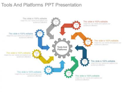




Try Before you Buy Download Free Sample Product
 Impress Your
 Audience
 100%
100% Editable
 Save Hours
 of Time


Our Tools And Platforms Ppt Presentation are bound to fit your budget. They enable effective cost control.
People who downloaded this PowerPoint presentation also viewed the following :
Tools and platforms ppt presentation with all 7 slides:
Inform folks about ensuring healthy ingredients with our Tools And Platforms Ppt Presentation. Be an advocate for grow at home.
FAQs for Tools and
Honestly, just go with something that doesn't make you want to throw your laptop when you're scrambling to finish a presentation. Template variety is huge - saves so much time. Real-time collaboration is pretty much essential these days, and cloud sync means you won't be stuck redoing everything on different devices. Don't get too caught up in fancy animations though, they usually look cheesy anyway. Media handling matters - photos, videos, charts should import smoothly. PDF export is non-negotiable. Oh, and definitely try the free version first because paid features aren't always worth it.
Honestly, templates are a lifesaver. You get a professional look without spending hours tweaking fonts and colors - and let's be real, most of us suck at design anyway. They give you structure so you're not staring at blank slides forever. Your audience won't get distracted by weird formatting choices either. The best part? All that time you save can go toward actually rehearsing your presentation. Just pick something that fits your vibe and tweak it a little so it doesn't look generic.
First thing - figure out who you're actually presenting to and what they care about. That'll guide everything else. Match your colors to their vibe (finance people = boring blues, creative types = something with actual personality). Ditch those awful stock photos for images that look like their actual world. Oh, and please swap out the placeholder text! Use their lingo and examples they'll recognize immediately. Font size is huge too - go bigger if you're presenting to executives across a conference room. Honestly, I'd run it by someone who knows the audience first. They'll spot the weird stuff you missed.
Okay so group presentations don't have to be a nightmare anymore. Everyone can jump in and edit the same deck at once - you'll see changes happening live, which is honestly pretty cool. No more of that "final_FINAL_v3" email madness. Comments let you argue about font choices without getting into it face-to-face (thank god). Just make sure you set permissions right because my teammate once accidentally nuked half our slides the night before. You can track who changed what too. Really keeps everyone on the same page without stepping on each other's work.
Honestly, storytelling makes or breaks presentations. Nobody wants to stare at endless bullet points about quarterly whatever. Structure it like an actual story - problem, tension, solution. Your slides should back up that arc without drowning people in data. Most software has templates that help with flow, which is nice I guess. But really, think about the journey you're taking people on. Hook them with a question upfront. Build some suspense with your findings. Then hit them with your solution. Way more memorable than just dumping 47 slides of metrics on them. Trust me on this one.
Dude, animations totally help keep people engaged - like, their eyes actually stay on your presentation instead of wandering off. Progressive reveals are clutch because it stops everyone from reading ahead while you're mid-sentence (super annoying when that happens). Movement breaks up the monotony too. Static slides get boring fast, probably after slide 3 if I'm being honest. The timing thing is huge - animations create these visual hooks that help people remember your main points later. Just don't go crazy with the flashy stuff. Simple fades work way better than bouncing text everywhere. Keep it clean so it actually supports what you're saying.
Honestly, the worst thing people do is just slapping their content into templates without changing anything. Like, why keep those boring stock photos that mean nothing? And don't even get me started on cramming text everywhere just because there's bullet points available. Templates should be your starting point, not the final thing. I always swap out colors to match my brand and delete sections I don't need. Oh, and maybe avoid those super animated ones everyone uses - your presentation will look exactly like Karen's from accounting.
So most industries just adapt regular presentation software to fit what they need. Healthcare has HIPAA-compliant versions with medical image libraries. Finance teams plug in real-time data feeds and use templates that won't get them in trouble with regulators. Teachers love the interactive stuff - some of that gamification is actually pretty smart. Engineers and architects need CAD integrations for 3D visuals, which makes sense. Honestly, I'd check if there are industry-specific add-ons for PowerPoint or Google Slides first. Way easier than starting from zero.
Honestly, cloud presentations are game-changers for team stuff. You can jump in from your phone, laptop, whatever - and everyone can edit at once without that annoying email chain thing. Auto-save is clutch too, I've definitely learned that the hard way lol. The comment features make giving feedback so much less awkward than those weird track changes. Only downside is needing wifi, but that's pretty much everywhere now. Google Slides is solid, or PowerPoint Online if you're already in that ecosystem. Try it on your next group thing and you'll see what I mean.
Every video or image needs to actually support your point - don't just throw in flashy stuff because it looks neat. Make sure visuals are big enough for the back row to see. Videos should be under 2 minutes, trust me on this one. Audio's honestly where most people mess up (I've watched so many presentations die because someone's mic didn't work), so have a backup ready. Sprinkle multimedia throughout to break up boring text slides. Test everything on their actual setup beforehand! Always keep static images as backups when tech inevitably fails you.
Oh nice question! So first thing - ditch red/green color combos since colorblind people can't tell them apart. High contrast is your friend too. Font size needs to be at least 24pt or people will squint like crazy. Alt text for images is honestly a pain but super necessary for screen readers. Keep layouts simple and logical - no weird jumping around. Also (this might be obvious but) always caption your videos or provide transcripts. I used to skip that step and felt terrible when someone mentioned they couldn't follow along. Clean fonts work way better than fancy ones too.
Look, people's brains just eat up visuals way faster than walls of text or numbers. When you throw a chart at someone instead of a boring spreadsheet, they'll spot patterns and weird outliers immediately. I learned this the hard way after watching too many eyes glaze over during presentations. Bar charts, line graphs, even simple pie charts - they all stick in people's heads longer than bullet points. The trick is picking the right type for whatever story your data's telling. Trust me, next time you're about to dump a massive table on someone, try a visual instead. You'll actually see people perk up.
Stick to 2-3 colors that actually work together - none of that rainbow nonsense. White space is your friend, so don't cram everything onto one slide. Pick readable fonts (seriously, Comic Sans died in 2005). Keep animations simple - basic transitions are fine, but skip the spinning text unless you're presenting to five-year-olds. I learned this the hard way in college. Limit your text and use good images that make sense with what you're saying. The whole point is looking professional without being boring. Start with a clean template and don't overthink it.
Honestly, AI-powered design tools are game changers right now. Gamma and Beautiful.ai will literally auto-generate your slides and suggest content - saves me hours of formatting hell. Real-time collaboration is getting way better too, like Google Slides but actually smooth. Interactive stuff is huge - polls, Q&A sections, clickable elements that keep people awake during presentations. Nobody wants to sit through another boring deck, you know? Try the AI features on your next presentation. They're weirdly good at fixing layouts that look terrible when I make them myself.
Oh man, those comment features in PowerPoint are actually clutch! You can drop feedback directly on slides instead of doing the whole "on slide 7, the blue chart..." email thing. Way less confusing. Plus everything stays organized in threads - no more hunting through email chains trying to remember who said what. I usually tell people to set a hard deadline for comments though, otherwise you'll be tweaking stuff forever. Trust me on that one. The best part? You can actually see what's been fixed and what still needs work. Makes the whole revision process so much smoother.
-
Excellent template with unique design.
-
Topic best represented with attractive design.