Campaign performance report powerpoint presentation

Rating:
90%
Campaign performance report powerpoint presentation
Slide 1 of 5
Favourites Favourites

Try Before you Buy Download Free Sample Product

Audience Impress Your
Audience
Editable 100%
Editable
Time Save Hours
of Time
The Biggest Sale is ending soon in
0
0
:
0
0
:
0
0
Rating:
90%
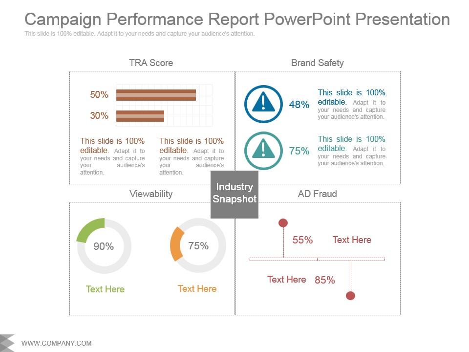
Presenting campaign performance report powerpoint presentation. This is a campaign performance report powerpoint presentation. This is a four stage process. The stages in this process are industry snapshot, viewability, ad fraud, brand safety, tra score.

FAQs for Campaign performance

Start with the basics - impressions, clicks, CTR, conversions. Those numbers matter most. Cost stuff is huge too: CPC, CPM, total spend so you can track where money actually went. Conversion rate and cost per conversion are game changers honestly, they show if your campaign is actually working or just burning cash. Oh and if you're doing brand awareness, toss in reach and frequency. The trick is matching metrics to what you're trying to accomplish instead of cramming every possible stat in there.

Check your cost-per-acquisition, conversion rates, and ROI for each channel first. Raw numbers matter, but so does lead quality - I've seen cheap channels bring terrible customers that aren't worth the headache. Multi-touch attribution is your friend here since last-click data misses half the story. Honestly, I just throw everything into a basic spreadsheet and rank by performance. Then figure out why the good ones work and the bad ones suck. Pull this stuff weekly so you can move budget around fast. Oh, and actually dig into the customer journey - that's where you'll find the real insights.

Keep it simple with charts people can actually read from across the room - bar charts and line graphs work best for stuff like CTR and conversions. I'm totally obsessed with color-coding everything by performance (green = good, red = bad). Makes it so obvious what's killing it vs what's tanking. Start with your biggest wins right up front, then back it up with data. Nobody wants to squint at messy tables during meetings, trust me. Oh and always end each section telling them exactly what to do next - otherwise they'll just nod and forget about it.

Check the revenue attribution part first - that's where the magic happens. Look at both direct AND assisted conversions because last-click attribution is honestly pretty misleading. Also peek at your time window settings since some campaigns take forever to convert. Do the math: (total attributed revenue minus campaign costs) divided by campaign costs times 100. Boom, there's your ROI percentage. Anything over 400% is pretty decent for most stuff. If the report doesn't calculate it automatically, just dump everything into a spreadsheet. Way easier to see patterns that way.

Dude, audience segmentation is a total game-changer for figuring out what's actually working in your campaigns. Break down your data by different groups instead of just staring at those overall numbers that tell you nothing. Your younger crowd might be obsessed with video content while older people scroll right past it - that kind of stuff you'd never catch otherwise. Honestly, I wish I'd started doing this sooner because you'll spot exactly where your budget's getting wasted. Just try splitting your next report by age and location first. The patterns that pop up will blow your mind.

Honestly, just start with Google Analytics and Data Studio - they're free and cover like 90% of what you need. If your company's got money to burn, Tableau and Power BI are solid for fancier stuff. Already using HubSpot or Salesforce? Their reporting's actually pretty decent. But here's the thing - I've seen people pull off amazing reports in plain old Excel with pivot tables. Sometimes the simple route wins. Oh, and if you're using Google Sheets, those pivot tables work great too. Start with whatever you can access now, then figure out what's missing later.

Check your metrics first - what's working vs. what's bombing? Low CTR usually means bad creative or you're hitting the wrong people. Conversion rates suck? Probably your landing page, not the ads themselves. Budget allocation is huge too - move money from losers to winners. I actually love digging into this stuff because you can spot quick fixes pretty fast. Oh, and if your landing page loads slow that'll kill conversions every time. The data basically tells you exactly what to fix, so don't overthink it. Just tackle the biggest problem first.

Honestly, competitor analysis is like cheating on a test but in the best way possible. You get to see what's actually crushing it in your market instead of just guessing. Look for gaps where they're killing it and you're falling behind - but also watch for stuff they're completely missing. CTRs, conversion rates, ad spend... you can benchmark all that against what everyone else is doing. The real gold though? Stealing their best messaging and creative ideas, then making them way better for your own brand. I mean, why reinvent the wheel when you can just build a better one, right?

Weekly reports are your best bet for most campaigns. Daily can work too if you're tweaking things constantly. I learned the hard way that staring at numbers every single day just made me paranoid - weekly patterns actually matter more. Though honestly? New campaigns are different. Go daily for those first couple weeks so you can catch any disasters early. Oh, and set up automated reports instead of pulling data manually each time. Trust me on that one - it'll save you so much hassle down the road.

Oh man, biggest thing is don't cherry-pick the good stuff and ignore context. Dumping raw numbers in a spreadsheet is pretty much worthless – honestly drives me crazy when people do that. You gotta compare the same timeframes and attribution windows, otherwise it's meaningless. When performance sucks, focus on actual insights instead of making excuses. That's where the real value is. Always tell them what you learned and what you'd change next time. People need to understand why things happened, not just see a bunch of data points.

Set up a side-by-side comparison showing how each variant performed. Screenshots are clutch here - people want to actually see what you tested. Include your hypothesis, sample sizes, and the statistical significance stuff. Conversion rates, CTR, whatever metrics matter most. The lift percentage is huge - that's what everyone cares about anyway. Don't forget confidence intervals so people know if the results actually mean something. Oh, and always end with what variant to roll out and your next testing ideas. Makes you look like you're thinking ahead.

Dude, you need the qualitative stuff because it tells you WHY your numbers look the way they do. Like maybe your click-through rates are amazing but conversions suck - customer feedback might reveal your landing page is a hot mess. Comments and surveys catch things spreadsheets totally miss. Plus you'll spot problems brewing before they tank your metrics. I always pull actual customer voices when I'm digging into performance data now. Makes such a difference honestly. Raw numbers only tell half the story.

Most of the time I stick to a 70/30 split - focus heavy on the numbers like CTR, conversion rates, ROAS. Then mix in the softer stuff like customer feedback and how people actually feel about the brand. Numbers show you what went down, but honestly? The qualitative bits explain the why, and that's where you strike gold. Oh, and here's something I learned the hard way - always pair your biggest win (or epic fail) with an explanation of why it happened. Makes your reports actually mean something instead of just being a data dump. Stakeholders eat that stuff up because it tells a real story.

Hey! So for social media, you're basically looking at engagement rate, reach, and how much people share or save your stuff - that tells you if your content actually hits. Email's different though. Open rates, click-through rates, and conversions matter way more since those people already said yes to hearing from you. Social builds the buzz and community vibe, but email? That's where you get people to actually do something. Oh and CTR benchmarks are wild - 1-2% rocks for social but sucks for email. I'd compare cost per engagement vs cost per conversion between them.

Honestly, I'd grab data from the past 6-12 months - whatever timeframe actually makes sense for your campaign type. Pull your CTR, conversion rates, cost per acquisition, stuff like that from similar campaigns or seasonal periods. Then just compare what you're seeing now against those averages. Are you crushing it? Tanking? Running pretty normal? This gives you realistic expectations instead of just guessing. Oh, and pick your top 3-4 KPIs and set up some basic benchmark ranges. Makes it way easier to spot when something's going sideways before it becomes a real problem.

Ratings and Reviews

90% of 100
Review Form
Write a review
Most Relevant Reviews
  1. 80%

    by Jack Johnson

    Good research work and creative work done on every template.
  2. 100%

    by Devin Daniels

    Qualitative and comprehensive slides.

2 Item(s)

per page: