

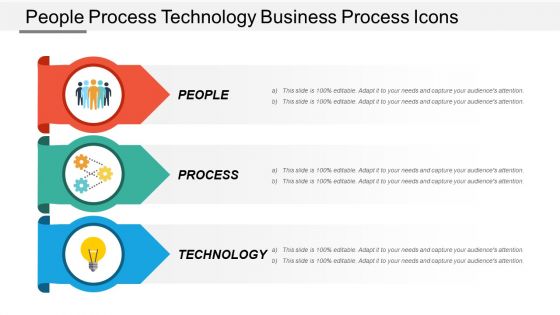
People process technology business process icons




Try Before you Buy Download Free Sample Product
 Impress Your
 Audience
 100%
100% Editable
 Save Hours
 of Time


Effectively cater for any challenge with our People Process Technology Business Process Icons. Get fit to handle the future.
People who downloaded this PowerPoint presentation also viewed the following :
People process technology business process icons with all 5 slides:
Inspire a burning desire to achieve with our People Process Technology Business Process Icons. It will fan the intensity.

FAQs for People process technology
Honestly, those little process icons are game-changers for presentations. Your audience gets the workflow instantly instead of zoning out over paragraph after paragraph. I've seen way too many people lose their crowd with text-heavy slides - it's brutal. Icons guide people through each step visually, plus they make everything look way more professional. They're perfect for international teams too since symbols work across languages. Oh, and here's a tip I learned the hard way - stick with one icon style throughout or it'll look messy. Trust me, your presentations will actually hold people's attention for once.
Think of business process icons as visual shortcuts - your brain processes images way faster than text, so they're perfect for quick understanding. Anyone can grasp what's happening at a glance, regardless of their job or tech knowledge. Icons also break up those horrible walls of text that make workflows look intimidating. Honestly, I've seen people's eyes glaze over when faced with dense process documents. Pick a standard icon set and stick with it across all your processes. Your team will start recognizing common actions automatically, which speeds everything up.
Start with clarity - your icons need to be instantly recognizable and consistent throughout. Keep them simple since process diagrams get cramped fast. Use universal symbols when you can (gear for settings, envelope for email) instead of reinventing the wheel. Honestly, detailed icons are the worst because they just become unreadable blobs when you shrink them down. Test with real users if possible - what's obvious to you might totally confuse them. Oh, and definitely keep a style guide so everyone's on the same page with the icon set. Makes everything way cleaner.
Honestly, custom icons are like giving your presentations a proper brand makeover instead of leaving them looking generic. You want your icon styles and colors matching your brand guidelines - makes everything feel way more put-together. Think of it like coordinating an outfit vs just throwing on whatever's clean (we've all been there). Your audience picks up on that visual consistency without even realizing it, which builds trust and helps them remember your stuff. The trick is finding icon sets that actually fit your brand's vibe, then sticking with them across all your slides.
So every industry has their own icon game figured out. Healthcare teams use stethoscopes and medical crosses for patient stuff. Manufacturing? Gears and assembly line symbols everywhere. Banks love their dollar signs and lock icons for compliance workflows - honestly makes sense since security is huge for them. Retail companies stick with shopping carts and delivery trucks to map supply chains. Here's the thing though - these aren't just pretty decorations. Your team will instantly recognize what each process does when you use familiar symbols. Skip the generic business icons and go with whatever your industry would immediately get.
Dude, color psychology totally changes how people use your business icons. Red screams "stop" or "urgent stuff" - you know the drill. Green feels like "all good" or finished tasks. For anything data-related or security, blue works because it feels trustworthy and solid. Yellow's tricky though... catches attention but gets annoying fast if you go overboard. Honestly, consistency matters way more than picking perfect colors. Once you choose your palette, stick with it religiously. People start recognizing patterns without thinking about it. Your team will zip through workflows so much faster when the colors actually mean something instead of just looking pretty.
Oh dude, animated icons are clutch for this stuff! Spinning gears show operations running, arrows can indicate data moving around, pulsing dots for anything that's currently active. Way better than boring static ones, honestly. Perfect for dashboards or when you're mapping out processes and need people to spot bottlenecks quickly. Just don't go overboard with the animations - I've seen some that are so distracting you can't focus on anything else. Keep them subtle but purposeful. They're great for showing if something's running vs just sitting idle too.
Okay so the main thing that drives me nuts is when people mix like 5 different icon styles - it just looks sloppy. Don't make your icons super complicated either, nobody wants to decode tiny details. I'd say stick with stuff that actually makes sense for what you're showing instead of getting all abstract and artsy with it. Oh and here's the thing - you don't need an icon for everything! Sometimes a regular text box works way better than jamming in some random symbol that doesn't fit. Try showing your diagram to someone who's never seen it before. They'll tell you real quick if your icons are confusing.
Oh man, this is such a real thing! Icons that make perfect sense to us can be totally confusing or even offensive in other places. Like thumbs up? Super positive here, but actually rude in parts of the Middle East. Colors are tricky too - red screams "danger" to us but means good fortune in other cultures. Even arrows can mess things up since some languages read right-to-left. Honestly, I'd just test everything with your local team first. Or play it safe and stick to basic shapes - avoid hand gestures completely because they're just asking for trouble.
Honestly, just use vector tools since they won't get pixelated when you resize. Figma's my favorite - it's free and you can collaborate easily with your team. Adobe Illustrator is obviously great if you've got the budget for it. Canva works fine for quick stuff, though it's pretty basic. Oh, and Sketch if you're on Mac. The main thing is keeping your designs simple. I learned this the hard way - complex icons turn into blurry messes when they're small in your process flows. Stick with clean geometric shapes and you'll be good.
Honestly, icons are a game-changer for this stuff. Your marketing people, IT team, and ops folks all look at the same symbol for "approval process" and boom - everyone gets it instantly. No more "wait, what does this step mean?" interrupting every meeting. Process maps get clearer, onboarding happens faster since new people don't have to learn everyone's weird department slang. I'd say start small though - pick maybe 10-15 core icons for your most common cross-team processes first. You'll be shocked how much smoother everything runs when people aren't constantly translating jargon.
Match your icon sizes to your text - tiny icons with massive headlines look weird. Pick one style and stick with it throughout (mixing flat and 3D icons is honestly just distracting). I always put icons in the same spot relative to text - left side or above, whatever works. Give everything room to breathe with white space. Your icons should actually mean something related to your content, not just random decoration. Oh, and definitely check how it looks from across the room - you'd be surprised how often text becomes unreadable from the back.
Honestly, icons are like visual shortcuts for your audience's brain. People zone out way less when they can actually see what you're talking about. Your brain processes visuals something like 60,000 times faster than text - which sounds made up but it's legit wild when you think about it. Complex workflows become way easier to follow when you're not drowning people in bullet points. Plus it breaks up the monotony. I'd swap out at least half your text for relevant icons next time. You'll be surprised how much more engaged people get.
So I've been noticing minimalism is huge right now - clean, simple icons that actually scale well across different devices. That super detailed stuff? Honestly looks kinda outdated already. Adaptive design is another big one. Also seeing way more focus on consistency within icon families, which makes sense because your whole interface should speak the same visual language. Oh, and accessibility isn't optional anymore - better contrast, clearer symbols that work for everyone. You should probably audit what you've got now against these standards. Style guide would help too if you don't have one.
Track click-through rates and how fast people actually complete tasks. Run A/B tests with different icon sets - you'll be surprised which ones work better. Most companies never bother testing this stuff, which is wild. Watch real users during usability sessions too. Are they hesitating? Clicking wrong things? That tells you way more than just the numbers. Oh, and definitely send out feedback surveys. Start with icons for your three biggest business processes first. Mix the hard data with what you observe - both matter. Sometimes an icon tests well but still confuses people in practice.
-
Awesome presentation, really professional and easy to edit.
-
Excellent work done on template design and graphics.