


People Process Technology Powerpoint Presentation Slides






Try Before you Buy Download Free Sample Product
 Impress Your
 Audience
 100%
100% Editable
 Save Hours
 of Time


Draw up a contract with our People Process Technology Powerpoint Presentation Slides. Include all the critical clauses.
People who downloaded this PowerPoint presentation also viewed the following :
Content of this Powerpoint Presentation
Slide 1: This slide introduces People Process Technology. State Your Company Name and begin.
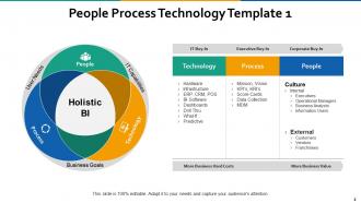
Slide 2: This is the first People Process Technology Template slide showing Holistic BI: Process, Technology, People, User Needs and IT Capabilities in a triangular image form.
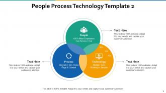
Slide 3: This is second People Process Technology Template slide showing its three components- People: All Or Most Employees Can Access / Use, Technology: Multiple Tools Working In Tandem, Process: Integration Into Home Page & Content.
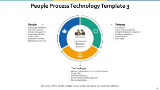
Slide 4: This is the third People Process Technology Template slide with points and sub points menetioned. Use it as per your business need.
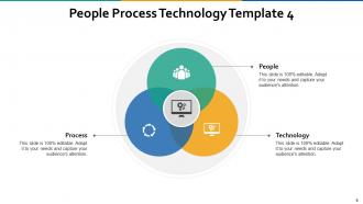
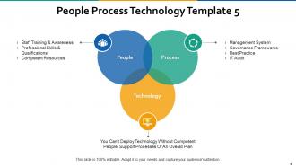
Slide 5: This is the fourth People Process Technology Template slide showing all of its three components: People, Technology and Process in form of a circular flow diagram. Use it as per your business need.
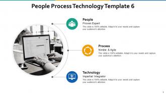
Slide 6: This is the fifth People Process Technology Template slide with icon imagery and text boxes to state relevant information.
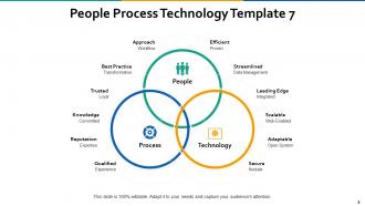
Slide 7: This is the sixth People Process Technology Template slide with relevant imagery. Use as per your business requirement.
Slide 8: This is the seventh People Process Technology Template slide showing PEOPLE, TECHNOLOGY and PROCESS as main sub headings and Knowledge Committed, Reputation Expertise, Trusted Loyal, Qualified Experience, Leading Edge Integrated, Scaleable Web-Enabled, Adaptable Open Systems, Secure Nodular, Best Practice Transformation, Approach Workflow, Efficient Proven and Streamlined Data Management as secondary sub headings.
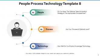
Slide 9: This is the eighth People Process Technology Template slide showing People: Do you have the optional talent acquisition strategy & the appropriate competencies? Process: Are your process at an optional level? Technology: How well do you employ & Leverage Technology?
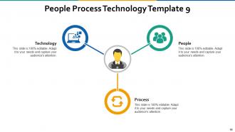
Slide 10: This is the ninth People Process Technology Template slide showing its three components People, Process and Technology in a triangular form with their respective icons.
Slide 11: This slide shows People Process Technology Icons.
Slide 12: This slide is titled as Additional Slides for moving forward.
Slide 13: This slide shows Clustered Column chart with three products comparison.
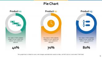
Slide 14: This slide shows Pie Chart with three products comparison.
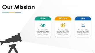
Slide 15: This is Our Mission slide with Imagery and text boxes.
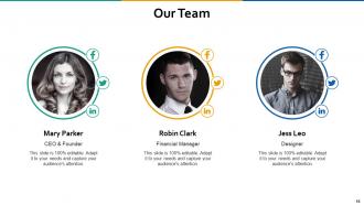
Slide 16: This is Our Team slide with names and designation.
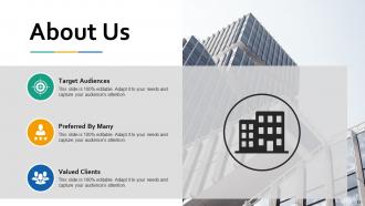
Slide 17: This is About Us slide to show company specifications etc.
Slide 18: This is a Comparison slide to state comparison between commodities, entities etc.
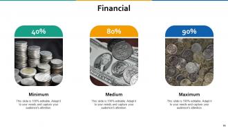
Slide 19: This is a Financial slide. Show finance related stuff here.
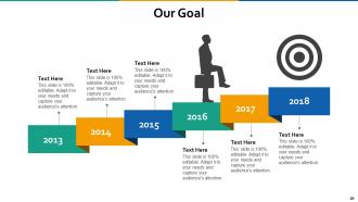
Slide 20: This is Our Goal slide. State your important goals here.
Slide 21: This slide displays Magnifier Glass with text boxes.
Slide 22: This is a Thank You slide with address, contact numbers and email address.
People Process Technology Powerpoint Presentation Slides with all 22 slides:
Give folks a heavenly experience with our People Process Technology Powerpoint Presentation Slides. It helps create an ethereal atmosphere.





FAQs for People Process Technology
Honestly, start with your main message first, then build everything else around that. You'll want a hook right up front - something that grabs them. Keep slides super clean with bullet points instead of walls of text (trust me on this one). Make sure people in the back can actually read your font size. Practice your timing so you're not speed-reading through everything. Skip the cheesy stock photos - they're distracting. Focus on telling a story instead of just dumping information. Oh, and have a strong ending that sticks with people.
Okay so here's the thing - your PowerPoint shouldn't be a boring data dump. People remember stories way better than bullet points. We literally process images like 60,000 times faster than text (crazy right?). So use that! Add images, icons, simple drawings to show your point instead of just telling it. Each slide becomes part of your story rather than random facts slapped together. I always start with my main message first, then think: what pictures would actually help someone get this? It's like creating chapters that flow together. Trust me, your audience will thank you for not making them read walls of text.
Honestly, just pick 2-3 colors max or it'll look like a rainbow threw up on your slides. If you've got brand colors, use those. Otherwise grab one main color and stick with grays or white for the rest. Oh, and please don't do light text on dark backgrounds - I learned that the hard way when half my audience was squinting at yellow letters they couldn't see. Bright colors are fine if you're pitching something creative, but maybe tone it down for serious meetings. Test everything on the actual projector first since colors always look weird when projected compared to your laptop screen.
Honestly, less is more with animations. Basic transitions like "Fade" or "Push" between slides look clean. For bullet points, try "Appear" or "Fly In" - they work without being annoying. Those spinning, bouncing effects? They're the worst. People get distracted and miss your actual point. Time everything to match how fast you talk. There's nothing more awkward than standing there waiting for text to slowly crawl across the screen. Oh, and definitely test it all beforehand - animations have this magical ability to completely break right when you need them most!
Okay so first thing - don't cram a wall of text on every slide. People will just read instead of listening to you talk. Use big enough fonts that someone in the back can actually see them. Those weird spinning animations? Skip them entirely, they're so outdated. Pick a simple color scheme with good contrast so your text doesn't disappear. Here's the big one though - never just read your slides out loud like you're doing karaoke night. One main point per slide works best. Visuals should help your argument, not distract from it. Trust me on this.
Honestly, it's all about knowing your audience. Tech companies go super minimal with tons of data viz to show off growth metrics. Healthcare sticks with that trustworthy blue-and-white thing - kinda boring but it works. Finance is all charts and conservative colors because they want to look stable (makes sense, I guess). Creative agencies completely flip the script though - they use wild colors and layouts that would make a banker cry. My advice? Look at what the big players in your industry are doing and steal their visual style. Not literally steal, but you know what I mean.
Honestly, font choice can totally make or break your presentation. Go with something clean like Arial or Calibri - those fancy script fonts look pretty but they're impossible to read from the back of the room. Size matters too! At least 24pt for regular text, bigger for headers. I learned this the hard way when half my audience was squinting at my slides lol. Sans-serif is your friend here. Keep everything consistent throughout and definitely do a test run from across the room. You'd be surprised how different things look from a distance.
Honestly, data viz tools are a game changer for presentations. Your audience won't have to squint at endless spreadsheet rows anymore. Bar charts and pie charts tell the story way faster than tables full of numbers. I mostly use PowerPoint's built-in stuff, but Tableau and Power BI are solid if you want to get fancy. The key is figuring out your main point first, then picking whatever chart type actually supports it. Trust me, people zone out hard when you throw raw data at them. Even a simple graph makes everything click instantly.
Dude, templates are a lifesaver. Seriously cuts down your prep time since you're not staring at a blank slide wondering where to put stuff. They make everything look way more professional too - I'm definitely not winning any design awards on my own! You just drop your content in and you're good to go. Most templates already handle the boring stuff like making sure text is readable and follows company rules. Oh, and they keep your branding consistent across slides. I'd grab maybe 3 or 4 different ones for different types of presentations. Trust me, your future stressed-out self will thank you.
Mix up your slides to hit different learning styles - keeps everyone from zoning out. Visual people love charts and images way more than walls of text. For audio learners, your explanations matter plus maybe throw in a video clip or two. Kinesthetic is harder with PowerPoint but interactive polls work, or just mention hands-on stuff they can try later. Honestly, I started doing this because my own presentations were putting me to sleep. Try layering things so each slide hits at least two styles at once - like a chart with good verbal explanation.
Dude, presentations are all about visuals and stories - ditch those bullet point death traps. I bombed so many talks before figuring this out lol. Keep text super minimal (like 6 words max per bullet). Ask questions to wake people up and actually look at them instead of your screen. Oh, and transitions between slides matter more than you'd think. Throw in some polls or quick discussions too. People zone out crazy fast if you're just reading facts at them. The whole point is making them remember something, right? Practice helps but honestly the interactive stuff saves you every time.
Honestly, the accessibility checker in PowerPoint is a lifesaver - run that first and it'll flag most problems for you. Make sure your fonts are at least 18pt, and stick with boring ones like Arial. I know, I know, but those fancy fonts are impossible to read. High contrast colors are huge too. Oh, and add alt text to your images and charts - takes like 2 seconds per slide. Structure stuff with headings instead of just throwing text everywhere. Bullet points work way better than long paragraphs anyway.
Honestly, interactive stuff makes such a difference - clickable hotspots on images, short video clips embedded right in your slides. I'm obsessed with using animated GIFs instead of boring static photos now. Audio narration is clutch too, especially after I sat through like 10 terrible presentations last month. Live polls work really well if you're presenting in person. Oh, and subtle background music during story parts? Chef's kiss. Just don't go crazy with it or people won't focus on what you're actually saying. I'd start with maybe one or two multimedia things and see how it goes.
Oh this is actually pretty easy! Go to View > Slide Master first - that's where all the template stuff lives. Then just swap in your brand colors, change the fonts to whatever your company uses, and plop your logo somewhere in the header or footer. Charts and graphics need their colors updated too (always forget about those). Save it as a custom template afterward so your whole team can access it. Honestly the slide master is kind of ugly to look at but once you're done, every new slide automatically gets your branding. Way better than doing it manually every time.
Think of it like telling a story to someone you actually want to listen. Hook them right away, then build up the problem so they're invested in what happens next. Your slides should flow together - I love using stuff like "but then we found out" or "here's the crazy part." Honestly, I picture myself explaining it over drinks rather than in some boardroom. Pick one thread and stick with it the whole way through - could be following a customer's experience or whatever challenge you're solving. Don't be afraid to cut slides that seem cool but don't actually move your story forward. Circle back to your opening theme at the end so it feels complete, not just like you ran out of slides.
No Reviews