


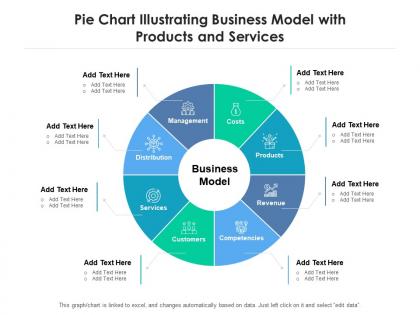
Pie chart illustrating business model with products and services




Try Before you Buy Download Free Sample Product
 Impress Your
 Audience
 100%
100% Editable
 Save Hours
 of Time


Our Pie Chart Illustrating Business Model With Products And Services are topically designed to provide an attractive backdrop to any subject. Use them to look like a presentation pro.
People who downloaded this PowerPoint presentation also viewed the following :
Pie chart illustrating business model with products and services with all 2 slides:
Use our Pie Chart Illustrating Business Model With Products And Services to effectively help you save your valuable time. They are readymade to fit into any presentation structure.
FAQs for Pie chart illustrating business model with
Definitely focus on your biggest revenue streams and major costs - stuff like customer acquisition, operations, R&D. Don't go crazy with tiny slices though. I made that mistake once and it looked like a toddler's art project. Stick to maybe 5-7 categories tops. Make sure you've got actual percentages on there, not just colors floating around. Oh, and add a little legend explaining what each slice means - your "operations" might be totally different from someone else's. Trust me, stakeholders hate having to decode your chart like it's some puzzle.
Honestly, pie charts are perfect for this stuff. You can literally see which parts of your business are huge vs tiny at a glance. Like if 80% of your revenue comes from one client - yikes, that's risky. Same with costs eating up way more than they should. Your team will actually understand what you're talking about instead of glazing over at spreadsheets. I'd make one showing where you are now, then sketch out where you want to be next year. It's weirdly satisfying once those numbers click visually. Plus investors love anything they can grasp in 2 seconds.
Honestly? Just start with Excel or Google Sheets - they're super easy and you probably already know how to use them. Canva's great if you want it to look prettier without much effort. Adobe Illustrator gives you way more control but there's definitely a learning curve there. PowerBI and Tableau are pretty intense for just making pie charts, though they're incredible if you're dealing with tons of data that updates constantly. I've definitely gone down rabbit holes trying to make the "perfect" chart when honestly, a clean Excel one would've been fine. Whatever you're comfortable with is your best bet to start.
Your pie chart's gonna look totally different depending on what business you're in. SaaS companies dump like 40% into R&D and getting customers. Restaurants? More like 30-35% just on food and staff costs - which honestly makes sense when you think about it. Manufacturing is all about materials and production expenses. Service businesses spend most of their money on people since, well, that's basically what they're selling. Don't just grab some random business template online though. Look up actual industry reports for your specific sector to see what's normal. Those numbers will be way more useful than generic advice.
Don't cram a million tiny slices under 5% - nobody can read that mess. Also avoid colors that look identical or make zero sense together. I see so many people go crazy with 3D effects thinking it looks "professional," but honestly it just makes everything harder to read. Your biggest slice should start at the top, then arrange the rest by size. Oh, and double-check your math actually hits 100% because that's embarrassing when it doesn't. Clear labels are your friend. Trust me on this one - simple beats fancy every time.
Honestly, pie charts are perfect for this stuff. Your board can instantly see which revenue streams are crushing it vs the tiny ones without digging through boring spreadsheets. Plus it shows if you're way too reliant on one source - which happens more than you'd think. The visual just clicks faster than numbers ever will. Board meetings go so much smoother when everyone gets the story immediately instead of squinting at data tables. Oh, and definitely stick to your top 5-6 streams max, otherwise it'll look like a rainbow mess that nobody can read.
Colors make or break your pie chart, seriously. Pick contrasting ones so people can actually tell your revenue streams apart - I've seen too many that just look like mud! Your brand colors are great if they work, but readability wins over branding every time. Make your biggest segments darker to grab attention. Green for profits, red for costs - that psychology stuff actually helps. Oh and test it in black and white since people still print things out sometimes. Don't forget the legend either.
Honestly, I'd refresh that pie chart every quarter. Whenever something big shifts with your revenue or costs, update it then too. I get it - feels like pointless admin work. But those charts catch stuff you'd totally miss otherwise. New products launching? Different markets? Pricing changes? Update it right after. Small shifts add up fast and suddenly your actual business looks nothing like what's in your head. I learned this the hard way with my cousin's coffee shop - thought retail was still their main thing but delivery had quietly become 60% of sales. Just set a quarterly reminder and call it done.
Yeah, pie charts can do both but it gets tricky. The numbers part is straightforward - slice sizes show your percentages or whatever data you're working with. For the qualitative stuff, you'd use colors or little icons to represent things like risk levels or market types. But here's the thing - it turns into a hot mess really quickly if you're not careful. I'd stick to maybe 2-3 qualitative categories tops. Otherwise you'll need a legend the size of Texas just to explain what everything means. Honestly might be easier to pair it with a simple table on the side.
Your pie chart needs backup data to actually make sense. Throw in a timeline showing how revenue's changed over the last few quarters – a big slice is meaningless if that segment's tanking. Bar charts comparing you to competitors help too, plus a simple table with real dollar amounts because percentages lie sometimes. Oh, and if you're in multiple markets, break it down geographically. Stakeholders need the full picture, not just a snapshot. Trust me, they'll ask for this stuff anyway.
Pie charts are perfect for showing revenue breakdowns or market splits - investors eat that visual stuff up. They're drowning in decks all day, so anything clean and easy to read scores major points. Show your different revenue streams or customer segments with simple charts. Oh, and double-check your math adds to 100% because I've seen way too many founders mess that up (awkward). Use colors that actually contrast so people can tell sections apart. The whole point is painting a picture of growth potential or diversified income that makes investors feel less nervous about risk. Keep labels big enough to read without squinting.
Totally! Different audiences care about completely different stuff. Investors want the money side - revenue streams, profit margins, growth potential. Meanwhile, employees need to see how they actually fit in, plus operational stuff and company priorities. Honestly, throwing workflow details at investors just makes their eyes glaze over. For the money people, stick to cash flow and market opportunities. Employee version should highlight value creation and how teams contribute. Make like 2-3 versions and you'll be way more effective. It's actually pretty smart once you think about it.
Honestly, focus on three main ratios for your pie chart: revenue by segment, where customers come from, and how you're spending money. Revenue breakdown is always a hit because people want to see what's actually making you money. For costs, you can split it fixed vs variable or by department - whatever tells the story better. Customer lifetime value by segment works well too if your data's decent (though that one can get messy fast). Really just pick whichever ratio backs up the main point you're trying to make about how your business works. Don't overthink it.
Hey! So for pie charts, don't go crazy with too many slices - like 5-7 max or it gets messy. Pick colors that actually make sense together, not random rainbow stuff. I always put the percentages right on the chart because legends are annoying to look back and forth at. Oh and if there's one slice you really want people to notice, pull it out a tiny bit from the center. Makes it pop. Basically think of it like you're showing someone your data in 30 seconds - they should get it immediately without squinting or getting confused.
So Netflix does this really well - they'll show how much they spend on original shows vs licensed stuff vs movies. Tesla breaks down their revenue streams too, like vehicle sales versus energy storage. Apple's pie charts for App Store revenue always look ridiculously polished (because, well, it's Apple). Salesforce uses them for customer segments which actually makes sense. The trick is sticking to maybe 3-4 big slices max. Nobody wants to squint at tiny wedges that don't really tell the story anyway.
-
Awesome presentation, really professional and easy to edit.
-
Best Representation of topics, really appreciable.
-
Great quality product.
-
Unique design & color.
-
Colors used are bright and distinctive.
-
Very unique, user-friendly presentation interface.
-
Top Quality presentations that are easily editable.