


Pitch book general and deal ipo pitchbook ppt template




Try Before you Buy Download Free Sample Product
 Impress Your
 Audience
 100%
100% Editable
 Save Hours
 of Time


General pitchbook provides an overview of the company and includes relevant information, such as past successful investments, recent market trends, current deals, and profits. A deal pitchbook is prepared for specific values, focusing on how the investment firm can offer services that suit the clients financial needs. Check out our professionally designed Pitchbook General and Deal IPO template that covers company overview such as critical services offered, significant clients, leadership team, deal statistics such as IPO deals count in past five years, investment banking deals, etc. This further includes investment banking market trends, competitive market, competitor comparison, product differentiation, etc. Also, in this initial public offering pitchbook, we have covered details related to IPO timeline, dividend policy, IPO roadshow, investment highlights, companys strategy, income statement, key financials, etc. Talk to our expert team for your queries and book a free demo with our experienced and influential research analysts. Get access to the pitch deck on General and Deal IPO Pitchbook and download the template now.
People who downloaded this PowerPoint presentation also viewed the following :
Content of this Powerpoint Presentation
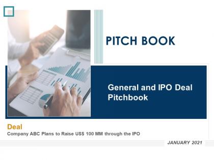
Slide 1: This slide displays the title i.e. 'General and IPO Deal PitchBook' and your company name.
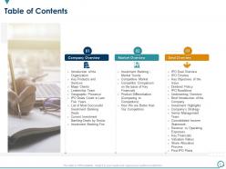
Slide 2: This slide presents the table of contents for the project.
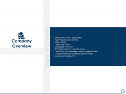
Slide 3: This slide exhibits the title for company overview.
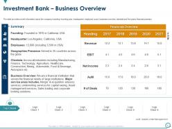
Slide 4: The slide provides a brief information about the company including founding year, headquarter, clientele and five years financial summary, etc.
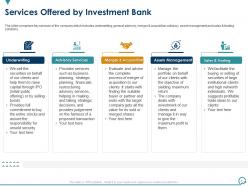
Slide 5: The slide comprises key services of the company which includes underwriting, merger & acquisition advisory, asset management and sales & trading solutions.
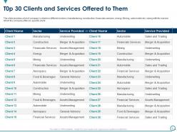
Slide 6: The slide provides a list of company’s clients in different sectors along with the service which the company offers to specific client.
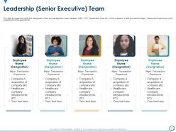
Slide 7: The slide provides the name and designation of the key management team members (CEO, CFO, Department head etc.) of the company.
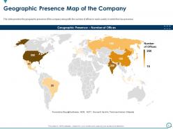
Slide 8: The slide provides the geographic presence of the company along with the number of offices in each country in which the has presence.
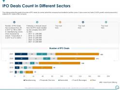
Slide 9: The slide provides the graph of number of IPO deals (by sector) which the company has handled in last five years.
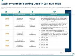
Slide 10: The slide provides the top five deals (by profit amount) of the company in last five years.
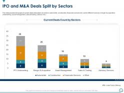
Slide 11: The slide provides the graph of current deals bifurcation under different services.
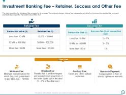
Slide 12: The slide covers the fee structure of the company for its services.
Slide 13: This slide shows the title for market overview.
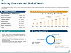
Slide 14: The slide provides the industry overview and key facts (market trends) of the industry.
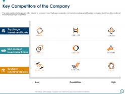
Slide 15: The slide provides the key players in the industry by company’s size (Top/Large companies, mid market companies, small/boutique companies etc.).
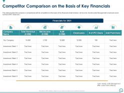
Slide 16: The slide provides the company’s comparisons with its competitors on the basis of key financials (total revenue, net income, number of IPO deals etc.)
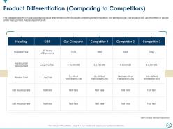
Slide 17: The slide provides the key unique points (product differentiation) of the products comparing to its competitors.
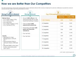
Slide 18: The slide provides the key strong points (market position, awards, distribution network) of the company comparing to its customers.
Slide 19: This slide displays the title for deal overview.
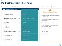
Slide 20: The slide provides the overview of IPO deals.
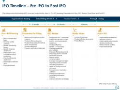
Slide 21: The slide provides the timeline of IPO issue and covers the five steps i.e. Pre-IPO planning, Preparation for Filing, SEC Review, Road Show, and Post IPO.
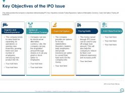
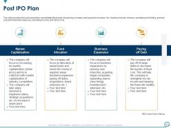
Slide 22: The slide provides the company’s objectives behind issuing IPO.
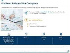
Slide 23: The slide provides POST IPO Dividend Distribution Policy of the company which covers the type and different ways/methods of dividend payment.
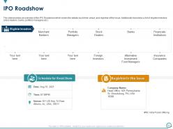
Slide 24: The slide provides an overview of the IPO Roadshow which covers the details such time, venue, and registrar of the issue.
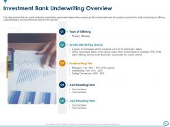
Slide 25: The slide provides the key points related to underwriting agreement between the company and the investment bank.
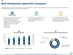
Slide 26: The slide provides the brief introduction about the company introducing IPO.
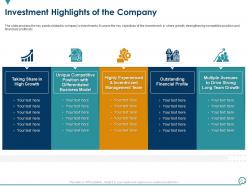
Slide 27: The slide provides the key points related to company’s investments.
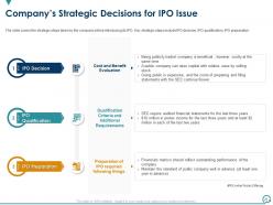
Slide 28: The slide covers the strategic steps taken by the company before introducing its IPO.
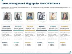
Slide 29: The slide provides the name and designation of senior management teams (CEO, CFO, Department Head etc.) of the company.
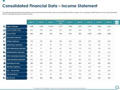
Slide 30: The slide provides the historical (last three years) and forecasted (next five years) income statement of the company.
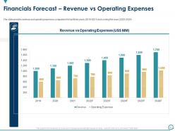
Slide 31: The slide provides revenue and operating expenses comparison for last three years (2019-2021) and coming five years (2022-2026).
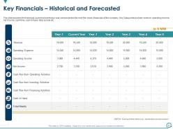
Slide 32: The slide provides the historical (current and previous year) and projected (for next five years) financials of the company.
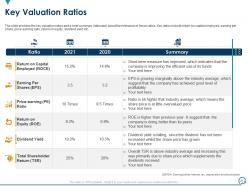
Slide 33: The slide provides the key valuation ratios and a brief summary (rationale) about the relevance of those ratios.
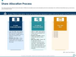
Slide 34: The slide provides the methods of share allocation in different subscription cases (oversubscription and under subscription).
Slide 35: The slide provides the post acquisition consolidated financials of acquiring company and acquired company.
Slide 36: This is the icons slide for the pitchbook.
Slide 37: This slide displays the title for additional slides.
Slide 38: This slide shows about the company, target audience and its client's values.
Slide 39: This slide presents the details of the team members responsible for the project.
Slide 40: This slide exhibits the targets of the company.
Slide 41: This slide explains the puzzle related to company and pitchbook.
Slide 42: This slide is for important notes related to the pitchbook.
Slide 43: This slide shows the stacked column chart for different products. The charts are linked to Excel.
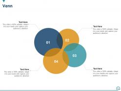
Slide 44: This slide displays the venn of the company.
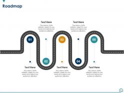
Slide 45: This slide presents the roadmap of the company.
Slide 46: This is the thank you slide and contains contact details of the company including phone no., office address, etc.
Pitch book general and deal ipo pitchbook ppt template with all 46 slides:
Use our Pitch Book General And Deal IPO Pitchbook Ppt Template to effectively help you save your valuable time. They are readymade to fit into any presentation structure.




FAQs for Pitch book general and deal ipo
So your pitchbook needs the usual suspects: company overview, problem/solution, market size, business model, traction, team, financials, and funding ask. But here's the thing - tons of founders just jump straight to their solution without explaining what sucks right now. Don't do that. Walk investors through the actual problem first, then show how you're gonna fix it and make money doing it. Keep slides super visual, throw in real customer quotes if you've got them. Oh and tailor each deck to your audience because VCs want different stuff than strategic partners. End with concrete next steps so they know what you need from them.
Dude, visuals can totally save your pitchbook presentation. Nobody wants to stare at endless spreadsheets - charts and graphs help people actually understand your financial stuff without their eyes glazing over. I'd stick with clean, simple design that flows naturally. Team photos and product screenshots make everything feel more real too. Oh, and here's something I learned the hard way - don't go overboard with fancy graphics just because you can. One solid visual per slide works way better. Everything should back up your main story, not distract from it.
Start with the boring stuff upfront - compliance highlights, licenses, certifications. Banks love seeing that first. Case studies from similar financial clients should be super prominent, that's your credibility right there. Risk management and data security sections are non-negotiable. Integration capabilities matter too since they'll definitely ask how you work with their existing systems. Show you understand their specific headaches like digital transformation or regulatory nightmares. Oh, and create template slides for different pain points - saves you tons of time when customizing for banks vs insurance vs investment firms.
Dude, your audience is literally everything when it comes to pitchbooks. VCs want hard data and growth metrics. C-suite folks? Keep it high-level, they don't have time for details. I bombed this one meeting bringing 40 slides when they clearly wanted the quick version - super awkward. Technical people actually want the nitty-gritty stuff though. Match their expertise and attention span or you'll lose them. Corporate execs care about ROI and how it fits their strategy. Always stalk their LinkedIn first (kidding but not really) to figure out what they actually care about.
Start with your investment thesis right up front - don't make people hunt for it. Then hit them with the "why now" moment and market size. After that, introduce the company and team, walk through the numbers and how they stack up against competitors. I've watched so many people screw this up by drowning readers in market research first. Nobody cares about your 47 charts on TAM if you haven't sold them on the idea yet. Make sure each section flows into the next one naturally. You want readers nodding along thinking "yeah, this checks out." Wrap up with concrete next steps.
Dude, forget just throwing data at people - tell them a story instead. Start with the problem, build up the drama around what's going wrong, then boom - your solution saves the day. I always think of it like explaining to someone why this deal actually matters, you know? Weave your numbers into that narrative instead of just bullet-pointing everything to death. Concrete examples work way better than abstract concepts (client testimonials are gold for this). Each section needs a beginning, middle, and end. Trust me, it flows so much better than random facts scattered everywhere.
Dude, branding is huge for pitchbook templates. Your company colors, fonts, and logo need to be woven throughout every slide - makes it actually yours instead of looking generic. I've honestly seen way too many decks that scream "default PowerPoint template" and it's rough. Don't go overboard though. Subtle integration beats slapping your logo everywhere like you're marking territory lol. Create a solid master slide first with all your brand stuff, then work from there. Oh and keep it consistent but not boring - there's definitely a balance to hit.
Ugh, the worst thing you can do is cram everything onto one slide. Like seriously, nobody wants to read a novel up there. Make each slide about ONE thing. Also don't bounce around topics randomly - your flow should make sense from problem to solution, you know? Keep charts simple so people can actually read them (I've seen some truly terrible tiny fonts). Skip the cheesy stock photos too - we all know you didn't really have a boardroom handshake moment. Oh, and definitely end with what you actually want from them. Otherwise they'll just sit there like "...so what now?"
Honestly, visuals are a game-changer for pitches. Nobody wants to squint at spreadsheet rows during your presentation - charts and graphs let people actually absorb your data fast. I'd focus on the sections where you're losing people and swap those text blocks for clean visuals. Waterfall charts work great for revenue projections. Comparison graphs make market size way more digestible. The trick is matching the right visual to each data point. Don't overcomplicate the design though. Simple beats fancy every time when you're trying to tell a story with numbers.
Just stick with PowerPoint for now - everyone expects it anyway and you already know how to use it. If your design skills are trash like mine, Canva has some decent templates that'll make your deck look way more professional. Google Slides is clutch when you're working with a team since everyone can jump in and edit. Figma's cool if you want something fancy and interactive, but honestly it's kind of a pain to learn. My advice? Master your content in PowerPoint first, then mess around with Canva once you've got your story down.
Honestly, consistency makes or breaks your whole deck. Same fonts, colors, spacing throughout - otherwise people get distracted wondering why everything looks random. I've sat through presentations that looked like a collage project (probably because different people worked on each section). It's so jarring. Your audience should focus on what you're saying, not puzzle over why the design keeps changing. Build a solid template first with all your key elements locked down. Then stick to it religiously. Makes you look way more professional and helps your story actually land instead of getting lost in visual chaos.
Okay so here's the deal - if you're a startup, lean hard into the problem you're solving and why your team can actually pull this off. You probably don't have crazy revenue numbers yet, so sell the vision instead. But established companies? Total opposite approach. Lead with your metrics, growth numbers, happy customers - all that good stuff you've already proven. I always think startups are basically asking people to bet on potential while established companies get to flex their track record. So yeah, put your best cards up front depending on where you are. Makes sense?
Virtual slides need way bigger fonts - seriously, screen resolution kills tiny text. Split dense stuff across multiple slides because people's attention dies on video calls. I always add more visual cues so nobody gets lost scrolling through their phone. In-person? You can cram more details since you're there to walk them through it. The real game-changer is pacing though. Virtual needs punchy segments with interaction breaks every few minutes. Oh, and definitely test your deck on a video call first - what looks good on your monitor might be garbage on Zoom. Trust me on that one.
Honestly, just ask your prospects straight up what worked and what didn't - yeah it's awkward but you'll get the best feedback that way. Track your conversion rates obviously. If you're using digital tools, check which slides people spend time on vs. skip over completely. During presentations, notice where you lose people or when they start checking phones (brutal but tells you everything). Set up monthly reviews with your team to catch outdated stuff. Oh and watch for sections that always generate the same questions - usually means something's unclear. The whole point is building this feedback loop so you're not just guessing what resonates.
ESG stuff is everywhere now - investors are obsessed with your sustainability story. Also, thank god we're finally ditching those insane 40-slide decks for shorter, visual ones with interactive bits. Clean charts and infographics beat walls of text every time. Video intros are pretty much expected at this point. Oh, and the cookie-cutter approach is dead - you've got to tailor content for different investor types now. Honestly, if your pitchbook still looks like it's from 2019, you're probably losing deals. I'd start by overhauling your visual framework first.
-
Informative presentations that are easily editable.
-
Easy to edit slides with easy to understand instructions.