


Pitch deck to raise funding from bridge financing powerpoint presentation slides




Try Before you Buy Download Free Sample Product
 Impress Your
 Audience
 100%
100% Editable
 Save Hours
 of Time


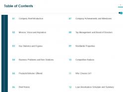
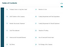
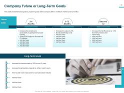
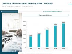
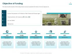
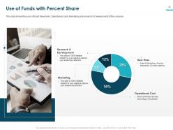
Cover your fixed and variable costs by employing this Pitch Deck To Raise Funding From Bridge Financing PowerPoint Presentation Slides. Acquire funding for your business startup with this fundraising pitch complete deck. Formulate a plan of action to get your business started till the heavy investment pours in by taking the aid of these caveat loan pitch PPT templates. Select these startup pitch PPT slides to mention the long-term goals of your organization in an eye-catching manner. This swing loan pitch PPT slideshow is designed to help you create a winning presentation for gaining the interest of potential investors. Highlight the historical and forecasted revenue using these pre-seed pitch PPT designs; provide a sense of reliability to the investors towards your company. Showcase the project context and objective in an attractive and comprehensible manner with the assistance of this investor pitch PPT presentation. You can create a visual treat for your audience by utilizing these professionally designed funding deck PPT themes for procuring finance to fulfill the immediate business requirements.
People who downloaded this PowerPoint presentation also viewed the following :
Content of this Powerpoint Presentation
Pitch deck to raise funding from bridge financing powerpoint presentation slides with all 41 slides:
Use our Pitch Deck To Raise Funding From Bridge Financing Powerpoint Presentation Slides to effectively help you save your valuable time. They are readymade to fit into any presentation structure.


FAQs for Pitch deck to raise funding from bridge financing
Stick to 10-12 slides max - problem, solution, market size, business model, traction, competition, team, financials. Oh and don't forget the ask (how much cash you need). I swear half the decks I see go on forever and investors just zone out. Each slide should hit one main point. Visuals beat walls of text every time. Make sure your problem flows into your solution naturally - that's where you hook them. Practice the whole thing in 10 minutes, then save time for questions. That's honestly where deals get made anyway.
Dude, seriously - stories are what make pitch decks actually stick. Nobody remembers another boring slide full of numbers, but they'll remember the narrative about your problem and solution. Think of it like a movie: start with the pain point that hooks them, build up the market tension, then boom - your product saves the day. Honestly, our brains are just wired to connect with stories over spreadsheets. Structure it so there's this natural flow from problem to solution to "here's how we win together." End with super clear next steps. Trust me, investors will thank you for not putting them to sleep.
Honestly, the worst thing you can do is word-vomit all over your slides. Investors hate that. Keep it visual with key points only. Never be wishy-washy about market size or how you'll actually make money - saying "massive opportunity" without numbers is basically useless. And here's what drives me crazy: people spend forever explaining product features but can't tell you their business model. Stick to 10-12 slides tops. Practice so you're not racing through the good stuff at the end. Most important part? Have a specific ask. Don't just say you need "investment" - tell them exactly how much and what you'll do next.
Dude, visual design can make or break your pitch. Investors scroll through tons of these things daily, so yours better not look like garbage. Clean layouts, readable fonts, consistent colors - basic stuff but so many people mess it up. I swear I've watched solid startups bomb because their slides looked ancient. Keep it under 15 slides, use actual charts instead of paragraph dumps, and find decent photos that make sense. Oh and don't go full DIY unless you're secretly a designer. Canva templates exist for a reason - they'll save you from that "PowerPoint from hell" look.
Honestly, market research is what makes or breaks your whole pitch deck. It backs up everything - your target market size, proves people actually want what you're building, shows you get the competitive landscape. Can't tell you how many decks I've seen with totally bogus numbers that investors spot immediately. This stuff should feed into your market opportunity slide, competitive analysis, customer validation sections. Real data from legit sources is everything, not just wishful thinking. Oh and start collecting this early - finding solid, recent market data always takes way longer than you expect it will.
Honestly, you gotta swap out key slides depending on who you're talking to. Investors? Hit them with market size, traction numbers, and how you'll make money - they're basically just looking for dollar signs. Partners care about totally different stuff though - what's in it for them, customer overlap, timeline details. I keep like 2-3 versions of my deck ready to go at all times. Same story, but maybe 4-5 slides get completely swapped out. Oh and definitely stalk your audience beforehand - LinkedIn, company news, whatever you can find. Makes a huge difference when you can speak their language.
Back up your big claims with solid numbers - market data from Gartner, your actual growth metrics, revenue if you've got it. Customer testimonials are huge though, way better than just stats on a slide. Don't pad it with meaningless stuff like "10K users!" when they're all free accounts. Investors hate that. Focus on data that proves your business model works. Oh and definitely prep a backup deck with all your sources - they'll ask where you got everything. Trust me on that one. Make sure the numbers actually support what you're claiming, not just random impressive-sounding figures.
Pick one clear problem you solve and who needs it - that's your anchor. Right after, hit them with the exact pain they're feeling. If you nail this, they'll literally be nodding. Skip the "revolutionary solution" BS and use real numbers instead. Way too many founders drown their actual value in fancy jargon (drives me crazy honestly). One key point per slide max. Visuals should back up what you're saying, not replace walls of text. Oh, and don't forget the "why now" piece at the end. Creates that urgency you need.
Dude, 10-12 slides max and nail it in under 20 minutes. Lead with something that actually grabs their attention - not just "we're revolutionizing blah blah." Tell the story: here's the problem, here's how we fix it, here's why people will pay for it. Don't read off your slides like a robot, make eye contact instead. Oh, and save tons of time for Q&A - that's honestly where the magic happens. You HAVE to know your numbers inside out though. Revenue forecasts, market size, how much it costs to acquire customers. If you mess up the financials, game over. Practice until you can do it in your sleep.
Stick to the 6x6 rule - max 6 bullet points, 6 words each. Let your visuals carry the weight instead of cramming text everywhere. Nobody wants to read paragraphs during your pitch, honestly. Use good images, charts, icons - whatever helps tell your story better than words alone. Your slides should make sense even without you there explaining (though you will be obviously). Font size matters too - people in back need to actually see this stuff. Oh and here's the thing - if someone can't glance at your slide and get it immediately, you're overthinking it. Less text, more visual punch.
Honestly, PowerPoint or Keynote are your safest bets - everyone knows how to use them and they won't crash on you. Canva's actually gotten really good lately, especially their startup templates (way better than the cheesy ones from like 2019). Google Slides is solid if you're working with a team since you can all edit at once. Figma's more advanced but might be overkill unless you're super picky about design. Oh, and whatever you choose, just export everything to PDF before sending - investors hate dealing with version issues and fonts that don't load right.
Your pitch deck isn't set in stone—it should evolve after every investor meeting. Write down what confused them or where they zoned out. Those moments are pure gold. I watched one founder realize investors kept interrupting his demo slide to ask about revenue, so he moved that info way earlier. Smart move. When three different VCs ask the same question, just add a slide for it. Cut anything that makes eyes glaze over (be ruthless here). Keep a simple feedback doc and tweak things between meeting rounds. Your deck will get tighter each time.
Dude, case studies and testimonials are gold for your pitch deck. Real customers saying your product actually works? That's way more convincing than any graph you can throw at investors. I'd put them in your traction slides to prove people genuinely want what you're building. One authentic testimonial beats a ton of fancy metrics sometimes - investors need to see you're solving actual problems, not just theorizing. Just get permission first (obviously) and avoid the generic "amazing product!" nonsense. Focus on quotes that nail your main value props. Trust me, this stuff works.
Keep it to 1-2 slides max and focus on why THIS team can actually pull it off. Skip the boring resume dumps - investors hate those. Tell the story of why these particular people together are perfect for this specific market. Previous wins matter way more than fancy job titles from random companies. Oh, and if you've got legit advisors or board members, definitely include them for credibility. Each person gets 2-3 lines tops. You want to show real domain expertise, not just impressive-sounding backgrounds that don't actually relate to what you're building.
Don't let your closing slide be boring - that's when investors start scrolling their phones. Skip the generic "Thank you" and go with something like "Let's discuss your investment." Bold move? Throw your biggest metric or next milestone right on there. I've seen it work really well. Make sure your contact info is super visible, and maybe add a visual that hits your main value prop again. Just don't cram everything together though. You want them fired up to talk, so end strong and make the next step obvious.
-
Great product with highly impressive and engaging designs.
-
The content is very helpful from business point of view.
-
Great designs, Easily Editable.
-
Awesome use of colors and designs in product templates.
-
Excellent design and quick turnaround.