


Pitch deck slide marketing strategy powerpoint graphics


Try Before you Buy Download Free Sample Product
 Impress Your
 Audience
Editable
of Time


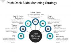
Get this Pitch deck slide marketing strategy PowerPoint graphics to outline the efficient brand strategy to boost your business. Communicate your brand’s functional and intentional purpose effectively with this brand plan PPT example. Make sure that the marketing strategy is in accordance with the objectives and purpose of your company. Maintain the brand’s consistency to ensure customers’ loyalty towards your brand. Motivate your staff to work in unison towards the progress of your company. Put forth a streamlined brand strategy proposal for your employees to follow. Hit the target market and prove why you stand out amongst your competitors using successful marketing and branding strategies. Recognize any challenges you might face in branding and train your staff to overcome them by using effective brand strategy techniques. Devise an easy to understand PowerPoint presentation for your viewers by incorporating our market strategy sample PPT slide. With various channels like social media, email marketing, etc., spread your brand’s awareness effortlessly. Avail this brand management PPT design to make an impressive PowerPoint presentation.
People who downloaded this PowerPoint presentation also viewed the following :
Pitch deck slide marketing strategy powerpoint graphics with all 5 slides:
Highlight ingrained biases with our Pitch Deck Slide Marketing Strategy Powerpoint Graphics. Identify the influences that created them.
FAQs for Pitch deck slide marketing
Look, your pitch deck needs three things: know your audience, tell a solid story, and figure out how to distribute it. Tailor everything to whoever you're pitching - what keeps them up at night? Story-wise, go problem → solution → market opportunity. Don't jump around like most decks do (seriously, it's painful to watch). Distribution could be investor networks, demo days, cold emails - whatever gets you in the room. Oh, and make different versions for different situations. Start with one master deck, then tweak it from there. You'll thank yourself later.
Look, investors see like 50 pitches a week - you need yours to stick. Raw data alone won't cut it. Instead, tell them a story: here's this massive problem, we're the team that can actually fix it, and here's the incredible opportunity if you back us. I mean, think about it - would you rather sit through another boring spreadsheet presentation or hear about something that gets you excited? The story part is what makes people remember you later when they're deciding where to put their money. Your numbers still matter obviously, but the narrative makes them care about YOU. Structure it like a three-act story instead of random slides.
Honestly, knowing your audience is everything with pitch decks. VCs think totally different than customers or board members, so you've got to adjust accordingly. A tech investor already gets SaaS metrics - don't waste time explaining basics. But some traditional exec? They'll need more context. Research their background first and figure out what they actually invest in. Then decide which problems to focus on and how much financial detail to include. I learned this the hard way after bombing a pitch because I went way too technical for the wrong crowd. Your messaging and even slide design should match who's listening.
Okay so here's the thing—people judge your idea based on how it looks before they even read anything. I'm not kidding, I've watched brilliant presentations crash because someone used terrible fonts (seriously, avoid Comic Sans at all costs). Clean design makes you seem credible and prepared. Messy slides? You look disorganized. Colors matter too—blues build trust, reds create urgency. Good images and charts help people actually understand complex stuff instead of zoning out. White space is your friend. Don't cram everything with text because your visuals are doing half the work of convincing people anyway.
Break that complex stuff into chunks people can actually digest. Bold headers and bullet points are clutch - gives their eyes somewhere to go. Charts work way better than walls of text, honestly. Bar charts for comparing things, line graphs for trends, pie charts for market stuff (though I kinda hate pie charts but whatever). Don't cram everything onto one slide - that's where people lose interest. One key point per slide keeps them following along instead of getting overwhelmed. Oh, and lead with your strongest number. Hook them early, then build your case from there.
Think of your pitch deck like telling a good story - problem is the villain, your solution saves the day. Each slide should flow into the next naturally. Start with where you were, show where you are now, then paint the picture of where you're headed. Real customer stories work way better than vague concepts, trust me on this one. I'd actually read the whole thing out loud when you're done - if it sounds boring or choppy, that's your cue to fix it. You're basically pitching a movie sequel and investors want to know how it ends! Build up that tension before you get to your big ask.
Don't cram paragraphs on your slides - people zone out when they're reading instead of listening to you. Practice beforehand too (seriously, so many founders wing it and crash). Skip the "trillion dollar market" nonsense without showing your actual slice. Your financials need to be realistic, not some crazy hockey stick that screams wishful thinking. The story has to flow: problem → your solution → why you'll crush it. Oh and nail your timing so you can adjust if they give you 10 minutes instead of 20. Makes all the difference honestly.
Look, consistency makes or breaks your whole deck. Your colors, fonts, logo - keep everything identical across slides. I can't tell you how many times I've seen slide 3 look like it's from a totally different company. Super awkward. Investors notice this stuff more than you'd think. When your branding stays tight, they assume you'll run your business the same way. Quick tip that saved me tons of time: write down your hex codes and main talking points before you even start building slides. Trust me on this one.
Honestly, stick to 10-12 slides max. I've watched too many founders bomb with 20+ slide decks - people just zone out. Each slide should take maybe 1-2 minutes, so you're talking 15-20 minutes total. Problem, solution, market size, business model, traction - that's your core stuff right there. Everything else can wait for the follow-up meeting. I know it's tempting to throw in every detail, but be brutal about cutting things. Some of the best pitches I've seen were only 8 slides. Short attention spans are real, trust me on this one.
Look, market research is basically your secret weapon for pitch decks. You'll figure out exactly what keeps your audience up at night, then structure everything around those pain points. I'm telling you, it's like having insider info before you walk in there. Know which numbers they actually care about, what language clicks with them, their biggest worries - all of it. Way better than just crossing your fingers that your product will wow them. Start by asking your target investors what's driving them crazy right now. Then build your whole story around that stuff. The visuals, examples, everything should speak their language.
Definitely go with funnel charts and conversion data - investors eat that stuff up. Customer personas with actual photos beat boring bullet points every time. Honestly, I've seen too many decks skip the competitive landscape thing, but a simple positioning map helps them instantly get where you stand. Oh, and screenshots from your actual campaigns (social, ads, email) are gold because it shows you're not just talking theory. Just don't cram everything into one slide though. Each visual should hit one main point or you'll lose them.
Okay so definitely put your main CTA on the last slide - be super specific like "Let's book that follow-up call for next week" or whatever makes sense. Don't just end with "Questions?" because honestly that's where good presentations go to die. Throughout the deck, sprinkle in some lighter asks too. Like on your strategy slide you could say "We'd love to hear your thoughts on this part." The whole point is making it ridiculously easy for them to know what you want them to do next. If they have to guess what "moving forward" actually means, you've already lost them.
Honestly, pitch decks right now are all about telling a story with your data instead of just dumping numbers everywhere. Dark mode is everywhere – makes everything look way more expensive than it actually is lol. Interactive stuff and animated charts are pretty much expected now. Think mini-documentary vibes rather than those soul-crushing slide marathons. Keep it tight though – 10-12 killer slides beats 20 boring ones every time. Video backgrounds are cool but don't go crazy or you'll lose people. I'd start with Pitch or Beautiful.ai templates since they've already got this stuff figured out.
Honestly, I'd update that thing every 3-6 months minimum. More often if you're dealing with big changes like product launches or whatever. Trust me - I made the mistake of using stale numbers in front of investors once. Super awkward lol. Monthly tweaks make sense if you're pitching constantly, but quarterly works for most people. Your metrics, competition, market stuff - it all shifts faster than you think. Here's what I do (and you should too): set a calendar reminder to review it even when you're not using it. Way better than panicking when someone wants to see your deck tomorrow.
Honestly, feedback saves your ass every time. Run your deck past 3-4 people - mix of industry folks and total outsiders who'll catch the jargon you're blind to. I always cringe at stuff that seemed genius at 2am but makes zero sense in daylight. Where do they look confused? What questions pop up? Those moments are gold for tightening your story. Random tangent but outsiders are actually better at spotting weak value props than experts sometimes. Each round helps you prep for stakeholder pushback. Seriously don't wing it - test drive with friends first, then polish before showtime.
-
Use of icon with content is very relateable, informative and appealing.
-
Topic best represented with attractive design.