


Slack pitch deck powerpoint presentation slides





Try Before you Buy Download Free Sample Product
 Impress Your
 Audience
 100%
100% Editable
 Save Hours
 of Time


Our Slack Pitch Deck Powerpoint Presentation Slides are topically designed to provide an attractive backdrop to any subject. Use them to look like a presentation pro.
People who downloaded this PowerPoint presentation also viewed the following :
Content of this Powerpoint Presentation
Slide 1: This slide displays title i.e. 'Slack Pitch Deck' and your Company Name.
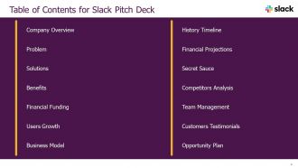
Slide 2: This slide presents table of contents.
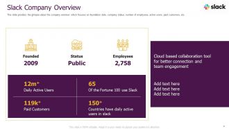
Slide 3: This slide provides the glimpse about the company overview which focuses on foundation date, company status, number of employees, etc.
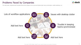
Slide 4: This slide provides the glimpse about the problem faced by the companies such as issues with desktop clutter, teams synchronization, etc.
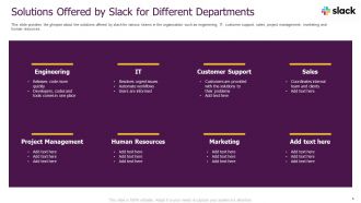
Slide 5: This slide provides the glimpse about the solutions offered by slack for various teams in the organization such as engineering, IT, customer support, etc.
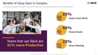
Slide 6: This slide provides the glimpse about the benefits of using slack in the company such as more productivity, better team work, fewer mails and meetings, etc.
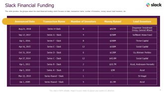
Slide 7: This slide provides the glimpse about the slack financial funding which focuses on date, transaction name, number of investors, money raised, etc.
Slide 8: This slide provides the glimpse about the slack users growth which focuses on daily active and paid users during year 2018 along with their projected number.
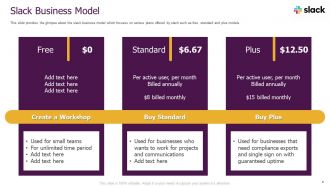
Slide 9: This slide provides the glimpse about the slack business model which focuses on various plans offered by slack such as free, standard and plus models.
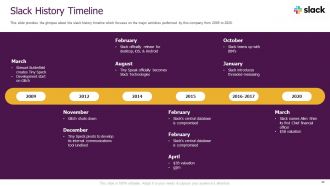
Slide 10: This slide provides the glimpse about the slack history timeline which focuses on the major activities performed by this company from 2009 to 2020.
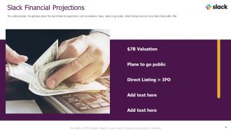
Slide 11: This slide provides the glimpse about the slack financial projections such as valuation value, plans to go public, etc.
Slide 12: This slide provides the glimpse about the slack secret sauce which focuses on centralized communications, intelligent bot system, etc.
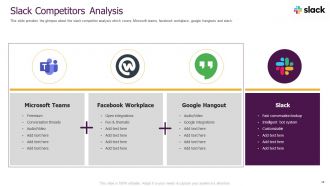
Slide 13: This slide provides the glimpse about the slack competitor analysis which covers Microsoft teams, facebook workplace, google hangouts and slack.
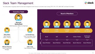
Slide 14: This slide provides the glimpse about the slack team management which focuses on executive team covering CEO, CFO, CTO, SEM, SMO, and board of members.
Slide 15: This slide provides the glimpse about the client testimonials wherein customers share their experience of using our tool and how it benefits them.
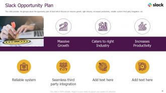
Slide 16: This slide provides the glimpse about the opportunity plan of slack which focuses on massive growth, right industry, increased productivity, etc.
Slide 17: This is the icons slide.
Slide 18: This slide presents title for additional slides.
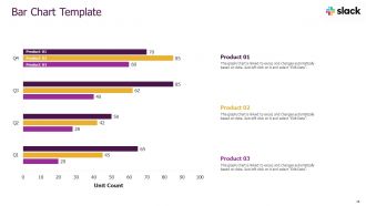
Slide 19: This slide exhibits quarterly bar charts for different products. The charts are linked to Excel.
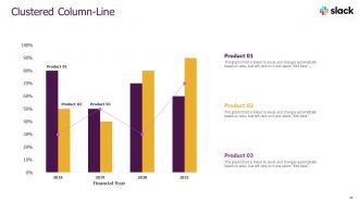
Slide 20: This slide displays yearly clustered column & line charts for different products. The charts are linked to Excel.
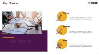
Slide 21: This slide presents your company's vision, mission and goals.
Slide 22: This slide shows details of team members like name, designation, etc.
Slide 23: This slide exhibits goals.
Slide 24: This slide exhibits ideas generated.
Slide 25: This slide shows about your company, target audience and its client's values.
Slide 26: This slide depicts posts for past experiences of clients.
Slide 27: This slide exhibits yearly timeline.
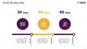
Slide 28: This slide depicts 30-60-90 days plan for projects.
Slide 29: This slide presents circular diagram.
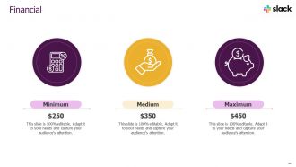
Slide 30: This slide showcases financials.
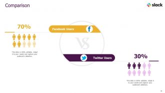
Slide 31: This slide highlights comparison of products based on selects.
Slide 32: This is thank you slide & contains contact details of company like office address, phone no., etc.
Slack pitch deck powerpoint presentation slides with all 32 slides:
Use our Slack Pitch Deck Powerpoint Presentation Slides to effectively help you save your valuable time. They are readymade to fit into any presentation structure.









FAQs for Slack pitch deck
Start with the problem - make them feel that pain point right away. Then show your solution, but skip the tech jargon (seriously, investors hate that). You need market size, business model, and any traction you've got. Competitive analysis is crucial, plus your team's background. Oh, and financial projections - even if they're rough estimates. Be super specific about funding - how much and exactly what it's for. Keep it 10-12 slides tops. Practice until you can tell the story without rushing. The timing thing trips up way more people than you'd think.
Dude, visual storytelling is huge for Slack pitch decks. Look at how Slack nails it with those clean icons and layouts - steal that vibe. Map out user pain points with before/after shots, or show your product's growth using timeline visuals. Data visualizations work great for demonstrating scale too. Honestly? Investors are drowning in boring text decks, so visuals immediately stand out. Just don't throw in random pretty stuff - every visual needs to actually push your story forward. I'd suggest storyboarding your key points first, then figure out the best visual format for each. Makes the whole process way less overwhelming.
Hey! So first thing - don't cram a million words on each slide. Slack's deck was crazy clean and visual, you should check it out. Even though everyone thinks they "get" workplace communication, you still need that problem/solution setup. Investors want context. Oh and here's where people always mess up - they try to show off every feature they've ever built. Just focus on your main thing and what makes you different. Skip those boring market size slides unless your numbers are actually impressive. Most importantly though, practice telling the story out loud beforehand. You'll catch weird transitions between slides that way.
Dude, it's all about who you're talking to. VCs want to see those juicy growth numbers and market size - basically prove you can make them rich. But enterprise clients? They care more about security and how it'll actually save them money. I'd make investor decks way more technical and data-heavy, while keeping customer ones super clean and simple. Think of it like... you wouldn't explain your startup the same way to your mom as you would to a potential buyer, right? Same product, totally different angle depending on what's gonna get them excited.
Dude, branding is everything for your Slack pitch deck. Investors see tons of these things, so consistent colors and fonts will make yours stick. But skip the crazy animations - they're just distracting. Your visual style should scream "clean workplace communication" you know? Modern, collaborative, that whole thing. I learned this the hard way actually - my first deck looked like a rainbow threw up on it. Short version: every slide needs to feel cohesive and support your story. Don't let flashy design compete with what you're actually saying about the product.
Dude, turn those boring numbers into actual visuals that people will remember. Growth curves, engagement maps, revenue charts - whatever makes your data interesting instead of just rows of spreadsheet hell. Clean, simple charts work best though, don't go crazy with it. Also stick to your brand colors so everything looks put together. Honestly, text-heavy slides are presentation death - visuals break that up and keep people awake. I learned this the hard way during my first pitch lol. Just make sure each chart actually supports your main points instead of being random eye candy.
Get 3-5 people you trust to look at your deck, but don't just ask "what do you think?" That's useless. Give them specific stuff to focus on - like does slide 3 actually make our value prop clear, or is the problem statement compelling enough? Way better feedback that way. Definitely practice out loud with someone who wasn't involved in making it. They'll spot holes you can't see anymore. Oh and give yourself at least 48 hours to make changes before the real thing - learned that one the hard way! Keep a separate doc for good feedback that doesn't quite fit this pitch.
So basically you gotta tailor everything to what each group actually gives a shit about. Investors? Hit them with market size, revenue potential, all that ROI stuff. Your teammates just want to know if this thing will make their day less painful - focus on workflow improvements and productivity boosts. Clients are different - they need the concrete benefits and implementation details that fix their actual problems. Mix up your metrics too. Growth numbers work for investors, efficiency stats for your team, cost savings for clients. The Slack story stays the same but you're just tweaking the details. Honestly, it's like speaking different languages to the same people.
Screen sharing's your best friend here, but go slower than you think you need to - people can't see over someone's shoulder like in regular meetings. Test your wifi first because dropping out mid-pitch is basically presentation death. Big fonts are clutch since half your audience is probably squinting at laptops. I'd honestly send the deck ahead of time so people can pull it up themselves if your screen share gets wonky. Call folks out by name for questions - otherwise you're just talking into the void. Oh, and pause way more than feels natural. Remote presentations need those breathing moments or everyone zones out.
Honestly, most people go crazy with animations and it just becomes distracting. But when you nail it, those smooth transitions actually create "aha" moments. Try fading in your key metrics when you reveal growth numbers. After explaining pain points, slide in some user testimonials. Your product demo should animate to show actual workflow - not just random flashy stuff. Stick to simple effects like fade, slide, zoom. Keep timing consistent around 0.5-1 seconds. Oh and definitely test everything beforehand because technical fails during your pitch are brutal. You're directing attention, not putting on a Vegas show.
So for design tools, Figma's probably your best bet - super clean and modern. Canva works great too if you want something easier. PowerPoint could work but honestly it tends to look kinda corporate unless you find some really good templates. Oh and definitely use Loom for recording demos! Way better than just throwing in static screenshots. Shows the actual Slack interface in action which is huge for a communication tool pitch. If you're feeling ambitious, Principle or After Effects can add some nice animations. But honestly? Start simple with one main tool first, then add fancy stuff later. Don't overthink it.
One insight per slide, period. Cut everything else that doesn't support your main story. Start with your best numbers - user growth, engagement, whatever makes people actually pay attention. I swear, most decks I see are just walls of text that nobody wants to read. Bullet points over paragraphs every time. Let your charts tell the story instead of cramming in explanations. Keep it to 10-12 slides max, then throw all the boring financial stuff in an appendix if they ask for it later. Oh and practice your 10-minute pitch until you can do it in your sleep - trust me on this one.
Honestly, start with engagement stuff - daily active users, message volume, how many teams actually stick around. MRR and customer acquisition costs are obvious must-haves. Time in the app is massive because people literally work in Slack all day (I swear I forget other apps exist sometimes). Retention rates tell you if you're solving real problems. Also track expansion revenue when customers upgrade their plans - that's pure gold. Oh, and don't sleep on the boring operational metrics like uptime. Pick maybe 6 that actually tell your story and be ready to explain why each one matters.
Dude, this stuff actually matters way more than people think. Your deck might land perfectly with the US team but totally flop in Japan - Americans love that direct, confident vibe while Japanese teams often see it as way too aggressive. Germans? They'll think your sleek minimalist slides look half-baked because they want ALL the details. Even colors mean different things across cultures. And honestly, some poor person in Singapore is probably reviewing this at like 5am before they've had coffee, so timing's brutal too. I'd definitely make a few different versions for your main regions, or at least run it by local teammates first.
Dude, go bold with your typography and leave tons of white space - that's what everyone's doing right now. Dark mode is perfect for tech stuff. Skip the boring static slides and add some interactive elements like clickable demos or videos. 3D graphics work great too, just don't go overboard. Oh, and ditch stock photos for custom illustrations when you're visualizing data - way more engaging. Build it in Figma instead of PowerPoint if you can. Honestly, I've seen too many generic decks lately, so anything that tells a real story will stand out.
-
Out of the box and creative design.
-
Awesomely designed templates, Easy to understand.
-
Excellent Designs.
-
The content is very helpful from business point of view.
-
Use of different colors is good. It's simple and attractive.
-
Excellent products for quick understanding.
-
Designs have enough space to add content.
-
Nice and innovative design.