

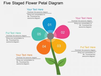
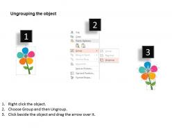
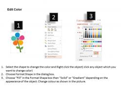
Pm five staged flower petal diagram flat powerpoint design




Try Before you Buy Download Free Sample Product
 Impress Your
 Audience
 100%
100% Editable
 Save Hours
 of Time


Give it the full go with our Pm Five Staged Flower Petal Diagram Flat Powerpoint Design. They ensure you don't hang back.
People who downloaded this PowerPoint presentation also viewed the following :
Pm five staged flower petal diagram flat powerpoint design with all 9 slides:
Not to be outdone our designers have added hundreds of new Pm Five Staged Flower Petal Diagram Flat Powerpoint Design. Browse our fresh styles.
FAQs for Pm five staged flower petal diagram
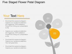
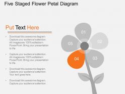
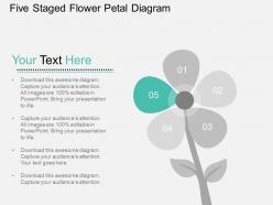
So there are five main parts - Initiating, Planning, Executing, Monitoring & Controlling, and Closing. They're set up like petals around a flower, which sounds cheesy but actually makes sense visually. You cycle through these for any project, and the names are pretty obvious once you see it laid out. The monitoring part is cool because it overlaps with everything else - you're always checking how things are going. I've found it's super helpful for figuring out where you're getting stuck. Like if a project feels off, you can usually pinpoint which phase is the problem. Try mapping your current stuff onto this framework and see what jumps out.
Each petal becomes one of your project phases - initiation, planning, execution, monitoring, closure. Work clockwise from any petal as your visual roadmap. What I really like about the flower shape? It shows these phases aren't just linear steps. They're interconnected and can overlap. Sometimes you'll jump between petals when issues pop up or stakeholders change their minds (ugh, right?). Each stage is crucial for project "growth" - skip one and things won't fully bloom. Post the diagram somewhere visible so your team always knows which phase you're tackling.
So that flower shape is actually pretty clever - it shows how PM stages overlap instead of being these rigid steps. Each petal touches the others, right? Your planning affects execution, monitoring loops back to earlier phases, and honestly, that's just how real projects work. The center is your core project that everything revolves around. Unlike waterfall methods (ugh), you can jump between petals fluidly. This is perfect for explaining to stakeholders that hopping between phases isn't messy project management - it's totally normal flow. Way better visual than boring linear charts.
That flower petal diagram is actually pretty smart for stakeholder meetings. You can just point at the petals instead of sending a million confusing emails about project phases. Each petal is its own phase, but they overlap so people get how everything connects timing-wise. Visual learners eat this stuff up - way better than those messy Gantt charts nobody really understands anyway. Just throw it up on the screen during your next meeting and walk through it with everyone. Honestly saved me so much back-and-forth when I started using it. Makes the whole project timeline click for people.
So there's this PM flower petal thing that actually works pretty well for mapping team collaboration. Each petal covers a different project stage - initiation, planning, execution, monitoring, closing. Honestly, it's way less boring than it sounds. What's cool is you can spot exactly where your team needs to sync up most, instead of just hoping everyone figures it out. I'd definitely try it at your next kickoff meeting - just show people the visual so they know when their piece really matters. It catches collaboration gaps early too, which... yeah, that's saved me a few headaches. Way better than winging the whole communication thing.
Honestly, the worst thing you can do is cram way too much text into each petal. Nobody's gonna read that mess. Each section should be super concise and easy to scan. Also - and this might sound obvious - don't force random stuff into flower format just because it looks pretty. It works great for processes with like 4-6 connected parts, but I've seen people shove grocery lists into these things and it's just... weird. Keep your petals the same size unless there's actually a reason they should be different. And make that center circle really clear since it holds everything together.
Honestly, the five-petal PM diagram just makes way more sense than those old linear models. You know how waterfall makes everything seem so rigid and separate? This one shows how all your project pieces actually overlap and mess with each other - planning, execution, monitoring, the whole deal happens at once. It's way more visual too. I've found stakeholders get it faster when you can point to how everything connects instead of just walking through some boring checklist. Agile's better than waterfall but even sprints feel kinda boxed-in compared to this. Perfect for messy, complex projects.
Yeah totally! The five-petal thing works great for agile if you stop thinking about the petals as phases. Run all five as ongoing workstreams instead - so initiation, planning, execution, monitoring, and closure all happen at once during sprints. Your center becomes the product backlog or whatever your sprint goal is. Honestly it's weird more teams don't do this - it maps really well to agile ceremonies. Just update all five areas during sprint retros so nothing gets out of whack. Oh and shorter sprints work better obviously.
Bold colors for each petal - makes them way easier to tell apart. Stick with simple fonts that won't look like garbage from the back row. White backgrounds project better than dark ones, trust me on this. Definitely add arrows or numbers between petals because people get confused about the order (even when it's super obvious). Make your text huge - like, bigger than you think you need. Oh and test it on an actual projector first, not just your laptop. Screens always look different when projected.
Oh man, cultural stuff totally throws off how teams read those flower petal diagrams! Risk tolerance is huge - some cultures won't speak up if they think something's risky during planning. Others just bypass the whole collaborative thing entirely. The "people" section gets weird too since stakeholder engagement means different things everywhere. I worked on this one project where teams in different regions looked at the same diagram and came away with completely opposite interpretations - it was a mess. You'll want to talk through what each petal actually means before you start, maybe tweak the visuals so they make sense for your team's background.
So here's what I do - track five things: schedule performance (are you hitting deadlines?), cost variance, quality stuff like defect rates, scope compliance, and how well you're using your resources. Most PMs just obsess over budget and timeline, which honestly drives me crazy because you miss so much. Set up a simple dashboard showing all five at once throughout the project, not just at the end. When one area starts going south, you'll catch it before it tanks everything else. Think of it like a health checkup - you wouldn't just check your pulse and call it good, right?
Just swap out the petal names for whatever makes sense in your field. IT teams might do Requirements Analysis, Design & Architecture, Development, Testing, Deployment. Construction? More like Planning & Permits, Design, Procurement, Construction, Handover. Here's the thing though - don't just jam generic PM phases into your setup. Map out how work actually flows for you first, then see what naturally groups together into five chunks. I've watched teams get pretty inventive with this stuff. The whole point is flexibility, so make it work for your reality, not some textbook version.
So basically you map out different risk categories like petals around your project - technical stuff, money issues, stakeholder drama, whatever applies. Way better than those endless spreadsheets nobody reads. Each "petal" shows you where your risks cluster, so you can spot if you're obsessing over one thing while totally missing others. Makes meetings way less painful too since everyone can actually see what you're talking about. Just pick your 5-6 main categories first, then start plotting what you've got. You'll probably be surprised where the gaps are!
Try PowerPoint with those Morph transitions - they're actually pretty slick now. Build each petal on separate slides, then animate them to fade in or rotate one by one. Prezi works too if you want something fancier. I'd start simple though - just one petal reveal per slide to see how it feels. You can always record it with Loom later and add your voiceover explaining each stage. Oh, and Figma's decent for this stuff too if you're feeling adventurous. Just don't go overboard with flashy animations - they get annoying fast.
So the cool thing about the flower petal model is you can actually see how everything connects instead of pretending projects work in a straight line. Because let's be honest - when does that ever happen? You'll always end up going back to earlier stuff when you learn something new later on. Client feedback hits multiple phases at once, discoveries make you revisit old work... it's messy but real. I actually love showing this to clients who think projects should be super linear. Makes the chaos feel more manageable somehow. You should try it at your next kickoff - way better than those boring timeline charts.
-
Topic best represented with attractive design.
-
Top Quality presentations that are easily editable.