


Posters For Cyber Security Training Ppt





Try Before you Buy Download Free Sample Product
 Impress Your
 Audience
 100%
100% Editable
 Save Hours
 of Time


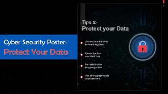
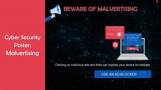
This set of slides contains cybersecurity posters with tips to protect data.
People who downloaded this PowerPoint presentation also viewed the following :
Posters For Cyber Security Training Ppt with all 21 slides:
Use our Posters For Cyber Security Training Ppt to effectively help you save your valuable time. They are readymade to fit into any presentation structure.










FAQs for Posters For Cyber
Okay so for cyber security posters that people actually pay attention to - you need super clear actions, not just "be careful" which is honestly worthless. Tell them exactly what to do like "check the sender before clicking." Make consequences feel real to them personally. Skip the terrible stock photos (we've all seen that guy in a hoodie lol) and go with visuals that pop. One threat per poster works way better than cramming everything together. Keep language simple - no tech speak. Make sure the main message is readable from across the room, and always tell people who to contact when they spot weird stuff.
Honestly, visuals are a game-changer for cyber security stuff. Your brain just clicks with diagrams way faster than reading paragraphs about network protocols or whatever. Like, showing a phishing attack as a flowchart? So much clearer than explaining it step by step in text. Colors help too - red for danger, green for safe zones. I'm probably biased since I'm super visual, but icons and infographics just stick better. You'll remember seeing that "before/after" comparison of a hacked system way longer than reading about it. Even something simple like adding little warning symbols next to important points makes a huge difference.
So definitely do different versions for different age groups - it actually makes a huge difference. Younger folks respond better to bright colors and casual language they'd use themselves. Meanwhile, older employees usually want cleaner designs with proper explanations. I know it sounds weird, but test stuff out first with real people from each group before you go printing everything. Maybe start with like 2-3 different styles? Oh, and comic sans... I still hate it but apparently some people think it's "friendly" so whatever works I guess. Way better than making one boring poster nobody pays attention to.
Quarterly reviews are the bare minimum - monthly's way better since threats change so fast. Set up Google alerts for major breaches so you're not blindsided. Your IT team should flag new threats too. Honestly, the biggest thing is tracking what employees actually look at through quick surveys or just asking around. Dead content nobody reads is pointless. I'd rotate 2-3 posters each quarter with fresh examples. Oh, and current attack methods - that stuff gets outdated crazy fast. Simple rotation schedule keeps everything relevant.
Dude, infographics are seriously perfect for cyber security stuff. Nobody wants to read paragraphs about encryption protocols - their eyes just glaze over. But throw some icons and flowcharts at them? Suddenly it all makes sense. I love how you can show step-by-step stuff like "here's what to do with that sketchy email" or compare crappy passwords vs good ones. The visual flow just guides people through naturally. Even those basic templates online can make your boring security policies actually readable. Honestly, people remember pictures way better than walls of text anyway. Simple icons, consistent colors - that's really all you need to get started.
Yeah, humor works great if you target the right stuff. Mock the hackers and their sketchy tactics - like showing phishing emails as obviously fake or making scammers look like cartoon villains. I've seen funny ones about weak passwords that actually stick with people. Just don't make fun of anyone who got scammed because that's kinda mean. Keep it playful but serious about the actual dangers. Oh, and definitely run your ideas by coworkers first - what's funny to you might land weird with others. The goal is making security memorable without being preachy about it.
Honestly, measuring poster effectiveness is trickier than you'd think. Start with the obvious stuff - are security incidents dropping in those areas after 3-6 months? Check if people are actually reporting more suspicious emails (that's usually a good sign). Employee surveys help too, plus you can run phishing simulations to see if click rates improve. If you've got QR codes on there, track those scans. Quick knowledge tests work well for seeing what actually stuck. The behavioral changes matter way more than just putting posters up and hoping for the best.
Honestly, posters are just constant visual nudges that keep security on people's radar. Put them where everyone hangs out - break rooms, elevators, by the printers. I've actually seen them get people talking by the coffee maker, which is pretty cool. The trick is switching them out regularly so they don't become wallpaper that nobody notices anymore. Make them eye-catching with simple, clear messages that tell people exactly what to do. Oh, and definitely focus on whatever security issues your company struggles with most - like if everyone's terrible with passwords, hit that hard.
Don't cram everything onto one poster - people's attention spans are terrible these days. Pick one thing, like "think before you click" instead of listing every security tip you know. Clean design beats cluttered mess every time. Skip the scary "hackers are coming for you" stuff because honestly? People just roll their eyes and ignore it. Use normal words, not tech jargon that makes everyone feel dumb. Oh, and test it on a few coworkers first - if they can't get the main point in five seconds, you need to simplify. Nobody reads tiny text anyway.
Dude, this stuff is way trickier than you'd think! Colors that scream "trustworthy" to some people look sketchy to others. Same with showing authority figures or certain symbols. Language barriers are obvious, but you've also got to think about literacy levels and how different cultures view tech/rules. Some groups respond better to "we're all in this together" messaging instead of the whole personal responsibility angle. Oh, and testing is huge - definitely run your designs by diverse focus groups first. You might end up needing totally different versions for different audiences, which is a pain but worth it.
Interactive quizzes work great - test what people actually absorbed from your poster. Video demos showing real phishing attempts hit different too. My favorite though? "Choose your own adventure" scenarios where they scan and walk through security incidents step by step. Super engaging. Link to your reporting tools so when someone spots a threat, boom - they can report it instantly from their phone. Oh, and since cyber threats change constantly, link to updated resources instead of reprinting posters every month (your budget will thank you). Just start with one simple quiz link first. See how your team reacts before you go overboard with fancy stuff.
Yeah definitely get feedback - surveys, focus groups, or just grab people for quick chats. I'd ask employees what actually sticks with them and what's confusing. Sometimes our "brilliant" posters totally bomb lol. The real test? Whether they remember the main points a week later. Also ask what catches their eye design-wise. Then use all that input to tweak your messaging and visuals - focus on stuff they deal with daily. Oh and set up a quick feedback form after each campaign launches.
Honestly, AI stuff is where I'd put my money right now - deepfakes and AI-powered phishing are getting scary good. Social engineering attacks are way more sophisticated too, especially vishing and business email compromise. Remote work security still matters since everyone's doing the hybrid thing. Supply chain attacks have been brutal lately after all those major breaches (remember SolarWinds?). Mobile security's huge because people literally live on their phones. Maybe do a quarterly rotation through these topics? That way you're not beating the same drum all year and it stays relevant to what your people are actually seeing.
Honestly, the best way is tracking your security incident rates and those phishing test results - see if fewer people are clicking sketchy links. Password behavior's another big one to watch. Get your baseline numbers first though, otherwise you're just guessing if the posters actually did anything. IT logs are pure gold here - failed logins, people plugging in random USBs, security help desk calls. You could do employee surveys too but honestly people just tell you what sounds good half the time. I'd check monthly for the first few months after you put them up.
Yeah, colors totally matter for cybersecurity stuff! Dark blue with white text works amazing - way better than those awful beige combos I used to make. Red's perfect for "WARNING: DON'T CLICK THIS" because it literally makes people pay attention. Blues and greens are chill for regular training materials. Don't go crazy with rainbow everything though. Two or three colors max, otherwise people get distracted by your "design skills" instead of learning. Oh, and definitely test it on a couple people first - learned that one the expensive way when I printed 500 copies of something nobody could read properly!
-
I was mind-blown by the services that SlideTeam provided me. Thanks a ton!
-
Design layout is very impressive.