


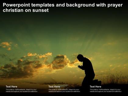
Powerpoint templates and background with prayer christian on sunset




Try Before you Buy Download Free Sample Product
 Impress Your
 Audience
 100%
100% Editable
 Save Hours
 of Time


Our Powerpoint Templates And Background With Prayer Christian On Sunset are topically designed to provide an attractive backdrop to any subject. Use them to look like a presentation pro.
People who downloaded this PowerPoint presentation also viewed the following :
Powerpoint templates and background with prayer christian on sunset with all 2 slides:
Use our Powerpoint Templates And Background With Prayer Christian On Sunset to effectively help you save your valuable time. They are readymade to fit into any presentation structure.

FAQs for Powerpoint templates and background with prayer
Go with a warm sunset as your base - those golden oranges and deep purples just hit different for church stuff. Throw in a simple cross silhouette or maybe some doves if you're feeling it. I'd stick with white or cream text since it pops against all those colors, and definitely add some subtle shadows so it's actually readable. Don't go crazy with too many elements though - the sunset's already doing most of the heavy lifting. Oh, and test it on a projector first! Colors always look weird when you project them compared to your computer screen.
Yeah, color choices make a huge difference in setting the mood! Warm oranges and deep purples give off that peaceful worship vibe. Blues and soft pastels feel more contemplative. But seriously, avoid neon colors - they'll just wreck the whole spiritual atmosphere. Vibrant golds and reds energize people, while muted earth tones are perfect for quiet reflection and prayer. Match your colors to whatever message you're going for. Celebration? Go bold. Meditation? Keep it soft. Oh, and I've definitely seen people mess this up by overthinking it too much.
For Christian imagery, sunset silhouettes with crosses work really well - same with open Bibles against those golden skies. Mountains and calm water scenes are solid choices too. Stick with warm colors like oranges, purples, soft yellows since they naturally feel hopeful. Churches and steeples look amazing when they're backlit. Praying hands are honestly overdone at this point, but whatever, they still get the job done if you don't go cheesy with it. Keep things simple so your text doesn't get lost. Pick one main element first, then build everything else around that.
So you can basically change whatever you want to match your church's vibe. Colors, fonts, text layout - all of it. Works really well for Easter services or those evening ones with the sunset theme (honestly looks pretty nice). Add your own scripture verses and logo without fighting weird formatting issues. You're not stuck with some cookie-cutter design that screams "template." Instead you get something that actually fits your congregation's style. Oh, and don't forget to update the contact info - always see people miss that step.
Dude, serif fonts are your friend here - Times New Roman, Galatia, or Crimson Text look perfect for scripture quotes. Cinzel or Trajan Pro make awesome headers since they've got that carved-in-stone vibe. I'm honestly tired of seeing presentations where you can't read anything past the third row because someone picked some crazy decorative font. Open Sans and Lato are solid for body text. Oh, and definitely check how your fonts look against those sunset oranges and purples - contrast matters way more than you'd think.
Think sunset vibes - slow fades and gentle transitions work way better than flashy stuff. I'd do fade-ins for text appearing like stars coming out, or slides that shift from warm oranges to deep purples. Don't go crazy with effects though (I learned this the hard way). Maybe add a soft glow on Bible verses or some drifting clouds. The whole point is keeping that peaceful mood without being distracting. Oh, and definitely test your timing beforehand - nothing kills the vibe like animations that feel rushed or awkward during the actual service.
Hey! So sunsets work really well for Christian stuff because they hit all those themes about renewal and God's faithfulness. You know how "His mercies are new every morning"? Same vibe but in reverse. They're perfect for messages about eternal life or finding peace in God. The golden light thing is honestly a bit cliché at this point, but people still eat it up when you're talking about heaven or God's glory. Short sentences punch harder sometimes. Try pairing sunset visuals with verses about hope or rest - that combo never fails with congregations. Plus they're just beautiful to look at, which keeps people from zoning out during service.
Yeah, adding scripture to those sunset slides is genius - hits people right in the feels, you know? Sunsets already make everyone all contemplative and peaceful. Drop in some Psalms about God's creation or verses on new beginnings. I've watched presentations where one simple Bible verse completely changed the vibe. Way more powerful than I expected, honestly. Put the text right over your sunset images for that visual punch. Pick passages that actually match what you're seeing - like verses about God's glory in nature work perfectly with those golden hour shots.
Honestly, templates are such a lifesaver. You'll get way better results than trying to design from scratch – professional layouts, matching colors, nice fonts that actually work together. Christian sunset ones already have the perfect imagery built in, which is clutch. I spent like 3 hours once trying to make slides look decent and they still turned out kinda meh. With templates you just swap in your content and boom, done. Way better use of your time focusing on what you actually want to say instead of messing around with design stuff.
Totally depends on who you're presenting to! Kids and youth groups? Go wild with bright colors and dynamic sunset effects - they'll love it. But if it's Sunday morning service or something more formal, keep things subdued so you don't distract from the message. Oh, and denominational stuff matters too. Some churches are super traditional while others embrace all the contemporary visual flair. I've honestly seen some gradient choices that were... yikes. Just make sure you test everything on their actual projection system first - sunset colors can look totally different under church lighting than on your laptop.
Definitely go with gentle transitions like "Fade" or "Dissolve" - anything flashy will totally clash with the peaceful sunset vibe you're going for. I'd stick to 1-2 seconds max for timing. Those bouncy or spinning transitions? Hard pass. They'll just kill the whole contemplative mood. Keep everything consistent throughout so it flows nicely. Oh, and do a quick test run first! You want the transitions to match your speaking pace. The sunset imagery is already doing the heavy lifting mood-wise, so your transitions just need to stay out of the way.
Oh dude, you've gotta lean into storytelling for this! Sunsets are already so emotional - like, why wouldn't you use that? Start with something dark or challenging, then move toward the light as the sunset progresses. It's such a natural metaphor for hope or God's faithfulness. Maybe open with a personal story or parable that follows that same arc? People remember stories way better than random facts anyway. The whole journey structure works perfectly - darkness to light, struggle to resolution. Honestly, I'd probably throw in a testimony that mirrors what's happening in the sky. Makes the whole thing feel connected.
Make your text big and dark - trust me on this one, light fonts just disappear against those orange/purple skies. I made some absolutely terrible slides once that nobody could read lol. Stick to maybe 2-3 colors that don't fight with the sunset. White space is your friend here. If the background's too busy, throw a semi-transparent box behind your text. The sunset should support your biblical message, not steal the show from it. Oh and definitely test it on a projector first - colors look way different up there than on your laptop screen.
Oh man, sunset slides can be tricky! Make sure your text really pops - use dark text on the lighter parts of the sky, white or yellow on the darker areas. Don't put text right over the super bright sunset parts though, it looks awful. I'd add some semi-transparent boxes behind your text so it stands out better. Clean fonts work way better than fancy decorative ones that'll just disappear. Step back from your screen to check if you can actually read everything. Honestly, I always make a backup version with higher contrast just in case the original doesn't work.
Oh totally, the denomination makes a huge difference! Catholics and Orthodox churches usually go for those fancy, formal templates - think deep colors and gold accents that match their whole traditional vibe. Protestant churches? Way more minimalist and clean. Pentecostals are the complete opposite though - they love anything bold and energetic. Honestly, I think they'd pick neon if they could get away with it! Baptists and Methodists sit somewhere in between. Before you pick anything, just look at what they're already using for bulletins or websites. Match that energy instead of going against what they're comfortable with.
-
Informative presentations that are easily editable.
-
Unique design & color.
-
Qualitative and comprehensive slides.
-
Excellent products for quick understanding.
-
Helpful product design for delivering presentation.
-
Great designs, really helpful.
-
Understandable and informative presentation.
-
Good research work and creative work done on every template.
-
Commendable slides with attractive designs. Extremely pleased with the fact that they are easy to modify. Great work!
-
Helpful product design for delivering presentation.