


Priority ranking ppt example




Try Before you Buy Download Free Sample Product
 Impress Your
 Audience
 100%
100% Editable
 Save Hours
 of Time


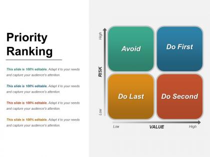
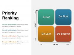
Evaluate the list of tasks to be performed on the priority basis with our priority ranking PPT slide design. It allows you to simply rank the functions in accordance to their order of importance in your company. This prioritization matrix PPT image diagram simply allows you to take competent business decisions in accordance of your available resources. Thus, it also helps in introducing change in your business structure also. Describe the various benefits of prioritizing your tasks with such matrix PPT design layout. Such as, it helps in resolving your business problems. You can also represent the essential growth parameters of your structure graphically through this Project Prioritization Matrix PowerPoint slide layout. Use this priority ranking chart PPT diagram to complete your projects successfully. It also allows you to easily meet your projects deadlines. Therefore, simply click on the download tab given below and start working over this professional priority matrix PowerPoint template design. Identify attempts at indoctrination with our Priority Ranking Ppt Example. Counter the ill effects of brainwashing.
People who downloaded this PowerPoint presentation also viewed the following :
Priority ranking ppt example with all 5 slides:
March forward with our Priority Ranking Ppt Example. They are aware of the exact drill.
FAQs for Priority
Effective priority ranking presentations include clear evaluation criteria, weighted scoring matrices, stakeholder impact analysis, resource requirement assessments, and timeline considerations. These components work together by providing transparent decision-making frameworks, enabling objective comparisons across competing initiatives, and facilitating stakeholder alignment, with many organizations finding that structured approaches streamline resource allocation and enhance strategic focus.
Visual aids enhance priority ranking understanding by transforming abstract concepts into clear, digestible formats through charts, graphs, color-coding, and hierarchical layouts. These visual elements enable audiences to quickly grasp relative importance, identify critical priorities at a glance, and retain information more effectively, with many organizations finding that visual presentations accelerate decision-making processes and improve stakeholder alignment.
Common mistakes include presenting rankings without supporting data, failing to explain ranking criteria, overwhelming audiences with too many priorities, and neglecting stakeholder input during the ranking process. These errors undermine credibility and decision-making effectiveness, with many organizations finding that clear methodology explanations, focused priority lists, and collaborative ranking approaches ultimately deliver stronger stakeholder buy-in and more actionable strategic outcomes.
Determining criteria for priority ranking involves analyzing your audience's strategic objectives, available resources, implementation timelines, potential impact on key performance indicators, and alignment with organizational goals. Through stakeholder consultation and data analysis, organizations establish weighted scoring systems that reflect factors like cost-effectiveness, feasibility, and competitive advantage, with many finding that transparent criteria enhance decision-making credibility and stakeholder buy-in.
Tools for creating engaging priority ranking presentations include PowerPoint, Keynote, Prezi, Canva, Google Slides, and specialized platforms like Miro or Lucidchart. These platforms enhance visual impact through interactive elements, customizable templates, and collaborative features, with many organizations finding that combining traditional presentation software with data visualization tools delivers more compelling stakeholder engagement and clearer decision-making outcomes.
Storytelling techniques enhance priority ranking presentations by framing each priority as a narrative with clear challenges, stakes, and outcomes, using character-driven scenarios that demonstrate impact. Through compelling case studies, data visualization that shows progression over time, and emotional connections that highlight consequences of different ranking decisions, presenters can transform abstract priorities into memorable stories that resonate with stakeholders and drive decisive action.
Audience engagement ensures priority ranking presentations resonate through interactive discussions, real-time feedback collection, and collaborative decision-making processes that build consensus. When presenters encourage questions, facilitate group exercises, and incorporate stakeholder input, organizations achieve stronger buy-in, clearer understanding of ranking rationale, and more effective implementation of prioritized initiatives across teams.
Data visualization improves priority ranking clarity by transforming complex numerical data into intuitive charts, graphs, and matrices that highlight relationships, trends, and hierarchies instantly. Through heat maps, ranking dashboards, and comparative visualizations, organizations streamline decision-making processes, enhance stakeholder understanding, and accelerate strategic resource allocation, ultimately delivering faster consensus and more transparent priority management across teams.
Context is crucial when presenting priority rankings because different stakeholders have varying perspectives, interests, and decision-making criteria that influence how they interpret and act on prioritized information. When presenting to executives, focus on strategic impact and ROI, while operational teams need implementation details and resource requirements, with many organizations finding that tailored contextual framing significantly enhances stakeholder buy-in and accelerates decision-making processes.
Tailoring priority ranking presentations involves adjusting criteria, metrics, and frameworks to align with sector-specific objectives, regulatory requirements, and operational realities. Financial services might prioritize risk mitigation and compliance, while manufacturing focuses on efficiency and cost reduction, with healthcare emphasizing patient outcomes and safety, ultimately ensuring your recommendations resonate with industry stakeholders and drive strategic decision-making.
Effective strategies include anticipating common concerns through stakeholder research, preparing data-driven responses with supporting evidence, acknowledging valid points before redirecting, and using visual comparisons to demonstrate trade-offs. During presentations, many organizations find that directly addressing resource constraints, timeline concerns, and competing priorities upfront builds credibility and facilitates more productive discussions about strategic choices.
Feedback from previous presentations informs improvements by identifying unclear ranking criteria, confusing visual hierarchies, insufficient stakeholder input methods, and weak justification processes. Organizations can refine their priority frameworks, enhance data visualization techniques, and strengthen decision documentation, with many finding that systematic feedback integration leads to more transparent, defensible ranking decisions and increased stakeholder buy-in.
Successful priority ranking presentations include Apple's product roadmap reveals, McKinsey's strategic consulting frameworks, Amazon's leadership principles hierarchies, and Tesla's feature development timelines. These presentations streamline decision-making by showcasing clear criteria, visual scoring matrices, and stakeholder alignment methods, with many organizations finding that structured priority frameworks enhance resource allocation, accelerate project timelines, and deliver measurable competitive advantages.
Cultural differences significantly impact priority ranking perception through varying communication styles, decision-making hierarchies, risk tolerance levels, and time orientations across global audiences. Organizations presenting to international stakeholders find that high-context cultures prefer detailed background information, while low-context cultures favor direct rankings, ultimately requiring culturally adaptive presentation strategies for effective global communication.
Post-presentation follow-up actions include distributing meeting notes, establishing clear timelines, assigning ownership for priority items, scheduling regular progress reviews, and creating feedback channels for ongoing input. These actions ensure accountability by maintaining momentum, enabling stakeholders to track implementation progress, and allowing organizations to adjust priorities based on changing business conditions, ultimately delivering sustained strategic alignment and measurable outcomes.
-
Thanks for all your great templates they have saved me lots of time and accelerate my presentations. Great product, keep them up!
-
Great product with effective design. Helped a lot in our corporate presentations. Easy to edit and stunning visuals.